Welcome back! In our last lesson, we built several beautiful and culturally relevant color palettes for your woodworking brand, like "Serengeti Earth" and "Kilimanjaro Mist." We focused on ensuring the colors felt right and communicated your brand's core attributes.
Today, we'll shift our focus from aesthetics to function. A premium brand experience must be accessible to everyone, and a key part of that is ensuring your digital content is easy to read. This lesson's goal is to evaluate color choices against accessibility standards for digital readability. We'll learn the essential rules of color contrast so you can be confident that your website and social media are professional, inclusive, and legible for all your potential customers, including those with visual impairments.
Why Digital Accessibility Matters for a Premium Brand
Before we dive into the rules, it's important to understand why this matters. Accessibility isn't just a technical checkbox; it's a core component of a positive user experience and a signal of brand quality. For a premium brand like yours, it demonstrates care, professionalism, and trustworthiness.
Furthermore, making your content accessible is often a legal requirement. The video below explains the ethical and legal importance of creating inclusive designs.
FIX Color Contrast – Accessibility in Web & UI Design
To understand the motivation behind accessibility, watch this short segment from the video 'FIX Color Contrast – Accessibility in Web & UI Design' by Pimp my Type.
Watch from 01:27 to 02:50. Pay attention to the idea that accessible design makes your product better for everyone, not just for users with disabilities.
Understanding Contrast and the WCAG Standards
When we talk about readability, we're primarily concerned with color contrast—the difference in brightness (or luminance) between the text color and its background color. This is measured using a ratio. A 1:1 ratio is no contrast at all (e.g., white text on a white background), while 21:1 is the maximum (black on white).
The internationally recognized standards for this are the Web Content Accessibility Guidelines (WCAG). For our purposes, we'll focus on the widely adopted "Level AA" conformance level.
This article provides a very clear, plain-language summary of these requirements.
A plain language guide to WCAG contrast requirements
Please read the following sections from 'A plain language guide to WCAG contrast requirements' to get a solid grasp of the core concepts and rules.
Read the sections 'Why contrast matters,' 'Understanding contrast ratios,' and 'How to meet WCAG accessibility standards.' This will give you a clear definition of the key terms and the specific ratios you need to know. Pay close attention to the different requirements for normal vs. large text.
Key Contrast Ratios to Remember (WCAG Level AA)
Based on your reading, here are the essential numbers to commit to memory:
- 4.5:1 for normal text. This applies to most of the text on your website.
- 3:1 for large text. WCAG defines this as text that is at least 24px, or 18.5px and bold.
- 3:1 for UI components and graphical objects. This is a crucial and often overlooked rule. It means things like button backgrounds, icons, and input field borders must have enough contrast against their surroundings to be identifiable.
This video provides a great visual summary of these rules and introduces the concept of non-text contrast.
FIX Color Contrast – Accessibility in Web & UI Design
To reinforce these numbers and see how they apply to more than just text, watch these clips from 'FIX Color Contrast'.
First, watch from 02:50 to 03:18 for a quick recap of the text contrast ratios. Then, watch from 03:57 to 04:44 to understand the important 'non-text contrast' rule for interactive elements like buttons.
A Practical Tip: The Grayscale Test
Before even using a formal contrast checker, a quick and effective test you can perform is to view your design in grayscale. Your engineering background might give you an appreciation for this kind of simple, effective diagnostic. If your text is hard to read or elements disappear when the color is removed, it's a strong sign that your contrast is too low. Good design works in black and white first.
How to Not Suck at Color - 5 color theory tips every designer should know
The video 'How to Not Suck at Color' by The Futur Academy has an excellent segment explaining this principle.
Watch from 03:34 to 04:46. The key takeaway is: 'If it works in grayscale, it'll work in color.' This focuses on the value (lightness/darkness) of a color, which is the foundation of contrast.
Evaluating Your Color Palette
Now, let's apply these standards to the palettes we developed in the previous lesson. We need to test the key combinations you'll actually use. For example:
- Body text color on the main background color.
- Heading color on the main background color.
- Text color on an accent-colored button.
Let's take our "Serengeti Earth" palette as an example:
- Primary (60%): Sandy Beige (let's use HEX code
#F5EFE1) - Secondary (30%): Rich Brown (let's use
#5C3D2E) - Accent (10%): Burnt Orange (let's use
#D95B1E)
How to Test:
You can use a free online tool like the WebAIM Contrast Checker. You simply input the HEX codes for the foreground (text) and background colors.
-
Test 1: Body Text on Background
- Foreground: Rich Brown (
#5C3D2E) - Background: Sandy Beige (
#F5EFE1) - Result: The contrast ratio is 7.46:1. This passes for normal text (needs >4.5:1) and large text (needs >3:1). Excellent!
- Foreground: Rich Brown (
-
Test 2: A Call-to-Action Button
- Let's say we have a button using the Burnt Orange accent color. What color should the text be?
- Foreground: White (
#FFFFFF) - Background: Burnt Orange (
#D95B1E) - Result: The contrast ratio is 3.22:1. This fails for normal text but passes for large text. So, if you use this combination, the text on the button must be large and/or bold.
-
Test 3: The Button Itself
- Remember the non-text contrast rule? The button's background must have a 3:1 contrast with the page background.
- Button Color: Burnt Orange (
#D95B1E) - Page Background: Sandy Beige (
#F5EFE1) - Result: The contrast ratio is 2.32:1. This fails. The orange button would blend into the beige background, making it hard to see.
How to Fix Contrast Issues
A failing grade doesn't mean you have to abandon your color. Here are some strategies:
- Adjust the Shade: Could you use a slightly darker orange for the button? Or a slightly lighter beige for the background? Small tweaks can often get you past the threshold.
- Add a Border: For the button in Test 3, a simple solution is to add a border that does have enough contrast. For example, adding a Rich Brown (
#5C3D2E) border around the orange button would clearly define its shape against the beige background. - Use Different Combinations: Instead of white text on the orange button, perhaps the dark brown text would work better. (Testing
#5C3D2Eon#D95B1Egives a ratio of 2.9:1 - still failing for normal text, so large text would be needed).
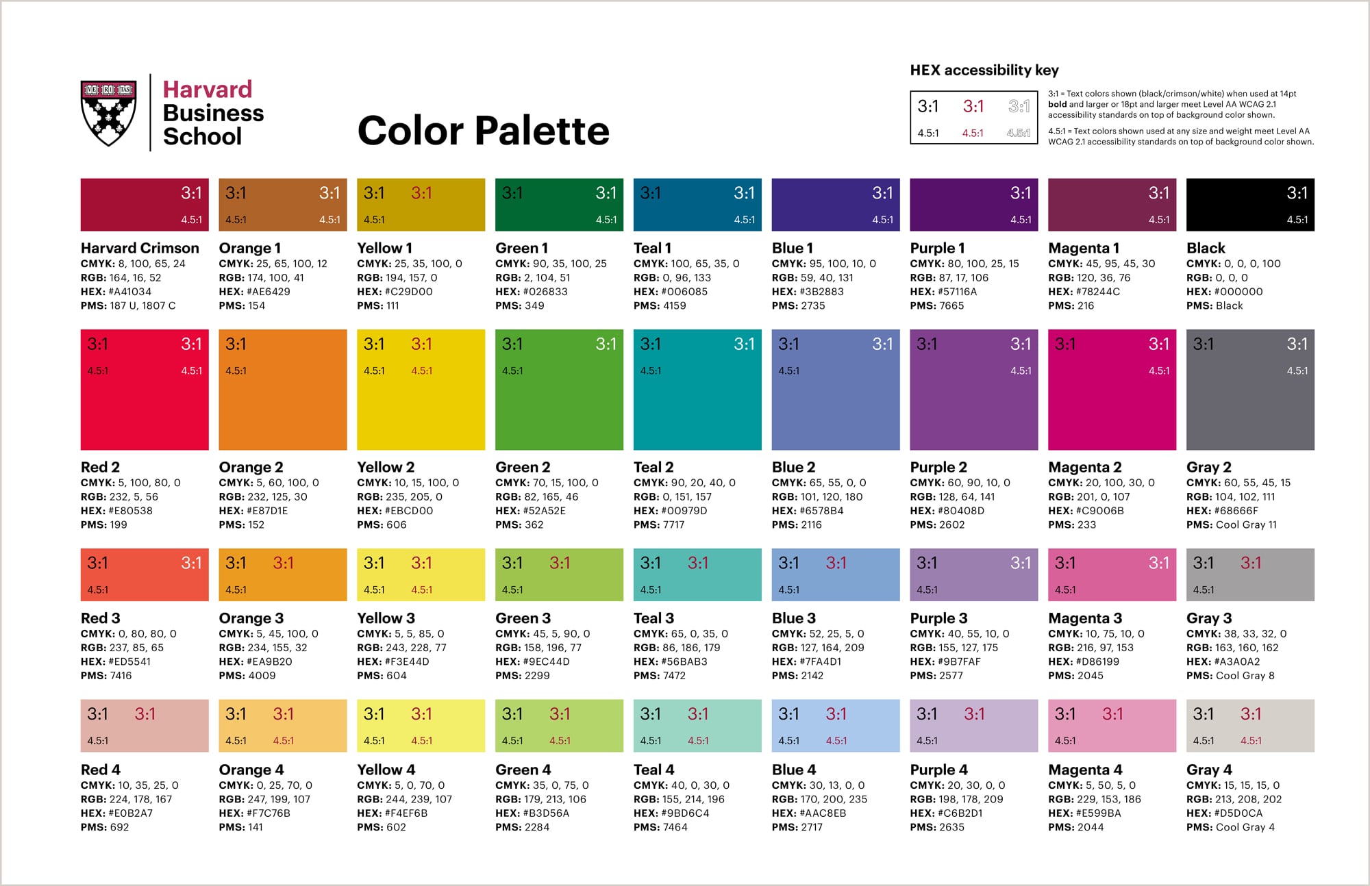
This process of testing and refining is crucial. Below is an example from Harvard Business School showing how they document their color palette with accessibility in mind.
Test your understanding!
Let's evaluate the "Kilimanjaro Mist" palette.
- Primary: Charcoal (
#343a40) - Secondary: Muted Green (
#556B2F) - Accent: Golden Yellow (
#FFC107)
Using the WebAIM Contrast Checker, test the following combination: Normal-sized text in Golden Yellow on a Charcoal background. Does it pass the WCAG AA standard? What could you do if it fails?
Show answer
- Foreground: Golden Yellow (
#FFC107) - Background: Charcoal (
#343a40) - Result: The contrast ratio is 9.19:1. This easily passes the 4.5:1 requirement for normal text. This would be an excellent combination for highlights or links on a dark background.
Let's try another: Normal-sized white text (#FFFFFF) on the Muted Green background.
- Foreground: White (
#FFFFFF) - Background: Muted Green (
#556B2F) - Result: The contrast ratio is 3.89:1. This fails for normal text (needs >4.5:1) but passes for large text (needs >3:1). So, this combination should only be used for headings or other large text elements.
Conclusion
You now have the knowledge to ensure your brand's beautiful color palette is also functional and inclusive. This is a critical step in creating a professional and trustworthy brand identity.
Key Takeaways:
- Digital accessibility is a sign of quality and is crucial for a premium brand.
- Color choices must be evaluated against WCAG contrast ratios: 4.5:1 for normal text and 3:1 for large text and UI components.
- Always test your key color combinations using a contrast checker before finalizing your palette.
- You can often fix failing contrast by adjusting shades or adding other visual cues like borders, without discarding your chosen colors.
Next Up:
We are now at the final step of defining your brand's color system. In the next lesson, we will bring everything together to document the color specifications (HEX, RGB, CMYK) for your chosen palette, ensuring it can be used consistently across both digital and print media. This will be the final piece of the "Language of Color" module.