Hello! Welcome back to our module on CSS fundamentals.
In the previous lesson, we demystified the CSS cascade, learning the precise algorithm browsers use to determine which style declaration wins when multiple rules compete. We saw that the cascade is about resolving conflicts to find the final value for a property.
Today, we'll explore what the browser does with those values, specifically for properties that define an element's size and spacing. Our focus is on one of the most fundamental concepts in CSS: the box model. Your goal for this lesson is to explain the components of the CSS box model and the effect of the box-sizing property.
Understanding this is non-negotiable for web development. Every element on a page is a rectangular box, and this model is the browser's schematic for calculating its dimensions and position. This is the "under-the-hood" mechanic that dictates all CSS layout.
We will cover:
- The four components of every CSS box: content, padding, border, and margin.
- How the
box-sizingproperty fundamentally changes the calculation of an element's dimensions.
The Four Layers of the CSS Box
Every block-level element rendered on a page is composed of four nested rectangular boxes. Moving from the inside out, they are:
- Content Box: The area where your content (text, images, etc.) is displayed. Its dimensions can be determined by the content itself or by explicit
widthandheightproperties. - Padding Box: An area of space around the content, but still inside the element. It pushes the content away from the border. The element's background color extends into the padding.
- Border Box: This box wraps the padding and content. It's the visible frame of the element if a
borderis set. - Margin Box: This is an invisible area of space outside the border. It's used to create space between an element and its neighbors.
The following video provides an excellent visual and conceptual walkthrough of these four layers.
CSS Box Model explained (padding, border, margin)
This video from the Coder Coder channel breaks down each component of the box model, explaining its purpose and key properties. Watching these segments will build a solid mental model of how an element is constructed.
Watch the video from the beginning (00:25) up to 15:34. As you watch, focus on the distinct role of each layer: Introduction (00:25 - 01:02): Get the high-level overview of the four layers. Content (01:02 - 02:31): Understand how width and height properties affect this box by default. Padding (02:31 - 09:18): Note that padding is inside the element and that you can control it with shorthand and logical properties (padding-block, padding-inline). Border (09:18 - 11:28): See how the border encloses the padding and content. Margin (11:28 - 15:34): Observe that margin is outside the element and is used to create space between elements.
A common point of confusion is the difference between padding and margin. Let's clarify:
| Feature | Padding | Margin |
|---|---|---|
| Location | Inside the border | Outside the border |
| Purpose | Creates space between content and the border | Creates space between an element and its neighbors |
| Background | Inherits the element's background color/image | Transparent; shows the parent element's background |
| Negative Values | Not allowed | Allowed (can be used to create overlaps) |
To solidify this, let's review a concise textual explanation.
This article from Devopedia provides a clear, technical distinction between margin and padding.
Read the section titled 'How is margin different from padding?'. It succinctly summarizes the key differences we've just discussed.
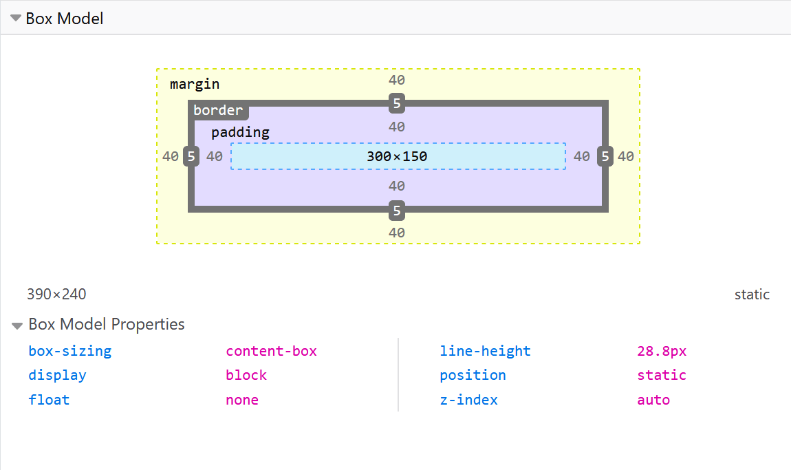
You can visualize all of this using your browser's developer tools. Inspecting any element will show you a diagram of its box model, which is invaluable for debugging layout issues.
The Calculation Problem: box-sizing
We've established the components. Now for the crucial part: how is the final size of an element calculated when you set its width? For example, if you write width: 200px; and padding: 20px;, should the element be 200px wide, or 240px wide?
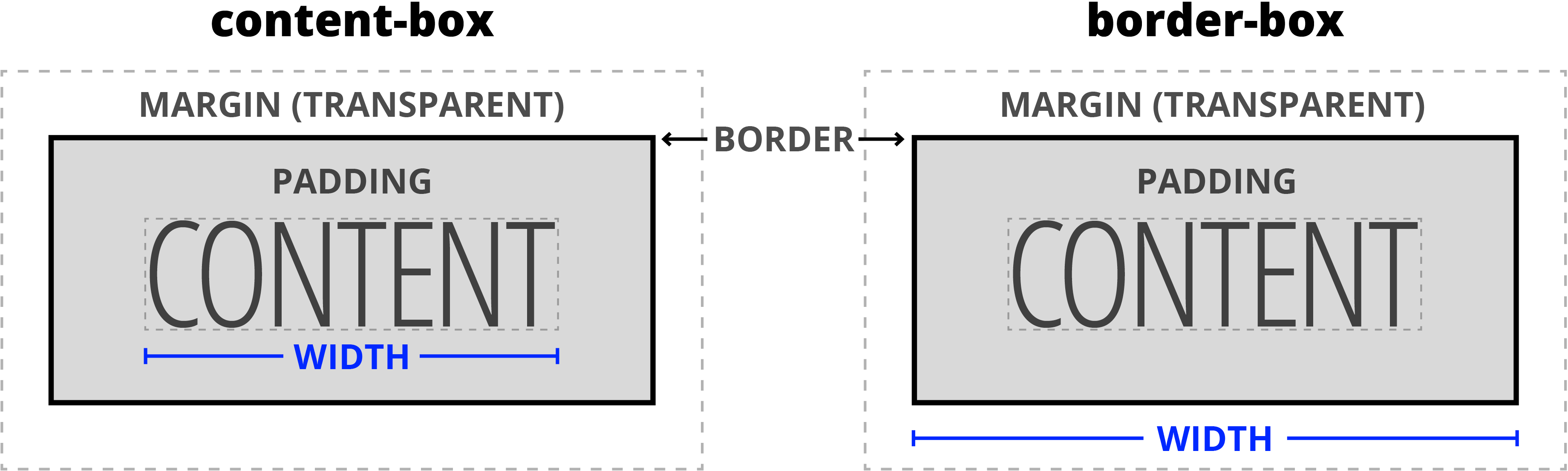
The answer depends on the box-sizing property. It has two main values: content-box (the default) and border-box.
The Standard Model: box-sizing: content-box
By default, CSS uses the content-box model. In this model, the width and height properties apply only to the content box. Padding and border are added on top of that width.
Let's use an example from the MDN documentation:
.box {
  width: 350px;
  height: 150px;
  padding: 25px;
  border: 5px solid black;
}
With box-sizing: content-box, the actual rendered width of the element will be:350px (width) + 25px (padding-left) + 25px (padding-right) + 5px (border-left) + 5px (border-right) = 410px.
This behavior is often unintuitive because adding padding or a border changes the overall dimensions of the element, which can break carefully crafted layouts.
The Alternative Model: box-sizing: border-box
The border-box model provides a more predictable way of thinking about layout. In this model, the width and height properties apply to the element up to and including the border. Padding and border are contained within that specified width.
Using the same CSS rules:
.box {
  box-sizing: border-box; /* The key change */
  width: 350px;
  height: 150px;
  padding: 25px;
  border: 5px solid black;
}
Now, the actual rendered width of the element is simply 350px. The browser automatically subtracts the space for padding and border from the content area.
The following video provides a focused and clear explanation of this difference and why border-box is the modern standard.
box-sizing: border-box explained
Kevin Powell provides a concise explanation of box-sizing, showing why content-box can be problematic and how border-box leads to more predictable layouts.
Watch from 00:55 to 03:04. Pay close attention to the visual demonstration of how padding and border are added externally in content-box versus internally in border-box.
A Modern Best Practice
Because border-box is so much more intuitive, it has become a standard best practice to apply it to all elements in a project. However, simply using a universal selector (*) isn't the most robust approach. A slightly more sophisticated method that uses inheritance is preferred.
html {
  box-sizing: border-box;
}
*,
*::before,
*::after {
  box-sizing: inherit;
}
Why is this better?
This setup sets the border-box model on the <html> element and then tells every other element (*) and pseudo-element (::before, ::after) to inherit their box-sizing from their parent.
This provides two benefits:
- It achieves the goal of making
border-boxthe default for your entire document. - It makes it easier to override the
box-sizingfor a specific component or section if you ever need to integrate third-party code that relies on thecontent-boxmodel. You can change it on a container, and all its children will inherit that change automatically.
The historical context for border-box is also interesting. This "more intuitive" model was actually how early versions of Internet Explorer worked, contrary to the W3C specification at the time. The CSS3 specification later adopted this behavior as an option with the box-sizing property, acknowledging its practical benefits.
Conclusion
You have now mastered the structure of every element in CSS. The box model is a core concept that you will use constantly when building user interfaces.
Key Takeaways:
- Every element is a set of four nested boxes: content, padding, border, and margin.
- Padding adds space inside the border, while margin adds space outside it.
- The
box-sizingproperty determines how an element's total size is calculated. box-sizing: content-box(the default) setswidthandheightfor the content area only. Padding and border are added on top, increasing the element's rendered size.box-sizing: border-boxsetswidthandheightfor the entire area up to the border. This is more predictable and is considered a modern best practice.
What's Next?
We've defined the four components of the box model, but one of them—margin—has a peculiar behavior that often surprises developers. In the next lesson, we will dive into the rules of margin collapsing, where the margins of adjacent elements can combine or "collapse" into a single margin. Understanding this is crucial for debugging vertical spacing issues.