Hello! Let's continue our exploration of CSS fundamentals.
In the last lesson, we broke down the CSS box model, establishing that every element is a box with four layers: content, padding, border, and margin. We also saw how box-sizing: border-box makes layout calculations more predictable. You now have a solid mental model for how an individual element's space is defined.
Today, we'll focus on a peculiar and often misunderstood behavior of the outermost layer: the margin. Your learning goal is to describe the rules of margin collapsing and identify scenarios where it occurs. This is a classic "gotcha" in CSS. Understanding its underlying mechanics will save you countless hours of debugging vertical spacing issues.
We'll investigate:
- The definition and purpose of margin collapsing.
- The three primary scenarios where margins collapse.
- The concept of a Block Formatting Context (BFC) and how it's used to prevent collapsing.
- Modern strategies for managing vertical spacing that avoid these issues altogether.
What is Margin Collapsing?
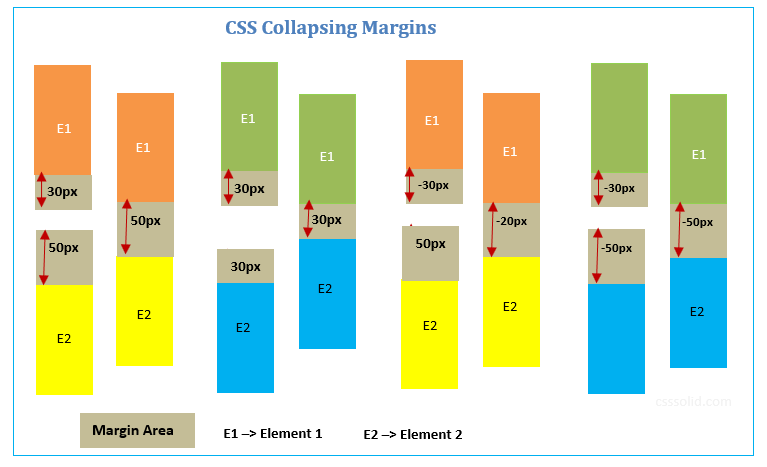
Margin collapsing is a behavior where the vertical margins of two or more adjacent block-level elements combine into a single margin. The size of this single margin is the size of the largest of the individual margins, not their sum.
This was an intentional design choice in the early days of CSS, primarily intended for text-based documents. It ensures that the space between a heading and a paragraph, for example, is consistent and doesn't become excessively large due to "double margins."

The rules get more complex when negative margins are involved.
The Rules and Scenarios of Margin Collapse
To truly master this concept, you need to know when it happens. The MDN documentation provides a clear, structured breakdown of the three primary scenarios. We'll use this as our guide.
The MDN Web Docs article 'Mastering margin collapsing' is the definitive reference on this topic. It systematically lists the three basic cases where collapsing occurs.
Read the introductory section and the descriptions of the three main cases: 'Adjacent siblings', 'No content separating parent and descendants', and 'Empty blocks'. Focus on the definitions; we will explore the solutions next.
Let's summarize and contextualize those three cases:
-
Adjacent Siblings: This is the most straightforward case, as shown in the image above. The bottom margin of one block-level element touches the top margin of its next sibling, and they collapse.
-
Parent and First/Last Child: This is often the most surprising scenario.
- If there is no border, padding, or inline content between the top of a parent element and the
margin-topof its first child, those two top margins will collapse. The child's margin effectively "escapes" the parent, pushing the parent down. - Similarly, if there is no border, padding, inline content,
height, ormin-heighton the parent, itsmargin-bottomwill collapse with themargin-bottomof its last child.
- If there is no border, padding, or inline content between the top of a parent element and the
-
Empty Blocks: If an element has a margin-top and margin-bottom but has no content, padding, border, or height, its top and bottom margins will collapse into one another.
A key rule that underpins all of this is that only vertical margins (top and bottom) collapse. Horizontal margins (margin-left and margin-right) never do.
Preventing Margin Collapse: The Block Formatting Context
Now that we know the rules, how do we control this behavior? The most robust way to prevent margin collapse is to create a new Block Formatting Context (BFC).
Conceptually, a BFC is a mini-layout environment within the page. Once an element establishes a BFC, it acts as a containing block for its descendants. One of the key properties of a BFC is that the margins of elements inside it do not collapse with margins outside of it.
You have likely created BFCs before without realizing it, as it happens as a side effect of using certain CSS properties.
The following video does an excellent job of explaining this phenomenon and introducing the modern solution.
What is this weird white space getting added to elements?
The Coder Coder video 'What is this weird white space getting added to elements?' provides a clear, conceptual explanation of why a child's margin can escape its parent and how creating a new Block Formatting Context (BFC) solves the problem.
Watch from 01:18 to 04:26. Pay close attention to: The visualization of the child's margin collapsing 'through' the parent (01:18 - 01:52). The explanation of what a BFC is and why it's the solution (01:52 - 03:21). The comparison of 'hacky' methods (like adding a border) versus the modern display: flow-root property (03:21 - 04:26).
As the video explained, here are some ways to create a new BFC and thus prevent margin collapse between a parent and its children:
display: flow-root;: This is the modern, dedicated property for creating a BFC. Its only job is to establish a new context without any other layout side effects. This is the preferred method.display: flex;ordisplay: grid;: These create new Flex or Grid formatting contexts, which have similar containing effects to a BFC and also prevent margin collapse.overflowwith a value other thanvisible(e.g.,auto,hidden).- Adding a
borderorpaddingto the parent element. This works not by creating a BFC, but by physically separating the parent's box edge from the child's margin, so they no longer touch and cannot collapse.
Modern Strategies for Spacing
Rather than reacting to margin collapse, we can architect our CSS to proactively avoid it. A common and robust strategy is to apply margin in only one direction for vertical spacing. For example, by resetting all default margins and then applying only margin-top to elements, you eliminate the possibility of adjacent margins touching and collapsing.
A popular and powerful technique for this is the "lobotomized owl" selector: * + *.
Collapsing margins - what they are and how to deal with them
Kevin Powell's video provides a fantastic walkthrough of this modern spacing technique, showing how to build a consistent and collapse-free layout system.
Watch from 08:19 to 12:40. Focus on: The initial problem: resetting all margins creates a new issue where elements are squashed together. The solution: using the * + * selector to apply margin-top to every element that is an adjacent sibling. The conceptual elegance: this applies space between elements, not on all sides, leading to predictable rhythm. A technical refinement: why * + * is often preferred over *:not(:first-child) due to lower specificity.
This approach, combining margin resets with a single-direction spacing rule, is a powerful pattern. It makes vertical spacing declarative and predictable, sidestepping the complexities of margin collapse entirely. Given your background in software engineering, you can think of this as adopting a convention that eliminates a class of bugs by design.
Conclusion
You've now explored one of CSS's most notoriously tricky concepts. By understanding the "why" behind it—its origin in typographic layout—and the precise rules of its execution, you can move from being surprised by it to controlling it.
Key Takeaways:
- Margin Collapse is the fusion of vertical margins of adjacent block-level elements into a single margin, which takes the size of the largest margin.
- It occurs in three main scenarios: adjacent siblings, a parent and its first/last child (if there's no separation), and empty blocks.
- The primary mechanism for preventing margin collapse is to create a new Block Formatting Context (BFC). The modern, preferred way to do this is with
display: flow-root. - Using properties like
padding,border,display: flex, oroverflow: autocan also prevent margin collapse, often as a side effect. - A robust, modern strategy is to manage vertical spacing with a single-direction margin rule (e.g.,
* + * { margin-top: 1em; }) to avoid collapse by design.
What's Next?
So far, we've dealt with elements within the "normal flow" of the document. In the next lesson, we will learn how to take elements out of this normal flow using the position property. You will learn the difference between relative, absolute, fixed, and sticky positioning, which will unlock a whole new dimension of layout control.