Welcome to the next step in your Canva journey. In our previous lessons, you've gone from a blank page to a design with a title, an author, a decorative line, and an icon. While all the pieces are on the canvas, they might feel a bit scattered. This lesson is all about bringing order and professionalism to that layout.
Today, you will learn how to use Canva's alignment guides and spacing tools to organize elements neatly on a page. Mastering these features is the key to transforming a collection of individual items into a clean, cohesive, and professional-looking design. This skill is fundamental for every page you will create, from the cover to the final chapter of your ebook.
Method 1: The Intuitive Approach with Smart Guides
Before we dive into automated tools, let's explore Canva's built-in intelligence. As you move elements around your page, you'll notice pink lines appearing and disappearing. These are Smart Guides, and they are your first line of defense against messy layouts.
- A solid pink line appears when an element is centered on the page (either vertically or horizontally).
- Dotted pink lines appear when an element aligns with the edge or center of another element.
- Numbered markers pop up between elements to show you that the spacing is equal.
These guides provide instant visual feedback, allowing you to make quick adjustments by eye.
How to Evenly Space Elements on Canva
This article from Cameron & Tia's blog gives a great overview of the fundamental alignment features.
Focus on the first two points in the article: Read the point on Snapping to understand how smart guides help elements lock into place. Then, read about Spacing Guides to see how the numbered markers help you create consistent gaps between your elements.
Take a moment to open your "The Silent Forest" project and experiment. Try dragging your title text box until the solid pink line appears, showing it's perfectly centered on the page. Then, try to align the decorative line with it and watch for the dotted lines.
Method 2: The Power Approach with the Position Tool
Smart guides are great for simple adjustments, but when you need perfect alignment and distribution across multiple objects, the Position tool is your best friend. It provides a set of powerful commands to organize selected elements automatically.
To use it, first select multiple elements. You can do this by holding down the Shift key and clicking on each element, or by clicking and dragging your mouse to draw a box around them. Once selected, a "Position" button will appear in the top-right toolbar.
Clicking "Position" opens the Arrange panel, which contains the tools we need. The key sections are "Align elements" and "Space evenly".

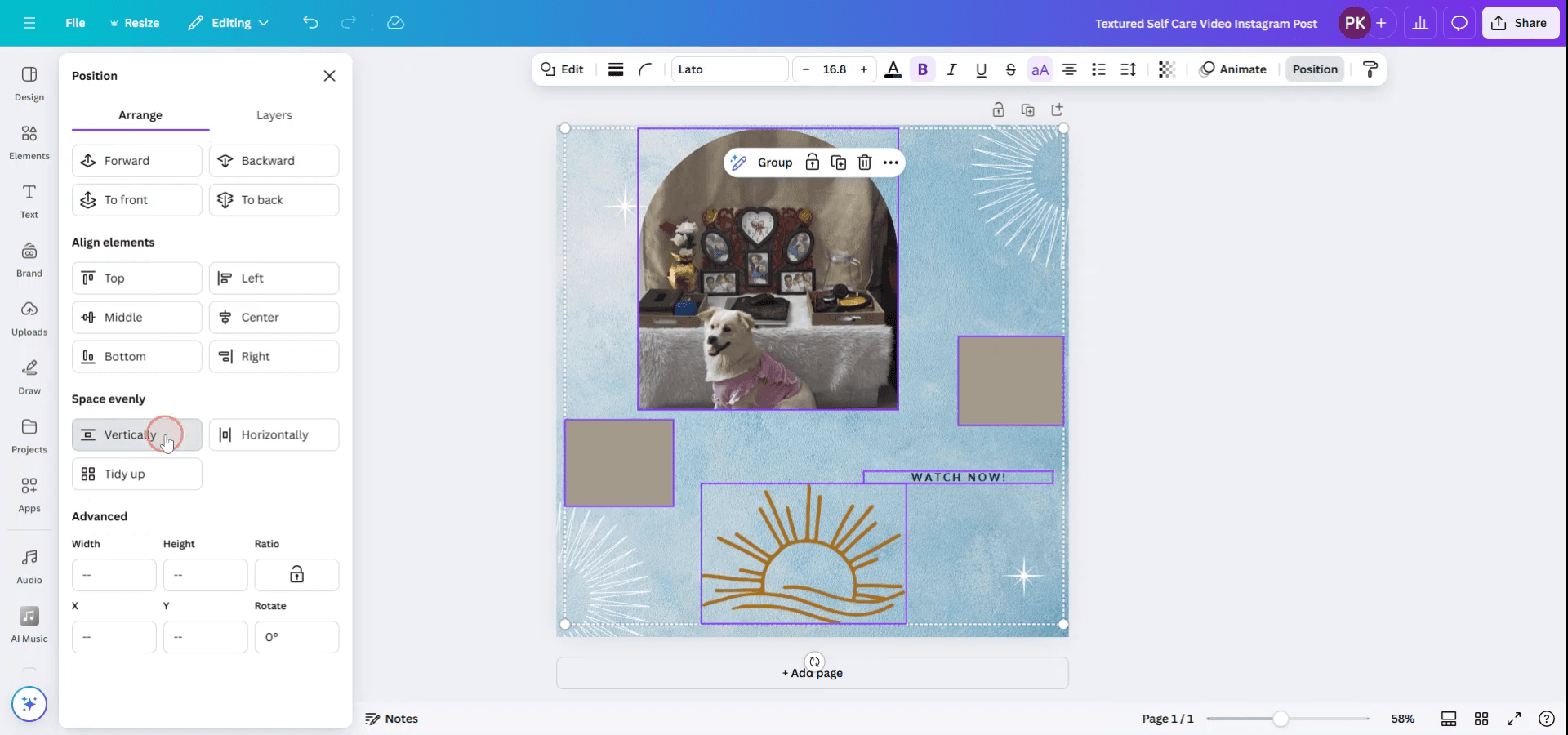
The best way to understand these tools is to see them in action. The following video demonstrates how to use the Position tool to solve common design challenges.
Perfectly Align and Space Elements in Canva QUICKLY ⏰
This video by Jacqui Naunton provides clear, quick demonstrations of the alignment tools you'll be using constantly.
Watch these key segments to see how the tools work in practice: Spacing lines: Watch from the beginning of the demonstration to see how to create a series of lines and then use Position > Space evenly > Vertically to distribute them perfectly. This is a technique you might use to create a worksheet or notes page in an ebook. Aligning columns: Skip to the part where she works with multiple boxes. Notice how Canva's smart guides help with initial placement, showing the pixel spacing between objects. Centering objects: The demonstration of aligning circles within each other is an excellent example of using Position > Center and Middle together to create a perfectly concentric design. Aligning text: Finally, watch how to align paragraphs of text. This shows how to use Position > Left to create a clean left edge for all your text blocks.
As you can see, these tools save an incredible amount of time and eliminate the guesswork of manual alignment.
Let's Practice: Tidying Up Your Title Page
Now, let's apply this to your "The Silent Forest" project. Your page currently has four elements: the pine tree icon, the title text, the decorative line, and the author's name. We'll use the Position tool to arrange them perfectly.
- Open your project.
- Select all four elements. Hold down the Shift key and click on each one.
- Center everything. With all elements selected, click Position in the top-right toolbar. Under "Align elements", click Center. All four items will immediately jump into a perfectly straight line down the middle of the page.
- Distribute the spacing. The elements are now centered, but the vertical spacing between them is probably uneven. To fix this, go back to the Position panel. Under "Space evenly", click Tidy up.
Canva will automatically adjust the vertical gaps so that the space between the icon and title, the title and the line, and the line and the author name are all perfectly equal. Your page should now look clean and intentionally designed.
To review these concepts and have a handy guide for the future, the following article explains the "Tidy up" tool in detail.
How to tidy up on Canva (With Examples and Shortcuts)
This article from Faith Ola provides a focused, step-by-step guide on the Tidy up tool, including a useful shortcut.
Please read the following sections to solidify your knowledge: Start with What is the Canva Tidy Up Tool? for a clear definition. Review the steps under How to Tidy Up on Canva to see the different ways to access the feature. Finally, take note of the section on the Canva Tidy Up Tool Shortcut, ALT+SHIFT+T (or Option+Shift+T on Mac). This is a great timesaver.
Conclusion
In this lesson, you've learned the essential skills for creating orderly and professional layouts. You now know how to use both the intuitive smart guides for quick adjustments and the powerful Position tool for precise alignment and distribution. By tidying up your title page, you've seen firsthand how these features can instantly elevate a design from amateur to polished. This marks the successful completion of your first module, where you've gone from a blank canvas to a well-structured first page.
In our next lesson, we will begin a new module and move from the mechanics of arrangement to the art of design. You'll learn about visual hierarchy, a core design principle that uses contrast in size, weight, and color to guide the viewer's eye and make your pages more effective and engaging.