Welcome to the first lesson of our new module, "Designing the Photo Book Object." In the previous module, we navigated the intricate process of curating and sequencing your images, culminating in a complete visual narrative framed by a deliberate opening and closing. You now have the soul of your book; today, we begin building its body.
This lesson marks the transition from the abstract sequence to the tangible, physical object. We will explore how the fundamental architectural decisions you make—about your book's size, orientation, and format—are not mere practicalities, but powerful extensions of your artistic concept. As someone with a deep background in sculpture and design, you are already intimately familiar with how form, scale, and materiality shape an observer's experience. We will now apply that same sensitivity to the medium of the photo book.
Our goal is to determine the most appropriate physical form for your project, setting the stage for the detailed page layout work that will follow.
The Book as a Sculptural Object
Before we delve into specifics, it's essential to frame our thinking. A photo book is more than a simple container for images. It is an object with presence, weight, and a distinct mode of interaction. Its physical characteristics are the first things a viewer encounters, and they can either reinforce or undermine the story within.
The following article argues against what the author calls "Tupperware photobooks"—generic containers into which photographs are simply dumped. It makes a compelling case for why the form of the book is an integral part of the artistic statement.
The Form of the Photobook (Revisited)
This short introduction from Cphmag.com effectively argues for the importance of considering the book's physical form as a primary conceptual tool.
Please read the first few paragraphs of the article, from the beginning down to this point. The author's critique of "glorified Tupperware" is a useful starting point for our discussion.
This idea that design choices should amplify, not overshadow, the work is central. Every decision about the book's physical nature is an opportunity to enhance your narrative.
Dimension 1: Size and Orientation
The size of your book has a profound impact on the viewing experience. It dictates the relationship between the viewer's body and the work, influencing feelings of intimacy, awe, or curiosity.

Let's explore this connection between size and meaning.
In this segment from his video "How to Layout a Photobook," photographer Aaron Hardin discusses the conceptual implications of choosing a book's size.
Watch from 01:26 to 02:12. Hardin draws a clear line between the scale of the book and its emotional tenor: smaller books feel more intimate, like a diary, while larger books can feel monolithic and are well-suited for grand landscapes.
This distinction is a fundamental starting point.
- Small books (e.g., 5x7" or 6x9") draw the viewer in. They are held close, creating a personal, one-on-one experience. They can make the content feel precious or private.
- Large books (e.g., 12x12" or larger) command a space. They are often placed on a table and viewed from a slight distance. This scale can impart a sense of grandeur, authority, or immersive detail.
- Mid-size books (e.g., 8.5x11") are versatile and often feel more documentary or reportorial in nature.
The orientation of the book—portrait, landscape, or square—is usually guided by the dominant orientation of your photographs. A landscape-oriented book naturally accommodates horizontal images, while a portrait-oriented book favors verticals. A square format is neutral and can create interesting compositional challenges and opportunities with both.
However, these are just conventions. An artist can use size and orientation in unconventional ways to make a specific point.
This blog post by Michael Kazanjy offers pointed examples of how artists use size to convey meaning.
Read the section of the article beginning with this paragraph. The example of a tall, narrow book for skyscrapers is a perfect illustration of form following function, while the idea of printing huge buildings as small prints shows form being used to create conceptual contrast.
Dimension 2: Format and Binding
"Format" refers to how the book is physically constructed, most notably its binding. The binding method affects not only the book's durability and cost but also how it opens, how it feels in the hands, and how images can be presented across a two-page spread.
To discuss this effectively, we need a shared vocabulary for the parts of a book.
This video, "The Anatomy of the Photobook" by Sebastian Siadecki, provides a clear, concise introduction to the terminology of book construction.
Please watch the section from 02:42 to 05:11. Pay close attention to the terms recto (right-hand page), verso (left-hand page), and especially the gutter (the center fold), as this area is critical when laying out images.
With that terminology in mind, let's look at the different ways a book can be put together. The choice of binding is a crucial design decision that dictates the physical experience of turning the pages.
The following resource provides an excellent survey of common binding methods.
This next segment from "The Anatomy of the Photobook" is a comprehensive visual guide to different binding styles and their characteristics.
Watch the extended section from 05:16 to 18:58. As you watch, focus on how each binding type affects the book's ability to lay flat. You don't need to memorize every single type, but get a feel for the main categories.
Here is a summary of the most relevant binding types for an artistic photo book and their implications:
-
Smyth Sewn (or Section Sewn):
- Structure: Pages are printed on large sheets, folded into "signatures," and then sewn together before being bound into a cover. This is the hallmark of high-quality book production.
- Experience: Lays relatively flat, allowing for images to cross the gutter with minimal disruption. It is durable and feels substantial. It is the standard for most hardcover trade photo books.
-
Perfect Bound:
- Structure: Individual pages are stacked and glued together at the spine. Common for softcover books ("paperbacks") and some less expensive hardcovers.
- Experience: Does not lay flat. A significant portion of the image can be lost in the gutter, making it a poor choice for designs that rely on full-bleed, two-page spreads.
-
Saddle Stitch / Pamphlet Stitch:
- Structure: Folded sheets are nested inside one another and then stapled (saddle stitch) or sewn (pamphlet stitch) through the center fold.
- Experience: Lays completely flat. Ideal for zines, chapbooks, and smaller projects where uninterrupted spreads are essential. The number of pages is limited.
-
Accordion (or Leporello):
- Structure: A single, long sheet folded back and forth on itself.
- Experience: A highly sculptural format that emphasizes the continuous flow of a sequence. The book can be read page-by-page or unfolded and viewed as a single, panoramic object.
-
Other Artistic Bindings (Japanese Stab, Coptic, Swiss): These offer unique aesthetic qualities. A Swiss binding, for example, exposes the spine and allows the book block to lay perfectly flat, making it an elegant choice for showcasing spreads.
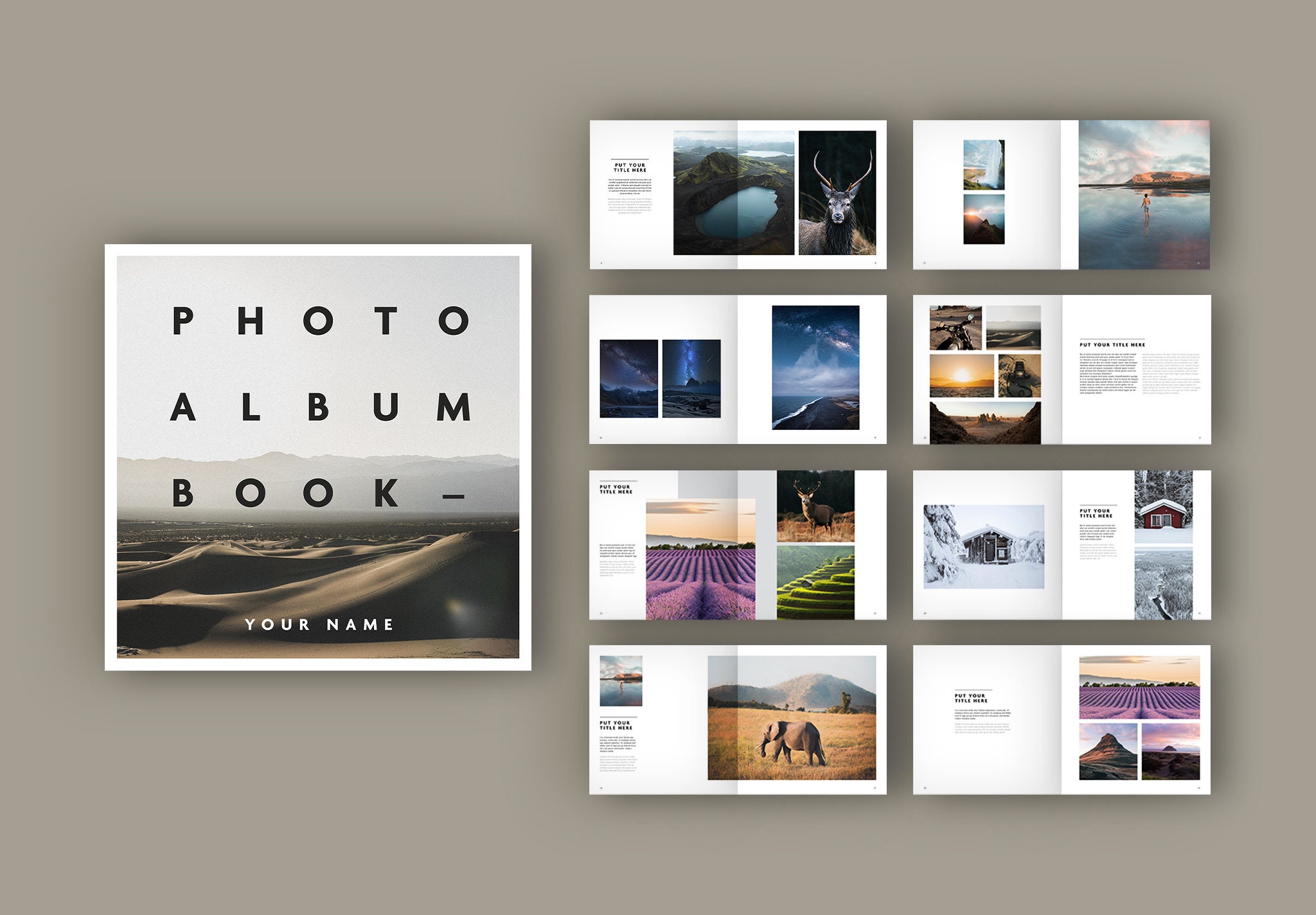
Your Turn: Defining Your Book's Architecture
Now, let's apply these concepts to your project. Take out your sequence of prints and your artist statement. This exercise is about making preliminary choices to guide your design process, not ironclad final decisions.
1. Re-evaluate Your Concept's "Feeling"
- Read your artist statement. What are the key emotional or conceptual words? Is your project about intimacy, memory, grandeur, fragility, chaos, or order?
- Based on this, what is the ideal viewing experience? Should the viewer feel drawn into a private world, or confronted by a large, public statement?
2. Choose a Tentative Size and Orientation
- Look through your final image sequence. Is there a dominant orientation (horizontal vs. vertical)? This is a strong clue for your book's orientation.
- Based on your concept's "feeling," propose a size. Don't just pick a standard number; think in relative terms first. Should it be small enough to hold comfortably in two hands? Large enough to require a table?
- Example: If your project is a quiet, tender exploration of family, a small, intimate portrait-oriented book of perhaps 6x8 inches might feel right. If it's a series on vast, open landscapes, a large, landscape-oriented 13x11 inch book might be more appropriate.
3. Select a Potential Binding Format
- Review your sequence again, specifically looking for visual pairs and spreads. Do you have images that must work together across the gutter to be effective?
- If so, you need a binding that lays flat (Smyth Sewn, Saddle Stitch, Swiss, etc.). A Perfect binding would be a poor fit.
- What is the desired material feel? Does your project call for the polished quality of a Smyth-sewn hardcover, or the raw, immediate feel of a saddle-stitched zine?
- Select one or two binding methods that seem most aligned with your project's narrative and desired physical presence.
Jot down your initial thoughts on these three elements: Size, Orientation, and Binding Format. These decisions form the blueprint for your book as a physical object.
Conclusion
In this lesson, we have established that the physical form of a photo book is a critical component of its artistic meaning. We've moved beyond seeing the book as a mere container and have begun to approach it as a sculptural object whose properties can be fine-tuned to serve your concept.
Key takeaways from today:
- Form is Content: The size, shape, and format of your book are not afterthoughts; they are primary design decisions that shape the viewer's interpretation.
- Size Conveys Emotion: Smaller books tend to create intimacy, while larger books convey grandeur and authority.
- Binding Dictates Interaction: The choice of binding method determines how the book handles, how it opens, and how effectively it can display images across a two-page spread.
You have now laid the architectural foundation for your book. In our next lesson, we will move inside, taking your sequence and your newly-defined format to begin the process of page layout. We will explore how to translate the pacing and rhythm you developed in your sequence into the dynamic space of the page and the spread.