In our previous lesson, we established the dual role of lines in visual design: they provide structure and function while also conveying emotion and character. We saw how different line types—straight, curved, jagged—begin to shape the psychological tone of a design. Today, we will refine that understanding by examining the specific properties that designers manipulate to control a line's impact with much greater precision.
Your goal for this lesson is to explain how line weight, direction, and quality affect visual communication and emotional tone. We will move beyond the general categories of lines to analyze the nuanced attributes that allow designers to create hierarchy, guide the viewer's eye, and infuse their work with a distinct personality. This will equip you with a more sophisticated vocabulary to articulate not just that a design works, but how its linear elements contribute to its success.
Line Weight: Creating Hierarchy and Conveying Mood
The most immediate property of a line is its line weight, which refers to its thickness or apparent "heaviness." This single attribute has a profound impact on what we notice first and what feeling a design imparts. At a basic level, the difference is intuitive: thin lines feel delicate, while thick lines feel bold.
A Guide to the Core Elements of Design
To begin, let's read a quick overview of how simple variations in line weight can shape a brand's personality. This article from Softriver provides a great introduction.
Focus on the section under the heading The Power and Personality of a Single Line. Notice the examples given for thin, thick, and jagged lines.
The reading introduces the idea that thicker lines feel more "important." This concept is formalized in design theory as visual weight. An element with high visual weight is a force that attracts the eye. As a PM, you often deal with UIs that must guide users to the most critical actions. Line weight is a primary tool for creating this guidance.
Design Principles: Visual Weight And Direction
Now, let's get a more formal definition from this in-depth Smashing Magazine article. It explains how various visual properties combine to create visual weight.
Read the introduction to "Visual Weight," starting from the beginning of the article down to the end of the bulleted list of characteristics. You can read this section. Pay special attention to Size, Value, and Orientation in the list, as these relate directly to the properties of a line.
While thickness is the most obvious aspect of line weight, professional illustrators and designers think about it in a more sophisticated way. Line weight can also be manipulated through value (how light or dark it is) and even blurriness. These properties can be combined to communicate multiple things simultaneously, such as importance, depth, and the direction of light.
The following video from the Proko channel offers a masterclass in this layered approach. While the context is drawing, the principles are universal to all visual communication.
Line Weight Communicates So Much More Than You Think
This video breaks down how an artist thinks about applying line weight. It introduces three guiding principles: using weight to show importance, light, and depth.
Watch the video in a few segments: First, watch the introduction where the artist describes line as a "visual language" from the beginning. Next, see the different ways line weight can be varied, including thickness, value (darkness), and tapering, from this section. Then, watch the core demonstration from drawing the box. This is the most important part. Notice how he methodically applies layers of thinking: first establishing values for light and shadow, then adding thickness for depth, and finally adjusting for overall importance (outer vs. inner contours). Finally, see the summary of the combined effect from the conclusion.
The key takeaway is that line weight is not a single decision but a system. A designer can use a dark, thick line to indicate that an object is both in shadow and close to the viewer. Conversely, a thin, light line can suggest an object is distant and in bright light. In UI design, a thick, bold line for a "Confirm Purchase" button and a thin line for a "Cancel" link use this same principle of importance to guide user behavior.
Line Direction: Guiding the Eye and Setting the Mood
If line weight controls what we see first, line direction controls where our eyes go next. In the last lesson, we touched on the basic emotional associations of line direction. Let's solidify that with some clear examples from the world of branding.
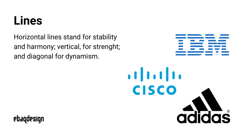
Notice how:
- Horizontal lines in the IBM logo create a feeling of stability, calm, and reliability.
- Vertical lines in the Cisco logo suggest strength, power, and connectivity (like signals reaching upward).
- Diagonal lines in the Adidas logo evoke a strong sense of action, speed, and dynamism.
Beyond individual lines, the overall dominant direction of a composition sets a pervasive mood and creates a path for the eye to follow. This is known as visual direction.
Design Principles: Visual Weight And Direction
Let's return to the Smashing Magazine article to explore this concept further.
Read the sections titled Visual Direction and The Overall Direction Of A Composition. These sections explain how direction acts as a force that leads the eye and establishes a dominant mood for the entire design.
In a well-designed app interface, the main reading path (like a social media feed) is often strongly vertical, encouraging scrolling. Key interactive elements like buttons and sliders are often horizontal, reinforcing stability and control. The deliberate use of a diagonal element in such a layout would immediately draw attention due to its contrast with the established directional grid.
Line Quality: The Texture of Emotion
Finally, we arrive at the most subtle property: line quality. This refers to the unique character and texture of a line. Is it smooth and consistent, or is it rough and varied? Is it solid, broken, or sketchy? This quality is like the tone of voice in spoken language; it gives the line its personality.

Look at the image above. You can instantly feel the difference between the chaotic scribble for "Frustrated" and the gentle, even waves for "Calm." The sharp, energetic zig-zags of "Energetic" are worlds apart from the slow, heavy swirls of "Sleepy." This is line quality in action.
In digital design, we often see these qualities expressed:
- Crisp, uniform lines: Common in UI design, these lines feel clean, modern, precise, and technical. They are the default in most consumer apps because they convey order and clarity.
- Rough, hand-drawn lines: These suggest a personal touch, creativity, and authenticity. A journaling app or a brand focused on organic products might use this style to feel more human and less corporate.
- Broken or dashed lines: These can create rhythm, but they also indicate something is temporary, a placeholder, or a path to be taken. Think of the "marching ants" selection tool in image editing software or the lines indicating a route on a map.
Synthesis: Deconstructing an Interface
Let's synthesize these three concepts—weight, direction, and quality—by analyzing their combined effect in a practical context. Imagine you are reviewing two different UI proposals for a simple music player screen in a consumer app.
Proposal A: "The Minimalist"
- Line Weight: All lines are thin and light gray. The progress bar, song title, and control icons have nearly equal visual weight.
- Line Direction: The layout is strictly horizontal. The track information, progress bar, and playback controls are all aligned on a rigid horizontal grid.
- Line Quality: Lines are perfectly crisp, with sharp, geometric corners.
- Overall Effect: This design feels calm, clean, and modern. The lack of hierarchy and the stable direction make it feel unobtrusive and restful. It prioritizes elegance over urgency.
Proposal B: "The Headliner"
- Line Weight: The artist and song title are set in a bold, heavy font. The play/pause icon is significantly thicker than the next/previous icons. Secondary information uses very thin lines. This creates a powerful visual hierarchy.
- Line Direction: While the main layout is horizontal, a volume slider is placed diagonally, and a background graphic uses radiating lines. This introduces energy and movement.
- Line Quality: The lines in the background graphic might have a textured, almost "hand-drawn" quality to add a sense of personality, contrasting with the crisp lines of the UI controls. This is relevant to your interest in house music, which often uses bold, expressive visual styles.
- Overall Effect: This design feels dynamic, engaging, and confident. It actively directs your attention and has a strong personality. It prioritizes energy and clear interaction points.
Neither design is inherently better, but their line choices create radically different user experiences. Understanding the interplay of weight, direction, and quality allows you to articulate precisely why one feels calm and the other feels energetic, and which is more appropriate for the app's goals.
Conclusion
In this lesson, we moved beyond the basic definition of a line to dissect the properties that give it such versatile power.
Key Takeaways:
- Line Weight (thickness, value) is a primary tool for creating visual weight, which establishes hierarchy and tells the user what is most important. It can also be used to suggest depth and form.
- Line Direction (horizontal, vertical, diagonal) guides the viewer's eye through a composition and establishes the overall mood—from stable and calm to energetic and dynamic.
- Line Quality (the character or texture of a line) infuses a design with personality and emotional tone, making it feel precise and digital, or personal and organic.
These three attributes rarely work in isolation. A masterful designer orchestrates them to create a cohesive system that is both functional and expressive.
In our next lesson, we will see what happens when a line connects back to its starting point. We will explore the world of shapes, differentiating between geometric and organic forms and analyzing how their inherent psychology is used in branding and interface design.