Hello! Welcome back to your second lesson on design theory.
In our first lesson, we established that vision is an active, constructive process. Your brain isn't a passive camera; it's a powerful pattern-matching engine that uses both raw visual data (bottom-up processing) and your existing knowledge and expectations (top-down processing) to build your visual reality.
Today, we'll zoom in on the very first moments of that process. We'll explore the patterns your brain notices first, before you've even had a chance to pay conscious attention. This brings us to our learning outcome: Define pre-attentive processing and identify visual properties (e.g., color, size, orientation) that are processed pre-attentively.
Understanding this is the key to creating "glanceable" interfaces—designs that communicate critical information instantly. For a product manager, this knowledge is invaluable for guiding teams to build apps that feel intuitive and efficient, rather than cluttered and demanding.
1. The Science of a Glance
Before you decide to focus your attention on something, your brain has already scanned the entire visual field and picked out the most salient features. This rapid, subconscious, and parallel processing of basic visual properties is called pre-attentive processing. It's the reason a single red dot "pops out" from a sea of blue dots, or why you instantly notice a single tilted line in a group of vertical lines.
To get a clear definition of this concept and its importance for interface design, let's start with a short reading.
Design for glanceable interfaces. How preattentive vision ...
This article, 'Design for glanceable interfaces' by Julian Scaff, provides an excellent, product-focused introduction to pre-attentive processing.
Please read the first two sections, titled 'The Blink of Understanding' and 'The Science of Glance'. Focus on the definition of pre-attentive processing and the speed at which it occurs.
As the article states, this all happens in less than 250 milliseconds—faster than conscious thought. It's a cognitive reflex. The key takeaway is that your brain doesn't read a visual scene first; it feels it.
This process takes place in what psychologists call our sensory memory. It's an automatic filtering mechanism that helps us manage the constant flood of visual information. To reinforce this, let's look at another resource that frames it slightly differently.
Preattentive Visual Properties and How to Use Them in ...
This article from the Interaction Design Foundation, 'Preattentive Visual Properties', offers a more formal definition and categorizes the properties we'll be discussing.
Please read the very first paragraph of the article and the final section titled 'The Take Away'. This will solidify the definition and its role in our memory systems.
So, to summarize, pre-attentive processing is:
- Fast: Occurring in under half a second.
- Subconscious: It happens without any conscious effort from you.
- Parallel: It processes the entire visual field at once, not serially.
- Difference-driven: Its primary function is to detect differences and make certain elements stand out.
2. The Properties That "Pop"
Now that we know what pre-attentive processing is, let's identify the specific visual properties that trigger it. What are the levers designers can pull to command attention at this fundamental level?
Take a look at the image below. In each column, one element should immediately stand out from the rest. You don't need to search for it; your brain finds it for you. This is the "pop-out" effect in action.
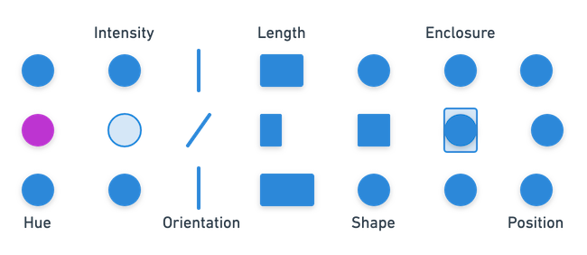
This image gives us a great preview of the properties we're about to discuss. The article from the Interaction Design Foundation organizes them into four main categories, based on the work of researcher Colin Ware. This provides a useful structure for us to think about them.
The Four Categories of Pre-attentive Properties
Let's explore these categories. For this section, you'll be reading parts of the same Interaction Design Foundation article we looked at earlier.
Preattentive Visual Properties and How to Use Them in ...
We'll now dive into the specific properties. This article breaks them down clearly.
Please read the sections titled 'The Four Preattentive Visual Properties', starting from the overview and continuing through all four numbered sections: '1. Color', '2. Form', '3. Movement', and '4. Spatial Positioning'. Focus on the specific attributes listed under each category (e.g., under 'Form', note attributes like size, shape, and orientation).
Let's break down what you just read:
-
Color: This is one of the most powerful pre-attentive tools.
- Hue: This is what we typically just call "color" (e.g., red, green, blue). A different hue stands out immediately.
- Intensity/Value: This refers to a color's lightness or darkness. A bright element in a field of dark elements will pop, and vice-versa.
-
Form: This is a broad category that covers the shape and structure of objects.
- Size/Scale: Larger objects are perceived as more important and draw the eye.
- Shape: A distinct shape (e.g., a circle among squares) is instantly noticeable.
- Orientation: A tilted element in a field of vertical elements is easy to spot.
- Length/Width: A line that is significantly longer or wider than its neighbors will stand out.
- Curvature: A curved line among straight lines (or vice-versa) is immediately apparent.
-
Movement: Our visual system is highly attuned to motion, a trait inherited from our evolutionary need to spot predators or prey.
- Motion: An element that is moving, especially when others are static, is a powerful attention-grabber.
- Flicker: A blinking or pulsing element also commands attention, though as the article notes, both motion and flicker should be used with great care in UI design to avoid being distracting or annoying.
-
Spatial Positioning: This relates to where objects are in space and their relationship to one another.
- 2D Position: An element's position relative to the group can make it stand out (e.g., the one misaligned item in a grid).
- Spatial Grouping: Elements that are close together are perceived as a group. We'll explore this much more in the next lesson on Gestalt principles.
3. Application & Reflection
As a Product Manager, your job isn't to be the designer, but to effectively critique and guide design decisions to meet user and business goals. Understanding pre-attentive properties allows you to have a much more precise conversation about why a design works or doesn't.
Imagine you are reviewing a new feature in your education app: a user's dashboard that shows a list of their courses. Each course has a completion percentage next to it.
The goal is to make it instantly obvious to the user which courses are new (not yet started) and which are complete (100% done), without them having to read every line.
How could you use at least three different pre-attentive properties to achieve this? Describe how you would apply each property to distinguish between "new," "in-progress," and "complete" courses.
For example:
- Property 1: How would you use color hue?
- Property 2: How would you use shape?
- Property 3: How would you use size/scale?
Think about how these choices would help a user understand their status in a single glance.
Conclusion
In this lesson, we've moved from the general idea of pattern-seeking to the specific, hard-wired shortcuts the brain uses to analyze a visual scene.
Key Takeaways:
- Pre-attentive processing is the brain's rapid, subconscious detection of basic visual features that happens in under 500 milliseconds.
- This process causes certain elements to "pop out" based on their fundamental properties, guiding a user's attention before they consciously decide where to look.
- The key pre-attentive properties fall into four main categories: Color (hue, intensity), Form (size, shape, orientation), Movement, and Spatial Positioning.
- By consciously using these properties, designers can create interfaces that reduce cognitive load and communicate information with near-instant clarity.
In our next lesson, we will build directly on this. We've seen how spatial grouping is a pre-attentive property. We'll now explore this idea in much greater depth by studying the Gestalt principles of perception. These principles describe the predictable ways our brains group disparate elements into meaningful, coherent wholes.