Hello! In our last lesson, we unpacked the Core Web Vitals (LCP, INP, and CLS) and established why they are critical for user experience and SEO. We identified that Largest Contentful Paint (LCP) is often negatively impacted by large, unoptimized images—a common bottleneck on modern websites.
Today, we'll tackle that problem head-on. This lesson directly addresses the learning outcome: Optimize images for web performance using Astro's built-in Image component. You'll learn how Astro automates complex image optimization tasks, allowing you to deliver fast, high-quality images with minimal effort. This is a foundational skill for building the high-performance accounting website you're aiming for.
1. The Astro Approach: Where to Store Your Images
Before we use Astro's components, it's crucial to understand where to place your image files. Astro treats images differently based on their location.
The official Astro documentation clearly explains the two main directories for storing images and the implications of each choice. Understanding this is the first step to effective image management.
Please read the section titled 'Where to store images', focusing on the distinction between src/ and public/. Also, take note of how remote images are handled.
To summarize the key points:
src/directory: This is the recommended location for any image you want Astro to process, optimize, and bundle. By placing images here, you unlock Astro's full suite of optimization tools. You can import these images directly into your.astrocomponents like JavaScript modules.public/directory: This folder is for assets that should not be processed. Astro copies everything frompublic/directly to the final build folder as-is. This is suitable for files that must have a specific name or location, likefavicon.icoorrobots.txt, but it means they won't be optimized.
For your project, you should place nearly all your website's visual assets—like logos, hero images, and blog post illustrations—inside src/assets/images/ to take full advantage of Astro's capabilities.
2. Meet the <Image /> Component
Astro's primary tool for image optimization is the built-in <Image /> component. It's a high-level abstraction over the standard <img> tag that adds a layer of powerful transformations.
Mastering Image Optimization in Astro.js
This article from the caisy.io blog provides a great high-level overview of Astro's image optimization features and introduces the <Image /> and <Picture /> components. It's a good primer before diving into the more technical docs.
Read the sections 'Overview of Astro.js's Built-In Image Optimization Features' and 'Using Astro.js's Image and Picture Components'. Focus on the benefits Astro provides out-of-the-box, such as automatic optimization and lazy loading.
The <Image /> component is more than just a convenience. It's an optimization powerhouse that automatically:
- Resizes and Compresses: Generates smaller, optimized versions of your images without noticeable quality loss.
- Converts to Modern Formats: Creates and serves next-gen image formats like
.webpor.avif, which offer superior compression compared to.jpegor.png. The browser automatically picks the best supported format. - Prevents Cumulative Layout Shift (CLS): Infers the image's dimensions and automatically adds
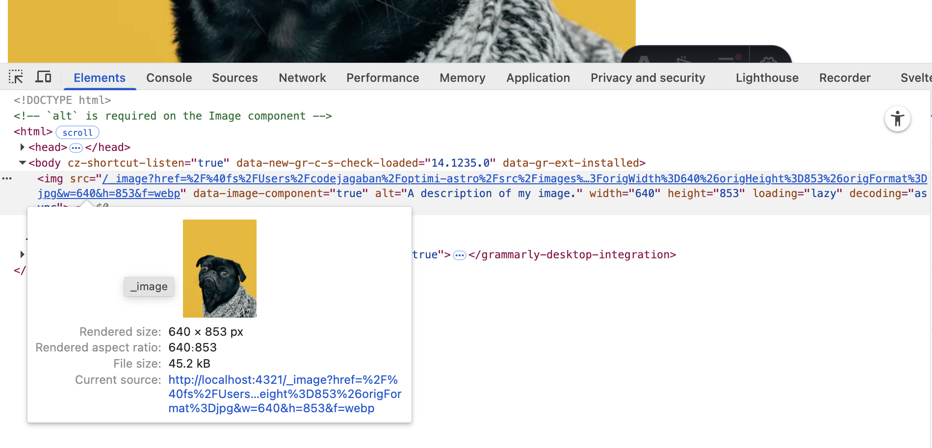
widthandheightattributes to the final<img>tag. This reserves space for the image during page load, preventing that jarring "jump" of content we discussed in the last lesson. - Implements Lazy Loading: Automatically adds
loading="lazy", which tells the browser to defer loading offscreen images until the user scrolls near them. This dramatically improves initial page load speed and your LCP score.
3. Practical Usage: <Image /> vs. <img>
Let's see how this works in practice. To use the <Image /> component, you import it from astro:assets and also import the specific image file you want to display.
Example:
Let's say you have a hero image for your homepage located at src/assets/images/accounting-hero.jpg.
---
// 1. Import the Image component and your image file
import { Image } from 'astro:assets';
import heroImage from '../assets/images/accounting-hero.jpg';
---

<!-- 2. Use the Image component in your template -->
<section>
  <h1>Professional Accounting Services</h1>
  <Image
    src={heroImage}
    alt="A modern office with accountants collaborating."
  />
</section>
That's it! With just this simple code, Astro performs all the optimizations mentioned above. The final HTML rendered in the browser will look something like this:
When should you use a standard <img> tag?
The <Image /> component is almost always the right choice. However, as the Astro docs point out, there are a few exceptions.
Let's refer back to the official documentation for a clear-cut comparison between using <Image /> and the native <img> element.
Read the short section titled 'Choosing vs '.
Use the standard <img> tag only when:
- The image is in the
public/folder and you don't want it processed. - You need to change the image's
srcattribute dynamically on the client-side with JavaScript. - The image format is not supported by Astro's processing service (e.g., some
.giffiles).
4. Creating Responsive Images
A critical aspect of web performance is serving appropriately sized images for different devices. Sending a massive desktop-sized image to a mobile phone wastes bandwidth and slows down the page. The <Image /> component handles this elegantly by generating srcset and sizes attributes.
The Astro docs detail how the image components handle responsive behavior automatically, which is a significant advantage for modern web development.
Read the section 'Responsive image behavior' to understand how Astro generates multiple image sizes and the corresponding HTML attributes.
By default, Astro generates a set of images at different widths. You can customize this with the widths and sizes properties. For example, if your image will be displayed in a column that is half the screen width, you can tell the browser this:
<Image
  src={heroImage}
  widths={[400, 800, 1200]}
  sizes="(max-width: 800px) 100vw, 50vw"
  alt="A modern office."
/>
widths: An array of widths (in pixels) for Astro to generate.sizes: A string that tells the browser how wide the image will be relative to the viewport.(max-width: 800px) 100vw, 50vwmeans "if the screen is 800px or less, the image is 100% of the viewport width; otherwise, it's 50%."
While you can fine-tune these, Astro's defaults are often sufficient.
Test your understanding!
You are building a blog post template for the accounting website. Each post has a main feature image (feature.png, 1600x900px) stored in src/content/blog/images/. This image should be displayed at the top of the post.
Your task: Write the Astro code block (---) and the component usage in the template to display this image. It must be optimized, have descriptive alt text, and prevent layout shift. How does your solution address the Core Web Vitals LCP and CLS?
Show answer
---
import { Image } from 'astro:assets';
import featureImage from './images/feature.png';
// Assuming the Astro component is in the same directory as the blog post folder structure
---

<article>
  <Image
    src={featureImage}
    alt="A graph showing positive financial growth trends."
  />

  <!-- The rest of the blog post content -->
</article>
How this addresses Core Web Vitals:
- LCP (Largest Contentful Paint): Since this is a large feature image at the top of the page, it will likely be the LCP element. By using
<Image />, Astro automatically compresses it and converts it to a modern format like WebP, making the file size smaller and allowing it to download and render faster. This directly improves the LCP score. - CLS (Cumulative Layout Shift): The
<Image />component inspectsfeature.pngat build time, determines its aspect ratio, and addswidth="1600"andheight="900"to the final<img>tag. This reserves the correct amount of space on the page before the image has finished loading, preventing the content below it from shifting and thus ensuring a CLS score of 0 for this element.
5. Images in MDX and Content Collections
Your goal is to use MDX for content like blog posts and service pages. Astro's image tools integrate seamlessly with this workflow. You can define images in your frontmatter and then use them in your dynamic page templates.
Mastering Image Optimization in Astro.js
Since your project relies heavily on MDX, understanding how to manage images within your content is essential. This blog post covers exactly that.
Read the section 'Images in Markdown, MDX, and Content Collections'. Pay attention to how images are referenced in frontmatter and how the image() helper can be used in your collection schema for validation.
For example, in a blog post file at src/content/blog/new-tax-laws.mdx:
---
title: "Understanding the New 2025 Tax Laws"
pubDate: 2024-10-26
coverImage: "./images/tax-code-book.jpg"
coverAlt: "A close-up of a book titled 'Tax Code'."
---

Welcome to our analysis of the new tax laws...
Then, in your layout or page template that renders this post, you can access coverImage and pass it to the <Image /> component. Astro is smart enough to resolve the relative path and optimize the image. This powerful pattern keeps your content and assets neatly organized together.
Conclusion
You've now learned how to wield one of Astro's most powerful features for performance. By consistently using the <Image /> component, you are systematically tackling major causes of poor LCP and CLS, moving your project closer to the goal of a high-performance, professional website.
Key Takeaways:
- Store images you want optimized in the
src/directory. - Use the
<Image />component to automatically handle resizing, format conversion, lazy loading, and CLS prevention. - The
<Image />component is the default choice; use<img>only for specific edge cases. - Astro's image tools integrate seamlessly with Content Collections, allowing you to manage images alongside your MDX content.
- Always provide meaningful
alttext. The<Image />component will give you an error if you forget, enforcing accessibility best practices.
Up Next:
Astro's <Image /> component applies lazy loading to images by default. In the next lesson, we will explore this concept of "lazy loading" more broadly. You'll learn how to apply it not just to images but also to interactive UI components to further reduce the initial JavaScript payload and improve your site's interactivity scores.