Hello! In our last lesson, we tapped into your creative side by designing a beautiful, one-of-a-kind digital invitation. That exercise was about artistic expression and visual storytelling—skills you've honed in your bespoke gifting business.
Today, we'll shift our focus to the systematic side of design, an area where your analytical background in commerce and accounting will be a distinct advantage. Your learning goal is to create a modular email newsletter template with structured content blocks. This isn't about a single design, but about building a flexible, reusable system that a client (or you for your own business) can use time and time again. This is one of the most practical and profitable services a freelance designer can offer.
We will explore the fundamental structure of effective emails, learn how to build reusable content blocks using Figma's powerful Auto Layout feature, and understand the practical steps for preparing your design for an email marketing platform.
1. The Anatomy of a Modular Email
Before we start designing, let's understand the strategy. Why modular? Because it's efficient. It allows you or your client to quickly assemble new emails by mixing and matching pre-designed, pre-approved blocks. This saves time, ensures brand consistency, and is a huge value proposition for your freelance services.
A typical marketing email is structured into a few key sections.
How to Design High Converting Ecommerce Emails In Figma [FREE MASTERCLASS]
This video by Max Sturtevant, an e-commerce email expert, provides a fantastic overview of what makes an email effective. It breaks down the key components from a strategic perspective.
Watch the first part of the video, focusing on the concept of Structure. Pay close attention to these ideas: The "elevator pitch": He discusses the importance of the hero section and having a call-to-action (CTA) "above the fold" (visible without scrolling). The "bridge" section: This is the middle part of the email, where you provide more information, often using infographics or structured layouts. Repeating buttons and smooth flow: Notice how he emphasizes placing CTAs throughout and creating a seamless scrolling experience. These sections—Hero, Bridge, Product Blocks, Footer—are the "structured content blocks" we'll be building.
These sections—Hero, Bridge, Product Blocks, Footer—are the "structured content blocks" we'll be building.
A professionally designed email template in Figma isn't just a single long image. It's a well-organized file with defined styles and components, making it easy to manage and update.
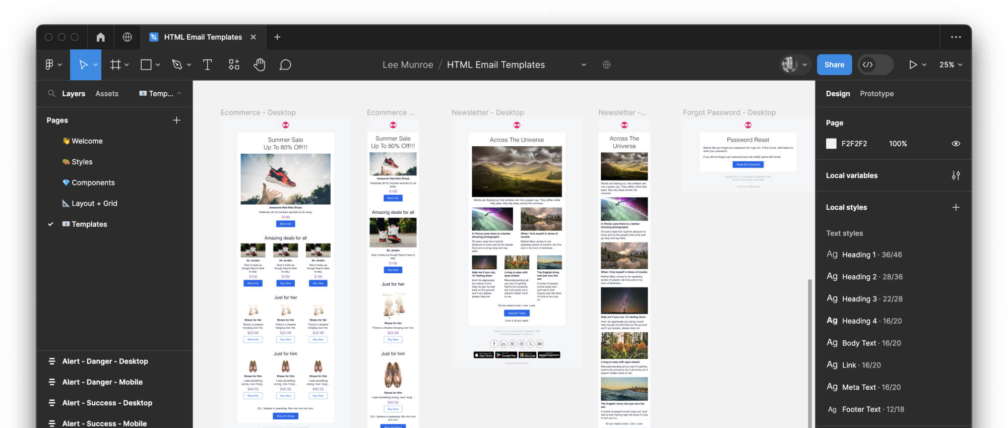
This image showcases a well-organized Figma file for email design. Notice the defined text styles on the right and the clearly structured templates on the canvas. This is the level of organization we are aiming for.
2. The Engine of Modularity: Auto Layout
The key to creating flexible, "stackable" content blocks in Figma is Auto Layout. It allows you to create frames that automatically adjust their size based on the content inside them. This means you can change the text or swap an image, and the layout will magically reflow without you needing to manually move everything else.
The article below introduces this concept perfectly.
Save time with Figma to industrialize email creation. - Badsender
This article from Badsender explains the "why" behind using Figma for email templates. It directly addresses the goal of creating reusable, modular designs.
Please read the following sections: Start with "Auto-layout: a powerful figma feature for email." The animated GIF here is crucial—it shows exactly how you can add, remove, and reorder modules seamlessly. This is the core of what we're learning today. Continue to "The atomic design..." and "... and the components." This connects the practical steps to a powerful design philosophy. Think of it this way: your CA background involves building financial reports from standard elements (accounts, line items). Atomic design is similar: you build large designs (organisms/templates) from small, consistent elements (atoms/molecules like text styles and buttons).
To effectively use Auto Layout, you need to understand its main properties.
Ultimate Guide To Auto Layout In Figma
This guide from Tilda Education is your reference manual for Auto Layout. It breaks down the settings you'll be using.
Focus your reading on these key sections: "What Is Auto Layout In Figma": Understand the four main rules it defines. "Key Auto Layout Properties": Skim through the definitions of Flow, Gap, Alignment, and Padding. You don't need to memorize them, but get familiar with the terminology. "Examples of using Auto Layout": Read the "Product card" example. It shows how to nest Auto Layout frames, which is an essential technique for creating complex modules. "When to use Auto Layout": This quick FAQ reinforces the benefits for creating reusable and responsive elements.
3. Building Your Modular Template
Now, let's apply these concepts. We'll follow along with a detailed video tutorial to build a few standard email blocks. The goal is not to replicate the design exactly, but to master the technique of creating and organizing each block as a self-contained module.
Open a new Figma file. Create a Frame with a width of 600px, which is the standard for emails. You can make the height around 2000px to start; you can always adjust it later.
How To ACTUALLY Design Emails With Figma For Klaviyo Email Marketing (2024)
This video provides a very practical, step-by-step demonstration of building an email in Figma. We will use it to guide the construction of our modular blocks.
We'll break this down block-by-block. Block 1: The Hero Section First, watch this segment on creating the hero section. Focus on the techniques: Notice how he layers a background image, a black rectangle, a gradient for a smooth fade, text layers, and a button. Your Turn: Create your own hero block. It should contain an image, a headline, a short text paragraph, and a CTA button. Group all these layers together in the Layers Panel (select them and press Cmd+G or Ctrl+G) and name the group [Block] Hero. Block 2: A Multi-Column Content Block Next, watch this part where he builds the "core values" section. Focus on the structure: He creates a two-column layout with dividers and uses gradients to add depth. This is a great example of a "bridge" or informational block. Your Turn: Create a two-column block. You can use it to list product features, company values, or event details. Again, group all the elements and name it [Block] 2-Column Text. Block 3: The Product Showcase Block Now, watch this segment on designing the "fan favorites" product section. Focus on repetition and consistency: He designs one product listing (image, name, rating, CTA) and then duplicates it. He uses simple rectangles to ensure consistent spacing. This is a perfect use case for Auto Layout, which would manage the spacing automatically. Your Turn: Create a product showcase block. Design a single "product card" containing an image, title, and a "Shop Now" link. Then, use Auto Layout to arrange three of these cards in a vertical stack with even spacing. Group them all and name the group [Block] Product Showcase. Crucial Step: Organizing for Modularity This is the most important concept. Watch this short clip. The instructor stops designing to organize his layers panel. He groups all the elements of the hero section into a single group named "hero section". This is exactly what transforms a collection of layers into a structured content block. By keeping all your blocks in named, organized groups or frames, you create a modular template that is easy to understand, update, and reorder. 4. From Design to Delivery: Slicing Once your design is complete, you can't just export it as one giant image. Email clients like Gmail can be slow to load large images, and it makes your CTAs unclickable. The standard process is to "slice" the design into smaller, horizontal image sections. Each section that needs to be a unique link (like a button) must be its own slice.
- Your Turn: Create your own hero block. It should contain an image, a headline, a short text paragraph, and a CTA button. Group all these layers together in the Layers Panel (select them and press
Cmd+GorCtrl+G) and name the group[Block] Hero.
Block 2: A Multi-Column Content Block
Next, watch
- Focus on the structure: He creates a two-column layout with dividers and uses gradients to add depth. This is a great example of a "bridge" or informational block.
- Your Turn: Create a two-column block. You can use it to list product features, company values, or event details. Again, group all the elements and name it
[Block] 2-Column Text.
Block 3: The Product Showcase Block
Now, watch
- Focus on repetition and consistency: He designs one product listing (image, name, rating, CTA) and then duplicates it. He uses simple rectangles to ensure consistent spacing. This is a perfect use case for Auto Layout, which would manage the spacing automatically.
- Your Turn: Create a product showcase block. Design a single "product card" containing an image, title, and a "Shop Now" link. Then, use Auto Layout to arrange three of these cards in a vertical stack with even spacing. Group them all and name the group
[Block] Product Showcase.
Crucial Step: Organizing for Modularity
This is the most important concept. Watch
This is exactly what transforms a collection of layers into a structured content block. By keeping all your blocks in named, organized groups or frames, you create a modular template that is easy to understand, update, and reorder.
4. From Design to Delivery: Slicing
Once your design is complete, you can't just export it as one giant image. Email clients like Gmail can be slow to load large images, and it makes your CTAs unclickable. The standard process is to "slice" the design into smaller, horizontal image sections. Each section that needs to be a unique link (like a button) must be its own slice.
How To ACTUALLY Design Emails With Figma For Klaviyo Email Marketing (2024)
The final part of the video explains this crucial handoff process.
Watch the segment from slicing the design to see how Figma's Slice tool is used to break the email into pieces. He also explains the importance of compressing the images before uploading them to an email service provider like Klaviyo, which is shown in the subsequent section inside Klaviyo. You don't need to do this now, but it's essential to understand the workflow.
Conclusion
Great work! You've just built the foundation for one of the most in-demand freelance design services. By moving from the one-off artistry of an invitation to the systematic structure of a template, you're building a versatile skill set. This process should feel familiar, leveraging the same structured thinking you used in finance to build efficient, repeatable models.
Key Takeaways:
- Modular Design is Efficient: Email templates are built from structured content blocks (e.g., Hero, Body, Footer) that can be mixed and matched.
- Auto Layout is Your Best Friend: This Figma feature is the key to creating flexible, responsive blocks that adapt to their content and are easy to reorder.
- Organization is Everything: Naming and grouping your layers into "Blocks" is what makes a design file a true template.
- Design for the Real World: Emails are built from sliced, compressed images that are then assembled and linked within an Email Service Provider (ESP).
Preview of the Next Lesson:
In our next lesson, we'll continue building your portfolio of high-demand assets by learning how to design a promotional web banner with a clear call-to-action (CTA). We'll focus on the principles of visual hierarchy and persuasive design to make banners that don't just look good, but also drive clicks.