In our previous lesson, you built a powerful, reusable Instagram post template using components and Auto Layout. You've created a single source of truth for your design, a core concept that separates professional-grade work from one-off graphics. Today, we'll expand on that foundation to tackle a critical skill for any freelance designer: adapting a design for multiple social media platforms.
Your clients won't just want an Instagram square; they'll need that same campaign to look great as a tall Instagram Story, a wide LinkedIn banner, or a Facebook post. This lesson is about learning to efficiently translate one core design across various dimensions, making your services far more valuable. We will focus on adapting your square post into a vertical Instagram Story format.
1. Why One Size Doesn't Fit All
Each social media platform has specific dimensions that perform best. A square post gets cut off in a Story, and a tall Story looks awkward in a LinkedIn feed. Being able to adapt your designs is non-negotiable.
To get a sense of the different sizes you'll encounter, it's helpful to know where to find the latest specifications.
How to Design Social Media Templates in Figma
This video from Envato Tuts+ introduces the challenge of multiple social media sizes and points to a helpful resource for finding them.
Watch from the beginning of the section on template sizes Template Sizes. The key takeaway isn't to memorize the numbers, but to know that "cheatsheets" for social media dimensions are a designer's best friend. This is about working smart.
Simply resizing the frame isn't enough. As you'll see, it often breaks the layout. True adaptation requires thoughtfully rearranging the content to fit the new canvas, a process made possible by mastering Figma's responsive features.
2. The Mechanics of a Responsive Layout
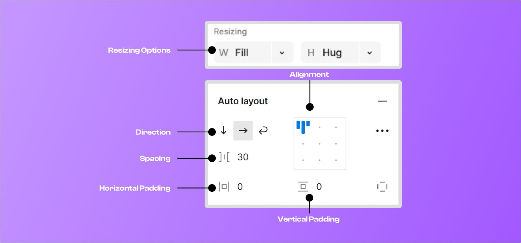
To make your design adapt gracefully, you need to give Figma rules about how elements should behave when their container changes size. This is done with two key features: Constraints and Auto Layout's Resizing Properties. You've used resizing before, but let's solidify the concepts.
- Constraints: These apply to objects inside a regular frame (one without Auto Layout). They let you "pin" an object to a side (left, right, top, bottom) or have it stretch.
- Auto Layout Resizing: These apply to objects inside an Auto Layout frame. The most important properties for adaptation are:
- Hug contents: The frame shrinks or grows to fit the content inside it.
- Fill container: The object expands to fill the available space in its parent frame.
The official Figma documentation provides a fantastic, step-by-step example of making a component responsive. Working through it will build your intuition.
Create a responsive card with auto layout and constraints
This official Figma guide walks through making a podcast card responsive. The principles are universal and directly apply to what we're doing.
Please read and follow along with these three sections in the article: "Apply constraints to the play button": Notice how constraints keep the button pinned to the corner when the parent frame resizes. "Add auto layout to text layers": Focus on the part where they change the text layer's resizing from "hug" to "fill container". This is the most crucial step for making text wrap correctly. "Add auto layout to the album art and metadata": Observe how they set different resizing properties for the album art (Fill) and metadata (Hug) to control how the card stretches vertically.
These rules—pinning with constraints and stretching with Fill container—are the building blocks you'll use to adapt your template.
3. Your Turn: Adapt Your Post for an Instagram Story
Let's apply these principles. We will adapt the square Instagram post component you created in the last lesson into a 1080x1920 Instagram Story.
Open your Figma practice file with the component from the previous lesson.
Step 1: Create a New Frame
- Instead of resizing your main component, let's create a new, separate frame for the Story.
- Press
Fand select the "Social Media" -> "Instagram Story" preset (1080x1920). - Rename this frame to
IG Story - Adapted.
Step 2: Add an Instance and Observe the Problem
- Go to your "Assets" panel and drag an instance of your
IG Post - Main Componentinto the newIG Story - Adaptedframe. - With the instance selected, go to the right sidebar. Under constraints, set it to "Top" and "Left & Right". Set its vertical position to
0and horizontal to0. It should now fill the width of the story frame, but you'll see a lot of empty space. This shows that just stretching isn't enough; we need to reconfigure the layout.
Step 3: Detach and Re-structure
- Select the instance of your component inside the story frame.
- Right-click on it and choose "Detach Instance" (or press
Cmd+Opt+B/Ctrl+Alt+B). This turns it back into a regular frame with all the layers, allowing you to modify its structure. - The main challenge is the image. A square image doesn't fit a portrait layout well.
- Select the
Image Placeholderrectangle. In the right sidebar, change its height to be much taller, perhaps around 1200px. - Select the image Fill and change its mode from
FilltoCrop. You can now drag the image within the placeholder to frame it better for a vertical view. A portrait-oriented image would work best here.
- Select the
Step 4: Adjust the Layout
Your elements are likely stacked vertically already thanks to Auto Layout, but the spacing will be off.
- Select the main
IG Story - Adaptedframe (which should still have Auto Layout applied). - In the Auto Layout panel, adjust the "Spacing between items" to create a more balanced composition for the taller format.
- You might want to move the
Captiontext layer above theHeaderto place your business info at the bottom, which is a common pattern in stories. Simply drag the layer to reorder it in the Layers panel. - Ensure the
Captiontext andHeaderlayers still have their horizontal resizing set toFill containerso they respect the frame's padding.
The video below demonstrates a similar process of adapting a Facebook post to a taller Instagram Story format. Watching it will help you visualize how to rearrange elements effectively.
How to Design Social Media Templates in Figma
This walkthrough shows the design decisions involved in adapting a layout from landscape to portrait.
Watch the section from Creating the Story. You don't need to copy it exactly. Instead, focus on how the designer: Uses a dark background to make the content pop in the Story format. Reconfigures the image mask to work in a vertical space. Rearranges the logo, title, and other elements to fit the new dimensions. Adds a visual cue (the arrow) to encourage users to see the next slide.
By the end of this exercise, you should have a new design that feels native to the Instagram Story format, not just a stretched version of your square post.
4. A Freelancer's Tip for Efficiency
Now that you understand the manual process of detaching, resizing, and reconfiguring, you can appreciate tools that speed this up. For high-volume work, plugins can be a lifesaver.
Thumblisher Tutorial: The Ultimate Guide to Resizing Social Media ...
This article introduces a plugin called Thumblisher, which is built for this exact task.
Read the sections "What is Thumblisher?", "Benefits of Using Thumblisher", and "Best Practices for Resizing Social Media Graphics". Understanding the manual process first is crucial, but knowing about such tools will make you faster and more efficient for future client work.
Conclusion
Today you've made a significant leap from creating a single design to thinking in terms of a multi-platform design system. You've learned that adapting a template isn't just about changing dimensions; it's about re-evaluating the composition to best fit the new context.
Key Takeaways:
- Adapt, Don't Just Stretch: Rearrange elements to create a layout that feels native to the new platform dimensions.
- Constraints Pin Elements: Use constraints to lock items like logos or buttons to the corners or edges of a frame.
Fill Containeris Your Best Friend: This Auto Layout property makes elements like text blocks and images responsive to their container's width.- Mastery First, Efficiency Later: Understanding the manual process of adaptation is essential before using plugins to automate the task.
Preview of the Next Lesson:
So far, we've focused on structured, content-driven templates. But your bespoke gifting business also requires designs that are more artistic and decorative. In our next lesson, we will shift gears and learn how to compose a decorative layout for a digital invitation, focusing on advanced layering, typography, and visual flourish.