Introduction
In our last lesson, you did an excellent job defining the foundational design tokens for color, spacing, typography, and elevation. You've essentially created the "single source of truth" for your design system, a practice that aligns perfectly with the structured, systematic thinking you honed during your CA articleship.
Today, we put those tokens to work. We're moving up from abstract values to a tangible, core element of any user interface: the button. Our goal is to build versatile, multi-state button components using variants and Auto Layout. This is a cornerstone skill for any UI designer, especially a freelancer, because creating a robust button component saves hours of repetitive work and ensures absolute consistency for your clients.
We will construct a "smart" button that can adapt its style (primary, secondary), state (default, hover, disabled), and content (with or without an icon) all from a single main component.
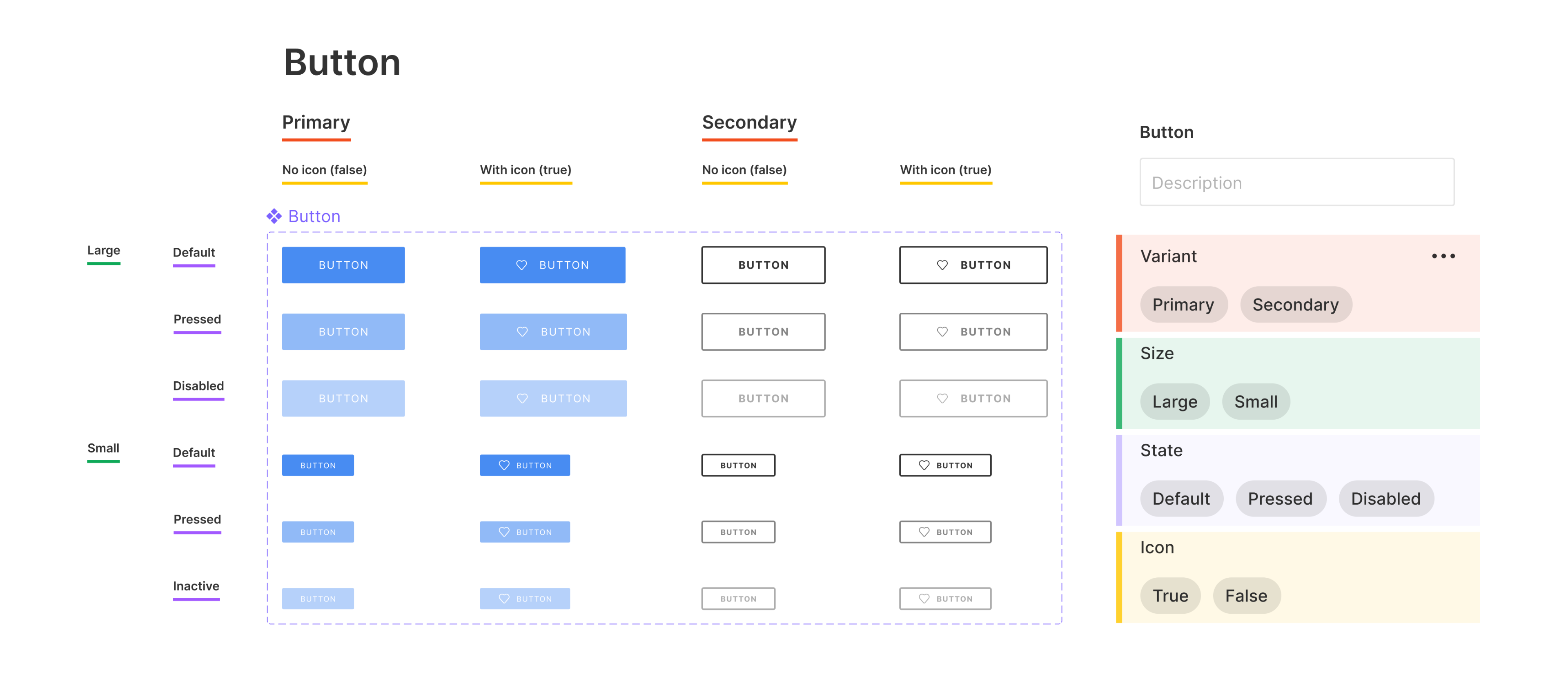
This is our goal: a well-organized component set where every possible button state is a variant of a single master component. Notice the properties like "Type", "Size", and "State" in the right-hand panel—this is the control system we are about to build.
The Anatomy of a Versatile Button
A truly versatile button component relies on the powerful synergy between two Figma features you've already encountered:
- Auto Layout: This ensures the button's structure is flexible. When you change the button's text from "Sign Up" to "Get Started for Free," Auto Layout automatically handles the resizing and maintains the correct padding.
- Component Variants: This feature allows us to create and manage all the different states and styles of the button within a single, neat package. Instead of having dozens of separate button components, you have one component with switches and dropdowns to control its appearance.
Let's start by building the basic structure of our button.
1. Building the Foundational Button Frame
Before we can create variants, we need a solid foundation. This involves creating a frame with a text layer and an icon, applying Auto Layout, and using the design tokens you created in the last lesson.
How to Design Powerful Components and Buttons with Variants and Auto Layout in Figma
The video "How to Design Powerful Components and Buttons" by Dennis Cortes provides a clear, step-by-step process for creating the initial button structure. We'll follow his lead to build our base.
Please watch from this section to build your initial button. As you follow along in your own Figma file, make these specific connections to your previous work: Text: Create a text layer that says "Button". Auto Layout: Add Auto Layout using Shift + A. Styling with Tokens: For the Fill, apply the color/brand/primary variable you created. For the Padding, apply your spacing/sm and spacing/md number variables. For the Corner Radius, apply a value like your spacing/sm variable. Add an Icon: Find a simple SVG icon (you can use a plugin like "Iconify" or just draw a placeholder) and place it inside the Auto Layout frame. Alignment: Ensure the icon and text are vertically centered using the Auto Layout alignment controls.
- Text: Create a text layer that says "Button".
- Auto Layout: Add Auto Layout using
Shift + A. - Styling with Tokens:
- For the Fill, apply the
color/brand/primaryvariable you created. - For the Padding, apply your
spacing/smandspacing/mdnumber variables. - For the Corner Radius, apply a value like your
spacing/smvariable.
- For the Fill, apply the
- Add an Icon: Find a simple SVG icon (you can use a plugin like "Iconify" or just draw a placeholder) and place it inside the Auto Layout frame.
- Alignment: Ensure the icon and text are vertically centered using the Auto Layout alignment controls.
At the end of this step, you should have a single, well-structured button frame that uses your design tokens.
2. From Frame to Component Set
Now we'll convert this frame into a component and begin building out its different styles and states using variants. A variant is just a version of your component with different properties.
Creating Type Variants (Primary vs. Secondary)
First, we'll give our button different visual styles, such as a main "Primary" style and a "Secondary" outline style.
How to Design Powerful Components and Buttons with Variants and Auto Layout in Figma
Let's continue with the same video. It explains the process of creating a component, duplicating it, and combining the duplicates as variants to define different button types.
First, watch the segment on making a base component and combining variants. Follow the steps to create your main component and then combine two instances as variants. Next, watch how to add a 'type' property. Follow along to create a property named Type with values Primary and Secondary. For your Secondary variant, modify its appearance: Remove the Fill. Add a Stroke and apply your color/brand/primary token to it. Select the text layer inside the Secondary variant and change its fill to color/brand/primary as well.
- For your
Secondaryvariant, modify its appearance:- Remove the Fill.
- Add a Stroke and apply your
color/brand/primarytoken to it. - Select the text layer inside the
Secondaryvariant and change its fill tocolor/brand/primaryas well.
Creating State Variants (Default vs. Disabled)
A button needs to communicate its state. A crucial state is disabled, which tells the user an action is not currently available. We'll add this as a boolean (true/false) property.
How to Design Powerful Components and Buttons with Variants and Auto Layout in Figma
This next clip from the video demonstrates how to add a disabled property and visually style it.
Watch the section on adding a disabled state. In this process, you will: Duplicate your existing variants. Create a new property called Disabled with values Yes and No. Select the Yes variants and apply a 50% opacity to the entire component to visually indicate the disabled state. This is a common and effective practice.
- Duplicate your existing variants.
- Create a new property called
Disabledwith valuesYesandNo. - Select the
Yesvariants and apply a50%opacity to the entire component to visually indicate the disabled state. This is a common and effective practice.
3. Adding More Power: Text and Visibility Properties
Our button is already quite versatile, but we can make it even smarter. What if we want to change the button text without digging into the layers? Or what if we need an icon-only button for a toolbar? We can achieve this with Text and Boolean properties.
MASTER Figma Components in 10 Minutes (Everything You Need To Know)
The video "MASTER Figma Components in 10 Minutes" by Arnau Ros gives an excellent, concise demonstration of adding these advanced properties.
Watch from this section on adding text and visibility properties. As you watch, apply these to your own button component: Create a Text Property: Select the text layer inside one of your variants. In the Content section of the right sidebar, click the "Create text property" icon. Name it Label and set the default value to "Button". Figma will automatically apply this to all variants. Create a Boolean Property for the Icon: Select the icon layer inside one of your variants. In the Layer section of the right sidebar (next to the eye icon), click the "Create boolean property" icon. Name it Show Icon and set the default value to True. Now, when you select an instance of your button, you'll see a text field for the Label and a toggle switch for Show Icon right in the properties panel! 4. Your Turn: Add Size Variants You've built a fantastic, multi-state button. To complete the exercise, let's add one more common variant property: Size. Your task is to create Large and Small versions of your button.
- Create a Text Property: Select the text layer inside one of your variants. In the
Contentsection of the right sidebar, click the "Create text property" icon. Name itLabeland set the default value to "Button". Figma will automatically apply this to all variants. - Create a Boolean Property for the Icon: Select the icon layer inside one of your variants. In the
Layersection of the right sidebar (next to the eye icon), click the "Create boolean property" icon. Name itShow Iconand set the default value toTrue.
Now, when you select an instance of your button, you'll see a text field for the Label and a toggle switch for Show Icon right in the properties panel!
4. Your Turn: Add Size Variants
You've built a fantastic, multi-state button. To complete the exercise, let's add one more common variant property: Size. Your task is to create Large and Small versions of your button.
MASTER Figma Components in 10 Minutes (Everything You Need To Know)
This final clip from the Arnau Ros video shows exactly how to add size variants. Use it as a guide for your task.
Watch the segment on creating different sizes and then follow these steps:
- Select your entire component set (the purple dashed border).
- In the properties panel on the right, add a new variant property named
Size. - Set the value for all your current variants to
Large. - Duplicate all your
Largevariants. - Select all the new duplicates and change their
Sizeproperty value toSmall.
- Go into each
Smallvariant and adjust the styling. Use your design tokens! For example:- Change the padding to use smaller spacing tokens (e.g.,
spacing/xs). - Change the text layer's font size to a smaller typography token you defined.
- Change the padding to use smaller spacing tokens (e.g.,
Conclusion
Excellent work. You have successfully built a highly versatile, multi-state, multi-style, and multi-size button component. By combining Auto Layout for structural integrity with Variants for state management, and powering it all with your design tokens, you have created a truly professional and scalable UI asset.
Key Takeaways:
- Auto Layout + Variants: This is the core combination for building flexible and scalable components like buttons.
- Properties are Your Control Panel: Variant properties (
Type,Size), Boolean properties (Show Icon,Disabled), and Text properties (Label) create an easy-to-use interface for customizing your component instances. - Tokens are the Foundation: Building components with your pre-defined tokens ensures consistency and makes future updates effortless. If the brand's primary color changes, you only need to update one variable, and every button will change with it.
- Systematic Building: The process of adding one property at a time (Type -> State -> Size) is a manageable way to build complexity without getting overwhelmed.
Preview of the Next Lesson:
Now that you've mastered buttons, we'll apply the same principles to another fundamental UI element. In our next lesson, you will learn to build flexible form input components with labels, error states, and helper text. You'll see how the concepts of variants and states are just as critical for creating intuitive and user-friendly forms.