Introduction
In our last lesson, you did an excellent job building a versatile button component, mastering how Auto Layout and Variants work together. This process of creating a single, adaptable element that can be reused in many situations is fundamental to professional design work—it's the design equivalent of creating a robust financial model template that can be adapted for different clients.
Today, we'll apply and expand those skills to create one of the most critical components in any digital product: the form input field. Our goal is to build flexible form input components with labels, error states, and helper text. We'll construct a complete input unit that isn't just a box to type in, but a "smart" component that can display different states (like an error), show helpful instructions, and include optional icons, all managed from a single set of properties.
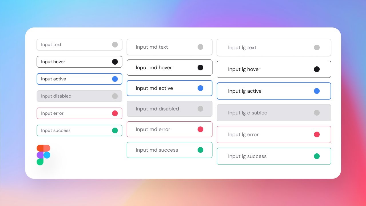
1. The Anatomy of a High-Functioning Input Field
Before we start building in Figma, let's establish the "why" behind each part of a well-designed input field. Much like an audit, where every line item has a purpose, every element of an input field serves to guide the user and prevent errors. A poorly designed form can lead to user frustration and bad data—outcomes we want to avoid.
We'll start by reading about the key principles of designing effective inputs.
Designing better inputs | Design good practices
This article from the "Design good practices" blog by Javier Cuello provides excellent, practical advice on designing usable and accessible form inputs. It will give us the rationale for the components we're about to build.
Please read the following sections to understand the core elements: Start with "Use meaningful labels". This explains why clear, persistent labels are superior to placeholders. Next, read "Provide contextual help". This section covers the role of helper text in guiding users. Finally, read "Communicate errors clearly". Pay close attention to why using color alone is insufficient for indicating errors.
As you can see, a great input field is more than just a rectangle. It communicates its purpose (label), provides guidance (helper text), and clearly explains when something is wrong (error state). Now, let's build a component that incorporates all this intelligence.

2. Building the Input Component in Figma
We will now build our input component from the ground up. This process involves assembling the individual text and icon layers, organizing them with multiple nested Auto Layouts, and then converting the entire structure into a powerful component with variants and properties.
The following video provides a comprehensive, step-by-step guide. We'll follow it closely to ensure our component is robust and flexible.
Ultimate Guide on How to Create Complex Input Fields Components in Figma
The "Ultimate Guide on How to Create Complex Input Fields Components in Figma" by Sergei Chyrkov is an excellent, detailed walkthrough that's perfect for this task.
We'll start by building the basic structure. Follow along in your Figma file. First, get a quick overview of the anatomy by watching from the structure. This recaps what we just read about. Next, build the core input box. Watch from building the input. Use Auto Layout (Shift + A) on a text layer to create the main field with padding, a fill, and a stroke. Now, add the label and helper text. Watch from adding text elements. This part is crucial as it shows you how to use nested Auto Layouts: One Auto Layout for the label and (optional) text. Another for the helper text and character count. A final, vertical Auto Layout to stack the label, the input box, and the helper text together.
At this stage, you should have a single, static assembly of all the parts of your input field, neatly organized with Auto Layouts.
3. Creating a "Smart" Component with Properties
Now we'll transform our static design into a dynamic component. This is where you'll see the true power of Figma's component properties, which you first used when building buttons. We'll create toggles to show or hide optional elements.
Ultimate Guide on How to Create Complex Input Fields Components in Figma
Let's continue with the same video to make our component configurable.
Watch the section on creating the component and adding properties. Follow these steps: Select your entire input assembly and turn it into a main component (use the icon in the top toolbar or Option + Command + K). Create Boolean Properties: We'll add toggles to show or hide parts of the component. Select the label layer inside your component. In the Layer section of the design panel on the right, click the "Apply boolean property" icon. Create a new property named Show Label and set its value to True. Do the same for the helper text layer, creating a Show Helper Text property. If you added an icon, create a Show Icon property for it as well. Now, if you create an instance of your component, you will see these toggles in the right sidebar, allowing you to customize the input field without detaching it.
4. Defining States with Variants
The final and most important step is to define the different visual states of the input field. An input needs to visually communicate whether it's active, disabled, or contains an error. We will achieve this using variants.
Ultimate Guide on How to Create Complex Input Fields Components in Figma
This final segment of the video demonstrates how to create a component set and define each state.
Watch from creating variants for states to complete your component. Select your main component. In the properties panel, click the + icon and choose Variant. This will create a component set. Rename the default property from "Property 1" to State. Your first variant's State is Default. Now, create variants for the other essential states by duplicating the default variant and changing its State value in the properties panel. Create the following states: Focused: Change the border color to a primary/accent color (e.g., blue). Error: Change the border color to an error color (e.g., red). Also, change the helper text to be red and write an example error message like "This field is required." Disabled: Change the fill color to a light gray and the text colors to a medium gray to make it look non-interactive. Filled: Change the placeholder text to look like user-entered text (e.g., make it black instead of gray). Once you've created all these variants, select an instance of your component. You should now have a dropdown menu for State in the properties panel, allowing you to switch the input's appearance instantly.
Conclusion
Congratulations! You have successfully constructed a complex, versatile, and highly reusable form input component. By systematically nesting Auto Layouts and then layering on component properties and variants, you've created a design asset that is both flexible for you as a designer and clear for the end-user. This skill is incredibly valuable for a freelance designer, as it dramatically speeds up your workflow and ensures professional-grade consistency in your projects.
Key Takeaways:
- Structure First: A well-organized structure using nested Auto Layouts is the foundation for any complex component.
- Properties for Flexibility: Boolean properties act as on/off switches for optional elements like labels and helper text, reducing the need for countless variants.
- Variants for States: Variants are the perfect tool for managing the different visual states of a component (Default, Focused, Error, Disabled), which are essential for communicating with the user.
- Building on Principles: The design of the component was directly informed by usability and accessibility principles, ensuring the final product isn't just visually appealing but also effective.
Preview of the Next Lesson:
We're now well into building a robust design system. In the next lesson, we will continue to build on these component skills by tackling another ubiquitous UI element. You will learn to build complex card components using nested instances and Auto Layout for content flexibility. This will prepare you to design layouts for product listings, articles, profiles, and more.