Introduction
Welcome to the final lesson in our module on Design Systems! In our previous lesson, you mastered the art of documenting components by creating clear usage guidelines, do's and don'ts, and accessibility notes for your modal component. This skill is akin to creating a detailed prospectus for a financial product—it ensures clarity, prevents misuse, and builds trust.
Today, we take the final, crucial step: we'll consolidate all the powerful components and styles you've built into a single, organized file and publish it as a professional component library. Your learning outcome is to structure and publish a Figma component library for team use and handoff.
This process transforms your collection of individual assets into a scalable, single source of truth. For your freelance career, this is a game-changer. It allows you to deliver polished, reusable design systems to clients or rapidly build new projects for yourself with unmatched consistency and speed—much like having a pre-approved set of financial models or a catalog of proven designs for your bespoke gifting business.
1. The Anatomy of a Library File
Before you can share your library, the source file itself must be impeccably organized. A messy library file is difficult to maintain and confusing for collaborators, especially developers. The goal is to create a structure that is intuitive and easy to navigate.
Most professional design systems live in a dedicated Figma file, separate from any specific product designs. The pages within this file are structured logically to separate different types of assets.

Let's explore how to structure the pages in your library file. A common and effective approach is to separate foundations (like colors and text styles) from the components themselves.
Organizing Figma files for team collaboration
This article from the LogRocket Blog provides excellent best practices for structuring design system files. It outlines a clear hierarchy and provides a practical example.
Please read the following sections: Start with "The hierarchy for structuring your information". This introduces the core elements: libraries, components, and styles. Continue to "File structure best practices for Figma". Pay close attention to the advice on dividing projects into pages and establishing clear naming conventions. Finally, review the "Example project: Organizing a Figma file by pages", which demonstrates a practical "Cover, Production, Archive" structure.
Based on these best practices, a great structure for your freelance component library would be:
✅ Cover: A dedicated page for your file's thumbnail. Include the library name, version, and status.---ordivider: An empty page used as a visual separator in the page list.🎨 Foundations: A page to document your color and text styles, effects (shadows), and grid systems. This is where your design tokens live.---ordivider🧩 Components: The main event. This page holds all your main components: buttons, inputs, cards, modals, etc. You should organize them on the canvas with clear headings.📄 Usage & Documentation: The page where you created your component documentation in the last lesson. This keeps the rules right next to the assets.---ordivider♻️ Archive: A place to move old or deprecated components. Never delete work; you might need to reference it later.
This structure makes your file easy to understand for your future self, your clients, and the developers who will turn your designs into code.
2. Publishing Your Team Library
Once your file is well-structured, you're ready to publish it. In Figma, publishing turns a regular file into a Team Library. This means its styles and components become available to use in any other file within the same Figma Team Project.
A note on Figma plans: Publishing styles (colors, text) is available on all plans, including the free one. However, to publish components, which is the core of a design system, you need a paid Professional, Organization, or Enterprise plan. This is a standard investment for professional design work.
Let's watch the official Figma guide on how this process works.
Figma tutorial: Create a shareable team library [5 of 8]
This official tutorial from the Figma channel, "Create a shareable team library," clearly explains the concept and the steps to publish.
Please watch these two clips: The 'what' and 'why': This section explains what a Team Library is and the plan requirements. The publishing process: This clip demonstrates the exact steps to publish your file.
To summarize the publishing process:
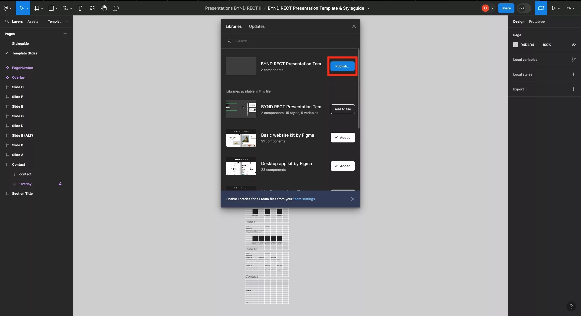
- Navigate to the Assets panel in the left-hand sidebar.
- Click the Team Library icon (it looks like a book).
- A modal will appear. In the top right, click the Publish button for your current file.
- You'll be prompted to add a description for this version (e.g., "v1.0 - Initial release with buttons, inputs, and modals"). This is crucial for version control.
- Click Publish. Your library is now live!
3. Using and Updating Your Library
A published library is useless if you don't know how to use it. The real power comes from consuming its assets in new design files and keeping them up-to-date.
Enabling and Using the Library:
- Create a new, blank Figma file for a project (e.g., "New Client Website").
- Open the Team Library modal again (
Assetspanel > Book icon). - You will see your newly published library in the list. Simply toggle it on.
Now, your library's assets are available in this new file:
- Your color and text styles will appear in the right-hand properties panel whenever you select an object or text layer.
- Your components will be listed in the Assets panel, ready to be dragged and dropped onto your canvas.
Updating the Library:
Designs evolve. What happens when you need to change a component?
- Go back to your original library file.
- Make the change to the main component. For example, you might adjust the corner radius of your buttons.
- Figma will automatically detect the change and display a notification banner at the bottom of the screen, prompting you to Publish changes.
- Click the notification, add a description of your changes (e.g., "Updated button corner radius"), and publish.
- Now, in any file that uses this library, a notification will appear: "Updates available." You can review the changes and click "Update all" to apply them instantly across your entire design file.
This workflow is incredibly powerful, ensuring consistency and saving countless hours of manual work. Let's see it in action.
Figma tutorial: Create a shareable team library [5 of 8]
Continuing with the Figma tutorial...
Watch the final parts of the video: Enabling a library: This shows how to access and turn on your library in a new file. The update workflow: This clip demonstrates the full cycle of making a change, publishing it, and accepting the update in another file.
4. Structuring for Developer Handoff
A published library isn't just for designers. It's a cornerstone of the developer handoff process. When a developer inspects your design using Figma's Dev Mode, they can click on an instance of a library component and immediately see its name, properties, and a link back to the main component in the library file.
This, combined with your documentation page, gives them a single source of truth. They don't have to guess about spacing, colors, or how a component behaves.
Jesse Showalter's video "Design to Development Handoff" provides great context on how file structure impacts developers.
Watch these two sections to understand the handoff benefits: Dev Mode and Libraries: See how developers can inspect elements and get an idea of your component library. Advanced Design System: This shows a highly advanced "true blue" design system file. While more complex than what you need now, it illustrates the level of organization that is possible and how it connects to design tokens and variables, a key concept in development.
5. Your Turn: Publish Your Design System
It's time to put theory into practice. You will now organize and publish the component library you've been building throughout this module.
-
Organize Your File:
- Open the Figma file where you've been creating your components (buttons, inputs, modals, etc.).
- Restructure the file using the page structure we discussed:
✅ Cover,🎨 Foundations,🧩 Components,📄 Usage & Documentation, and♻️ Archive. - Move your styles documentation to the
Foundationspage and your components to theComponentspage. Move the component usage guidelines you wrote in the last lesson to theDocumentationpage. - Clean up the
Componentspage canvas by adding text headings to group your components logically (e.g., "Buttons," "Form Inputs," "Modals").
-
Publish the Library:
- Follow the steps outlined in section 2 of this lesson to publish your file to your Team Library. If you are on a free plan, you will only be able to publish styles, but you should still walk through the process to understand it.
- Give it a descriptive name like "[Your Name] - Core Components v1.0".
-
Test Your Library:
- Create a new, blank Figma file.
- Open the Team Library modal and enable your new library.
- Try building a simple login form using only components from your library's Assets panel and styles from the properties panel.
- Experience the speed and consistency of building with a system!
This entire exercise should take you about 20-25 minutes.
Conclusion
Congratulations on completing the final step of building a design system! You have not only created a set of reusable, well-documented components but also learned how to structure and publish them as a professional, shareable library. This skill is a significant milestone that separates amateur designers from professionals who can deliver scalable, maintainable design solutions.
Key Takeaways:
- Structure is Key: A well-organized library file with clear page hierarchies (
Cover,Foundations,Components,Documentation) is essential for maintenance and collaboration. - Publishing Creates a Single Source of Truth: Using Figma's Team Library feature allows you to share styles and components across infinite projects.
- The Update Workflow is Powerful: The publish/update cycle ensures that all your designs stay consistent with minimal effort.
- Libraries are for Handoff: A published library provides a clear, inspectable system for developers, making the transition from design to code much smoother.
Preview of the Next Module:
This lesson concludes Module 10 and your deep dive into design systems. You now possess an incredibly valuable and marketable skill. In our next module, Module 11: Portfolio & Case Study Development, we will shift our focus to showcasing your abilities. Your first task will be to outline a case study, and the design system you've just built will serve as the perfect project to demonstrate your strategic thinking, technical skills, and business-oriented design process.