Introduction
In our last lesson, you successfully built a highly flexible modal component using Figma's native slot feature. You've now created several powerful, reusable assets for your design system. However, a component's power is only realized if people—including your future self and developers—understand how to use it correctly. An undocumented component is like a complex financial instrument without a prospectus; it's powerful but risky and prone to misuse.
This lesson bridges that gap. Your learning outcome is to write concise usage guidelines for a component, documenting its do's, don'ts, and accessibility considerations. Think of this as creating the Standard Operating Procedures (SOPs) for your design assets. This practice ensures consistency, reduces errors, improves collaboration with developers, and ultimately scales your design impact—a process that should resonate with the structured thinking you honed in your finance and audit career.
1. The 'Why' Behind Documentation
Before we get into the 'how', let's establish 'why' documentation is a critical business function for any design system. It's not just about writing notes; it's about creating a single source of truth that aligns designers, developers, and product managers.
Good documentation achieves several key goals:
- Ensures Consistency: It guides everyone to use the right component for the right job in the right way.
- Increases Efficiency: It reduces questions and guesswork, allowing team members to build faster and with more confidence.
- Improves Collaboration: It creates a shared language between design and engineering, clarifying behavior, states, and accessibility requirements upfront.
- Scales the System: It makes it possible for new team members to get up to speed quickly and contribute effectively.
Design systems: simplifying documentation writing
This article by Dean Harrison does an excellent job of framing documentation as a manageable and essential task. It distinguishes between the system's foundational thinking and its tangible assets.
Please read the following sections: Start from the beginning and read down to the end of the section "But before we begin". This will introduce the idea of "tangible" documentation, which is our focus today. Then, jump to the section "Remember you audience". This part highlights that you're writing for different groups (designers, developers, etc.), which is crucial for creating effective guidelines.
2. A Framework for Component Documentation
To avoid feeling overwhelmed, it's best to follow a consistent template. Most professional design systems document their components using a similar structure. By breaking the task down, it becomes a repeatable, manageable process.
Here is a standard structure you can adopt for documenting any component:
- Overview: What is it and why does it exist?
- Anatomy: What are its constituent parts?
- Usage Guidelines: How and when should it be used? (This includes the critical Do's and Don'ts).
- Behavior & States: How does it interact and change?
- Accessibility: What specific considerations are needed for it to be inclusive?
- Examples: Show the component in a real UI context.
Let's watch a professional designer walk through her documentation for a "Banner" component. This will give you a clear picture of what a finished documentation page looks like inside Figma.
Design systems case study walkthrough: Designing components and creating documentation [Part 2]
In this video, "Design systems case study walkthrough," Femke van Schoonhoven shows her completed documentation for a banner component.
Watch the section from the documentation walkthrough. As you watch, notice how her documentation file follows the structure we just outlined: an introduction, anatomy, variants, usage guidelines (including do's and don'ts), behavior, content rules, and finally, examples.
3. Writing Effective Usage Guidelines
This is the heart of your documentation. The goal is to provide clear, unambiguous rules that prevent misuse. The most effective way to do this is with a simple "Do" and "Don't" format.
- Do: Use a clear, positive instruction with a visual example of correct usage.
- Don't: Show a common mistake or anti-pattern, often with a red 'X' or similar visual cue, and explain why it's wrong.

This approach makes your guidance scannable and easy to comprehend, especially for busy developers or designers looking for a quick answer.
4. Integrating Accessibility from the Start
Accessibility is not an afterthought; it is a core requirement of professional design. Documenting accessibility ensures that the inclusive features you design are actually implemented.
Your documentation should address accessibility from two perspectives:
- For Designers: Reminders about visual considerations like color contrast, legible font sizes, and adequate touch target sizes.
- For Developers: Specific instructions on implementation details like ARIA roles, keyboard navigation behavior, and screen reader announcements.
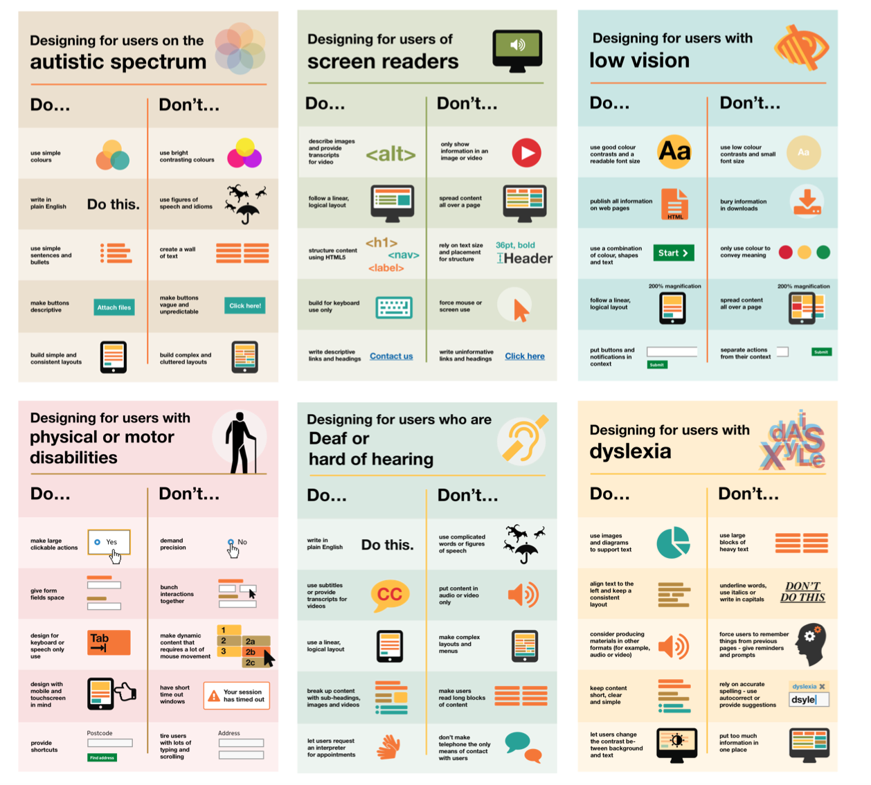
The UK Government Digital Service created an excellent set of posters that act as a quick reference for accessibility do's and don'ts.
5. Your Turn: Document the Modal Component
Now, let's apply this framework. Your task is to write usage guidelines for the modal component you built in the last lesson. Create a new page in your Figma file called "Component Documentation" and use the text tool to create a document based on the template below.
Component Documentation Template: Modal
1. Overview
- Component Name: Modal / Dialog
- Description: A modal is a dialog window that appears on top of the main page content. It interrupts the user's flow to present critical information or request a specific action.
- When to Use:
- To confirm a critical, potentially destructive user action (e.g., "Delete Post?").
- For short, self-contained tasks that require user input (e.g., logging in, creating a new folder).
- When you need to grab the user's full attention for an important message.
- When NOT to Use:
- For complex, multi-step processes (use a separate page instead).
- To show non-essential information (consider a less intrusive pattern like a tooltip or banner).
- For navigation or as a replacement for a content page.
2. Usage Guidelines (Do's & Don'ts)
- DO: Keep the content inside the modal focused on a single, clear task.
- DO: Always include a clear and obvious way to close the modal (e.g., a close 'X' icon in the corner, a "Cancel" button, or pressing the
Esckey). - DON'T: Use a modal to display large amounts of complex information or long forms.
- DON'T: Trigger a modal from another modal. This creates a confusing user experience.
3. Behavior
- Interaction: Clicking the overlay behind the modal should close it.
- Content: The content area is a
slotand can accept custom content, but it should remain simple. Use preferred instances to guide users toward common patterns like confirmation text or simple forms.
4. Accessibility Considerations
- Focus Management: When the modal opens, keyboard focus must move to the first interactive element inside it (e.g., the "Confirm" button or a form field).
- Focus Trapping: While the modal is open, keyboard focus (
Tabkey) must be trapped inside the modal. The user should not be able to tab to elements on the underlying page. - Closing: The
Escapekey must close the modal. - Screen Reader: The modal's role and title should be announced when it opens. The content on the page behind the modal must be hidden from screen readers (
aria-hidden="true").
Take about 15-20 minutes to recreate and review this documentation within your Figma file. This exercise will solidify your understanding of how to create clear, actionable guidelines for your components.
Conclusion
You have now learned how to create the essential "user manual" for your design components. This is a vital skill that elevates your work from just creating pretty pictures to engineering a scalable and maintainable system. By documenting usage, do's, don'ts, and accessibility, you provide the guardrails that ensure quality and consistency across a product.
Key Takeaways:
- Documentation is a Business Function: It drives efficiency, consistency, and collaboration.
- Use a Template: A consistent structure (Overview, Usage, Accessibility, etc.) makes documentation easier to write and read.
- Do's and Don'ts are Powerful: Use clear visual examples to show correct and incorrect usage.
- Document Accessibility Upfront: Specify requirements for keyboard navigation, focus management, and screen readers to ensure your designs are built inclusively.
Preview of the Next Lesson:
Your design system components are now built, and you know how to document them. The final step is to make them available to the rest of your team (or clients). In our next and final lesson for this module, you will learn how to structure and publish a Figma component library for team use and handoff, turning your local file into a shared, official resource.