In our last lesson, you masterfully adapted your desktop landing page design into a responsive mobile layout. We concluded by placing a placeholder hamburger icon in the mobile header, acknowledging that the real navigation was yet to be built. Today, we bring that icon to life.
This lesson focuses on choosing and designing the right navigation for your mobile experience. We will explore the most common mobile navigation patterns, analyze their strengths and weaknesses, and select the most appropriate one for your landing page. Then, you'll get hands-on in Figma to design and build a fully interactive menu, transforming a static icon into a functional part of your interface. This is a core skill that bridges layout design with user interaction.
1. The Landscape of Mobile Navigation
Designing for mobile isn't just about making things smaller; it's about respecting the physical context of how people use their phones. Limited screen space and one-handed use create unique challenges that desktop designs don't face.
A core concept that drives many mobile design decisions is the "thumb zone."

This ergonomic reality is why you see so many apps place their primary controls at the bottom of the screen. Keeping this in mind, let's explore the most common navigation patterns.
Mobile UX Marathon: Mobile UX Best Practices - Navigation, Search and Filters - Anna Potanina
The video "Mobile UX Marathon: Mobile UX Best Practices" by Anna Potanina on the Conversions channel provides an excellent overview of the primary navigation patterns used in mobile design.
Watch these segments to understand the main options available to you: Top Navigation: This covers the traditional "sticky" header, which keeps navigation accessible at the top. This is very common on mobile websites. Top Tabs: Useful for switching between a few, closely related views. Think of filters on a product page. Navigation Drawers: This is the formal name for the panel that slides out from a hamburger menu. The speaker correctly notes that while it can hold many items, it hides them, making them less discoverable. It's best for secondary, less-frequently-used functions. Bottom Navigation Bar: As the "thumb zone" image suggests, this is a highly ergonomic pattern for 3-5 primary, equally important destinations. It's the standard for most mobile apps.
Making a Choice for Your Landing Page
Now, let's apply this to your project. Consider the patterns you just saw:
- Bottom Navigation Bar: This is overkill for a single landing page. It's designed for multi-faceted apps where users constantly switch between core sections (e.g., Home, Search, Profile).
- Top Tabs: Not suitable here, as a landing page doesn't typically have peer-level data sets to switch between.
- Sticky Top Navigation / Hamburger Menu: This is the most logical choice. A landing page has a primary goal (conversion) and secondary links (e.g., About Us, Contact, Sign In). Hiding these secondary links inside a hamburger menu keeps the interface clean and focused on the main call-to-action, which is exactly what we want.
Therefore, for your landing page project, the hamburger menu is the appropriate pattern to design.
2. Designing an Effective Hamburger Menu
The hamburger menu is a powerful tool for decluttering an interface, but it comes with a significant trade-off: what is out of sight is often out of mind. To use it effectively, we need to follow established best practices.
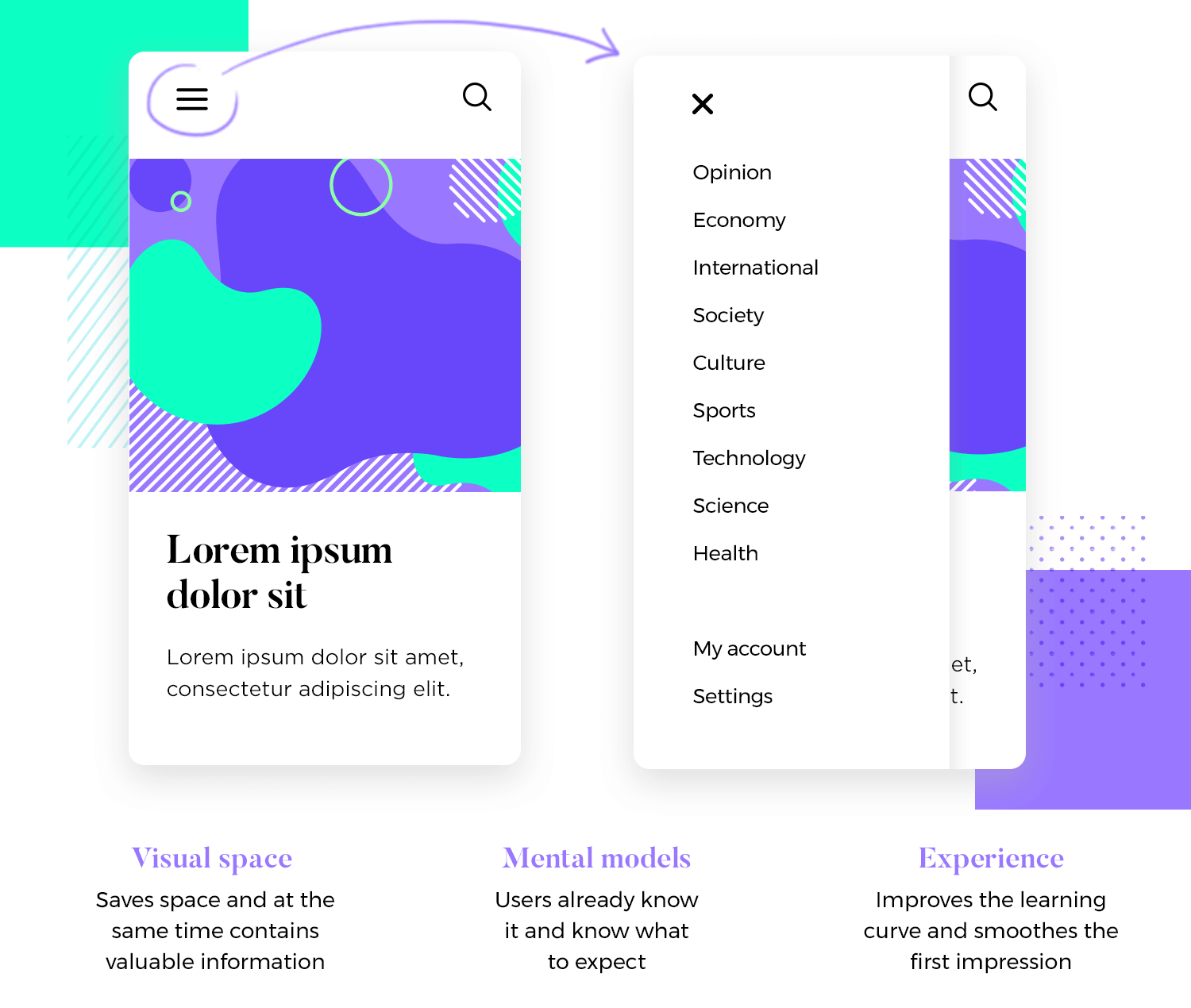
Let's dive into the theory and best practices for designing a great hamburger menu.
Guide to designing a hamburger menu + examples
This guide from Figma's official resource library provides a comprehensive look at the hamburger menu, covering its history, use cases, and design best practices.
Read from the beginning down to the end of the "Seven tips for hamburger menu design" section. As you read, focus on: When to use vs. When to avoid: Reinforce your understanding of why this pattern is right for our landing page but might be wrong for another type of product. Pros and Cons: Approaching this like a cost-benefit analysis will sharpen your design rationale. The main pro is saving space; the main con is reduced discoverability. The 7 Design Tips: Pay close attention to these. Tips like "Organize items logically," "Offer visual feedback," and "Keep accessibility top of mind" are crucial for turning a basic menu into a professional one.
3. Practical Application: Building the Hamburger Menu in Figma
With the theory covered, it's time for the hands-on implementation. In the previous lesson, you added a hamburger icon. Now, you will build the complete, interactive menu that opens when a user taps that icon.
This tutorial will guide you through creating the components, variants, and prototype interactions needed.
Create a Functional HAMBURGER MENU NAVIGATION in Figma (Tutorial)
The "Create a Functional HAMBURGER MENU NAVIGATION in Figma" tutorial by Mavi Design is a perfect step-by-step guide. We'll follow it to build our own menu.
Have your mobile landing page file open and follow along, applying the techniques to your own design.
Step 1: Create the Interactive Icon
First, we'll turn the static hamburger icon into a component with two states: closed (the three lines) and open (an 'X' icon).
- Action: Watch from the beginning of the tutorial to
create the icon . - Key Techniques:
- He creates the icon shape and turns it into a component (
Command/Ctrl + Option + K). - He then adds a variant for the "open" state and cleverly rotates and repositions the lines to form an 'X'. This is a fantastic use of variants.
- He creates the icon shape and turns it into a component (
- Your Turn: In your Figma file, create the
hamburger menucomponent withclosedandopenvariants, just as shown.
Step 2: Build the Menu Panel
Next, we need to design the panel that will appear as an overlay. This involves creating the menu items and organizing them.
- Action: Watch the segments on creating the
menu buttons and assembling thefull menu . - Key Techniques:
- He creates a
menu buttoncomponent with apressedstate variant for visual feedback. - He assembles multiple instances of the button into a vertical Auto Layout frame to create the menu panel. He gives it a fill color and padding.
- He creates a
- Your Turn:
- Create a
menu buttoncomponent for your navigation links (e.g., "Features," "Pricing," "Contact"). - Combine them into an Auto Layout frame to build your menu panel. Crucially, add your "open" (X) hamburger icon variant to the top of this panel.
- Create a
Step 3: Prototype the Overlay Interaction
This is the final and most important step: making it all work. We will use Figma's prototyping tools to make the menu open and close.
- Action: Watch the critical segment from
setting up the overlay . - Key Interaction:
- Select the
closedhamburger icon in your main page header. - In the Prototype panel, drag a noodle from the icon and set the interaction to: On Tap -> Open Overlay.
- For the overlay, select your menu panel component.
- Set the position to Manual and drag the preview so the 'X' icon in the overlay perfectly covers the hamburger icon on the page.
- Check the box for "Add background behind overlay" to create the dimming effect.
- Finally, select the
open('X') icon within your menu panel component and add an interaction: On Tap -> Close Overlay.
- Select the
- Your Turn: Follow the steps above to wire up your prototype. Once done, press the "Play" button to test it out. You should see your menu slide in, the background dim, and be able to close it by tapping the 'X'. The final segment of the video (
demonstration ) shows the finished result.
Conclusion
Excellent work! You have successfully moved from a static layout to an interactive component. You not only learned how to build a hamburger menu in Figma but, more importantly, why and when to use it compared to other patterns.
Key Takeaways:
- Context is King: The choice of navigation pattern depends entirely on the product's structure and the user's primary goals. A bottom tab bar is great for apps, while a hamburger menu is often best for decluttering mobile websites and landing pages.
- The "Thumb Zone" Matters: Ergonomics are a key driver of mobile UI design. Placing interactive elements where users can easily reach them is a fundamental principle.
- Prototypes Bring Designs to Life: You've now used Figma's "Open Overlay" interaction, a powerful tool for creating realistic pop-ups, dialogs, and menus without duplicating entire frames.
Preview of the Next Lesson:
You've created your first interaction! In the next lesson, we'll expand on this by building a simple click-through prototype for your landing page's entire primary user path. This will involve linking your main call-to-action button to another screen, simulating a complete user journey.