Welcome to the next step in our journey! In our last lesson, you successfully assembled a complete, polished desktop landing page. You've built a strong visual narrative designed to guide a user from interest to conversion. However, in today's digital landscape, that desktop view is only one piece of the puzzle. The majority of your potential clients will likely first encounter your work on a mobile phone.
This lesson bridges the gap between your static desktop design and the dynamic reality of multiple screen sizes. We will explore the core principles that allow a single website to provide a great experience on any device. You will learn to explain the three pillars of responsive design: fluid layouts, breakpoints, and the crucial philosophy of mobile-first thinking. Understanding this theory is essential before we dive into the practical work of adapting your landing page for mobile in the next lesson.
1. What is Responsive Design?
At its heart, responsive design is an approach that allows a website's layout to automatically change based on the size and orientation of the user's screen. Instead of creating entirely separate websites for mobile, tablet, and desktop, you create one flexible design that adapts to all of them.
To better understand what responsive design is, it's helpful to contrast it with a related concept: adaptive design.
Responsive vs. Adaptive vs. Fluid Design: What's the Difference?
This short video from Kerev Design provides a clear, high-level distinction between responsive and adaptive design. It will help you grasp the fundamental concept of a single, flexible layout.
Watch the first part of the video, from the beginning to the explanation. Focus on the core difference: Responsive: One fluid layout that adjusts. Adaptive: Multiple fixed layouts for specific screen sizes.
While adaptive design has its uses, the vast majority of modern web design relies on the responsive approach because of its flexibility and efficiency.
The principles we're about to cover—fluid layouts, breakpoints, and mobile-first thinking—are the foundational components that make responsive design work.
2. Principle 1: Fluid Layouts
The first and most fundamental principle is the fluid layout. Imagine a container made of rubber instead of concrete. A fluid layout doesn't use fixed, rigid dimensions (like 960 pixels wide). Instead, its elements are built to be flexible, resizing themselves relative to the screen or the container they're in.
This is primarily achieved using proportional units (like percentages) and flexible layout rules. In Figma, you've already been using the core concept behind fluid layouts every time you've set an element's horizontal resizing to "Fill container" within an Auto Layout frame. This tells the element to expand or shrink to fill the available space—the very definition of fluidity.
What is Responsive Website Design?
This article from Figma's resource library explains the technical building blocks of responsive design. We'll focus on the section explaining flexible layouts to connect the concept to the underlying properties that developers use.
Read the subsection titled "Flexible layouts." Don't worry about memorizing the code. Instead, focus on understanding the idea that layouts can be built on flexible grids (like the ones we set up for our landing page) and that properties like max-width are used to control how images and containers scale without breaking.
A key takeaway here is to shift your thinking from fixed compositions to dynamic systems. Instead of asking, "How does this look at 1440px wide?", you start asking, "How should this content flow and rearrange as the screen size changes?"
3. Principle 2: Breakpoints
If fluid layouts allow elements to stretch and shrink, breakpoints are the specific points where the layout fundamentally changes. They are predefined screen widths that trigger a shift in the design.
For example, a fluid 3-column layout on a desktop might look great as the screen shrinks, but eventually, the columns will become too narrow. At a certain "breakpoint," the design can switch to a 2-column layout, and then at a smaller breakpoint, to a single-column layout for mobile phones.

Now, let's watch a quick video that explains this concept with a real-world example.
Breakpoints in Responsive Design: What & Why
This video from the Nielsen Norman Group, a leader in UX research, clearly defines what breakpoints are and why they are essential for both user experience and developer collaboration.
Watch the entire video. Pay attention to: The definition of a breakpoint as a size where the design adjusts. The visual example of the Warby Parker website changing from three columns to one. The four basic breakpoint sizes: phone, tablet, laptop, and desktop. The two key benefits: consistency for users and clear communication with developers.
In essence, breakpoints are the "rules" that tell your fluid layout how to reflow its content for an optimal viewing experience at different screen sizes.
4. Principle 3: Mobile-First Thinking
The final principle isn't a technical rule but a strategic philosophy: mobile-first design.
Historically, designers often created the desktop version of a site first and then tried to "shrink it down" for mobile. This is called "graceful degradation." The problem is that it often results in cluttered, slow, and frustrating mobile experiences because you're trying to subtract complexity.
Mobile-first flips this on its head.
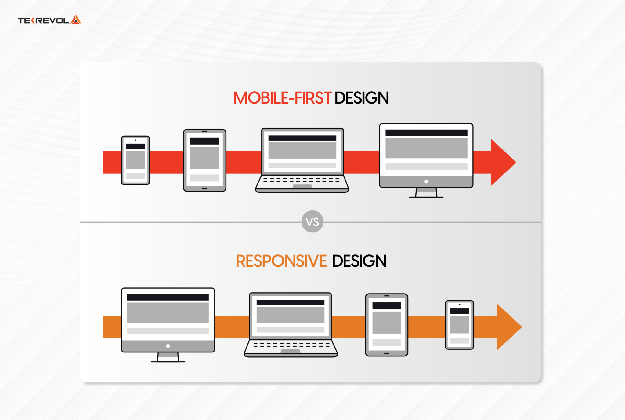
The mobile-first approach forces you to prioritize. With such limited screen space, you must focus on the absolute most critical content and user actions. This disciplined thinking leads to cleaner, more focused designs that benefit users on all devices. Your background in audit, which requires identifying the most critical information, is directly applicable to this process of prioritization.
Responsive Web Design Best Practices (2026) - Design Agency
This article from ALF Design Group provides an excellent, strategy-focused explanation of why mobile-first is more than just a buzzword. It frames it as a business and design philosophy.
Please read the following sections: Start with "What Is Responsive Web Design?" and "Responsive Design vs Mobile-First: What's the Difference?" to solidify the distinction. Then, jump to the section "How to Implement a Mobile-First Design Strategy." Read the subsections "Start With Mobile Intent, Not Screen Size" and "The Three-Tier Content Prioritisation Model." Focus on the idea that mobile-first is about prioritizing content based on user intent, not just screen size.
By designing for mobile first, you establish a strong, lean foundation. Then, as you move to larger screens (a process called "progressive enhancement"), you can strategically add secondary information or more complex interactions that enhance the experience, rather than just filling space.
Conclusion
Today, we've covered the essential theory that will empower you to design for any screen. You've learned how the three core principles of responsive design work together to create seamless user experiences.
Key Takeaways:
- Fluid Layouts: Designs should be flexible, using relative sizing (
Fill container) to adapt to different screen widths rather than being rigid and fixed. - Breakpoints: These are the specific screen widths where a fluid layout reflows into a new structure (e.g., switching from one column to two) to remain optimal.
- Mobile-First Thinking: This is a strategic philosophy. By starting with the smallest screen, you are forced to prioritize what's most important, leading to a cleaner and more effective design across all devices.
Preview of the Next Lesson:
With this foundational knowledge in place, we're ready to get practical. In the next lesson, you will apply these principles directly in Figma. We will take the desktop landing page you've already built and adapt it to create a polished, optimized mobile layout.