Introduction
In our last lesson, you mastered Smart Animate to create fluid transitions between entire screens. This is a powerful skill for showing how a user moves through an app. Today, we'll zoom in and apply those same principles to the small, delightful details that make an interface feel alive and responsive.
This lesson focuses on designing and prototyping common microinteractions like hover states, button feedback, and toggles. These small animations provide immediate feedback, guide the user, and build trust. For a freelance designer, mastering microinteractions is a way to add a layer of polish and professionalism that clients can immediately see and appreciate, separating your work from more static designs.
We'll start with the "why"—the business and psychological value of these details—before diving into the "how" of building them in Figma.
Part 1: The Business Case for Tiny Details
Before we jump into Figma, it's essential to understand why microinteractions are so important. They aren't just decorative flair; they are functional, persuasive, and directly impact user behavior and business goals. Your background in finance and business gives you a unique advantage in understanding that good design is ultimately about driving results.
A well-designed microinteraction can reduce user uncertainty, build trust, and make an experience more enjoyable, all of which contribute to higher conversion rates.
Micro-Interactions That Improve Conversions - Digital Kulture
This article from Digital Kulture does an excellent job of framing microinteractions in a business context, connecting them directly to conversion and user psychology.
Read the introduction, "The Silent Salesperson," and the following section, "The Psychology of the Minute." Focus on how these small interactions help by: Reducing cognitive load. Building trust through instant feedback. Creating a sense of reward (the "Dopamine Effect").
A useful way to think about building any microinteraction is to break it down into three parts, as outlined in the article:
- Trigger: What initiates the interaction? (e.g., a user hovering over a button, clicking a toggle).
- Rules: What logic determines the outcome? (e.g., if the toggle is "off," clicking it will change its state to "on").
- Feedback: How does the interface communicate the result of the action? (e.g., the toggle slides to the right and changes color).
Our focus today is on designing the visual feedback for common triggers.
Part 2: Designing the States Before You Animate
The key to prototyping any microinteraction is to first design its different visual states as variants of a single component. The animation you create is simply the transition between these states.
Common states for an interactive element include:
- Default: The element's appearance before any interaction.
- Hover: How it looks when a user's cursor is over it.
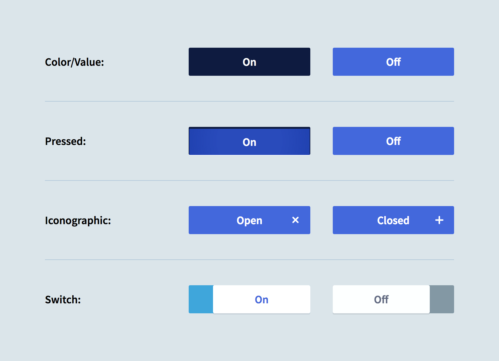
- Pressed/Active: Its appearance during a click or tap, or when it is the selected state.
- Disabled: How it looks when it's not interactive.
These images show some excellent examples of well-defined states for buttons and toggles.

Part 3: Hands-On Prototyping in Figma
Now, let's put this into practice. We'll build two of the most common microinteractions: a state-changing "like" button and a toggle switch. This process will use the Smart Animate skills from our last lesson, but apply them within a component set.
The following video from Flux Academy is a superb, action-oriented guide. We'll walk through it step-by-step.
How to get micro-interactions right using Figma
This video, "How to get micro-interactions right using Figma," provides a clear, practical walkthrough of creating several common microinteractions.
First, watch the section on the like button. The instructor demonstrates a multi-step animation that's perfect for practice. Then, continue with the toggle switch, which introduces different animation physics.
Activity 1: Build a Multi-State "Like" Button
Follow the video's instructions to create the heart icon interaction. Here's a summary of the key steps:
- Create Variants: Design three variants of your heart icon within a component set:
empty(default state),transition(a slightly larger, partially filled state), andfilled(the final, fully colored state). - Prototype the Click: In Prototype mode, drag a noodle from the
emptyvariant to thetransitionvariant. Set the trigger toOn Clickand the animation toSmart Animate. - Prototype the Automatic Transition: Now, drag a noodle from the
transitionvariant to thefilledvariant. This is the key step: set the trigger toAfter Delaywith a minimal time (e.g., 1ms). This makes the second part of the animation happen automatically after the click. UseSmart Animate. - Test: Place an instance of your component in a frame and test it in Presentation view.
This exercise reinforces the "pose-to-pose" concept perfectly. You define the key moments, and Figma animates between them.
Activity 2: Build a "Bouncy" Toggle Switch
Now, continue with the video to build the toggle switch. This introduces two new important concepts:
- Two-way Prototyping: You'll create interactions to go from "Off" to "On," and also from "On" back to "Off."
- Animation Physics: The video shows how to use Figma's built-in
BouncyorCustom springanimations to give the toggle a more physical, satisfying feel. Pay close attention to how the instructor fine-tunes the animation by adjusting the stiffness and damping parameters. This iterative process of testing and tweaking is central to good interaction design.
Adding the Hover State
The Flux Academy video focuses primarily on On Click interactions. However, a crucial microinteraction is the hover state, which signals to the user that an element is interactive before they click.
Let's add a hover state to the toggle switch you just built.
- Create a new variant for your toggle component. Name its state property something like
Off-Hover. - Style this variant to be visually distinct from the default "Off" state—perhaps by making the grey background slightly darker or the white circle slightly larger.
- Switch to Prototype mode. Drag a noodle from your default "Off" variant to the new
Off-Hovervariant. - In the Interaction details panel, change the trigger from
On ClicktoWhile Hovering. Keep the animation asSmart Animate.
Now, when you test your prototype, the toggle should change to its hover state when you move your mouse over it, and change back when you move the mouse away. This instant feedback is a fundamental building block of intuitive design.
Conclusion
You've now moved from animating entire screens to animating the small, interactive components that make up those screens. This attention to detail is what elevates a good design to a great one. It demonstrates a high level of craft and creates an experience that feels polished, intuitive, and satisfying for the user.
Key Takeaways:
- Microinteractions are not just decoration; they are a crucial part of UX that builds user trust and can improve conversions.
- The standard workflow is to first design the different visual states of a component as variants.
- You then use the Prototype tab to create transitions between these variants using triggers like
On Click,While Hovering, andAfter Delay. Smart Animateworks just as powerfully on component variants as it does on full frames.- Experimenting with animation physics (like
Ease in and out backorBouncy) can give your interactions a unique personality.
Preview of the Next Lesson:
You've successfully created isolated microinteractions for buttons and toggles. In the next lesson, we'll begin to assemble these into a more complex, stateful component. You will learn to design UI components for a multi-step form, including validation states and a progress indicator. This will involve designing states for user input (e.g., default, typing, validated, error), which are some of the most critical microinteractions for reducing user friction.