Introduction
In our last lesson, you created the strategic blueprint for a mobile app's onboarding flow, defining its goals and structure. You learned how to map out the journey from a user's first tap to their "Aha! Moment" and eventual activation. This strategic thinking is the bedrock of any successful user experience.
Today, we'll build directly on that foundation, moving from strategy to execution. Our goal is to design high-fidelity onboarding screens for a mobile app, applying platform-specific conventions. We will translate the 'why' and 'what' of your onboarding plan into polished, visually compelling screens in Figma. We'll focus on iOS and its Human Interface Guidelines (HIG) to master one platform's conventions thoroughly. This lesson is all about the craft: combining visual design principles with psychological hooks to create a first experience that feels both intuitive and delightful.
Part 1: Anatomy of a High-Fidelity iOS Onboarding Screen
Designing high-fidelity screens means moving beyond basic shapes and wireframes to consider every detail: typography, color, spacing, and native components. For iOS, this means aligning our design with Apple's Human Interface Guidelines (HIG) to create an experience that feels at home on the platform.
A typical iOS onboarding screen is built from a few key elements:
- Status Bar: Displays time, battery, and network status.
- Main Content Area: Contains the core message—often an illustration, a strong headline, and descriptive body text.
- Progress Indicator: Shows users where they are in the flow (e.g., a series of dots).
- Call-to-Action (CTA) Buttons: Primary and secondary buttons to move forward or skip.
- Home Indicator: The horizontal bar at the bottom of modern iPhones.
To see how a professional designer assembles these elements and applies iOS conventions in Figma, the following video is an excellent walkthrough.
UI Design Livestream - Designing your first iOS app
This livestream, "UI Design Livestream - Designing your first iOS app" by DesignCode, offers a practical demonstration of building iOS layouts directly in Figma. It's a great way to see the theory put into practice.
Watch the section from building the layout. Pay close attention to how the instructor: Assembles the basic screen structure using a status bar, tab bar, and home indicator. Applies Dynamic Type styles (Large Title, Body, Caption) for typography. Uses a consistent spacing system (e.g., 20pt margins, 4pt increments) to create a structured and clean layout. Creates different card and list layouts to present content, which is a common pattern in onboarding.
As the video demonstrates, adhering to conventions like using the SF Pro font, respecting safe areas, and using standard spacing doesn't limit creativity. Instead, it provides a robust foundation that makes the app feel predictable and trustworthy to the user, allowing your unique content and branding to shine.
Part 2: The Strategy and Psychology Behind Onboarding Content
A beautiful screen is ineffective if its message doesn't resonate. The content of your onboarding screens—the text, the questions you ask, the value you promise—is what ultimately converts a user. Your goal is to make the user feel understood and guide them toward the value they seek.
The next video meticulously deconstructs the onboarding flow of a highly successful app, Cal AI. It reveals the psychological tactics used at each step to personalize the experience and drive conversion. This analysis will be particularly relevant given your interest in the Growth.Design frameworks.
The app onboarding secrets that convert (proven strategies)
The video "The app onboarding secrets that convert" by Adam Lyttle provides a masterclass in designing a persuasive, multi-step onboarding flow.
Please watch these key segments: First, watch the section on the key elements of a good onboarding flow. Note the emphasis on social proof, benefits over features, and a final paywall. Next, watch the detailed breakdown of the Cal AI onboarding process. This is a fantastic example of a long, interactive flow that uses personalization questions, affirmations, and statistics to build trust and motivation. Finally, watch the summary, which recaps the universal elements of a successful flow: congratulate, demonstrate, and sell.
The Cal AI example shows how onboarding can be a powerful tool for market research and user personalization, gathering data not through a boring form, but through an engaging, conversational experience. This directly connects to the "Progressive Profiling" and "Segmentation" concepts from our previous lesson.
For more in-depth examples, your interest in Growth.Design will be well-served by their extensive library of case studies.
60 UX Case Studies To Improve Your Product Skills
This page from Growth.Design is a goldmine of practical UX analysis. You can filter their case studies to focus specifically on onboarding.
Go to the page and find the filter icons at the top. Click the rocket ship icon to see all case studies related to onboarding. Browse a few of the case studies that catch your eye. I recommend starting with: Grammarly Onboarding: "How to Craft Onboarding Surveys Users Love" Loom Onboarding: "The Psychology Behind Loom's Explosive Growth" Blinkist Onboarding: "One Simple Psychology Framework To Improve Your Onboarding" Headspace Onboarding: "How To Properly Apply Jobs-To-Be-Done To User Onboarding" Notice how each analysis breaks down the psychology and design choices screen-by-screen. This is an excellent resource to return to whenever you need inspiration.
Part 3: Practical Application: Designing "ArtisanHQ" Onboarding
Now it's time to combine strategy, psychology, and platform conventions in Figma. You will design a set of high-fidelity onboarding screens for the "ArtisanHQ" app we conceptualized in the last lesson.
Recap of the App Concept: "ArtisanHQ" is a mobile app for bespoke crafters (like your gifting business) to manage client projects, track tasks, and share progress galleries.
Here are two examples of multi-screen onboarding flows to inspire you before you begin.

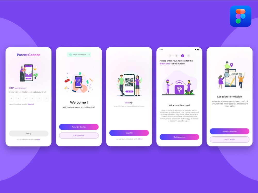
Your Design Task:
Create three high-fidelity onboarding screens for the "ArtisanHQ" app in Figma. This will be a "Benefits-Oriented" flow that precedes the sign-up screen.
- Screen 1: Welcome & Core Value: Introduce the app and its main benefit.
- Headline Idea: "Manage Your Creative Business, Beautifully."
- Screen 2: Benefit Focus 1: Highlight a key feature, like project management.
- Headline Idea: "Track Every Project From Start to Finish."
- Screen 3: Benefit Focus 2 & CTA: Highlight another benefit, like client galleries, and include the primary CTA to get started.
- Headline Idea: "Share Stunning Progress with Clients."
Design Specifications (Apply these in Figma):
- Frame: Use the iPhone 14 Pro frame (393 x 852 px).
- Layout & Spacing:
- Follow iOS conventions. Add layouts for the Status Bar at the top and the Home Indicator at the bottom.
- Use an 8-point grid system for spacing. Set your main horizontal margins to 24pt.
- Typography:
- Use the SF Pro font family. If you don't have it installed, you can use a similar sans-serif font like Inter.
- Apply a typographic scale using iOS styles:
- Headlines: Large Title (e.g., 34pt, Bold)
- Body Text: Body (e.g., 17pt, Regular)
- Color & Imagery:
- Choose a simple, elegant color palette that fits a creative/business brand.
- Incorporate visuals. You can use simple illustrations (from a Figma plugin like Blush or from your own creations) or high-quality stock photos (from a plugin like Unsplash).
- Components:
- Progress Indicator: Add a "dot" indicator (e.g., three dots) to show the user's progress through the three screens.
- Buttons: Design a prominent "Continue" or "Next" button on Screens 1 and 2, and a primary "Get Started" button on Screen 3. Ensure they are at least 44pt tall for touch accessibility.
The final part of the DesignCode video provides a perfect demonstration of creating a high-fidelity modal, which involves many of the same skills—working with input fields, buttons, and spacing. Watching it can give you a concrete example of the level of polish to aim for.
UI Design Livestream - Designing your first iOS app
This segment shows the instructor designing a sign-in modal from scratch, a common element in onboarding.
As you prepare to design your own screens, watch the process of designing the sign-in modal. Focus on how the instructor handles: Spacing within a contained element. Creating input fields with icons. Styling a primary action button. Ensuring contrast and readability.
Take your time with this exercise. The goal is to apply the principles we've discussed to create a polished, professional-looking result that you could confidently show a client.
Conclusion
In this lesson, you've bridged the gap between strategy and visual execution. You've learned how to design high-fidelity onboarding screens that are not only beautiful and platform-compliant but also psychologically persuasive.
Key Takeaways:
- High-fidelity design is about details: Applying platform conventions like iOS's HIG, using consistent spacing, and choosing appropriate typography are what elevate a design from a wireframe to a polished product.
- Content is king: The words, images, and questions you use are the primary drivers of user motivation. A great onboarding flow tells a compelling story about the value the user will receive.
- Learn from the best: Analyzing successful apps like Cal AI and using resources like Growth.Design provides a powerful toolkit of patterns and psychological principles to apply in your own work.
- Practice is key: The hands-on task of designing the "ArtisanHQ" screens solidifies your understanding and builds your practical Figma skills.
Preview of the Next Lesson:
You've now designed several reusable elements like buttons and text styles. In our next lesson, we will begin Module 10: Design Systems. You'll learn how to take these individual elements and formalize them into a full-fledged design system by creating, managing, and scaling comprehensive design tokens and component libraries. This is a crucial skill for ensuring consistency and efficiency, especially in freelance projects.