Hello! Welcome to your first lesson in the course on Lighting Design for Interior Design.
As a technical architect, you're an expert in defining the form and structure of spaces. This course will add a new, crucial dimension to your skills: shaping how those spaces are experienced through light.
Today, we begin with the most fundamental aspect of lighting design: the human being. The learning outcome for this lesson is to explain how the human eye perceives light, color, and brightness to inform comfortable interior design. We'll explore the basic biology of vision not as an abstract science lesson, but as the essential user manual for the people who will inhabit your designs. Understanding this is the foundation for every technical and creative decision you'll make as a lighting designer.
1. Beyond Visibility: The True Goal of Lighting
Before we dive into the mechanics of the eye, let's establish what we're trying to achieve. Good lighting isn't just about making things visible; it's about making people feel comfortable, relaxed, and engaged with their environment. Bad lighting can make a beautiful space feel sterile, flat, or even stressful.
To get a feel for this distinction, let's start with a short, insightful video that frames the entire philosophy of good residential lighting.
The Ultimate Guide To Lighting (For Your Home)
Watch this first section from 'The Ultimate Guide To Lighting (For Your Home)' by Five By Nine. It perfectly articulates why lighting is more about creating mood and balance than simply achieving brightness.
Watch from the beginning until 01:43. Pay close attention to the analogy of a dinner party and the critique of the 'two extremes' of lighting—overly bright versus overly dim.
As the video suggests, our goal lies in the middle ground: creating a balanced, layered experience. To do that effectively, we first need to understand the instrument we are designing for—the human eye.
2. The Eye-Brain System: Your Biological Toolkit
At its core, vision is a two-part process: the eye gathers light, and the brain interprets it. Your experience with technical systems will be helpful here, as the eye operates on clear physical principles.
To see how this works, please watch this brief segment.
This clip from the 'Visual Comfort' video provides a concise overview of the eye's main components and their functions.
Watch from 02:09 to 03:21. Focus on the roles of the iris, pupil, lens, and the photoreceptors (rods and cones) in the retina.
Let's break that down with a bit more detail, using the diagram below.
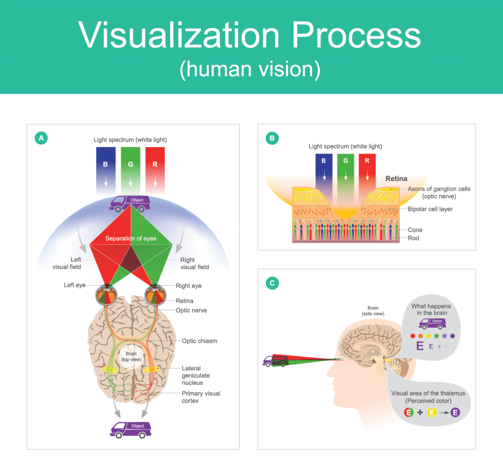
The key components for a lighting designer are the photoreceptors in the retina:
- Rods: These are highly sensitive to light and are responsible for our vision in low-light conditions (scotopic vision). They are excellent at detecting motion and perceiving shades of gray, but they don't see color. They are most numerous in our peripheral vision.
- Cones: These require more light to function and are responsible for our daytime vision (photopic vision). They allow us to perceive fine detail and, crucially, color. There are three types of cones, each sensitive to different wavelengths of light (roughly corresponding to red, green, and blue).
This dual system of rods and cones is the biological reason why a space can feel completely different at night than it does during the day. In bright daylight, your cones are doing the work, rendering a world of vibrant color and sharp detail. In a dimly lit restaurant, your rods take over, creating a softer, less detailed, and colorless view.
3. Perception in Practice: Brightness, Adaptation, and Contrast
Our perception of light is not absolute; it's relative and constantly changing. The brain doesn't just receive a picture; it actively interprets it. This is where the biology of vision translates directly into design principles.
Light and Dark Adaptation
Have you ever walked from a sunny street into a dark movie theater? The temporary blindness you experience is dark adaptation in action. Your pupils dilate to let in more light, and your rods slowly increase their sensitivity. The reverse process, light adaptation, happens when you walk back outside and are momentarily dazzled by the brightness.
To understand the practical implications, please read the following sections from the article "Basics of Human Light and Color Perception".
Basics of Human Light and Color Perception Eye Brain ...
This article provides key facts about how our perception of brightness is shaped by adaptation.
Read the sections titled 'Perception of Brightness and Contrast — Practical Essence' and 'Dark and Light Adaptation — Key Facts'. Note the typical timeframes for adaptation.
The key takeaway is that adaptation takes time. Full light adaptation can take 5-8 minutes, while full dark adaptation can take up to 30 minutes.
- Design Application: A well-designed space anticipates these transitions. An entryway or lobby should act as a "visual buffer zone" with intermediate light levels, allowing people's eyes to adapt comfortably as they move between a bright exterior and a dimmer interior, or vice versa. Abrupt, drastic changes in light levels are physically uncomfortable.
The Power of Contrast
Contrast is the difference in brightness between an object and its background. Our eyes are drawn to the brightest points in our field of view. While excessive contrast causes visual fatigue (as your iris constantly adjusts), controlled contrast is one of a designer's most powerful tools.
Let's return to "The Ultimate Guide To Lighting" to see how this principle is used in practice.
The Ultimate Guide To Lighting (For Your Home)
This segment explains how to use contrast effectively to create depth, guide attention, and define the function of a space.
Watch from 04:14 to 05:34. Notice the distinction between the even, flat lighting of an office and the varied, comfortable lighting of a home.
By creating intentional areas of light and shadow, you can:
- Create Visual Hierarchy: Guide a person's attention to a focal point, like a piece of art or an architectural feature.
- Define Space: Brighter zones support activity (a kitchen counter), while softer zones support rest (a seating area).
- Add Depth and Interest: Even lighting makes a room feel flat. Contrast makes it feel layered, richer, and more spacious.

Test your understanding!
Imagine you are designing the lighting for an open-plan living area. A client wants one area for watching movies and another corner for reading. How would you use the principle of contrast to light these two zones, and why would even, uniform lighting be a poor choice?
Show answer
Uniform lighting would be a poor choice because it fails to support the different activities. The entire space would feel like a single "task zone," making it difficult to relax for movie-watching.
Using contrast, you would:
- Reading Corner: Provide a brighter, more focused light source (like a floor lamp) to create high contrast on the pages of the book, ensuring comfortable reading without illuminating the whole room.
- Movie Area: Use low-level, indirect ambient light. This reduces overall brightness to prevent distracting reflections on the screen and allows the viewers' eyes to adapt to a dimmer environment, enhancing the cinematic feel. The bright screen itself becomes the main focal point.
This approach uses contrast to create two distinct functional and atmospheric zones within a single space.
4. The Perception of Color
As mentioned earlier, color vision is the job of the cones. However, our perception of color is also not absolute. It can be influenced by the surrounding light and by adaptation.
Read this final excerpt from the "Basics of Human Light and Color Perception" article.
Basics of Human Light and Color Perception Eye Brain ...
These sections explain how our sensitivity to color isn't uniform and can 'fatigue' over time.
Read the sections 'Color: Spectral Sensitivity and Thresholds' and 'Color Adaptation and Fatigue'.
The main implications for interior design are:
- Sufficient Light is Needed for Color: In very dim light (when our rods are dominant), we can't perceive color accurately. That's why colors in a space can appear muted or grayish at night if the light level is too low.
- Color Fatigue is Real: While less of a concern in typical homes, in commercial spaces with strong, colored-light branding (like a retail store or bar), prolonged exposure to one dominant color can temporarily affect how people perceive colors afterward.
We will explore color in much greater detail in upcoming lessons when we discuss Color Temperature and the Color Rendering Index (CRI), which are critical technical specifications for any light source.
Conclusion
This lesson established the fundamental link between human perception and lighting design. You are not just lighting a room; you are crafting a visual experience for a complex biological system.
Key Takeaways:
- Good lighting design prioritizes comfort, mood, and experience over simple visibility.
- The human eye uses rods for low-light vision (brightness) and cones for bright-light vision (color and detail).
- Our eyes constantly adapt to changing light levels, and good design provides smooth transitions to avoid discomfort.
- Contrast is a primary design tool used to create focus, define zones, and add depth to a space. Even, uniform light often feels flat and uncomfortable in residential and hospitality settings.
In our next lesson, we will build directly on this foundation. Now that we understand the receiver (the eye), we will turn our attention to the signal itself. We will identify the three primary characteristics of light: quantity, quality, and direction, which are the essential variables you will manipulate in every lighting design project.