In our last lesson, we took a significant step by creating our first React component, the ProductCard. You learned how to translate a design element from Figma into JSX, establishing a powerful mental model for mapping design structure to code structure. However, our component had a major limitation: its content was hard-coded, making it a static, one-off element.
This lesson addresses that problem head-on. We'll explore props, the mechanism React uses to make components dynamic and reusable. Your goal is to learn how to configure component instances by passing data through props, and you'll see that this concept is directly analogous to the Component Properties and Variants you use every day in Figma. This is where your design system thinking truly begins to merge with front-end development.
The Problem with Static Components
Imagine you have a list of products to display. With our previous ProductCard component, you would have to copy and paste the entire component's code for each product, changing the title, image, and price manually inside each copy. This is inefficient, error-prone, and unscalable—the exact opposite of the component-based approach we want.
The solution is to separate the component's structure from its data. The component should be a reusable template, and we should be able to "pass in" the data it needs to display. This is precisely what props allow us to do.
What are Props?
Props (short for "properties") are read-only arguments passed from a parent component to a child component. They allow a parent component to configure its children, sending down data and even functions.
The video below offers a great analogy: think of props as the pneumatic tubes at a bank's drive-through. They are a dedicated channel for sending information from one place (the parent component) to another (the child component).
React Typescript 2023 - 3. Props
This short clip from a "React Typescript" tutorial by Teddy Smith provides a simple and effective analogy for what props are and why they are necessary.
Watch the first minute of the video, from the introduction, to understand the core problem that props solve and the "tube" analogy for passing data between components.
The Figma developer documentation provides a concise and clear definition.
Working with React | Developer Docs
This official guide from Figma explains the core concepts of React that are relevant when working within the Figma ecosystem.
In the section "Components, props, and JSX", read the short definitions for Component and instance, and then focus on the definition of Props and the accompanying Button code example. Notice how the Button function receives an object { text, backgroundColor } as an argument. Those are its props.
The Design Engineer's Mental Model: Figma Properties to React Props
This is the most critical connection for you. In Figma, you create reusable components and define their configurability using Component Properties (like Variants, Booleans, and Instance Swaps).
- You might create a
variantproperty with options likeprimaryandsecondary. - You might create a
sizeproperty with options likesmall,medium, andlarge. - You might create a
booleanproperty calledwithIconto show or hide an icon.
React props are the direct code equivalent of these Figma properties.
The data you define for a component's properties in Figma is the same data you will pass as props to its React component counterpart.
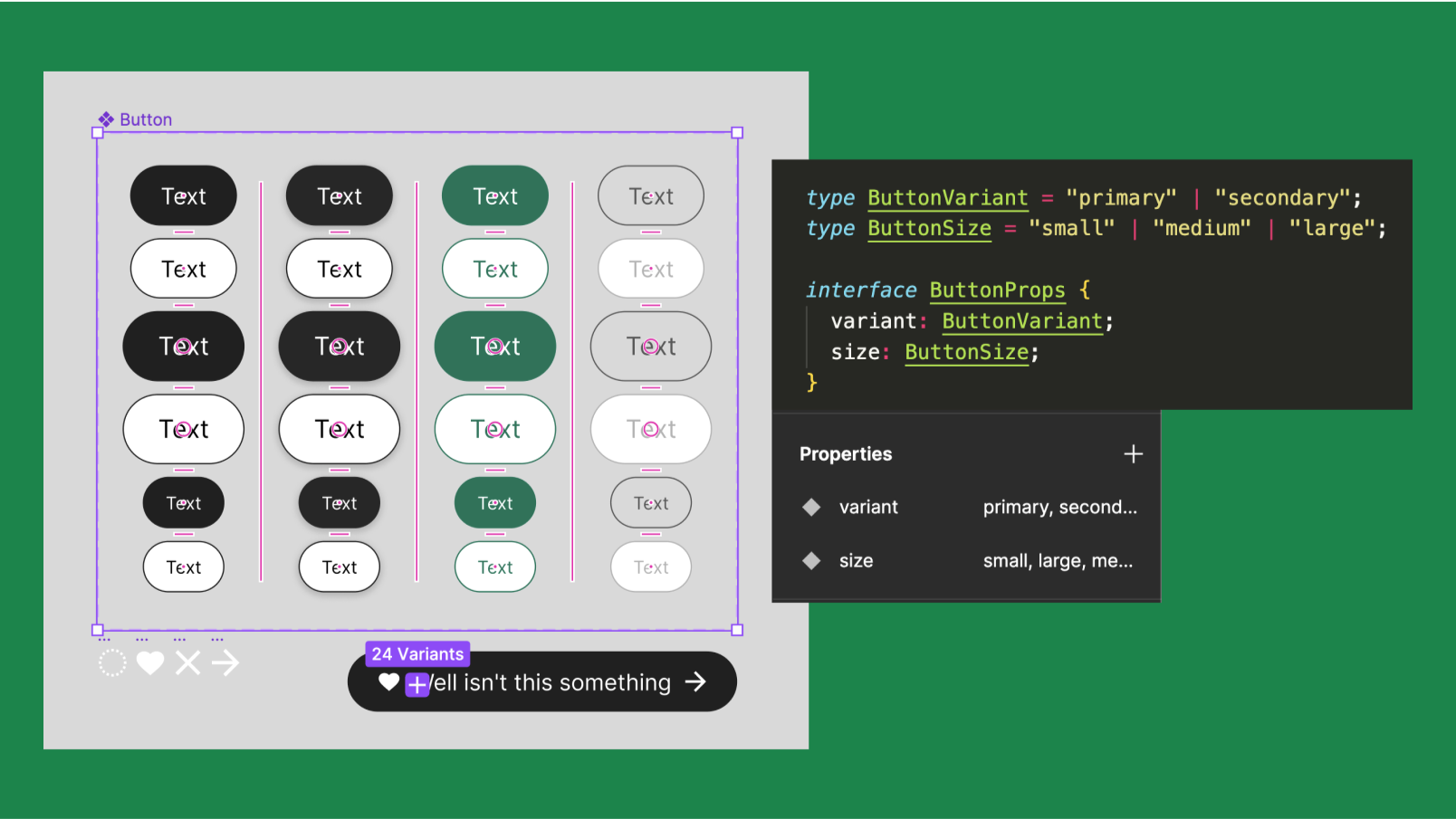
This concept is so foundational to modern design-to-code workflows that it's a key part of preparing designs for AI code generation.
This article explains how to structure Figma files for AI tools like Cursor, emphasizing the need for machine-readable design systems.
Read the section "2.1 Structuring Figma for Machine Readability", focusing on the part about Variants and Variables. This reinforces the idea that well-defined Figma component properties are not just for designers; they are the "API" that informs how the code component should be built and configured.
Making our ProductCard Reusable with Props
Let's refactor the ProductCard from our last lesson. First, we'll modify the component to accept props, and then we'll render it from a parent component, passing in the data.
Step 1: Modifying the Child Component (ProductCard)
We change the function signature to accept a props object. It's common practice to immediately "destructure" this object to pull out the specific properties you need.
// Before: Hard-coded data
function ProductCard() {
  const thumbnailUrl = "https://via.placeholder.com/300";
  const title = "Classic Leather Watch";
  const meta = "Elegant and timeless";
  // ... JSX uses these variables
}

// After: Accepting props
// We define what data we EXPECT to receive by destructuring the props object.
function ProductCard({ thumbnailUrl, title, meta }) {
  return (
    <div className="product-card">
      <div className="product-card__thumbnail">
        {/* We now use the props directly in our JSX. */}
        <img src={thumbnailUrl} alt={title} />
      </div>
      <div className="product-card__content">
        <h3 className="product-card__title">{title}</h3>
        <p className="product-card__meta">{meta}</p>
        <div className="product-card__actions">
          <button>Add to cart</button>
          <button>Details</button>
        </div>
      </div>
    </div>
  );
}
Step 2: Using the Component from a Parent (App)
Now, in a parent component (like App.js), we can render multiple ProductCard instances, passing different data to each one using attributes that match the prop names.
function App() {
  return (
    <div>
      <h1>Our Products</h1>
      <div className="product-list">
        {/* Each instance gets its own unique data passed as props. */}
        <ProductCard
          title="Classic Leather Watch"
          meta="Elegant and timeless"
          thumbnailUrl="https://example.com/watch.jpg"
        />
        <ProductCard
          title="Wireless Bluetooth Headphones"
          meta="Crisp sound, all-day comfort"
          thumbnailUrl="https://example.com/headphones.jpg"
        />
        <ProductCard
          title="Minimalist Ceramic Mug"
          meta="Handcrafted for your morning coffee"
          thumbnailUrl="https://example.com/mug.jpg"
        />
      </div>
    </div>
  );
}
The video below by Bro Code provides a very clear, step-by-step walkthrough of this exact process.
This tutorial clearly explains the concept of props and demonstrates how to create a reusable component and pass different data to each instance.
Watch from the beginning to the introduction to see how a Student component is created to accept a name prop. Then, skip to the section on reusability from "reusing the student component". This is the "Aha!" moment where you see multiple unique Student components being created from a single definition, just by passing in different props.
Unidirectional Data Flow
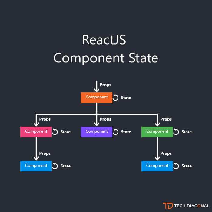
An essential rule in React is that props are read-only. A child component can read the props it receives from its parent, but it can never change them. Data flows in one direction: down from parent to child.
This makes your application's data flow predictable and easier to debug. If you need to change something, you always look to the component that "owns" the data (the parent), not the one that's just displaying it (the child).
Supervising AI: Prompting for Props
When using Vibe Coding with Cursor, your ability to describe a component's props is crucial for getting good results. Your prompt should not only describe the visual appearance but also its "API"—the data it needs to function.
A weak prompt: "Make a user profile card with an avatar, name, and status."
A strong, props-aware prompt:
"Create a React component named
UserProfileCard. It should accept auserprop, which is an object containingname(string),avatarUrl(string), andstatus('online' or 'offline'). It should also accept avariantprop ('default' or 'editable'). If the variant is 'editable', show an 'Edit' button. Use Tailwind CSS for styling."
When Cursor generates the code, your supervision task is to verify:
- Prop Definition: Does the component function signature correctly accept
userandvariantprops? - Prop Usage: Is
user.nameused for the heading? Isuser.avatarUrlused for the imagesrc? - Conditional Rendering: Is the 'Edit' button correctly rendered only when
variant === 'editable'? - Data Types: If you were using TypeScript, you would also check that the types are correct, ensuring you can't pass a number where a string is expected.
The UserProfileCard.tsx example in the "How AI Turns Figma into Code" article shows exactly what a well-structured, AI-generated component with props should look like.
This resource provides excellent examples of good vs. bad AI-generated code.
Review the code block under the heading "The MCP Result". Compare it to the messy, hard-coded output under "The Screenshot Result". The difference is that the first one is configurable via props, making it a reusable and maintainable component, while the second is a static block of styles.
Conclusion
You've now unlocked the single most important concept for creating scalable UIs in React. By using props, you can build a library of truly reusable components, just like you do in Figma.
Key Takeaways:
- Props are used to pass data from a parent component to a child component, making the child dynamic and configurable.
- This concept is directly analogous to Component Properties in Figma. A component's variants and properties in Figma define its props in code.
- Data flows in one direction (parent to child), and props are read-only for the child.
- When passing props in JSX, string values use quotes (
title="My Title"), while other data types like numbers or booleans use curly braces (price={99}). - In a Vibe Coding workflow, your prompt should clearly define the props a component needs, and your supervision role is to verify the generated code uses them correctly.
In this lesson, we focused on data that is passed into a component from the outside. But what about data that a component needs to manage internally? For example, is a dropdown menu currently open or closed? Is a checkbox checked? That's where state comes in. In our next lesson, you'll learn about the useState hook, which allows components to remember information and manage their own internal changes.