Hello! Welcome back to our course on React.
In the last lesson, you successfully set up a new React project using Vite and integrated Tailwind CSS. Your development environment is now ready, and you've seen how to apply a basic utility class to confirm everything is working.
Today, we transition from setup to styling. The goal of this lesson is to learn how to apply Tailwind CSS utility classes to style components efficiently. We will explore the "utility-first" philosophy and cover the essential classes for handling typography, colors, spacing, and layouts. By the end, you will be able to take an unstyled React component and bring it to life using Tailwind's powerful and intuitive toolset.
What is a "Utility-First" Workflow?
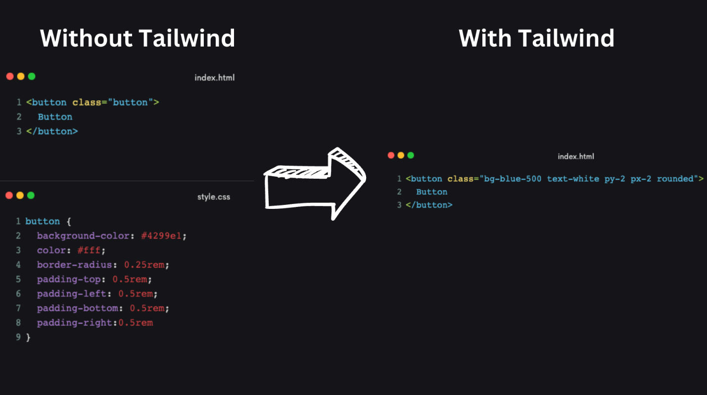
At its core, Tailwind CSS is a "utility-first" framework. Instead of giving you pre-built components like a styled button or card, it provides low-level utility classes. Each class applies a single CSS property, like a specific background color or padding amount. You build custom designs by combining these utilities directly in your JSX.
This image perfectly illustrates the concept:
Let's dive into how this works in practice.
The Core Building Blocks
Tailwind provides a comprehensive set of utility classes for almost every CSS property you'll need. Their names are designed to be intuitive and easy to remember.
To get a quick overview of the main categories, please read the following article. It provides a great catalog of the most common utilities you'll be using for styling.
Integrating Tailwind CSS in React Components
This article, 'Level Up Your React Apps with Tailwind CSS', has a fantastic section that summarizes the key utility classes for colors, fonts, spacing, and layout. It's a great way to quickly familiarize yourself with the syntax.
Please read the section titled 'Integrating Tailwind CSS in React Components'. Focus on the descriptions for Colors, Font size and styling, Padding and margin, Flex, and Grid. Don't worry about memorizing everything; the goal is to understand the patterns.
As you read, you probably noticed the consistent naming conventions:
bg-*forbackground-colortext-*forcolorandfont-sizep-*forpadding,px-*for horizontal padding,py-*for vertical paddingm-*formargin,mx-*for horizontal margin,my-*for vertical marginfont-*forfont-weight
This intuitive system is enhanced by modern code editors, which provide autocomplete for Tailwind classes, making the development process incredibly fast.

Why Not Just Use Inline Styles?
A common question is, "Isn't this just like writing inline styles?" While there are similarities, utility classes offer crucial advantages that inline styles lack.
Styling with utility classes - Core concepts - Tailwind CSS
The official Tailwind documentation explains this distinction clearly. Let's see why utility classes are more powerful than inline styles.
Read the section titled 'Why not just use inline styles?'. Pay attention to the three main advantages mentioned: Designing with constraints, Hover/focus states, and Media queries.
In short, utility classes enforce a consistent design system, can handle interactive states like :hover, and allow for responsive design—all of which are impossible with inline styles.
Practical Application: Styling a Component
Now, let's apply these concepts. We'll build up a UI piece by piece, using utility classes for everything from text styles to complex layouts. The following video is an excellent, hands-on demonstration of this process. We will go through it section by section.
Tailwind CSS in React Crash Course 2026 | Become a React Tailwind Pro in 1 Hour
This crash course by PedroTech is a great practical guide. We will use it to learn how to apply the most common utility classes for typography, color, spacing, and layout.
We will be watching several segments of this video. For now, just have it ready. I will direct you to specific timestamps as we go.
1. Typography and Color
Let's start by styling a simple piece of text. In your App.jsx file, you can replace the existing content with a simple div containing a p tag.
// src/App.jsx
function App() {
  return (
    <div>
      <p>Hello, Tailwind!</p>
    </div>
  )
}

export default App;
Now, watch the first part of the video to see how to style text size, weight, alignment, and color.
- Watch:
Tailwind CSS in React Crash Coursefrom 04:29 to 09:55.
After watching, try applying some of these classes to your <p> tag. For example:
<p className="text-2xl font-bold text-center text-rose-600">
  Hello, Tailwind!
</p>
You'll also see how to apply background colors using the bg-* utilities to the parent div.
2. Sizing and Spacing
Spacing is fundamental to good design. Tailwind uses a consistent spacing scale for padding, margin, width, and height.
- Watch:
Tailwind CSS in React Crash Coursefrom 09:55 to 13:19.
This section explains how to use padding (p-, px-, py-, pt-, etc.) and margin (m-, mx-, my-, etc.) utilities. The numbers (p-4, m-8) correspond to values on a predefined scale, which helps maintain visual consistency.
Try adding some padding to your div to give the text some breathing room:
<div className="bg-slate-200 p-8">
  <p className="text-2xl font-bold text-center text-rose-600">
    Hello, Tailwind!
  </p>
</div>
3. Layouts with Flexbox and Grid
Flexbox and Grid are the backbones of modern web layouts. Tailwind makes using them incredibly straightforward.
Flexbox: Let's see how to create a simple navbar layout.
- Watch:
Tailwind CSS in React Crash Coursefrom 15:56 to 22:49.
This segment shows how to use flex, items-center, justify-between, and gap-* to align items. This is one of the most common patterns you'll use.
Grid: Now for a grid of feature cards.
- Watch:
Tailwind CSS in React Crash Coursefrom 22:49 to 27:20.
Here you'll learn to use grid and grid-cols-* to create a column-based layout. The video also introduces rounded-* for applying border-radius.
4. Handling States and Interactivity
One of Tailwind's most powerful features is its ability to style elements based on their state (like hover or focus) using variants.
- Watch:
Tailwind CSS in React Crash Coursefrom 31:19 to 34:54.
This section demonstrates how to use the hover: prefix to change styles when a user hovers over an element. You'll see how to change a background color (hover:bg-slate-600) and even apply a transform (hover:scale-110).
Crucially, it also introduces transition-all and duration-* to create smooth, animated transitions between states, which dramatically improves the user experience.
// Example of hover and transition classes
<div className="bg-blue-500 p-4 rounded-lg transition-all duration-300 hover:bg-blue-700 hover:scale-105">
  Hover me
</div>
5. Arbitrary Values
What if you need a specific value that isn't in Tailwind's theme, like a custom color or a very specific pixel width? You can use square bracket notation [] to generate a class with an arbitrary value on the fly.
Styling with utility classes - Core concepts - Tailwind CSS
The official documentation provides a clear explanation of this powerful feature.
Read the section titled 'Using arbitrary values'. This will show you how to use square brackets for one-off styles.
This is extremely useful for situations where you need precise control without having to write separate CSS.
Examples:
- A specific width:
w-[500px] - A custom brand color:
bg-[#1DA1F2](Twitter blue) - A value from a
calc()function:h-[calc(100vh-4rem)]
Putting It All Together: A Responsive Navbar
Let's conclude with a practical example from the video that ties together many of these concepts, including React state and a preview of responsive design.
- Watch:
Tailwind CSS in React Crash Coursefrom 34:54 to 41:09.
This segment builds a complete responsive navbar. It demonstrates:
- Combining
flex,justify-between, anditems-centerfor the main layout. - Using React's
useStatehook to toggle a mobile menu. - Conditionally rendering the mobile menu based on state.
- Using responsive prefixes like
sm:hiddento show or hide elements on different screen sizes (a topic we will explore fully in the next lesson).
This example is a fantastic showcase of how efficiently you can build complex, interactive, and responsive components with React and Tailwind.
Conclusion
In this lesson, you've moved from having a configured project to understanding and applying the core concepts of Tailwind CSS. You are now equipped to style React components efficiently by composing utility classes.
Key Takeaways:
- Tailwind's utility-first approach involves building UIs by applying small, single-purpose classes directly in your JSX.
- The class names are intuitive and cover all major CSS properties like color, spacing, typography, and layout (Flexbox/Grid).
- Utility classes are superior to inline styles because they support design constraints, pseudo-states (
hover:,focus:), and responsive design. - You can apply smooth transitions to state changes for a polished user experience.
- For one-off values, you can use arbitrary value syntax with square brackets (e.g.,
w-[333px]).
Next Up:
We had a small taste of responsive design with prefixes like sm: and md:. In our next lesson, we will do a deep dive into this topic, learning how to use Tailwind's mobile-first responsive design system to create layouts that look great on any device.