Hello! Welcome back to our journey with React and Tailwind CSS.
In our last lesson, we dove into the utility-first workflow, learning how to style components efficiently with classes for color, spacing, and layout. We even got a small preview of responsive design when we saw how prefixes like hover: and sm: could modify styles.
Today, we will master that concept. The learning outcome for this lesson is to implement responsive designs using Tailwind's breakpoint prefixes. We'll explore Tailwind's "mobile-first" philosophy and learn how to create flexible layouts that adapt seamlessly from a small phone screen to a large desktop monitor.
The Mobile-First Philosophy
The most important concept in Tailwind's responsive design system is its mobile-first approach. This means:
- Unprefixed utilities (e.g.,
text-center,bg-blue-500) apply to all screen sizes, starting from the smallest mobile view. - Prefixed utilities (e.g.,
md:text-left,lg:bg-red-500) only take effect at their specified breakpoint and above.
This encourages you to design the mobile layout first, as it's often the simplest. You then layer on modifications for larger screens.
Responsive design - Core concepts - Tailwind CSS
The official Tailwind documentation explains this core concept very well. It's crucial to understand this before you start writing responsive classes.
Please read the section titled 'Working mobile-first'. Pay close attention to the examples showing how to correctly target mobile screens using unprefixed utilities.
Tailwind's Default Breakpoints
Tailwind comes with a set of five default breakpoints, inspired by common device resolutions. You can think of these as the points at which your design can adapt.

As the table shows, a class like lg:flex is equivalent to writing @media (min-width: 1024px) { .lg\\:flex { display: flex; } }. Tailwind handles all of this for you.
Applying Responsive Prefixes in Practice
Let's see this in action. The best way to learn is by watching and doing.
How to Create Responsive Websites (TailwindCSS)
We'll be using segments from the video 'How to Create Responsive Websites' by Austin Davis. It provides clear, practical demonstrations of the concepts we're discussing.
Please have this video ready. We will watch specific parts to see how responsive prefixes work for styling and layout.
1. Changing Styles at Different Breakpoints
Let's start with a simple example: changing a background color and text size based on the screen width.
- Watch:
How to Create Responsive Websitesfrom 02:09 to 04:15.
As you saw, you can apply a default style and then override it at a specific breakpoint. Try this in your App.jsx:
function App() {
  return (
    // Default background is gray, but on medium screens (768px) and up, it becomes blue.
    <div className="bg-slate-200 p-8 md:bg-sky-200">
      {/* Default text is large, but on large screens (1024px) and up, it becomes 3xl. */}
      <h1 className="text-lg font-bold text-center text-slate-800 lg:text-3xl">
        My Responsive App
      </h1>
    </div>
  );
}

export default App;
Resize your browser window and watch the background color and text size change as you cross the md (768px) and lg (1024px) breakpoints.
2. Adapting Layouts: Flexbox and Grid
The most powerful use of responsive prefixes is for changing component layouts. Two common patterns are switching a flex container from a column to a row, and adjusting the number of columns in a grid.
Flexbox: From Stacked to Side-by-Side
On mobile, it's common to stack items vertically. On larger screens, you have more space to place them side-by-side.
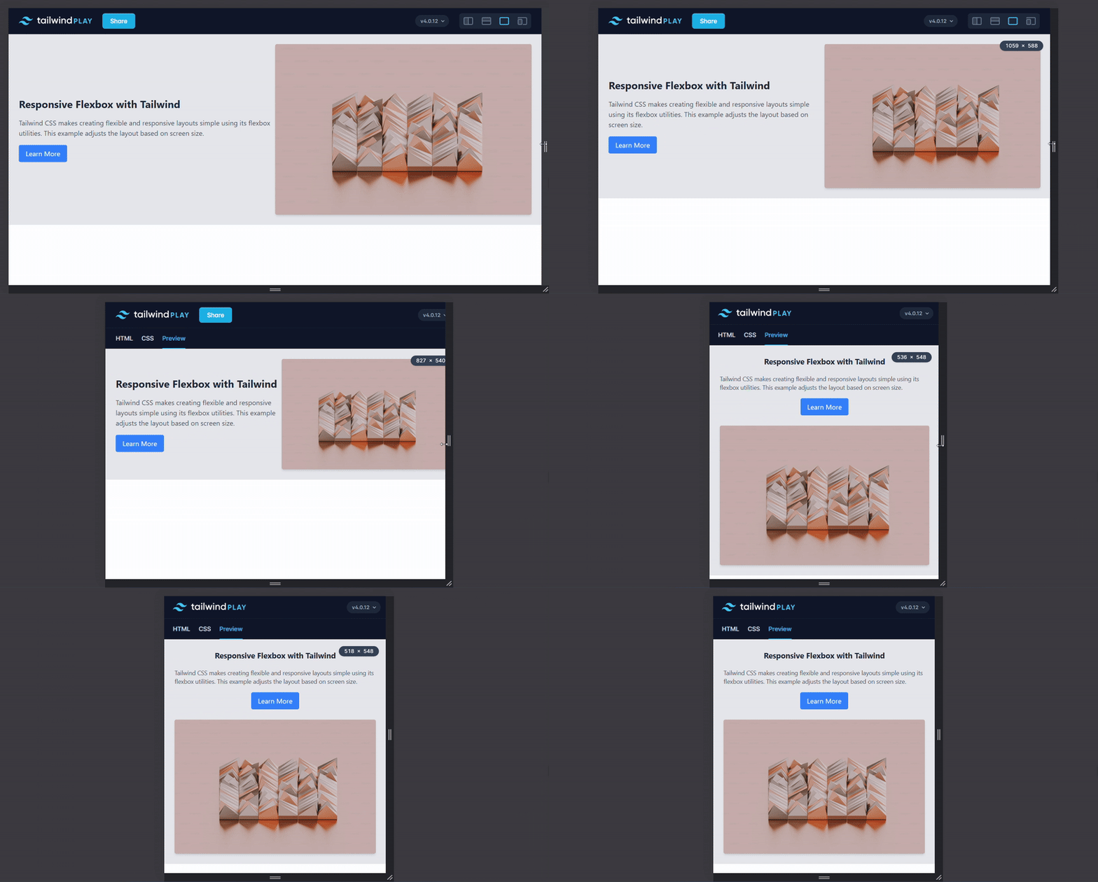
Now, let's see how this is coded.
- Watch:
How to Create Responsive Websitesfrom 04:19 to 05:49.
The key takeaway is this pattern:className="flex flex-col md:flex-row"
This sets the default to a vertical column (flex-col) and switches to a horizontal row (flex-row) on medium screens and larger.
Grid: Adjusting Column Count
Grid layouts are perfect for card collections or photo galleries. You can increase the number of columns as the screen gets wider to make better use of the space.
- Watch:
How to Create Responsive Websitesfrom 05:53 to 08:24.
This segment is excellent because it shows how to stack multiple breakpoints to create a progressively wider layout.
<div className="grid grid-cols-1 gap-4 sm:grid-cols-2 lg:grid-cols-4">
  {/* Your grid items go here */}
  <div className="bg-white p-4 rounded-lg shadow">Card 1</div>
  <div className="bg-white p-4 rounded-lg shadow">Card 2</div>
  <div className="bg-white p-4 rounded-lg shadow">Card 3</div>
  <div className="bg-white p-4 rounded-lg shadow">Card 4</div>
</div>
With these classes, the layout will have:
- 1 column on mobile (the default).
- 2 columns on small screens (
sm, 640px) and up. - 4 columns on large screens (
lg, 1024px) and up.
Advanced Technique: Targeting a Breakpoint Range
Sometimes, you might want a style to apply only within a specific range (e.g., "on tablets, but not on phones or desktops"). Tailwind allows you to do this by stacking a min-width prefix (like md:) with a max-width prefix (like max-lg:).
The BEST Way to Create Responsive Design with Tailwind CSS (2025)
This is a less common but very powerful feature. The video 'The BEST Way to Create Responsive Design with Tailwind CSS' by Lukas explains this concept clearly.
Watch from 07:39 to 10:13 to understand how to apply styles to a specific range of screen sizes.
The syntax looks like this: md:max-lg:bg-green-200. This class applies a green background only on screens that are at least md wide (768px) but less than lg wide (1024px). It effectively targets the range between two breakpoints.
A Note on Customizing Breakpoints
While the default breakpoints are sufficient for most projects, you should know that they are fully customizable. You can change their values, add new ones (like tablet or 3xl), or remove ones you don't need.
This is done in your tailwind.config.js file. While we won't go into detail here, the following resource is an excellent guide for when you need this capability.
The BEST Way to Create Responsive Design with Tailwind CSS (2025)
For future reference, this section of the video from Lukas explains how to override, extend, and add custom breakpoints in your configuration file.
You don't need to watch this now, but bookmark it. It explains everything you need to know about customizing breakpoints, which can be very useful in larger projects. (Watch from 10:13 to 15:20).
Conclusion
You now have the tools to build fully responsive interfaces with React and Tailwind CSS. By mastering the mobile-first approach and the use of breakpoint prefixes, you can ensure your applications look and feel great on any device.
Key Takeaways:
- Tailwind uses a mobile-first approach: unprefixed classes are the default, and prefixed classes apply from that breakpoint upwards.
- The default breakpoints are
sm,md,lg,xl, and2xl, each corresponding to amin-width. - You can apply responsive prefixes to any utility class to change styles, typography, or layout.
- Common patterns include switching from
flex-coltoflex-rowand increasing the number of columns in agrid. - You can target a specific breakpoint range by stacking prefixes, like
md:max-lg:utility.
Next Up:
We've learned to make our UI "respond" to screen size. In the next lesson, we will learn how to make it respond to application data by exploring how to apply styles conditionally based on component state or props. This will allow us to create even more dynamic and interactive user interfaces.