Hello! Welcome to the next lesson in your PL-400 certification journey.
In our previous lesson, we delved into the crucial topic of delegation, focusing on how to optimize the performance and scalability of your app's data layer. We learned that letting the data source do the heavy lifting is key to building enterprise-grade applications.
Today, we shift our focus from the backend data layer to the frontend presentation layer. This lesson kicks off our "Advanced Canvas App Techniques" module by addressing a fundamental aspect of modern user experience: how to design responsive Canvas App layouts using containers and modern screen templates.
As a developer with experience in HTML and CSS, you'll find the concepts here familiar. Just as you wouldn't build a modern website with a fixed-pixel layout, we don't build Power Apps that way either. A responsive app provides a seamless experience whether it's running on a phone, a tablet, or a large desktop monitor. Mastering this is essential for professional Power Platform development and a key skill tested on the PL-400 exam.
1. The Foundation: Enabling Responsiveness
The first step in building a responsive app is to change a few key app settings. By default, Canvas Apps are configured to scale a fixed-size layout up or down to fit the screen. To create a truly responsive design, we need to disable this behavior and let our controls adapt to the available space.
Create responsive layouts in canvas apps - Power Apps
The official Microsoft documentation, "Create responsive layouts in canvas apps," explains this foundational step. Please read the section on disabling 'Scale to fit'.
Read the initial section titled "Disable Scale to fit". This explains why turning off this setting (and consequently 'Lock aspect ratio') is the necessary first step to unlock responsive capabilities.
Once "Scale to fit" is off, your app's controls will no longer resize automatically. Instead, you will control their size and position using formulas that reference the screen's dimensions, much like using relative units (%, vw, vh) in web development. The app and screen provide several properties for this:
App.Width&App.Height: The actual width and height of the browser window or device screen.Screen.Width&Screen.Height: The width and height the screen will render at, typically calculated using theAppdimensions.
While you can build layouts by writing formulas for every control's X, Y, Width, and Height properties (e.g., Width = Parent.Width / 2), this quickly becomes complex. The modern and recommended approach is to use auto-layout containers.
2. The Building Blocks: Responsive Containers
Responsive containers are the cornerstone of modern Canvas App layout design. They manage the position and size of the controls you place inside them, saving you from writing dozens of individual formulas. They are analogous to CSS Flexbox, automatically arranging child elements.
There are two main types:
- Horizontal container: Arranges controls in a row.
- Vertical container: Arranges controls in a column.
The following video provides an excellent, hands-on demonstration of how these containers work.
Power Apps Responsive Design Containers & Screen Templates
This video by Reza Dorrani, a Microsoft MVP, is a fantastic practical guide to responsive containers. We'll start with the basics.
Please watch from the beginning up to 07:21. Focus on: The necessary app settings (00:45). The core properties of a container: Direction, Justify (alignment along the main axis), Align (alignment on the cross-axis), Gap, and Wrap (01:34). The properties of controls inside a container: Flexible width/height and Fill portions, which control how available space is distributed (04:51).
To recap the key container properties you just saw:
| Container Property | Description |
|---|---|
| Direction | Determines if controls are laid out horizontally or vertically. |
| Justify | Aligns controls along the primary direction (e.g., left, center, right for horizontal). |
| Align | Aligns controls along the secondary direction (e.g., top, middle, bottom for horizontal). Stretch makes them fill the container's height/width. |
| Gap | Sets the spacing in pixels between each control in the container. |
| Wrap | If enabled, allows controls to move to the next row/column if there isn't enough space. This is critical for responsiveness. |
For controls placed inside a container, you gain new properties:
| Control Property | Description |
|---|---|
| Flexible width/height | When toggled on, allows the control's width (in a horizontal container) or height (in a vertical container) to grow and shrink to fill available space. |
| Fill portions | Defines the proportion of available space a flexible control should occupy. If one control has 2 portions and another has 1, the first will take 2/3 of the space and the second will take 1/3. |
Test your understanding!
You have a horizontal container with three buttons inside it. All three buttons have Flexible width turned ON.
- Button A has Fill portions set to
2. - Button B has Fill portions set to
1. - Button C has Fill portions set to
1.
How will the available width inside the container be distributed among the three buttons?
Show answer
The total number of portions is 2 + 1 + 1 = 4.
- Button A will occupy 2/4 (or 50%) of the available width.
- Button B will occupy 1/4 (or 25%) of the available width.
- Button C will occupy 1/4 (or 25%) of the available width.
3. Building a Responsive Screen
To accelerate development, Power Apps provides several modern screen templates that come pre-configured with responsive containers.
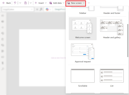
Let's continue with the video to see how to use one of these templates to build a common and practical layout.
Power Apps Responsive Design Containers & Screen Templates
Now, let's see these concepts in action by building a complete, responsive screen with a header, footer, gallery, and form.
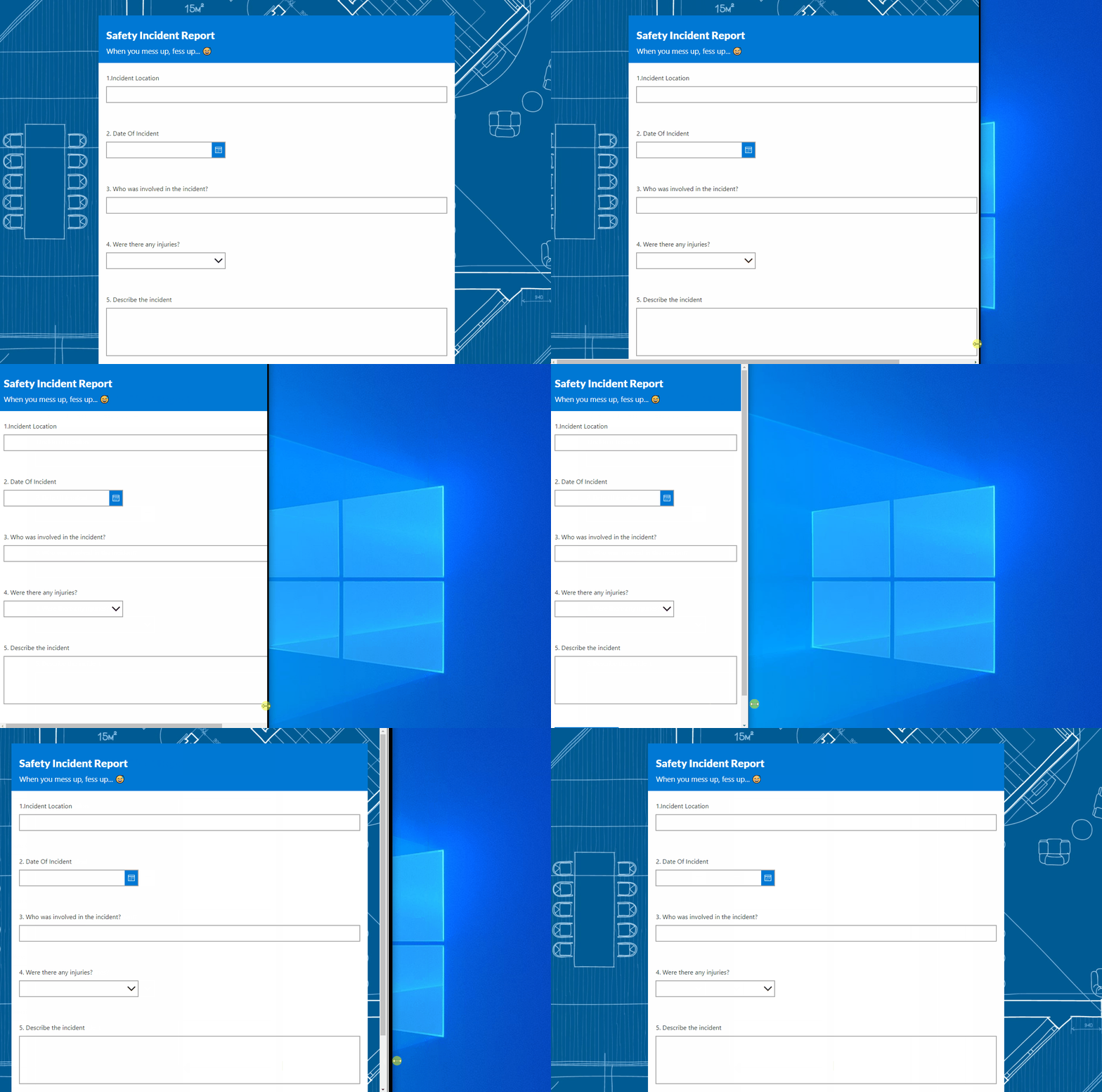
Watch from 07:21 to 16:48. This is the most important part of the lesson. Pay close attention to: The structure of the 'Header, Main section, and Footer' template, which uses nested containers (07:21). How the main section container's Flexible height is turned on to make it fill the remaining space. The use of Flexible width and Fill portions to make a form take up more space than a gallery (13:11). The powerful use of the Wrap property to stack the gallery and form vertically when the screen width becomes too small.
The technique you just saw—using a horizontal container with Wrap enabled for the main content—is a fundamental pattern for responsive design in Power Apps. It allows a side-by-side layout on larger screens to gracefully reflow into a stacked layout on smaller screens.
4. Advanced: Conditional Layouts with Screen Size
Sometimes, simply wrapping content isn't enough. You might need to make more significant changes, like reducing font sizes, hiding certain controls, or changing the height of elements on very small screens.
Power Apps provides the Screen.Size property for this. It returns a number (1-4) corresponding to predefined breakpoints:
| Size | Value | Default Breakpoint (Width) |
|---|---|---|
| Small | 1 | < 600px |
| Medium | 2 | 600px - 900px |
| Large | 3 | 900px - 1200px |
| ExtraLarge | 4 | > 1200px |
You can use this property in a Switch or If function to apply different property values based on the screen size. The final part of Reza's video demonstrates a powerful use case for this.
Power Apps Responsive Design Containers & Screen Templates
To make our wrapped layout even better, we can dynamically adjust the height of the gallery and form when they stack on a small screen. This final clip shows you how.
Watch from 16:48 to 23:37. The key takeaway is how to use a Switch statement on Screen.Size to change the Height formula of the gallery and form. When the screen size is small, their height is halved, preventing excessive scrolling.
This technique of combining containers with conditional formulas based on Screen.Size gives you complete control over your app's layout on any device.
Conclusion
You now have the fundamental skills to move beyond fixed-size apps and create modern, responsive user experiences. This is a significant step in your journey to becoming a professional Power Platform developer.
Key Takeaways:
- Start by Disabling "Scale to fit": This is the gateway to all responsive design in Canvas Apps.
- Containers are Your Best Friend: Use Horizontal and Vertical containers to automatically manage the position and size of controls.
- Master Container Properties:
Flexible width/height,Fill portions, andWrapare the essential properties for creating fluid layouts. - Use Modern Screen Templates: Don't build from scratch. Leverage the pre-built responsive templates for common layouts like headers, footers, and forms.
- Use
Screen.Sizefor Conditional Logic: When wrapping isn't enough, use theScreen.Sizeproperty to apply different styles or properties for different breakpoints (e.g., mobile vs. desktop).
Up Next:
Now that you can design a responsive screen, the next logical step is to make your UI elements reusable. In the next lesson, we will explore how to create and use a Power Apps component library to build reusable UI components, allowing you to maintain a consistent and responsive design system across all your apps.