Hello! Welcome to your next lesson on the path to the PL-400 certification.
In the last lesson, we mastered responsive layouts using containers, ensuring your apps look great on any screen. This is a vital skill, but as you know from your software development experience, creating consistent UI/UX across multiple screens—or even multiple applications—requires more than just repeating designs. It demands a strategy for reusable code.
Today, we'll address that challenge directly. This lesson covers how to create and use a Power Apps component library to build reusable UI components. Think of a component library as the Power Apps equivalent of a shared class library in .NET or an npm package in the JavaScript world. You'll build a UI element once, define its interface through properties, and then reuse it anywhere, ensuring consistency and dramatically speeding up development.
1. The "Why": Components and Component Libraries
Before we build anything, let's establish the core concepts. What exactly is a component, and why is a component library the professional standard for managing them?
A component is a self-contained, reusable group of controls. A component library is a special container for these components that allows you to centrally manage, version, and share them across different apps.
Component library - Power Apps
The official Microsoft documentation provides a clear introduction to component libraries and explains why they are the recommended way to reuse components. Please read the following sections.
Read the introduction and the section titled "Difference between an app and a component library." Focus on the key benefits: discovering components, publishing updates, and notifying app makers of new versions.
The key takeaway is that while you can create components within a single app, using a component library elevates your development by:
- Enabling Centralized Updates: Change the component in the library, publish it, and every app using it gets an update notification. This is far superior to copy-pasting and manually updating every instance.
- Promoting Consistency: Ensures that elements like headers, footers, and navigation menus have a standard look and behavior across your organization's portfolio of apps.
- Improving Discoverability: Provides a single place for developers to find and reuse existing UI elements.

2. Creating Your First Component in a Library
Let's get hands-on. We will create a component library and then build a simple, yet powerful, reusable popup dialog.
First, you need to create the library itself. You can find this option in the Power Apps maker portal.
Make A Power Apps Component Library To Share And ...
This article by Matthew Devaney provides a quick visual guide on locating and creating a new component library.
Please review the section "Add A New Component Library." The screenshots clearly show where to find the "Component libraries" area and how to create a new one.
Once your library is created, you are ready to build the component. The following video walks through the entire process, from creating the library to assembling the UI for a popup component.
Power Apps: Reusable Popup Component
Let's follow this practical guide from "The Analyst Nik" to build our popup. We'll start with creating the library and the basic structure of the component.
Please watch from 00:26 to 01:07 and then from 03:49 to 05:32. Focus on these steps: Navigating to and creating the new component library. Creating and renaming the new component. Using vertical and horizontal containers to structure the popup's layout (this builds directly on our last lesson!).
At this point, you have a static UI. It looks like a popup, but it isn't configurable or interactive. To bring it to life, we need to define its "public API" using custom properties.
3. Defining the Component's API: Custom Properties
Custom properties are how you pass data into and out of a component, and how you define its behavior. For a developer, this is the most important concept. You are defining the interface for your reusable control.
There are three main types of properties:
- Input Property: Passes data into the component. Use this to configure its appearance and content (e.g., colors, text, data tables).
- Output Property: Exposes data from the component to the app. Use this for things like returning a calculated value or the state of a control inside the component.
- Behavior Property: Allows the app to define an action to run when an event occurs inside the component (e.g., an
OnSelectfor a button). This is an advanced property type that makes components truly interactive.
The following video from Shane Young provides an excellent developer-focused explanation of input and output properties.
Power Apps Components - Mega Menu, Input, & Output
Shane Young breaks down how to make components dynamic. Pay close attention to how he explains the different data types you can pass.
Watch from 06:16 to 12:01 for Input Properties, 17:03 to 19:00 for Output Properties, and 19:47 to 22:27 for an advanced example of passing a table to a component. Notice the variety of data types available for input properties. Observe how an input property (ScreenName) is used to change the text of a label inside the component. Understand the concept of an output property emitting a value (ComponentColor) that the app can then use.
Now, let's apply this by defining the properties for our popup component. This requires enabling an experimental feature to use Behavior properties.
Power Apps: Reusable Popup Component
Let's return to our popup component video to create its custom properties. This will include input properties for customization and, crucially, behavior properties to make the buttons functional.
Watch from 00:53 to 04:02. This is a critical section. You will learn: How to enable "Enhanced component properties" to use Behavior properties. How to create several Input properties of different types: PopupFill (Color), PopupWidth (Number), Message (Text). How to create a Behavior property (lbOnSelect, rbOnSelect) that will function like the OnSelect of a standard button.
Test your understanding!
You are building a reusable header component. You want the app that uses this component to be able to:
- Specify the title text to be displayed.
- Specify the background color of the header.
- Define what happens when a "Logout" icon inside the header is clicked.
What types of custom properties would you create for each of these requirements?
Show answer
- Title Text: An Input property of type
Text. - Background Color: An Input property of type
Color. - Logout Action: A Behavior property (which functions as an
OnSelectevent). This allows the consuming app to define the logout logic, such asNavigate(LoginScreen).
4. Consuming, Updating, and Managing Components
With our component built and its properties defined, the final steps are to publish it and use it in an app.
- Save and Publish: You must save and then publish your component library. Only published versions are available to be consumed by apps.
- Import into App: In your Canvas App, go to the Insert pane and select "Get more components." You will see a list of available component libraries in your environment.
- Use and Configure: Once imported, the component will appear in the "Library components" section of the Insert pane. Add it to a screen and configure its custom properties in the properties panel, just like any other control.
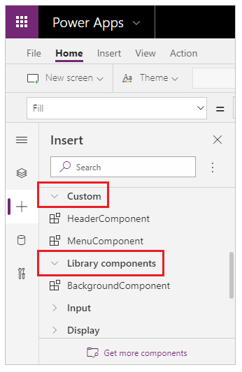
The final part of our popup video demonstrates this process perfectly.
Power Apps: Reusable Popup Component
Let's see the payoff. This clip shows how to import the popup component and use it in a real app, controlling its visibility and actions dynamically.
Watch from 05:32 to 08:24. Focus on: The Save and Publish step in the component library. Using "Get more components" to import the component into an app. Setting the component's Visible property to a variable to show/hide it. Wiring up the component's rbOnSelect (Right Button OnSelect) behavior property with Power Fx formulas.
Updating a Component
What if you need to make a change? Simply edit the component in the library, then save and publish it again. The next time you open an app that uses this component, Power Apps will notify you that an update is available, allowing you to seamlessly pull in the new version.
Component library - Power Apps
The official documentation explains this update process, which is a key benefit of using libraries.
Read the section "Update a component library." This covers how app makers are notified of updates and the process to review and apply them.
Conclusion
Today, you've bridged the gap between creating a single responsive screen and building a scalable, maintainable system of apps. By using component libraries, you are applying fundamental software engineering principles of modularity and reusability directly within the Power Platform.
Key Takeaways:
- Component Libraries for Centralization: They are the professional standard for creating reusable UI elements that can be shared, versioned, and updated across multiple apps.
- Properties Define the API: Use Input, Output, and Behavior properties to create a flexible and powerful interface for your components.
- Enable Enhanced Properties: To create interactive components with clickable elements, you must enable the "Enhanced component properties" feature to use Behavior properties.
- Lifecycle: Build, Publish, Import, Update: Remember the workflow for creating a component in a library, publishing it, importing it into an app, and then applying updates as the library evolves.
Up Next:
We will continue our dive into advanced Canvas App techniques by tackling a common real-world requirement: offline capability. In the next lesson, you will learn how to implement offline capabilities in a Canvas App using collections, LoadData/SaveData, and data synchronization patterns.