Introduction
Hello and welcome to a new phase of our course! In the previous module, we focused on the economic architecture of AI systems, culminating in a lesson where you successfully demonstrated how technical optimizations like caching can drastically improve a feature's financial viability by shortening its break-even timeline.
Now, we shift our perspective from economic health to system integrity. A feature can be profitable, but if the information it presents is unreliable, it can lead to poor decisions, erode user trust, and ultimately fail. This module, "Designing for Data Flow & Freshness," is dedicated to ensuring the data your systems present is not just fast, but also trustworthy.
In this first lesson, we will tackle a fundamental threat to data integrity. Our learning outcome is to identify the risks of exposing stale data in a decision-support interface. You'll learn the crucial difference between how fast data is delivered and how current it is, why that distinction matters, and the very real dangers of getting it wrong—a critical foundation for anyone designing systems that guide human or AI decisions.
1. Data Freshness vs. Data Latency
You might have heard the terms "latency" and "freshness" used interchangeably, but for a systems architect, they represent two different—and sometimes conflicting—qualities of a system.
- Data Latency measures system speed. It's the time between a request for data and the system's response. A low-latency system feels fast and responsive. You've seen this concept before in our diagnostic module.
- Data Freshness measures data currency. It’s the age of the data at the moment it's used. Fresh data accurately reflects the most current state of the world.
Think of it this way: A system with low latency but poor freshness is like a delivery service that brings you yesterday's newspaper in under 10 minutes. The delivery was fast, but the information is out of date.
To build a solid understanding of this distinction, please read the following sections from an article that breaks it down clearly.
Data Freshness vs Data Latency: What's the Difference?
The article 'Data Freshness vs Data Latency' from Tacnode provides a clear and concise explanation of these two core concepts.
Please read from the beginning of the article down to the end of the table titled 'Data Freshness vs Latency: Key Differences'. Focus on the definitions of freshness and latency and how the table contrasts them.
As the article highlights, latency is often what engineers focus on because it's easy to measure and directly impacts the user's perception of speed. Freshness, however, is often invisible until it causes a problem.
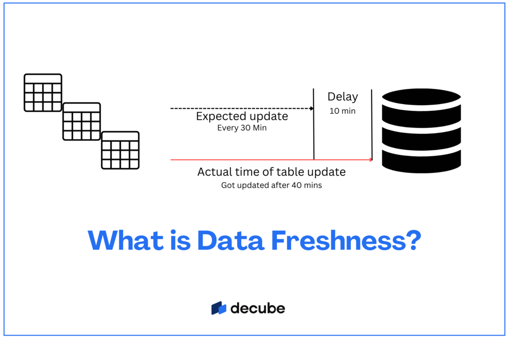
Here is a visual that illustrates the source of stale data—a delay between when an update is expected and when it actually occurs.
2. The Dangerous Quadrant: When Fast is Worse than Slow
It might seem counterintuitive, but a system that is fast but provides stale data is often more dangerous than one that is slow but provides fresh data. The article you just read introduces a simple but powerful framework for thinking about this.
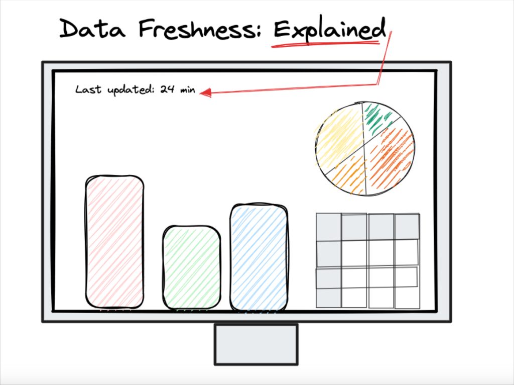
Let's explore the four states of a data system:
- Fast + Fresh: The ideal state. Decisions are both quick and correct.
- Slow + Fresh: Annoying but safe. The user has to wait, but they can trust the data they eventually receive.
- Slow + Stale: Obviously broken. The system feels slow and the data is wrong. This is usually flagged and fixed quickly.
- Fast + Stale: The dangerous quadrant. The system feels perfect. It's responsive, and the interface looks correct. However, it is consistently providing outdated information, leading users to make incorrect decisions with confidence.
This "Fast + Stale" state is a critical risk you must learn to identify. From a UX perspective, the system is giving positive feedback (speed) for what is actually a failure (bad data). This builds a false sense of trust that can have serious consequences when it's broken.
The following reading explains why this quadrant is so perilous.
Data Freshness vs Data Latency: What's the Difference?
Let's return to the Tacnode article to explore why the 'Fast + Stale' combination is so problematic.
Please read the section titled 'Why Data Freshness Matters: The Dangerous Quadrant'. Pay close attention to the explanation of why 'Fast + Stale' systems don't look broken.
3. Real-World Risks of Stale Data
These risks are not just theoretical. In decision-support interfaces across e-commerce, fintech, and SaaS products, stale data can lead to significant financial, operational, and reputational damage.
As a UX designer, part of your role in system architecture is to understand the user's context and the cost of a bad decision. Connecting the abstract concept of "data freshness" to concrete user and business outcomes is a vital skill.
The next reading provides excellent real-world examples. As you read, think about the user story behind each failure. What was the user trying to do? How did the stale data cause a negative outcome for them?
Data Freshness vs Data Latency: What's the Difference?
This final reading from the Tacnode article provides concrete examples of where stale data causes problems and explains why AI systems are especially vulnerable.
Please read the sections 'Real World Examples: Where Stale Data Causes Problems' and 'Why AI and Machine Learning Amplify Freshness Issues'.
Let's summarize the key risks identified in the article:
- E-commerce Inventory: Overselling products, leading to canceled orders and customer disappointment.
- Fraud Detection: Approving a fraudulent transaction because a risk signal from another part of the system hasn't arrived yet.
- Dynamic Pricing: Setting prices based on yesterday's demand, missing current market opportunities.
- Customer Personalization: Providing irrelevant recommendations based on old user behavior, damaging the user experience.
The article also makes a critical point about AI: an AI agent will act on whatever data it receives, immediately and at scale, without the human intuition to question if something feels "off." This makes designing for data freshness absolutely essential in the AI-powered systems you aim to build.
4. A Designer's Responsibility: Making Reliability Visible
So, what is your role as a designer and architect? You are not expected to build the data pipeline, but you are responsible for the interface through which the user interacts with its data. Your primary responsibility is to ensure the interface is not misleading.
As the article "From Data To Decisions" on Smashing Magazine notes:
"When data lags or fails to load, it can mislead users in serious ways: A dip in a trendline may look like a market decline when it is only a delay in the stream... Interfaces must show not only what the data says but also how current or complete it is."
This is a UX problem at its core. If the system cannot guarantee fresh data, the interface must make the state of the data transparent to the user. Hiding data staleness is a critical design flaw.
Your Turn: Identify the Risk
Let's apply this to a domain you're interested in. Consider a fintech dashboard you might design, one that displays a user's stock portfolio value and allows them to make trades.
Please answer the following:
- High-Risk Scenario: Describe a plausible scenario where data that is just five minutes stale could lead to a significant negative outcome for the user. What is the user trying to do, and what goes wrong?
- Low-Risk Scenario: Describe a scenario where five-minute-old data would be perfectly acceptable and pose virtually no risk.
- The Consequence: In your high-risk scenario, what is the specific damage to the user? Is it financial, emotional (loss of trust), or something else?
This exercise will help you connect the technical concept of data freshness to the practical impact on user decisions and well-being.
Conclusion
In this lesson, we established the critical difference between data latency and data freshness, and you learned to identify the significant risks associated with exposing stale data in decision-support interfaces.
Key Takeaways:
- Latency is about system speed, while freshness is about data currency.
- The most dangerous state for a system is "Fast + Stale" because it feels responsive and trustworthy while providing incorrect information.
- Stale data creates tangible risks, from financial losses in fintech to operational failures in e-commerce and poor recommendations from AI.
- As a designer and architect, your responsibility is to ensure the interface transparently communicates the reliability and freshness of the data it displays, thereby preventing users from being misled.
Next Steps
Now that you can identify the risks of stale data, our next lesson will focus on a common UX pattern used to manage latency: optimistic updates. While they can make an interface feel incredibly fast, they also come with their own unique set of failure risks when reality doesn't match the optimistic assumption. This will directly address our next learning outcome: Explain optimistic updates as a UX pattern and describe their associated failure risks.