Hello! Let's continue our journey into high-converting creatives.
In our last lesson, we focused on the principles of effective video ads, breaking them down into the Hook, Hold, and Close. You learned how pacing, captions, and visual cues are crucial for holding attention. Now, we'll address a critical next step: recognizing that not all ad space is created equal. A brilliant video for the Instagram Feed might completely flop in Reels.
This lesson is about adapting your creative to its environment. As a performance marketer aiming to scale campaigns, mastering placement optimization is a significant lever for improving efficiency and unlocking budget growth. A one-size-fits-all approach gets cropped, ignored, or feels out of place, wasting your ad spend. By tailoring your assets, you ensure your message is seen, understood, and resonates with the user's mindset in that specific moment.
Today, you will learn to adapt creative structure and format for different Meta placements (e.g., Feed vs. Reels/Stories).
1. Understanding the "Why": User Context Across Placements
Before we discuss pixels and aspect ratios, we need to understand the fundamental differences in user behavior across Meta's major placements. The same person uses the Instagram Feed, Stories, and Reels with three distinct mindsets. Your creative's success depends on matching the right mindset.
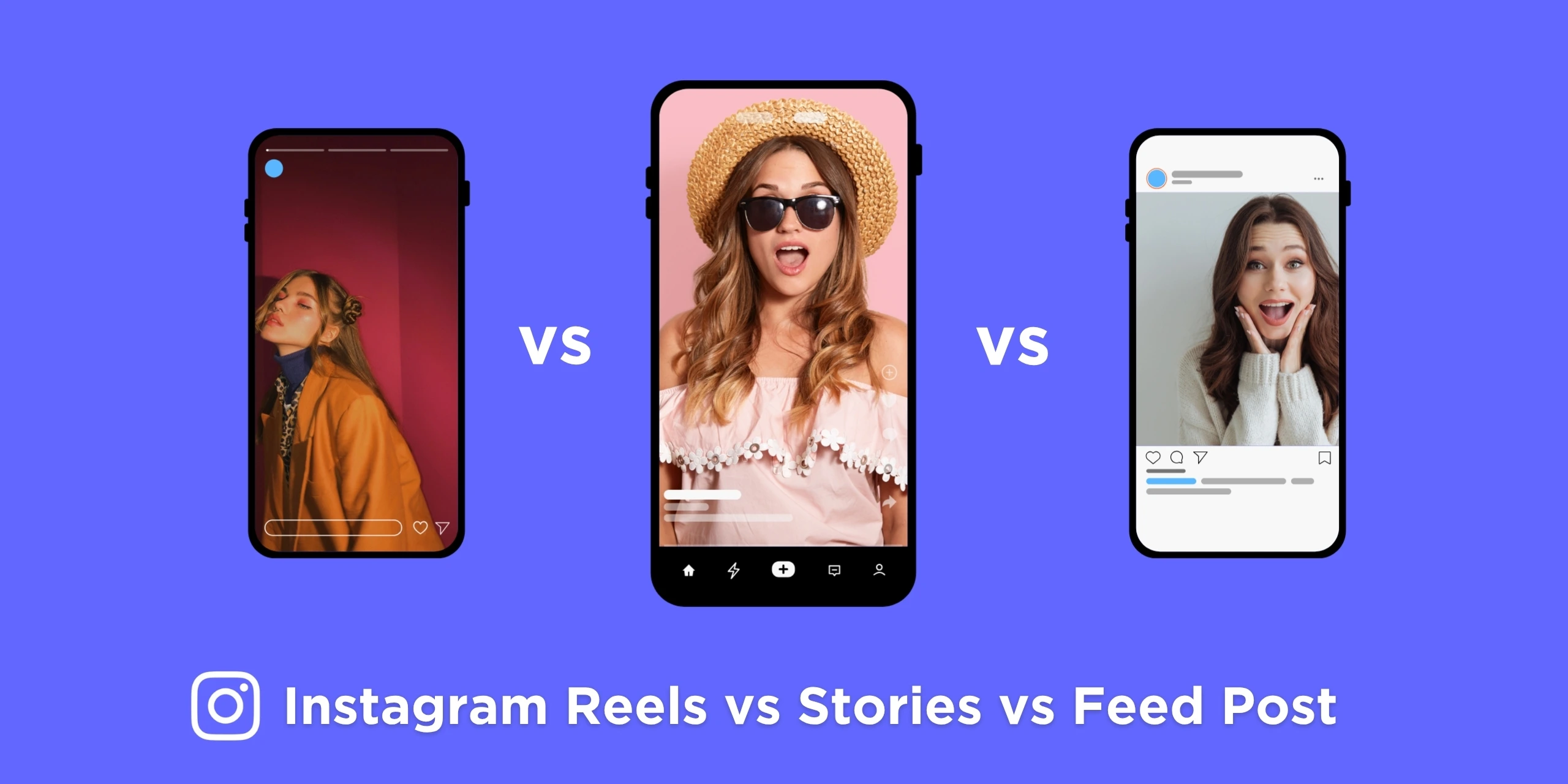
Let's dive into the specifics of user intent and behavior for each.
Feed vs Stories vs Reels: Meta Placement Performance
This article from Benly provides an excellent breakdown of the user context for each major placement. Understanding this is the foundation for all adaptation.
Read the sections titled "Understanding Each Placement" and "User Behavior Differences by Placement." As you read, focus on building a mental model for the "job" each placement does for the user: Feed: The user is in a "discovery" or "browse" mode, scrolling through a mix of content. Stories: The user is "checking updates" in a fast-paced, tap-through motion. The content is ephemeral, creating urgency. Reels: The user is in an "entertainment" mode, actively seeking to be entertained by short-form video. Pay close attention to the table under "Attention and viewing patterns." This data directly informs the creative decisions we'll discuss next.
To summarize the key distinctions from the reading:
| Behavior | Feed | Stories | Reels |
|---|---|---|---|
| Primary User Intent | Browse/Discover | Check Updates | Entertainment |
| Average View Duration | 3-6 seconds | 2-3 seconds | 8-15 seconds |
| Sound Enabled | 15-30% | ~50% | 60%+ |
| Click Propensity | High | Medium | Low |
| Best For | Direct Response | Retargeting, Urgency | Prospecting, Brand |
This table is your strategic compass. It shows that forcing a direct-response ad built for the Feed into a Reels placement is fighting against user intent—they're there to be entertained, not to click.
2. The "How": Mastering Technical Specs and Safe Zones
Now that we understand the strategic "why," let's get into the tactical "how." Adapting creative technically comes down to two things: aspect ratio and safe zones.
The Efficient Workflow: Design for 9:16 First
The most common aspect ratios are:
- 1:1 (Square): The classic Feed post.
- 4:5 (Vertical): Takes up more vertical space in the Feed.
- 9:16 (Full Screen Vertical): The standard for Stories and Reels.
Instead of creating three separate designs from scratch, an efficient workflow is to design for the most complex format first (9:16) and then adapt down. The key is to keep all critical information within a "safe zone" that will survive being cropped to 4:5 or 1:1.
This video explains the concept clearly.
What's The Best Facebook Video & Image Ad Size
In "What's The Best Facebook Video & Image Ad Size," William Kast provides a simple but powerful framework for creating a single asset that works across placements.
Watch the sections that explain how to design for a static ad and a video ad using a 9:16 canvas. Notice the concept of a central "safe zone" where all important elements (headline, logo, CTA) are placed. This is the core of an efficient, scalable creative process.
Safe Zones: The Most Common Point of Failure
The concept of a "safe zone" goes beyond just aspect ratio cropping. On Stories and Reels, Meta overlays UI elements (your profile icon, like/comment buttons, the CTA button) on top of your creative. If your key message or logo is in these areas, it will be hidden.
This is one of the most common and costly unforced errors in Meta advertising. The Ads Uploader guide on this topic is essential reading.
Meta Ads Safe Zones: The Complete Guide
This guide provides precise dimensions and highlights the critical difference between Stories and Reels safe zones—a mistake even experienced advertisers make.
First, read the introduction "What Are Meta Ads Safe Zones?" and "Why Safe Zones Matter for Ad Performance" to understand the financial impact of getting this wrong. Then, carefully study the section "Complete Safe Zone Dimensions by Placement," paying special attention to the part subtitled "Reels (9:16 Vertical), The Critical Difference." This is the most important takeaway. Finally, review "Common Safe Zone Mistakes to Avoid" to reinforce these concepts.
The critical insight from the reading is that while Stories and Reels are both 9:16, their safe zones are different.
- Stories Safe Zone: Requires clearing the top 14% and bottom 20% of the screen.
- Reels Safe Zone: Requires clearing the top 14% and bottom 35% of the screen.
If you design for Stories and run that creative in Reels, your call-to-action or headline at the bottom will be obscured by the UI. Always design for the most restrictive placement—in this case, Reels.
Here's the reference table from the article for your notes:
| Placement | Size (px) | Aspect Ratio | Top Safe | Bottom Safe | Sides |
|---|---|---|---|---|---|
| Feed Square | 1080×1080 | 1:1 | 100px | 100px | 100px |
| Feed Vertical | 1080×1350 | 4:5 | 250px | 250px | 100px |
| Stories | 1080×1920 | 9:16 | 270px (14%) | 380px (20%) | 65px (6%) |
| Reels | 1080×1920 | 9:16 | 270px (14%) | 670px (35%) | 65px (6%) |
3. The "What": Aligning Creative Style with Placement
Beyond technical specs, you must adapt the style, pacing, and message of your creative. A perfectly formatted ad will still fail if its tone is wrong for the placement.
Let's refer back to the Benly.ai article for a tactical checklist.
Feed vs Stories vs Reels: Meta Placement Performance
This resource provides clear, actionable tables on the creative requirements for each placement.
Read the sections "Creative Requirements by Placement" and "Asset Customization Strategies." Focus on the tables that break down the best practices for Aspect Ratio, Video Length, Hook, Sound Strategy, and Content Style for Feed, Stories, and Reels.
Here's a summary of the strategic creative shifts:
- For Feed: You can use more polished, almost "ad-like" creative. Since sound is mostly off, bold captions and clear visual storytelling are key. It's the best place for a strong direct-response message.
- For Stories: The creative should feel more native and casual. Use stickers, polls, and a direct-to-camera style. The message needs to be delivered almost instantly due to the fast tap-through behavior. Urgency works well here.
- For Reels: The creative MUST be entertainment-first. It should feel like organic, user-generated content (UGC). Using trending audio and formats is critical. The goal is to entertain or educate first, and sell second. This is your top-of-funnel powerhouse.
4. The "Where": Implementation in Ads Manager
Knowing the theory is great, but you need to know how to execute it within Meta Ads Manager. Meta provides a feature called Asset Customization (or "Customize creative by placement") that allows you to upload different versions of your media for different placement groups.
This screenshot shows the interface where Meta automatically adapts your creative, giving you the option to replace or crop it for different placement groups.

The following video provides a practical, step-by-step walkthrough of this entire process.
How to Customize Meta Ad Creative by Placement
Jon Loomer's "How to Customize Meta Ad Creative by Placement" is a clear, concise tutorial on the exact steps to take inside Ads Manager.
Watch the video in sequence. Here's what to focus on: Introduction: Understand how Meta groups placements by aspect ratio (square, tall, wide). Advanced Preview: Learn how to use this critical tool to check how your ad actually looks across all 20+ placements, identifying cropping and text truncation issues. Editing by Group: See how to change the media (image/video), text, and headline for an entire placement group at once (e.g., all Feed placements). Editing a Single Placement: Learn how to get even more granular and edit the creative for one specific placement if needed.
By using asset customization, you get the best of both worlds: you can run Advantage+ Placements to let the algorithm find the most efficient impressions, while ensuring that the creative shown in each placement is perfectly optimized for that context.
Conclusion
You've now learned not just the technical requirements for adapting creatives, but the strategic reasoning behind it. This is a crucial skill that separates amateur advertisers from professionals who can scale campaigns profitably.
Here are your key takeaways:
- Context is King: The user's mindset is different in the Feed (browsing), Stories (updating), and Reels (entertainment). Your creative strategy must align with this context.
- Master the Specs: Design for 9:16 first, keeping all critical elements within a central safe zone. Crucially, remember that Reels requires a much larger bottom safe zone (35%) than Stories (20%).
- Adapt Style, Not Just Shape: A Feed ad can be polished and direct. A Stories ad should be casual and urgent. A Reels ad must be entertaining and feel native.
- Use Asset Customization: Leverage Meta's built-in tools to upload specific creative versions for each placement group, ensuring your message is always delivered flawlessly.
In our next lesson, we will begin a new module, "The Creative Optimization Cycle." Now that you know how to design high-quality, placement-optimized creatives, we will focus on how to test them systematically. You'll learn how to design a structured creative testing framework with clear hypotheses and variable isolation, which is the engine of sustainable performance and scaling.