Hello and welcome to the next lesson in our journey to master Alteryx advanced topics.
In our last few lessons, we've focused on the functional aspects of building an Analytic App. We've learned how to configure various interface tools, use the Condition tool to create a dynamic experience, and use the Error Message tool to build a robust app that validates user input. Now, it's time to focus on the aesthetics and usability of the app's interface. A powerful app that is confusing to use won't be adopted by users.
This lesson addresses the learning outcome: Design a user-friendly app interface using grouping and layout options. We will explore the Interface Designer window and learn how to use its features to transform a default, disorganized collection of questions into a clean, professional, and intuitive user interface.
1. Plan Before You Build
Before you even drag a tool onto the canvas, it's a best practice to think about the end-user experience. Who is this app for? What is the most logical flow for them to provide their inputs? A simple sketch on paper or using a digital whiteboard can save you a lot of time later.
Analytics App in Alteryx - Part 2 - The Data School
This article from The Data School demonstrates a complete app-building process. For now, let's focus on the initial planning stage.
Please read the first two sections, 'Explore the dataset' and 'Sketch the user interface'. Notice how the author thinks through the requirements and draws a simple plan for the interface, including which tools they will need.
As you saw in the article, sketching the interface forces you to consider how to group related items. In the example, the author decided to group the region filters and the output field selections separately. This kind of planning is the first step toward a user-friendly design.
2. The Interface Designer: Your Layout Studio
All interface organization happens in the Interface Designer window. If it's not visible, you can open it by going to the View menu and selecting Interface Designer (or using the shortcut Ctrl+Alt+D).
This window has four key tabs on the left:
- Layout View: Where we will arrange, group, and organize all the visible elements of our app.
- Test View: Where you can test your app's functionality with different values.
- Tree View: Shows the connections between your Interface tools and the workflow tools they update.
- Properties: Allows you to set overall app properties, like a custom icon or what happens upon successful completion.
Today, our main focus is the Layout View.
3. Key Layout Elements
Within the Layout View, you can add several elements to organize your interface. Let's review the most important ones.
Interface Designer Window - Alteryx Help
The official Alteryx Help documentation provides a concise overview of the layout elements available in the Interface Designer. This will give you a formal definition of the tools we are about to use.
Read the 'Layout' section. Focus on the descriptions for Group Box, Label, Link, and Tab. Pay attention to what each element does.
To summarize the key elements from the reading:
- Group Box: This is the primary tool for creating visual separation. You use it to contain related interface questions, like putting all date-related inputs into a single box.
- Label: Lets you add static text to your interface. This is perfect for adding a title to your app, providing instructions, or labeling a section.
- Tab: When your app has many questions, you can use tabs to break it into logical, step-by-step sections. This prevents overwhelming the user with too many options at once.
- Link: Allows you to add a hyperlink to an external website or a file, which can be useful for providing help documentation or linking to a source.
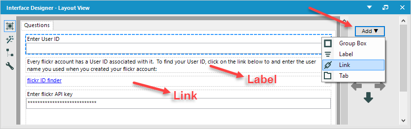
4. Putting It into Practice: From Chaos to Clarity
Now that we know the building blocks, let's see how they are used to transform a default interface into an organized one. We'll return to the Data School article, which provides an excellent visual walkthrough.
Analytics App in Alteryx - Part 2 - The Data School
This section of the article puts the theory into practice. It shows, step-by-step, how to use the layout elements to achieve the design from the initial sketch.
Please read section 5, 'Edit the Interface Designer'. Carefully follow the images showing the 'before' and 'after' of the app interface. Pay close attention to how the author adds labels and group boxes, and then uses the arrows to move the interface elements into the correct positions.
Let's break down the key steps shown in the article:
-
Start with the Default Layout: The initial layout (Image 9 in the article) is simply the list of interface tools in the order they were probably added. It's functional but not organized.
-
Add a Title: The author adds a
Labelto give the app a clear title, "SuperStore App," and moves it to the top using the up arrow. This immediately gives the user context. -
Rename the Tab: The default tab name is "Tab 1". Renaming it to something descriptive like "Executive View" makes the interface more professional. You can do this by selecting the tab in the layout tree and changing its
Nameproperty in the Configuration window. -
Create Group Boxes: The author adds two
Group Boxelements, one for filtering and one for the output configuration, as planned in the initial sketch. -
Organize Elements into Groups: This is the most crucial step. The author selects each interface question (like the list of regions or the dropdowns) and uses the arrows to move them inside the appropriate
Group Box. You can tell an element is inside a group by its indentation in the Layout View tree.
The final result (Image 13 in the article) is a much cleaner and more intuitive interface. The user immediately understands that there are two sections: one for filtering and one for configuring the output. This guided experience is the hallmark of a well-designed Analytic App.
Conclusion
Today, we shifted our focus from the internal logic of an Analytic App to its external appearance and usability. A well-organized interface is just as important as a well-functioning workflow for ensuring your users have a positive experience.
Key Takeaways:
- Plan your UI: Sketching your app's interface before you build helps you think from the user's perspective.
- The Interface Designer is your primary tool for arranging the user interface.
- Use a Group Box to cluster related questions and options visually.
- Use a Label to add titles, instructions, and other helpful text.
- Use Tabs to break a complex app into a multi-step, wizard-like process.
- Use the arrows in the Layout View to reorder elements and place them inside groups or tabs.
In our next lesson, we will focus on ensuring our app works as expected. We will learn how to test and debug an analytic app using the Analytic App Interface, a critical step before sharing your creation with others.