Hello! In our last lesson, we focused on styling the content inside your HTML elements, learning how to change fonts, colors, and text alignment. You now have a solid foundation for controlling the typography of your page.
Today, we shift our focus from the content to the container itself. Every element on a webpage is treated by the browser as a rectangular box. This lesson introduces the CSS Box Model, a fundamental concept that governs the space an element occupies. You will learn how to use the margin, padding, and border properties to control the size and spacing of these boxes, which is the first major step toward creating structured and professional-looking page layouts.
What is the CSS Box Model?
At its core, the box model is a set of rules that defines how every HTML element is rendered on a page. It's composed of four distinct layers, stacked from the inside out:
- Content: The actual content of the box, where your text and images appear. Its dimensions are defined by
widthandheight. - Padding: An area of transparent space around the content, inside the border. It pushes the content away from the border.
- Border: A line that is drawn around the padding and content.
- Margin: An area of transparent space outside the border. It pushes the entire element away from other elements.
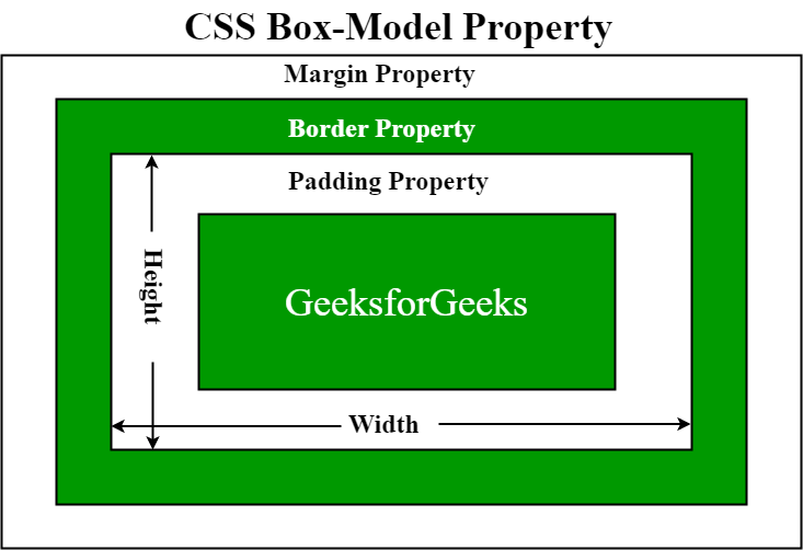
For a quick and clear introduction to these four parts and how they interact, the following video provides an excellent overview.
Learn CSS Box Model In 8 Minutes
This short video from Web Dev Simplified clearly explains the four components of the box model and their purposes.
Please watch from the beginning until the summary. Pay close attention to the distinction made between padding (spacing inside an element) and margin (spacing outside an element).
Applying Margin, Padding, and Border
Now that you have the basic concept, let's explore how to control these layers with CSS. The properties margin, padding, and border are some of the most frequently used in all of CSS.
The next video from Kevin Powell offers a fantastic, beginner-friendly walkthrough of each property, including how to set values for all sides at once (shorthand) or for individual sides (longhand).
HTML & CSS for Beginners Part 12: The CSS Box Model - Margin, Borders & Padding explained
This video provides a detailed, practical demonstration of how to apply margin, border, and padding.
Please watch the following segments: Margin: This section explains how margin creates invisible space around your box to push other elements away. Border: This part covers the three components of a border (width, style, color) and how to use the border shorthand property. Padding: This final segment highlights the key difference between padding and margin: padding creates space within an element and is included in its background color. It also covers the very useful shorthand notations for setting different values for top/bottom and left/right sides.
To solidify these concepts, it's helpful to have a written reference. The MDN Web Docs are an indispensable resource for web developers.
The box model - Learn web development | MDN
This article from the MDN Web Docs provides a comprehensive technical reference for the box model properties.
Please read the section Margins, padding, and borders. Skim through the text and interactive examples for margin, border, and padding. Don't worry about memorizing all the longhand properties; focus on understanding the shorthand syntax shown in the video, as it's what you'll use most often.
A Common Problem: Calculating Size with box-sizing
You might assume that if you set width: 300px;, the box will be 300 pixels wide on the screen. By default, this is not true. In the standard box model, the width and height properties apply only to the content area. The browser then adds any padding and border on top of that, making the element's final rendered width larger than what you specified.
This can make layout calculations very unintuitive. For example:width: 300px;padding: 20px;border: 5px solid black;
The total visible width of this element would be 300px (content) + 40px (left/right padding) + 10px (left/right border) = 350px.
Fortunately, there's a better way. The box-sizing property allows you to change how the browser calculates an element's size. By setting box-sizing: border-box;, you tell the browser that the width and height properties should include the content, padding, and border. This is far more intuitive.
The following resource explains this critical concept clearly.
The box model - Learn web development | MDN
Let's return to the MDN article to understand the two box-sizing models.
Read the two sections under the "Parts of a box" diagram: The standard and alternative models. Pay close attention to the diagrams showing how the total width is calculated in each case.
Because border-box is so much easier to work with, it has become a standard best practice to apply it to all elements on a page with a simple CSS reset. You will see this snippet at the top of almost every professional stylesheet.
*,
*::before,
*::after {
  box-sizing: border-box;
}
The * selector is a "universal selector" that targets every single element on the page.
Using Browser DevTools to See the Box Model
Your browser's developer tools are essential for working with the box model. They provide a visual diagram that shows you the exact size of the content, padding, border, and margin for any element you select. This is invaluable for debugging layout issues.
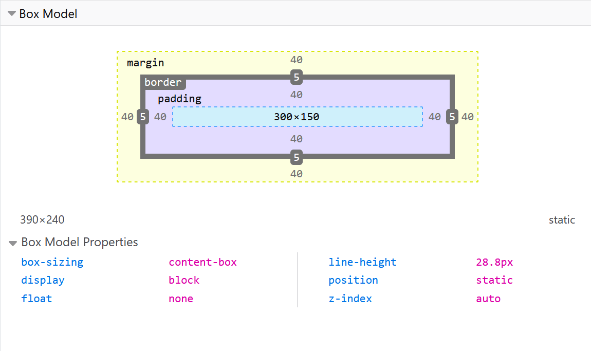
The Web Dev Simplified video you watched earlier has a great demonstration of this.
Learn CSS Box Model In 8 Minutes
This clip shows how to use the developer tools to inspect and understand the box model of an element in real-time.
Re-watch the segment from inspecting the element. Notice how hovering over each part of the diagram in the "Computed" tab highlights the corresponding area on the webpage.
Practice Time
Let's apply what you've learned to your project. Open your index.html and styles.css files.
-
Add the
box-sizingReset: At the very top of yourstyles.cssfile, add thebox-sizing: border-box;reset we discussed. This is the first rule you should have in your stylesheet. -
Add Padding to the
body: Currently, your content likely touches the edges of the browser window. Give it some breathing room by adding padding to thebodyelement.body { /* Keep your existing font/color styles from the last lesson */ padding: 20px; } -
Style your
h1: Let's make the main heading look more like a distinct block. Add some padding and a border.h1 { /* Keep your existing font/color styles */ padding: 20px; border: 3px solid #005a9c; /* A solid blue border */ }Notice how
border-boxmakes this easy. If yourh1took up the full width, it will still take up the full width, but the text will now be inset from the new border. -
Add Margin to Paragraphs: Create some vertical separation between your paragraphs (
<p>) and your lists (<ul>or<ol>).p, ul, ol { margin-bottom: 24px; /* Add space below these elements */ } -
Save and Inspect: Save your CSS file and refresh
index.htmlin the browser. Right-click on yourh1and choose "Inspect". Find the box model diagram in the developer tools and see how the values for padding and border match what you wrote in your CSS.
Conclusion
You've now learned one of the most important foundational concepts in CSS. Understanding the box model is the key to creating layouts, managing space, and building complex components.
Key Takeaways:
- Every HTML element is a rectangular box with four layers: content, padding, border, and margin.
- Padding creates space inside an element's border and includes the background color.
- Margin creates space outside an element's border and is always transparent, pushing other elements away.
- The
box-sizing: border-box;property makes layouts more predictable by including padding and border in an element's specifiedwidthandheight. - Browser developer tools are your best friend for visualizing and debugging the box model.
In our next lesson, we'll build directly on this knowledge by learning how to apply background colors and images to your elements. You'll see how padding plays a direct role in how backgrounds are displayed.