Hello! Let's continue with your capstone project.
In our last session, you did an excellent job of blocking in the major muscle groups over your mannequin figure. You now have a solid, three-dimensional blueprint that establishes the primary volumes and anatomical masses of your character.
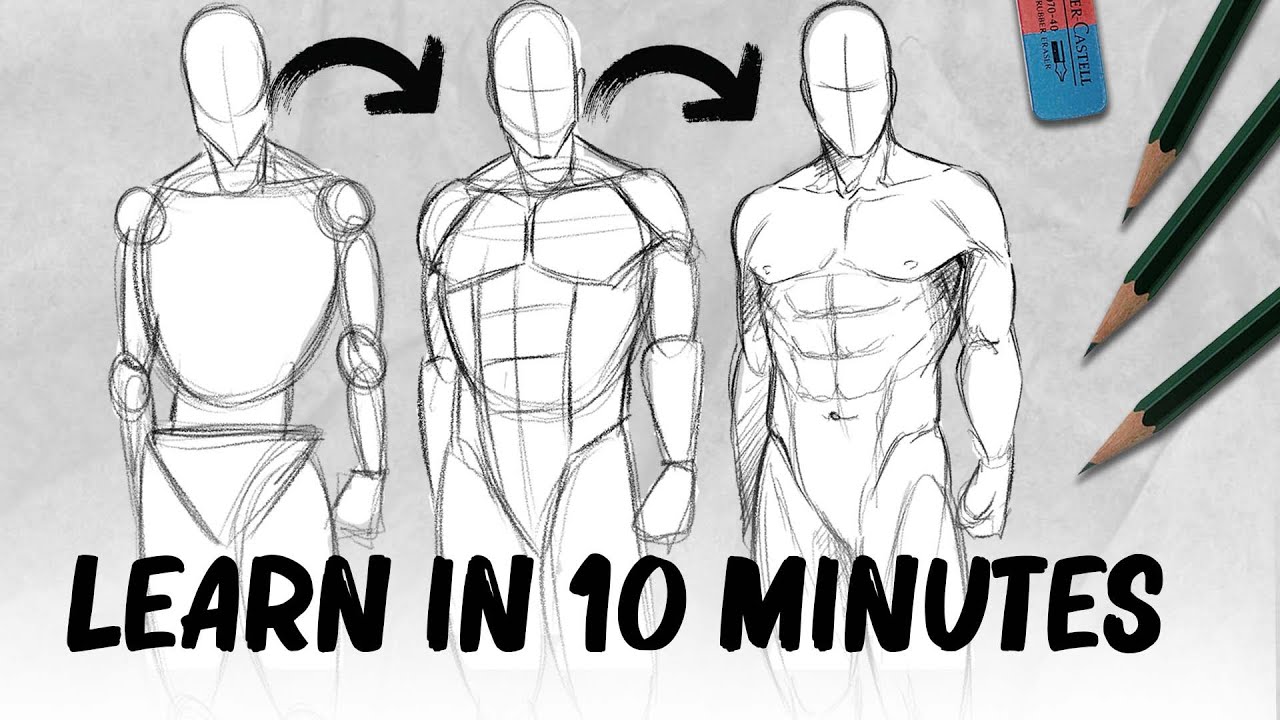
Today, we will focus on transforming that structural blueprint into a finished piece of line art. The learning outcome for this lesson is to refine the muscle blocks into a clean contour drawing of the surface anatomy. We'll move from the rigid, blocky forms to the elegant, organic lines that describe the surface of the skin, muscle, and bone. This is a critical transition from construction to presentation, and a clean contour is the foundation for effective shading and rendering.
1. From Blocks to Rhythmic Forms
Your muscle blocks are an essential guide, but muscles in a living figure aren't rigid blocks. They are soft, dynamic forms that stretch, squash, and flow into one another. Our first step is to learn how to translate those blocky guides into more fluid and natural lines. This involves thinking about rhythm and the interplay of straight lines and curves.
The following video is one of the best explanations of this principle. The instructor, Stan Prokopenko, introduces the concept of using "force" and "straight to curve" shapes to avoid common mistakes and create more dynamic limbs.
The Secret to Drawing Better Arms and Legs
In his video 'The Secret to Drawing Better Arms and Legs,' Proko demonstrates how to transform stiff, symmetrical shapes into fluid, anatomical forms. Pay close attention to how he uses arcs and the 'straight vs. curve' concept to design the silhouette of the limbs.
Please watch from the beginning of the arm demonstration at 00:00:53 until the end of the leg demonstration at 00:14:44. Then, watch the short summary from 00:16:00 to 00:16:29. Notice the critique of symmetrical 'balloon' or 'turkey leg' shapes and how a simple arc improves the flow. Focus on the 'straight to curve' principle. This is a powerful design tool: one side of a form is a long, gentle curve, while the other is straighter. This contrast creates a sense of tension and dynamism. Observe how this principle applies not just to the outer silhouette but also to the internal shapes of the muscles themselves.
This "straight vs. curve" idea is a foundational concept in figure drawing. The straight side often suggests bone or tendon, while the curved side represents the fleshy belly of a muscle. By consciously designing your lines this way, you move from simply outlining a shape to describing its nature.
2. Showing Overlap and Interlocking Forms
As you refine your contours, it's not enough for the shapes to be fluid; they also need to feel connected and three-dimensional. A common beginner mistake is to draw a single, continuous outline around the entire figure, which can make it look flat, like a gingerbread man.
To create depth, your lines need to describe how forms overlap, wedge into, and pass over one another.
The following video explores this idea of interlocking forms, based on the teachings of the famous anatomy instructor George Bridgman.
DECIPHERING BRIDGMAN'S ANATOMY 1
The video 'DECIPHERING BRIDGMAN'S ANATOMY 1' by moderndayjames provides a great explanation of how to make your forms feel solid and connected.
Please watch from 00:00:48 to 00:06:34. The key takeaways are: Wedging and Passing Forms: Pay attention to the idea that lines don't just stop at the edge of a form but continue into it to show how it connects or tucks behind another form (02:15). From Stiff to Organic: Observe the transition from blocky prisms to more rounded, organic forms (04:18). This is exactly the process you are undertaking now. Planes and Light: Notice how these simplified organic forms help define the major planes of the body, which will be crucial for shading later on (05:25).
3. Designing with Line Weight
Once you understand the shape and interaction of your lines, the final step is to refine the lines themselves. A single, uniform line weight can look flat and boring. Varying the thickness of your lines—a technique called line weight—is a powerful way to add depth, dimension, and visual interest to your drawing before you even add a single shadow.
The article '10 things you should do when drawing the human body' has an excellent, concise section on how to use contour lines to suggest form.
Please read section 08. Design the contour. Focus on the four techniques described: thick/thin lines, dark accents, subtle straights, and corners. These are your tools for creating a sophisticated contour drawing.
Here's a visual summary and a practical set of rules for applying line weight:

General Rules for Line Weight:
- Shadows and Undersides: Use a thicker line on the parts of a form that are turning away from the light source or are on the underside of an object. This mimics a core shadow and immediately creates a sense of volume.
- Proximity: Objects closer to the viewer can have a heavier outline than objects in the distance.
- Overlap: When one form passes in front of another, reinforcing the line of the overlapping form makes the depth clearer.
- Weight and Contact: Use a thicker line where a figure is in contact with a surface (like feet on the ground) to give a sense of weight and pressure.
4. Practice Exercise: Finalizing Your Contours (25 minutes)
Now it's time to put all these principles into practice. You'll be refining the muscle blocks you created in the last lesson.
Your Task:
- Open your Procreate file containing the figure with the blocked-in muscle masses.
- Lower the opacity of the muscle-block layer to around 30-40%. It should be visible but not distracting.
- Create a new layer on top for your final line art.
- Select a brush you like for clean line work (the default
Mapping PenorStudio Penin Procreate are good choices). - Carefully redraw the figure on the new layer, focusing on creating a single, clean contour drawing. As you draw, actively apply the concepts from this lesson:
- Think "Straight vs. Curve": For each part of a limb, identify which side should be the long, flowing curve and which should be the straighter, more structural side.
- Show Overlap: When you get to the shoulder, don't just draw the outline of the arm. Draw the deltoid's contour as it overlaps the bicep and pectoral muscles. Let your lines clearly define which form is in front.
- Apply Line Weight: Vary your pen pressure to change your line thickness. Use heavier lines for the undersides of the chest, arms, and legs. Use small, dark accents where muscles press together or where deep shadows would form (like the armpit or behind the knee).
- Work Cleanly: Your goal is a finished piece of line art. Take your time. Use the undo gesture freely.
Your final result should be a drawing where the line work alone creates a strong sense of three-dimensional form, ready for the final step of rendering.
Conclusion
Excellent work. You've now navigated one of the most important stages in figure illustration: translating a rough anatomical construction into a refined and communicative line drawing. This is where the artistry of creating elegant, descriptive lines comes to the forefront.
Key Takeaways:
- Refining muscle blocks involves translating them into organic, rhythmic shapes using principles like "straight vs. curve."
- Clean contour drawing isn't just about outlining; it's about using lines to show how forms interlock, overlap, and create a sense of 3D structure.
- Line weight is a fundamental tool for suggesting light, shadow, weight, and depth, making your line art more dynamic and three-dimensional on its own.
In our next lesson, we will build directly on the beautiful line art you've created today. We will begin to apply value and shading to render the musculature and create a sense of three-dimensional form, bringing your figure to life with light and shadow.