Welcome back!
In the last module, you built a strong foundation in drawing fundamentals. You learned how to use lines to construct 2D shapes and how to give them volume by building them into 3D forms in perspective. We capped it off by tackling foreshortening, a key skill for creating the illusion of depth.
Today, we begin a new module: Rendering Fundamentals: Light and Value. While the previous module was about constructing forms with lines (the "blueprint"), this one is about making those forms look solid and real using light and shadow.
Our first step is to master the core ingredient of shading: value. Today's learning outcome is to create a full value scale from light to dark with smooth, even gradations. This "palette" of grays is the foundation for everything we'll do in rendering, from shading a simple sphere to defining the complex musculature of the human body.
1. What is Value?
Before we can create a value scale, we need to be clear on what "value" means in art. It's a simple concept, but arguably the most important element in creating realistic, three-dimensional drawings.
To introduce the concept, let's watch a segment from Proko, a channel you'll find very useful as we move towards figure drawing.
This video from Proko provides a clear definition of value and explains why it is so fundamental to making your drawings look three-dimensional.
Watch from the beginning to 05:38. Pay close attention to: The definition of value as simply 'how light or dark something is'. The analogy of lines as the framework and values as the walls of a building. The concept of a value scale (from 0 for black to 10 for white) and why artists break this continuous spectrum into discrete, manageable steps.
As Proko explained, value is what gives our line drawings substance and form. While reality is a continuous gradient of light, artists use a value scale—a set of discrete steps from pure white to pure black—to understand and organize these tones.
A common standard is a 9-step or 10-step scale. Here is a great visual example that shows both a stepped scale and a smooth, blended one.
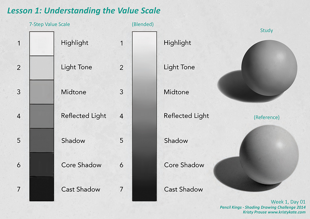
Your goal for today is to create both of these scales in Procreate.
2. The Digital Technique for Creating Value
Creating a smooth gradation of value digitally is a core technical skill. It involves two main steps: selecting the correct values and blending them seamlessly.
Selecting Grays in Procreate
First, how do you select a perfect gray, or any value in between? The Bardot Brush blog has an excellent, quick guide on how to do this in Procreate.
Make a Value Study in Procreate
This article, 'Make a Value Study in Procreate', shows you exactly where to find the value controls in the Procreate Color Picker.
Read the section titled 'Create the value study.' The key takeaway is the image showing the Color Picker. To select pure grays, you go to the 'Value' tab in the color menu (or the 'Classic' tab), set Saturation (S) to 0, and then use the Brightness (B) slider to select your value from 0% (black) to 100% (white).
Blending Values Smoothly
Once you have two different values on your canvas, how do you create a smooth transition between them? You could use the Smudge tool in Procreate, but a much more controlled and widely used method in digital painting is "on-screen mixing."
This technique involves using the eyedropper tool to pick intermediate colors and a pressure-sensitive brush to gently paint them in. Let's watch a video that demonstrates this fundamental skill. Although the software shown is likely Photoshop, the principle is identical in Procreate.
Digital Painting Fundamentals: Blending Paint
This video from Ctrl+Paint demonstrates the core technique of 'on-screen mixing' to blend between two colors (or, in our case, values).
Watch from 00:32 to 03:51. Focus on the process: Use a hard round brush with low pressure (and optionally, lower flow/opacity). Sample a color/value with the eyedropper (in Procreate, you can press-and-hold on the canvas). Lightly paint that value over the boundary between two areas. Sample the new 'in-between' value you just created and repeat the process. Notice how this creates a soft, stepped gradation that can be made smoother with more repetition.
3. Practice: Building Your Value Scales
Now it's time to apply these techniques in Procreate. Your task is to create two types of value scales: a 9-step scale and a continuous gradient.
Estimated time: 30 minutes
Part 1: The 9-Step Value Scale
- Set Up: In Procreate, create a new canvas. Draw a long, thin rectangle and use lines to divide it into 9 equal boxes.
- Establish Extremes: On a new layer, fill the far-left box with pure white (Brightness: 100%) and the far-right box with pure black (Brightness: 0%).
- Find the Middle: Select the middle box (the 5th one). Using the Brightness slider as shown in the Bardot Brush article, select a 50% gray and fill the box.
- Fill the Gaps: Now, work your way through the remaining boxes. For the box between white and middle-gray, pick a value of 75% brightness. For the one between middle-gray and black, pick 25%. Use your eye to judge the values for the remaining boxes to create even, distinct steps.
- Check Your Work: Squint your eyes while looking at your scale. This blurs the sharp edges and makes it easier to see if the jumps between values are even. If one step seems too large or small, adjust the value in that box.
Part 2: The Continuous Gradient Scale
- Set Up: Below your stepped scale, draw another long rectangle, but do not divide it.
- Establish Extremes: On a new layer, fill the far-left end with pure white and the far-right end with pure black. Leave a large gap in the middle.
- Blend: Now, use the "on-screen mixing" technique from the Ctrl+Paint video.
- Set your brush to a standard Hard Round brush.
- Use the eyedropper to select the white, and with light pressure, paint it slightly into the empty space.
- Select the black and do the same, painting towards the middle.
- Now sample the soft gray edge you've started to create and paint it down.
- Continue this process—sampling the intermediate tones and painting them down with light pressure—until you have a smooth, seamless gradient from white to black.
This exercise gives you both a conceptual tool (the stepped scale) and a practical skill (blending).
Conclusion
Great work today. You've taken the first and most critical step in learning to render form. By creating a value scale, you've not only learned what value is but also how to control it precisely within your software.
Key Takeaways:
- Value is the lightness or darkness of a tone, independent of color. It's the key to creating the illusion of light and 3D form.
- A value scale is an artist's tool for organizing the infinite spectrum of light into a manageable number of steps (e.g., 9 steps from white to black).
- In Procreate, you can select pure grays using the Brightness slider in the Color Picker with Saturation set to zero.
- On-screen mixing (using the eyedropper and a low-pressure brush) is a fundamental digital painting technique for creating smooth, controlled gradations.
Now that you have your "palette" of values, our next lesson will focus on the theory of light. We will explore how to determine the direction of a light source and predict how it will illuminate a form. This will be the first step in learning exactly where to place all the different values you practiced creating today.