Hello! Welcome to our next lesson.
In our previous session, you learned how to capture form data by handling the onSubmit event and using event.preventDefault() to stop the default browser refresh. This gives your React application full control over the submission process.
However, our form currently accepts any input, including empty or improperly formatted data. This isn't ideal for user experience or data integrity. Today, we'll fix that.
Our goal is to implement client-side validation logic and display error messages. This involves two main parts:
- Writing logic to check if the user's input meets our criteria (e.g., is a field required? Is an email valid?).
- Showing clear, helpful error messages to the user when the data is invalid.
This is what a well-validated form might look like, providing immediate feedback to the user:
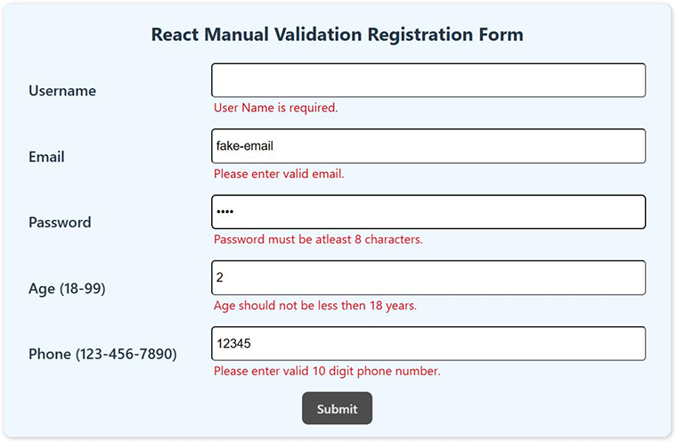
As a Laravel developer, you're familiar with the importance of server-side validation. Client-side validation doesn't replace it but acts as the first line of defense, creating a much better user experience by providing instant feedback without needing a round-trip to the server.
1. The Core Strategy: Validation on Submission
The most straightforward approach is to validate all inputs when the user clicks the "Submit" button.
Here's the workflow:
- Create a new state variable, typically an object, to hold any validation errors.
- In your
handleSubmitfunction, before you do anything with the form data, call a dedicatedvalidatefunction. - This
validatefunction will check the current form values against your rules and return an object of errors. For example,{ email: "Email is not valid", password: "Password is too short" }. - If the returned errors object has any properties, you update the errors state and stop the submission.
- If the errors object is empty, it means the form is valid! You can clear any old errors and proceed with submitting the data.
This video provides a clear walkthrough of this exact pattern.
Form Validation using React | React Forms Handling & Validation Tutorial | React Sign up Form
Watch this segment from the video "Form Validation using React" by Dipesh Malvia. It demonstrates how to create a validate function and use its output to manage an errors state object.
Watch from 10:30 to 16:44. Focus on these key points: How a separate validate function is created to check the form values. How it returns an errors object. How setErrors is called in the handleSubmit function. How conditional rendering ({errors.username && ...}) is used in the JSX to display the error messages.
Let's integrate this logic into the form example from our last lesson.
import { useState } from 'react';

function ValidatedContactForm() {
  const [name, setName] = useState('');
  const [email, setEmail] = useState('');
  // 1. Add state to hold error messages
  const [errors, setErrors] = useState({});

  const validate = () => {
    const newErrors = {};
    if (!name) {
      newErrors.name = 'Name is required';
    }
    if (!email) {
      newErrors.email = 'Email is required';
    } else if (!/\S+@\S+\.\S+/.test(email)) {
      // A simple regex for email format
      newErrors.email = 'Email format is invalid';
    }
    return newErrors;
  };

  const handleSubmit = (event) => {
    event.preventDefault();

    // 2. Validate the form first
    const validationErrors = validate();
    if (Object.keys(validationErrors).length > 0) {
      setErrors(validationErrors);
      return; // Stop the submission
    }

    // If validation passes, proceed
    const formData = { name, email };
    console.log("Form Data Submitted:", formData);
    alert(`Thank you, ${formData.name}!`);

    // Clear form and errors
    setName('');
    setEmail('');
    setErrors({});
  };

  return (
    <form onSubmit={handleSubmit}>
      <div>
        <label>Name:</label>
        <input
          type="text"
          value={name}
          onChange={(e) => setName(e.target.value)}
        />
        {/* 3. Display the error message */}
        {errors.name && <p style={{ color: 'red' }}>{errors.name}</p>}
      </div>
      <div>
        <label>Email:</label>
        <input
          type="text"
          value={email}
          onChange={(e) => setEmail(e.target.value)}
        />
        {errors.email && <p style={{ color: 'red' }}>{errors.email}</p>}
      </div>
      <button type="submit">Send</button>
    </form>
  );
}
This pattern is robust and gives you full control over your validation logic in JavaScript.
2. A More Declarative Way: Using HTML5 Attributes
While the JavaScript approach works well, you can often achieve the same result with less code by leveraging built-in HTML5 validation attributes directly on your <input> elements.
Common attributes include:
required: Specifies that the field must be filled out.type="email"ortype="url": The browser checks for a valid format.minLengthandmaxLength: Enforces string length.pattern: Allows you to provide a regular expression for the value to match.
This approach is more declarative—you're describing what the validation rules are in your JSX, rather than how to check them in JavaScript.
The following video demonstrates this technique effectively, showing how to enforce complex rules like password strength and matching passwords using only attributes and CSS.
BEST Ways to Handle and Validate React Forms without a Library
Now watch this clip from "BEST Ways to Handle and Validate React Forms without a Library" by Lama Dev. It shows how powerful the required and pattern attributes can be.
Watch from 27:23 to 33:44. Pay close attention to: How the required attribute works. How a pattern attribute is used with a regular expression (regex) to validate a username. How another regex is used for password complexity. A clever trick to validate that the 'Confirm Password' field matches the 'Password' field by dynamically setting its pattern.
When using HTML5 validation, you can style invalid inputs using the :invalid CSS pseudo-class. This allows you to add a red border or show an associated error message automatically when the input's value doesn't meet the rules.
Here's an example of how you might style this in a separate CSS file:
/* Style for the input when it's invalid */
input:invalid {
  border-color: red;
}

/* Initially hide error messages */
.error-message {
  display: none;
  color: red;
  font-size: 0.8rem;
}

/* Show the error message ONLY when the associated input is invalid */
input:invalid ~ .error-message {
  display: block;
}
And the corresponding JSX:
<div>
  <label>Email:</label>
  <input
    type="email" // Browser checks for email format
    required    // Browser checks that it's not empty
  />
  <span className="error-message">Please enter a valid email address.</span>
</div>
This combination is very powerful for simple, real-time validation without writing complex state logic.
3. Improving UX: Validating on Blur
Showing errors only on submission is good. Showing them instantly with HTML5 attributes is better. But the best user experience often involves showing an error only after a user has finished typing in a field and moved away from it. This prevents yelling "Error!" at them while they are still in the middle of typing.
The onBlur event is perfect for this. It fires whenever an input element loses focus.
The final video clip shows a professional pattern for implementing this. It uses a focused state for each input to track if the user has interacted with it. An error is only shown if the field is invalid and the user has "blurred" away from it.
BEST Ways to Handle and Validate React Forms without a Library
This last clip from the Lama Dev video demonstrates an advanced but highly effective UX pattern using the onBlur event.
Watch from 33:49 to 38:50. The core idea is: A new focused state is added to each input, initially false. onBlur is used to set that input's focused state to true. The CSS is updated to only show an error message if the input is both :invalid and has a focused='true' attribute.
This onBlur technique, combined with HTML5 attributes, provides a highly responsive and user-friendly validation experience without relying on a library.
Conclusion
You now have a powerful toolkit for validating forms in React.
Key Takeaways:
- Validation is Key: Client-side validation is essential for good user experience and preventing bad data from reaching your server.
- Two Main Strategies:
- On Submit (JavaScript-driven): Create a
validatefunction and anerrorsstate object. This gives you maximum control and is great for complex, interdependent rules. - Declarative (HTML5-driven): Use attributes like
requiredandpatterndirectly in your JSX for simpler, browser-handled validation.
- On Submit (JavaScript-driven): Create a
- Display Errors Clearly: Use conditional rendering to show error messages from your
errorsstate, or use CSS selectors like:invalidto show messages tied to HTML5 validation. - Enhance UX with
onBlur: For the most professional feel, trigger validation when a user leaves a field (onBlur) to avoid showing errors prematurely.
Preview of Next Lesson:
In all our examples so far, the form's state has been managed entirely within the form component itself. But what happens when other components need access to that data before submission? For example, showing a live preview of the form data elsewhere on the page. In our next lesson, we will learn how to lift state up to a common ancestor to share data between sibling components, a fundamental pattern for managing state in larger React applications.