Introduction
In our last lesson, you built a professional, user-friendly social media template in Photoshop/Photopea. You learned how Smart Objects and disciplined layer organization are key to creating a valuable digital product. That template was for a standard square post (1:1 aspect ratio), which is a great starting point.
However, the social media landscape is a multi-format environment. A design optimized for an Instagram grid post will be poorly cropped or have black bars in a vertical format like a Story or a Reel. Today's lesson is about solving that problem. The goal is to adapt a primary social media template for multiple platform dimensions (e.g., post, story, reel cover).
We will cover the strategies and tools needed to efficiently create a cohesive set of templates for various platforms, turning a single design into a versatile product pack. We'll explore two powerful workflows: using Artboards in Photoshop/Photopea for direct adaptation, and using nested Auto Layout in Figma for building truly responsive designs from the ground up.
1. Know Your Canvas: Dimensions and Safe Zones
Before you can adapt a design, you need to know what you're adapting it to. Different platforms and placements have different required dimensions and aspect ratios. Simply scaling your 1080x1080px design to 1080x1920px will stretch and distort it. The art is in recomposing the elements to fit the new canvas gracefully.
To get a handle on the most common sizes, let's consult a professional guide.
Social Media Image Sizes: A Practical Guide for Professionals
This guide from Imagine.art is a clear, up-to-date reference for social media image sizes. It's the kind of resource you'll want to bookmark.
Read the sections 'Key Concepts', 'Platform-Wise Social Media Image Sizes' (focus on Instagram and Facebook), and 'Best Practices for Scaling Designs'. Pay close attention to the distinction between dimensions and aspect ratios, and the advice on designing for vertical formats first.
As the guide mentions, it's not just about the size of the canvas, but also about the "chrome"—the user interface elements that sit on top of your design. Text, logos, or calls-to-action placed too close to the edge might be covered by a profile name, a like button, or a caption. This is where safe zones become critical.
Take a look at these two excellent visual guides for Instagram and TikTok.

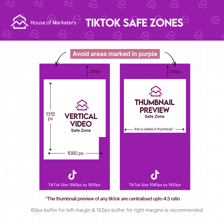
Your key takeaway here is: Your design must live within the safe zones. The area outside is for non-essential background elements only.
2. The Photoshop/Photopea Workflow: Artboards
In the last lesson, you created a single .psd file. To create variations, you could Save As... and create separate files, but that's inefficient. A much better way is to use Artboards, which let you manage multiple canvases within a single document. This is perfect for creating a social media template pack.
Let's see this workflow in action.
Use Artboards in Photoshop CC to Create Social Media Campaigns and More
This tutorial by Joseph Brewster provides a concise and practical guide to using Artboards in Photoshop for a social media campaign. The principles apply directly to adapting your template.
Watch from 03:08 to 10:14. Focus on these key steps: Creating New Artboards: See how he uses the Artboard tool to add new canvases next to the original. Setting Dimensions: Notice how he sets the new artboard to a square (1080x1080) and portrait size. Duplicating and Adapting: Observe how he duplicates the layers from the first design and rearranges them to fit the new dimensions. Batch Exporting: The final step shows the real power of Artboards—exporting all your sizes at once, perfectly named.
This workflow maintains the power of your Smart Objects. When you duplicate your Smart Object layer to a new artboard, it's still linked to the same source. If a user updates the image in the Smart Object, it will update across all artboards where it's used.
Your Turn: Adapt Your Template (Photoshop/Photopea)
Now, let's put this into practice.
Assignment (15-20 minutes):
- Open the square social media template
.psdfile you created in the last lesson in Photoshop or Photopea. - Use the Artboard Tool to add a new artboard. (In Photoshop, if your document doesn't use artboards yet, you may need to go to the Layers panel, right-click your layer group, and choose
Artboard from Group...). - Set the dimensions of the new artboard to 1080 x 1920 px (a standard Story/Reel size). Give it a descriptive name, like "Story - 9:16".
- Duplicate the layer group containing your design from the square artboard to your new story artboard.
- Rearrange the elements (your Smart Object placeholder, text layers, brand elements) to create a visually pleasing composition for the new vertical aspect ratio. Remember the safe zones! Keep key content away from the extreme top and bottom.
- Bonus: Create a third artboard for a portrait post, 1080 x 1350 px (4:5 aspect ratio), and adapt the design again.
3. The Figma Workflow: Systematic and Responsive Design
While Artboards are great for manually adapting a design, Figma allows for a more systematic approach that aligns with your preference for rule-based frameworks. By using nested Auto Layout, you can build a component that responds to changes in its frame size.
The goal isn't just to rearrange elements for one new size, but to define the relationships between elements so they reflow intelligently.
Figma Auto Layout Tutorial for Beginners
This tutorial from Aliena Cai is a great refresher on the fundamentals of Auto Layout. It's the foundation for building adaptable designs.
Quickly review the concepts from 03:04 to 04:52 and 06:49 to 07:58. Pay special attention to: Sizing: The difference between 'Hug' and setting a fixed size. Alignment & Padding: How to control the internal spacing. Nesting: The key idea that you need multiple layers of Auto Layout to build complex components.
The concept of nesting Auto Layout frames is the most important part. You don't apply one giant Auto Layout to everything. You group related items (like a title and subtitle), apply Auto Layout, and then nest that frame inside a larger one.
This Figma Learn article provides an excellent, detailed walkthrough of this exact process.
Combine vertical, horizontal, and grid auto layout flows
This official Figma article demonstrates precisely how to create a complex, responsive social media post by nesting vertical and horizontal auto layout frames.
Read the introduction and the section 'Nest vertical and horizontal flows'. Follow the breakdown of the social media newsfeed example. See how they build from the inside out: first the 'Author and date' (vertical), then the 'Profile' (horizontal), then the full 'Post' (vertical). This is the systematic approach you're looking for.
In this Figma workflow, you would build your square template with robust, nested Auto Layouts. Then, to create a story version, you could duplicate the component, change its dimensions, and watch the content reflow based on the rules you set (e.g., 'Hug' vs. 'Fill container'). It requires more planning upfront but offers unparalleled flexibility.
Conclusion
You now have two powerful, professional methods for taking a single design concept and expanding it into a full suite of templates. This skill is essential for creating marketable digital products that meet the real-world needs of content creators.
Key Takeaways:
- One Size Does Not Fit All: Always adapt your designs for the specific dimensions, aspect ratios, and safe zones of each platform and placement.
- Artboards for Efficiency: In Photoshop and Photopea, use Artboards to manage, adapt, and batch-export multiple template sizes from a single file.
- Auto Layout for Responsiveness: In Figma, use nested Auto Layout to create intelligent, rule-based components that can adapt to different dimensions with minimal manual adjustment. This is a "design once, resize anywhere" philosophy.
- Design for Safe Zones: The most beautiful design is useless if its key message is hidden behind a UI button. Always keep your core content within the central safe area.
Preview of the Next Lesson
So far, we've focused on creating the visual assets for a digital brand. You have a brand identity, a design system, and a set of flexible templates. But what content do you put in them? And how do you manage your ideas and workflow? In our next lesson, "Build a functional Notion database with custom properties," we will shift gears and begin building the 'homebase' for your business, creating a structured system to manage your projects, content, and ideas.