Introduction
Welcome back! In our last lesson, you successfully established a robust and organized photo catalog, which is the professional foundation for any photography-based work. You now understand the principles of non-destructive editing and how to manage your photo library using both physical folders and virtual collections in either Lightroom or Darktable.
Today, we move from organizing to editing. This lesson focuses on the first and most important step in developing a photo's look: making foundational adjustments. These are the core edits that correct and balance the overall color and tone of an image. Mastering them is essential because they form the base upon which all stylistic choices, including the presets we aim to create, are built.
Our learning outcome is to perform foundational edits by adjusting exposure, contrast, and white balance in the Basic panel. We will focus on Adobe Lightroom, since you have access to it, and its powerful, systematic tools that will allow you to achieve consistent, professional results.
1. The Anatomy of the Basic Panel
In Lightroom's Develop module, the Basic panel is your primary toolset. All foundational editing starts here. It's logically divided into three sections: White Balance (WB), Tone, and Presence. For this lesson, we will master the first two.

2. Correcting Color with White Balance
The first step in any edit is to ensure the colors are accurate. "White balance" refers to the process of removing unrealistic color casts, so that objects which appear white in person are rendered white in your photo. This is controlled by two sliders:
- Temp: Adjusts the color temperature along a blue-to-yellow axis. Moving it left makes the image cooler (bluer), and moving right makes it warmer (yellower).
- Tint: Adjusts the color along a green-to-magenta axis. This is used to fine-tune the temperature adjustment.
For a systematic approach, Lightroom provides an Eyedropper tool. You can click on an area in your photo that is supposed to be a neutral grey or white, and Lightroom will automatically adjust the Temp and Tint sliders to neutralize any color cast.
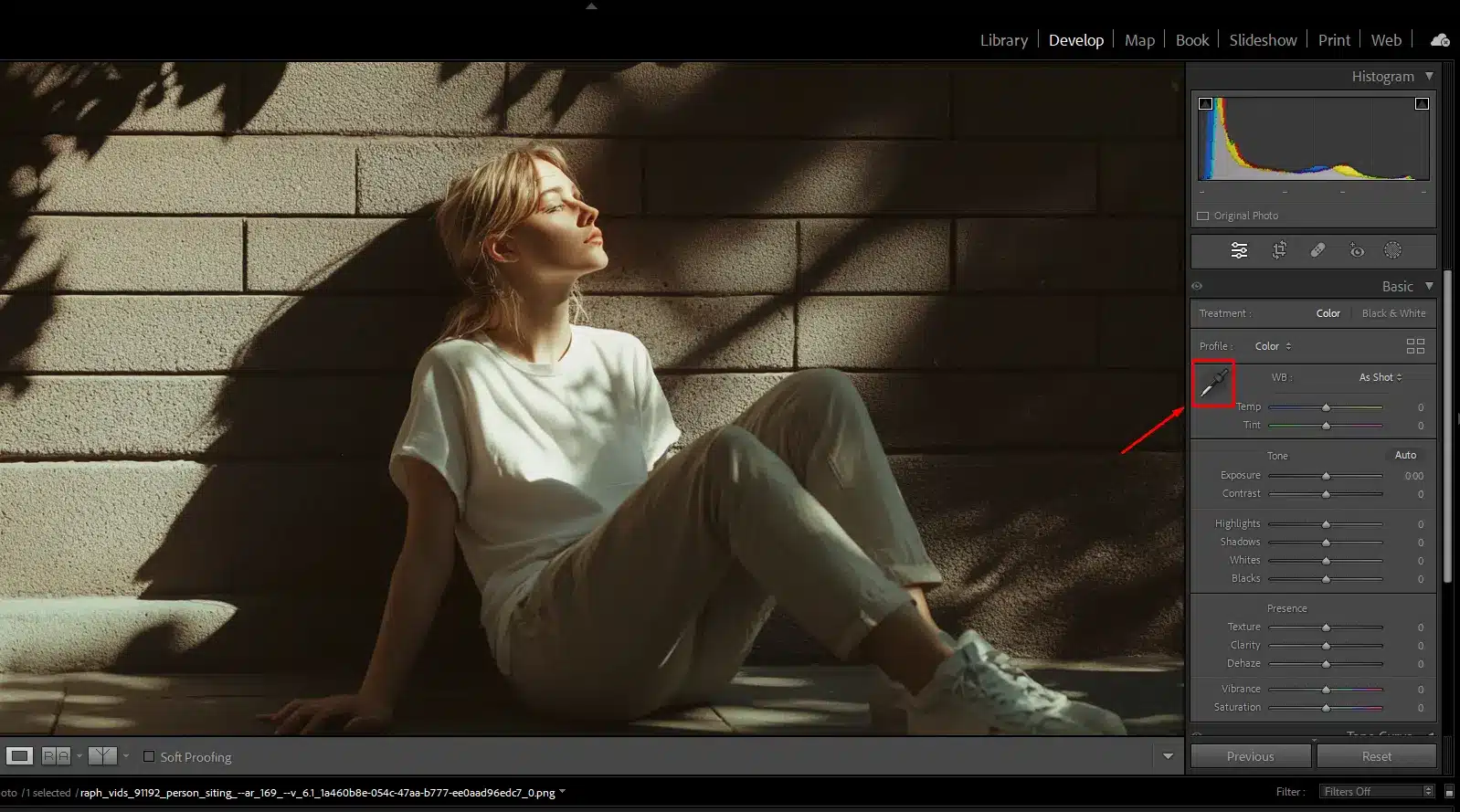
To see these tools in action and understand how to use them, watch this first segment from a detailed guide by Photo Feaver.
MASTER Lightroom Classic | How To Use The BASIC PANEL In Adobe Lightroom
This video, 'MASTER Lightroom Classic | How To Use The BASIC PANEL', provides an excellent overview. We'll start with the section on white balance.
Watch the segment from 05:16 to 08:23. Pay close attention to the three methods for adjusting white balance: using presets, manually adjusting the Temp/Tint sliders, and using the eyedropper for a precise, neutral correction.
3. Understanding Tone with the Histogram
Before you touch the tone sliders, you must understand your primary guide: the Histogram. The histogram is a graph that visually represents the tonal distribution of your image.
- The horizontal axis represents the brightness levels, from pure black on the far left to pure white on the far right.
- The vertical axis represents the number of pixels at each brightness level.
Reading the histogram allows you to objectively assess an image's exposure without being fooled by the brightness of your monitor or the ambient light in your room.
For a concise, professional explanation of how to read a histogram, please watch this clip from Adobe expert Julieanne Kost.
Using the Basic Panel and Histogram to Adjust Exposure and Contrast in Lightroom Classic
In this video, 'Using the Basic Panel and Histogram,' Julieanne Kost clearly explains how to interpret the histogram for different types of images.
Watch from 00:30 to 01:39. Notice how different images (low-key, high-key, mid-tone) produce distinctly shaped histograms. There is no single 'correct' shape; it is simply a data representation of your image's tones.
Clipping Warnings
A critical feature related to the histogram is clipping warnings. Clipping occurs when you push the tones to pure black or pure white, losing all detail in those areas.
- Shadow Clipping: Areas that have become pure black with no detail. Lightroom can show these as a blue overlay.
- Highlight Clipping: Areas that have become pure white with no detail. Lightroom can show these as a red overlay.
You can toggle these warnings by clicking the small triangles at the top corners of the histogram panel or by pressing the J key on your keyboard.
4. The Six Tone Sliders
The Tone section of the Basic panel gives you precise control over the tonal range of your image. While the Photo Feaver video provides a great visual demonstration, the following article offers an incredibly systematic and detailed breakdown of what each slider does and how it affects the histogram.
Master Lightroom's Tone Controls to Perfect Exposure, Contrast, and ...
The article 'Master Lightroom's Tone Controls' by Jos Buurmans is one of the best resources for understanding these sliders from a technical perspective. We'll focus on the core explanations.
First, quickly read the section 'The Histogram' for a text-based recap. Then, read 'The Tone Controls Explained' section in detail. It breaks down each of the main sliders: Exposure, Highlights, Shadows, Whites, and Blacks. Pay special attention to the pro tip: Hold Alt/Option while dragging the Whites or Blacks sliders to get a live view of clipping.
To see these sliders being adjusted in a real-world example, let's return to the Photo Feaver video.
MASTER Lightroom Classic | How To Use The BASIC PANEL In Adobe Lightroom
Now, let's watch the tone sliders being used to edit a landscape photo.
Watch the segment from 08:23 to 14:14. The narrator walks through adjusting Exposure, Contrast, Highlights, Shadows, Whites, and Blacks, all while referencing the histogram. This provides a practical demonstration of the concepts from the article.
Your Turn: Perform Your First Foundational Edit (25 minutes)
It's time to apply this knowledge. Open Lightroom and select one of the photos you imported in the previous lesson. We will follow a systematic workflow to apply a foundational edit.
- Analyze Your Image: Look at your photo and its histogram. Is it generally dark (histogram bunched to the left), bright (bunched to the right), or high-contrast (bunched at both ends with a dip in the middle)?
- Correct White Balance: Use the eyedropper tool to click on a neutral gray or white area in your photo. If there are no neutral areas, adjust the Temp and Tint sliders manually until the colors look natural.
- Set Tonal Range (White & Black Points):
- Hold down the Option (Mac) or Alt (Windows) key and begin dragging the Whites slider to the right. Stop just before you see significant color patches appear (this indicates highlight clipping).
- Hold down the Option/Alt key and drag the Blacks slider to the left. Stop just before large areas of color appear (this indicates shadow clipping). This sets the dynamic range of your photo.
- Adjust Overall Brightness: Adjust the Exposure slider so the main subject of your photo is correctly exposed. The middle of the histogram should shift left or right.
- Recover Detail:
- If any bright areas (like a sky) lack detail, drag the Highlights slider to the left to recover them.
- If any dark areas are too dark, drag the Shadows slider to the right to reveal detail.
- Adjust Contrast: Finally, make a small adjustment to the Contrast slider to add or reduce punch as desired.
To help you, the article we read earlier has excellent case studies.
Master Lightroom's Tone Controls to Perfect Exposure, Contrast, and ...
Refer back to the 'Master Lightroom's Tone Controls' article. The author provides step-by-step instructions for different scenarios.
Find the section titled 'Common Exposure Challenges.' Based on your analysis in step 1, follow the guide for either a 'Well-Exposed,' 'Underexposed,' 'Overexposed,' or 'High Contrast' image. Compare your adjustments to the settings shown in the article's examples.
Press the \ (backslash) key to toggle between the before and after states of your image. You should see a significant improvement in balance and clarity.
Conclusion
Congratulations, you've just completed the most fundamental and impactful stage of photo editing. By applying a systematic, data-driven approach, you can now correct any image to have a balanced and professional look.
Key Takeaways:
- The Basic panel is your starting point for all edits, divided into White Balance, Tone, and Presence.
- White Balance (
TempandTint) is adjusted first to ensure accurate color representation. The eyedropper is your most efficient tool for this. - The Histogram is an objective graph of your image's tonal data. Use it to diagnose exposure issues and guide your adjustments.
- The six Tone sliders provide precise control over the entire brightness range of your image.
- A professional workflow involves setting the white and black points first to establish the full tonal range, then adjusting exposure, and finally recovering detail with highlights and shadows.
Preview of the Next Lesson
You now have a perfectly balanced, "correct" image. This is the ideal canvas. In our next lesson, we will build upon this foundation to create a specific style. The learning outcome will be: "Manipulate individual colors in an image to achieve a specific style using the HSL/Color panel." This is where you'll start to shift hues, change saturation, and truly begin crafting the signature look for your first preset.