Introduction
Welcome back! In the last lesson, you mastered the Pen tool, giving you the power to draw any precise vector shape you can imagine. We focused on creating clean, efficient paths—the skeleton of any great vector illustration. But a skeleton is just the beginning.
Today, we're going to put flesh on those bones. Our goal is to apply multi-step gradients and strokes to create depth and visual interest in your vector artwork. We'll move beyond flat colors and learn how to simulate light, shadow, and dimension, transforming your shapes from simple outlines into compelling, three-dimensional-looking objects.
Take a look at the difference this can make. On the left is a flat icon; on the right is the same icon with gradients applied. That's the power we're unlocking today.
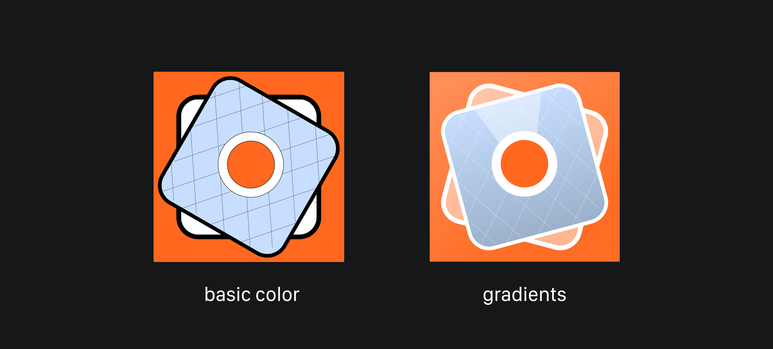
By the end of this lesson, you'll have a systematic toolkit for adding professional-level shading and style to your vector designs in Illustrator or Figma.
1. The Principle: Gradients as Simulated Light
Before we jump into the tools, it's crucial to understand why gradients work. The core principle is simple: gradients create the illusion of depth by mimicking how light behaves in the real world. Where light hits an object directly, we see highlights. Where light is blocked, we see shadows. The smooth transition between these areas is what our brain interprets as a curved or three-dimensional surface.
To build a solid foundation, let's explore this concept a bit further.
The Complete Guide to Color Gradient Design
The article 'The Complete Guide to Color Gradient Design' provides a concise explanation of how gradients relate to light and the basic types designers use to simulate it.
Please read the following sections: "What is color gradient..." and "The science behind color gradient perception" to understand the basic definition. "Creating depth through light simulation" to see how linear and radial gradients mimic different kinds of light sources. Focus on the idea that gradients are a tool to simulate light, form, and depth.
As the article explains, different gradient types simulate different lighting scenarios:
- Linear Gradients: Mimic a directional light source, like the sun lighting a flat wall.
- Radial Gradients: Simulate a focused light source, like a spotlight or the way light falls on a sphere.
By understanding this principle, you can move from randomly applying gradients to making intentional choices that add realism and focus to your work.
2. Technique 1: Building Depth with Layers, Gradients, and Blend Modes
The most powerful way to create depth isn't with a single, complex gradient. Instead, professionals build up layers of simple gradients, using blend modes to control how they interact. The two most important blend modes for this are:
- Multiply: Darkens the colors below it. Perfect for creating shadows.
- Screen: Lightens the colors below it. Perfect for creating highlights.
Let's see this in action with a clear, concise example.
3 Tricks Pro Designers Use For Depth in Adobe Illustrator
The YouTube channel Dansky has a great video showing a clean, systematic way to add shadows to a flat geometric logo using this exact technique.
Watch from 02:53 to 06:10. Pay close attention to the workflow: He draws a separate shape for the shadow. He applies a black-to-transparent linear gradient to this shape. He sets the shape's blend mode to Multiply and lowers the opacity. He uses a clever rotation trick to duplicate the shadow efficiently.
This workflow is your new best friend for adding simple, clean shadows. Now, let's explore how to apply this concept—and a few more advanced variations—to create more complex, organic shading.
Advanced Shading in Adobe Illustrator Using Layered Shapes, Blend Modes & Gradients - File Deep Dive
This video from Vector Art Academy dives deep into a layered shading process. We'll watch a few key parts that demonstrate how to combine gradients, feathering, and blend modes for a rich, textured result.
Please watch the following segments: Creating Directional Shadows (08:48 - 10:55): This part is crucial. Notice how she uses a shape with a linear gradient that fades to 0% opacity, sets the blend mode to Multiply, and adds a Feather effect to soften the edges. This creates a beautiful, soft shadow. Creating Highlights (11:38 - 13:36): Here, she demonstrates the opposite technique for highlights. She uses shapes filled with radial and freeform gradients, but this time sets the blend mode to Screen to make them pop. The freeform gradient is a powerful tool in Illustrator for placing highlights with pinpoint precision.
This layered approach gives you incredible control. You're no longer just shading an object; you're sculpting it with light and shadow, one layer at a time.
3. Technique 2: Applying Gradients to Strokes
Gradients aren't limited to the fill of an object. Applying them to strokes is an excellent way to add visual flair, create metallic or glowing effects, or simply make your outlines more interesting than a solid color.
The process is straightforward in both Illustrator and Figma. Instead of selecting a solid color for your stroke, you select the gradient option and configure it just as you would for a fill.
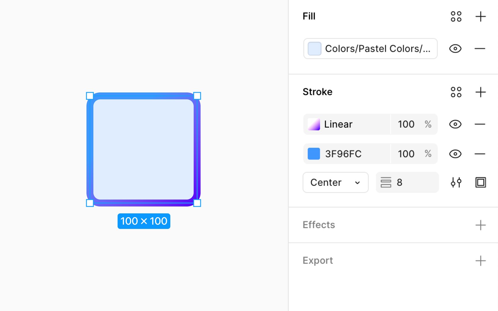
You can apply linear, radial, or angular gradients to strokes. This technique is particularly effective for:
- Icons: Giving a simple icon a metallic or vibrant outline.
- Typography: Adding a unique effect to large display text.
- UI Elements: Making buttons or containers stand out.
4. Your Turn: Practice Exercise
Theory is one thing, but muscle memory is built through practice. Let's apply these techniques.
Task: Shade a Sphere
- Open Illustrator or Figma and create a perfect circle. Fill it with a mid-tone color of your choice (e.g., a medium blue, grey, or green).
- Imagine a light source positioned at the top-right.
- Create the Shadow:
- Duplicate the circle (
Ctrl/Cmd + C, thenCtrl/Cmd + Fto paste in front). - Fill the new circle with a radial gradient. The center of the gradient should be your base color, and the outer edge should be a darker shade of that color.
- Set this circle's blend mode to Multiply and lower the opacity to around 50-70%.
- Using the Gradient Tool, move the center of the radial gradient to the bottom-left of the circle, opposite your light source.
- Duplicate the circle (
- Create the Highlight:
- Duplicate the original circle again and paste it in front.
- Fill this new circle with a radial gradient. The center should be a very light version of your base color (or pure white), and the outer edge should be your base color at 0% opacity.
- Set this circle's blend mode to Screen.
- Using the Gradient Tool, move and scale the gradient to create a small, soft highlight at the top-right of the circle, where the light hits directly.
- (Optional) Add a Gradient Stroke: Select the original circle and apply a two-color linear gradient to its stroke to see how it affects the final look.
By completing this exercise, you will have replicated the basic physics of light on a simple object, which is the foundation of all realistic shading.
Conclusion
Today you've made a significant leap from drawing flat shapes to creating artwork with depth and life. You've learned that adding dimension isn't about artistic magic, but about a systematic application of light and shadow principles.
Key Takeaways:
- Gradients create depth by simulating the way light falls on an object.
- The most effective shading is built by layering multiple shapes and gradients.
- Use the Multiply blend mode for shadows and the Screen blend mode for highlights.
- Combining gradients with effects like Feather creates soft, realistic transitions.
- Gradients can be applied to both fills and strokes to add visual interest.
Preview of the Next Lesson:
You can now create and shade individual vector objects. But what if you need an element that repeats infinitely? In our next lesson, we'll cover how to create seamless, scalable patterns using transform and blend tools. This will add another essential type of asset to your digital product toolkit.