Hello! Welcome back to our module on Advanced Theming & Performance Optimization.
In our last lesson, we established why performance is a cornerstone of a successful e-commerce site, linking it directly to conversion, loyalty, and SEO. We also defined how performance is measured with Google's Core Web Vitals: LCP (loading), INP (interactivity), and CLS (visual stability).
This lesson directly builds on that foundation. We will now move from the "why" to the "how," focusing on one of the most impactful areas for theme performance. You will learn to optimize image loading using lazy loading techniques and responsive image attributes.
Images are often the heaviest assets on a page and are frequently the Largest Contentful Paint (LCP) element. They can also be a primary cause of Cumulative Layout Shift (CLS). Mastering how to handle them efficiently is a critical skill for any Shopify theme developer. Your background in web development will be a great asset here, as we'll be diving into HTML attributes and browser behavior, but framing it all within the powerful context of Shopify's Liquid image_tag.
1. The Golden Rule: Above the Fold vs. Below the Fold
The most important principle in image optimization is understanding an image's position on the page. Does it appear in the initial, visible part of the screen (above the fold), or does the user need to scroll to see it (below the fold)? The answer determines our loading strategy.
- Above-the-fold images: These are critical. They should load as quickly as possible. We want to load them eagerly.
- Below-the-fold images: These are not immediately needed. We can defer loading them until the user scrolls near them. This is called lazy loading.
The native HTML loading attribute on an <img> tag gives us direct control over this:
loading="eager": (Default behavior) Tells the browser to load the image immediately.loading="lazy": Tells the browser to defer loading the image until it's about to enter the viewport.
Let's start by reading two short but crucial articles from Shopify's performance team that explain this concept and a common pitfall.
Lazy load images for performance
First, let's understand the basics of lazy loading and its main 'gotcha'. This article, 'Lazy load images for performance,' provides a clear definition and highlights the most important rule.
Read the sections 'What is lazy-loading?', 'How does it work?', and 'Are there any gotchas?'. Focus on understanding what loading="lazy" does and, critically, when you should not use it.
Optimizing images for performance on Shopify
Now, let's see the real-world impact of misusing lazy loading. This second article, 'Optimizing images for performance on Shopify', presents data on how often this mistake is made on Shopify stores and its effect on LCP.
Read the section 'Images and LCP', focusing on the 'Lazy vs eager loading' subsection. Pay attention to the histogram chart and the statistic about how many Shopify pages lazy-load their LCP image.
As you've read, the single biggest mistake you can make is to lazy-load an image that is above the fold, especially the LCP element. It delays the discovery and loading of the most important visual content on the page, significantly worsening the user's perceived loading speed.
Implementing Conditional Loading in Shopify
So, how do we apply this rule in a dynamic Shopify theme where sections can be moved around? We use Liquid's section.index (for sections on the homepage) or forloop.index (for items in a grid) to make an informed guess about the image's position.
For example, we can assume the first section (section.index == 1) is always above the fold. Or in a four-column product grid, we can assume the first four products are visible on load.
Here's how you'd implement that using Shopify's image_tag filter, which we will explore in more detail shortly:
{%- comment -%}
  Assume a 4-column grid. We eagerly load the first row (4 items)
  and lazy load the rest.
{%- endcomment -%}

{% for product in collection.products %}
  {%- liquid
    if forloop.index <= 4
      assign loading_strategy = "eager"
    else
      assign loading_strategy = "lazy"
    endif
  -%}

  {{ product.featured_image
    | image_url: width: 400
    | image_tag: loading: loading_strategy, class: 'product-grid-image'
  }}
{% endfor %}
2. Responsive Images: Serving the Right Size for the Right Screen
Lazy loading solves when an image loads, but it doesn't solve another major problem: loading an image that's too large for the user's screen. Sending a 2000px wide hero image to a mobile phone with a 400px wide screen wastes data and slows down the page.
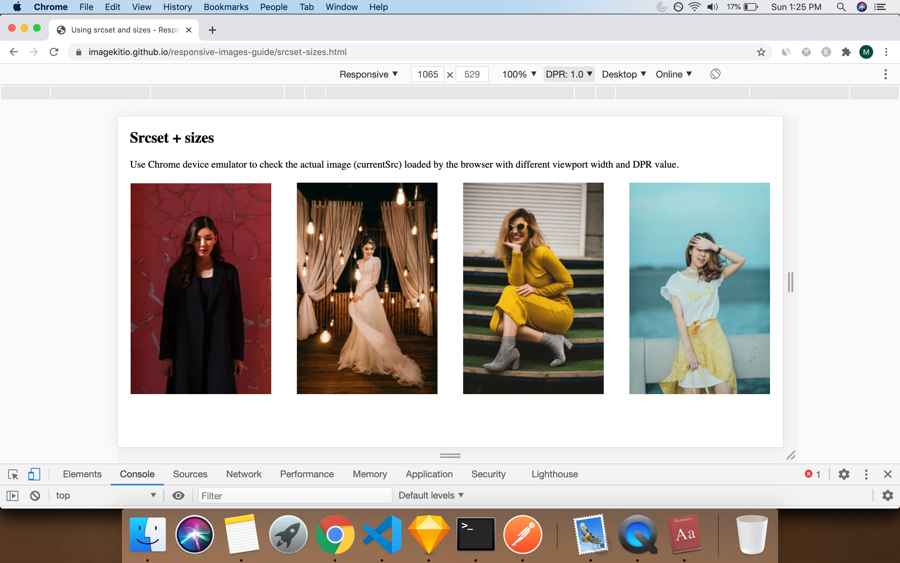
The solution is to provide the browser with a set of different-sized versions of the same image and let it choose the most appropriate one. This is achieved using the srcset and sizes attributes on the <img> tag.
This video gives a fantastic technical breakdown of how these attributes work together. Given your background, you'll find this deep-dive into browser mechanics insightful.
Make Your Site Lightning Fast With Responsive Images
The video 'Make Your Site Lightning Fast With Responsive Images' by Web Dev Simplified provides an excellent explanation of the srcset and sizes attributes.
Please watch from 01:28 to 10:08. This covers: srcset with w descriptors (01:28 - 06:36): How to provide the browser with a menu of image sizes. sizes (06:36 - 10:08): How to give the browser the crucial hint it needs to choose from that menu.
To summarize the core concepts from the video:
srcset: This attribute provides a comma-separated list of image sources and their actual widths (e.g.,small.jpg 400w, medium.jpg 800w, large.jpg 1600w).sizes: This attribute tells the browser how wide the image will be rendered relative to the viewport. It can include media queries (e.g.,(max-width: 800px) 100vw, 800px). This gives the browser the context it needs to download the smallest possible image fromsrcsetthat is still large enough to look sharp.
The Shopify Magic: image_tag Does the Hard Work
Manually creating all those image versions and writing the complex srcset and sizes attributes would be incredibly tedious. This is where Shopify's tooling shines.
When you use the image_url filter with a width parameter, and then pipe it to the image_tag filter, Shopify automatically generates the srcset and sizes attributes for you.
Let's look at the image_tag from our previous example:
{{ product.featured_image
  | image_url: width: 400
  | image_tag: loading: 'lazy'
}}
This simple line of Liquid might generate HTML that looks something like this:
<img
  src="//cdn.shopify.com/.../product.jpg?width=400"
  loading="lazy"
  width="800"
  height="800"
  srcset="//cdn.shopify.com/.../product.jpg?width=200 200w,
          //cdn.shopify.com/.../product.jpg?width=400 400w,
          //cdn.shopify.com/.../product.jpg?width=600 600w,
          //cdn.shopify.com/.../product.jpg?width=800 800w"
  sizes="(max-width: 750px) calc(100vw - 30px), 400px"
>
Note: The generated sizes attribute is a sophisticated default. You can also pass your own sizes attribute to the image_tag for more granular control if needed.
This is a massive productivity boost and a core reason to always use Shopify's built-in image filters.
Test your understanding!
You are building a custom section for a blog post. The template has a main hero image at the top and a gallery of smaller images throughout the article body.
- What value should the
loadingattribute have for the main hero image? - What value should the
loadingattribute have for the gallery images in the article body? - Which Liquid filter is essential for ensuring these images are responsive and don't cause layout shift?
Show answer
- The main hero image is above the fold, so it should have
loading="eager". - The gallery images are below the fold, so they should have
loading="lazy". - The
image_tagfilter is essential. It automatically addssrcsetfor responsiveness and thewidthandheightattributes to prevent layout shift (CLS).
3. Additional Optimizations and Best Practices
With conditional loading and responsive sizes handled, let's cover a few more best practices that contribute to a perfectly optimized image experience.
Preventing Layout Shift (CLS)
As mentioned in the previous lesson, CLS is often caused by images loading without their dimensions being specified. The browser doesn't know how much space to reserve, so when the image finally loads, content gets pushed around.
The fix is to always include width and height attributes on your <img> tags. Once again, the Liquid image_tag handles this automatically for you, pulling the dimensions from the original uploaded image. This single feature is a huge win for visual stability.
Next-Gen Formats (WebP & AVIF)
Modern image formats like WebP and AVIF offer superior compression compared to traditional JPEG and PNG, resulting in smaller file sizes at the same quality. Shopify's Content Delivery Network (CDN) is smart. If a user's browser supports a modern format, the CDN will automatically convert the image and serve the more efficient version (e.g., AVIF) even if you requested a JPG.

Prioritizing the LCP Image with fetchpriority
For the most critical above-the-fold image (your LCP element), you can give the browser an extra hint to download it even sooner using the fetchpriority="high" attribute. Browsers typically download images at a low priority; this attribute elevates it.
You can add this directly to your image_tag:
{{ section.settings.hero_image
  | image_url: width: 1800
  | image_tag: loading: 'eager', fetchpriority: 'high'
}}
You can read more about this in the "Fetch priority" section of the Shopify Performance blog post we looked at earlier. Use it sparingly—only for the one or two most critical images on the page.
Conclusion
Mastering image optimization is not about memorizing complex code; it's about understanding the principles and leveraging the right tools. Shopify's image_tag filter is your most powerful ally, automating many of the best practices we've discussed.
Key Takeaways:
- The Golden Rule: Eager load above-the-fold images (
loading="eager") and lazy load below-the-fold images (loading="lazy"). Use Liquid'sforloop.indexorsection.indexto implement this logic. - Let Shopify Do the Work: Always use the
image_tagfilter. It provides responsive images (srcset/sizes), prevents layout shift (width/height), and allows Shopify's CDN to serve next-gen formats (AVIF/WebP) automatically. - Prioritize the Critical Path: Give your main LCP image an extra boost with
fetchpriority="high". - Avoid Anti-Patterns: Never lazy load your LCP image.
Now that you know how to optimize one of the most significant asset types, our next lesson will turn to optimizing the code that generates the page itself. We'll explore why you should use the Liquid render tag for improved performance over the include tag, a key technique for creating faster, more modular themes.