Hello! It's great to connect with you again.
In our last lesson, you added a real-time character counter, a small but significant feature that greatly improves the user's awareness while they type. We focused on using the input event in JavaScript to create a dynamic and responsive UI element.
Today, we're taking a step back from adding new features to focus on the bigger picture: the overall look and feel of your application. This lesson addresses the learning outcome of refining the overall layout and styling for a polished user experience. We'll move beyond the default styles and apply design principles that make an application not just functional, but professional, intuitive, and enjoyable to use.
Think of it like this: so far, we've built the rooms of a house. Now, we're going to paint the walls, arrange the furniture, and set the lighting to make it feel like a home. This process is less about learning complex new code and more about applying simple, powerful tactics to elevate your design.
The Myth of "Design Talent"
Many developers feel they aren't "creative" enough to design a good-looking interface. The secret is that great UI design often relies on a set of proven principles and tactics, not just innate artistic talent.
To kick things off, let's watch the introduction to a fantastic talk by Steve Schoger, a designer who specializes in teaching these tactics to developers.
Steve Schoger | Refactoring UI | CSS Day 2019
In 'Refactoring UI', Steve introduces the idea of using tactics over talent to improve design. This sets the stage perfectly for our lesson.
Watch from 00:41 to 02:24. Notice his emphasis on making 'cosmetic changes' that have a big impact. This is exactly our goal today.
With that mindset, let's start refining your application, piece by piece.
1. Foundation: Spacing, Consistency, and Hierarchy
Before we touch colors or fonts, the most impactful changes come from structure and consistency.
Whitespace is Your Best Friend
One of the most common mistakes in beginner designs is cramming elements too closely together. Giving elements room to breathe makes your layout feel calmer, more organized, and easier to read.
A great way to approach this is to start with too much space and then reduce it.
Steve Schoger | Refactoring UI | CSS Day 2019
Steve Schoger explains a simple but powerful framework for thinking about whitespace.
Watch from 14:27 to 15:36. Pay attention to his advice on starting with generous whitespace and then pulling it back.
Your Action:
Open your style.css file. Look at the padding and margin values you're using.
- Increase the padding inside your main container (
.container) to give the whole interface more breathing room. - Ensure there's generous space between the text area, the tabs, and the results area. For example, you could add
margin-top: 20px;to your tabs container.
Create Visual Hierarchy and Consistency
Your design should guide the user's eye to the most important elements. This is called visual hierarchy. You create it using size, color, and placement. Consistency ensures that once a user learns what a button or a tab looks like, it looks the same everywhere.
The article "Boost Your Web Application's UX Design" has a great section on this.
Boost Your Web Application's UX Design
This article explains how consistency and visual grouping (using Gestalt principles like proximity and similarity) create a cohesive user experience.
Read section 5, 'Ensure Design Consistency', and the parts of section 6, 'Prioritize Readability and Accessibility', that discuss White Space and Font Size. This will reinforce the importance of a unified design.
2. A Cohesive Color Palette
Color is one of the most powerful tools for defining the mood and brand of your app. A limited, consistent color palette is key to a professional look.
How to Choose Colors? Steal!
You don't have to invent a color scheme from scratch. Look at existing websites and apps you admire for inspiration.
Steve Schoger | Refactoring UI | CSS Day 2019
Let's go back to Steve's talk, where he shares his simple, practical method for choosing colors.
Watch from 06:52 to 09:17. He mentions inspiration sites like Dribbble and the benefit of working with a constrained palette.
Pro-Tip: Saturate Your Grays
Pure gray (#808080, #ccc, etc.) can make a design feel dull and lifeless. A powerful professional trick is to saturate your grays with a hint of your primary color. If your primary color is blue, your "grays" should be slightly bluish.
Steve Schoger | Refactoring UI | CSS Day 2019
This is one of the most valuable tips in the entire talk. It will instantly make your design feel more cohesive and professional.
Watch from 33:26 to 35:28. Focus on the concept of 'adjusting the temperature' of your site by saturating grays with blue (for a cool look) or yellow/brown (for a warm look).
Your Action: Define a Color Palette with CSS Variables
Using CSS variables makes it incredibly easy to manage and apply your colors consistently. At the top of your style.css file, add a :root block to define your palette.
:root {
  --primary-color: #4A90E2; /* A nice, clear blue */
  --background-color: #F8F9FA; /* A very light, almost white gray */
  --container-bg: #FFFFFF; /* The background for your main card */
  --text-color: #212529; /* A dark, not quite black, text color */
  --text-color-subtle: #6C757D; /* A subtle, desaturated gray for secondary text */
  --border-color: #DEE2E6; /* A light border color */
}
Now, you can use these variables throughout your stylesheet. For example:body { background-color: var(--background-color); color: var(--text-color); }h1 { color: var(--primary-color); }
3. Refining Key Components
With our foundation of space and color, let's apply these ideas to the specific elements of your app.
The Main Container: Adding Depth
Your main application container likely sits on the page background. We can make it stand out and feel more tangible by adding a subtle shadow. Avoid the default, harsh box-shadow. Instead, layer multiple, soft shadows.
Steve Schoger | Refactoring UI | CSS Day 2019
This section of the 'Refactoring UI' talk is a masterclass in creating beautiful, realistic shadows.
Watch from 20:19 to 22:50. Pay close attention to how he builds a shadow from two parts: a tight, darker 'ambient' shadow and a larger, softer 'direct light' shadow.
Your Action: Apply a layered shadow to your .container class.
.container {
  /* ... other styles ... */
  background-color: var(--container-bg);
  border-radius: 8px; /* Consistent rounded corners! */
  box-shadow: 0 1px 3px rgba(0,0,0,0.1), 0 5px 15px rgba(0,0,0,0.05);
}
Tabs and Buttons: Clarity and Interaction
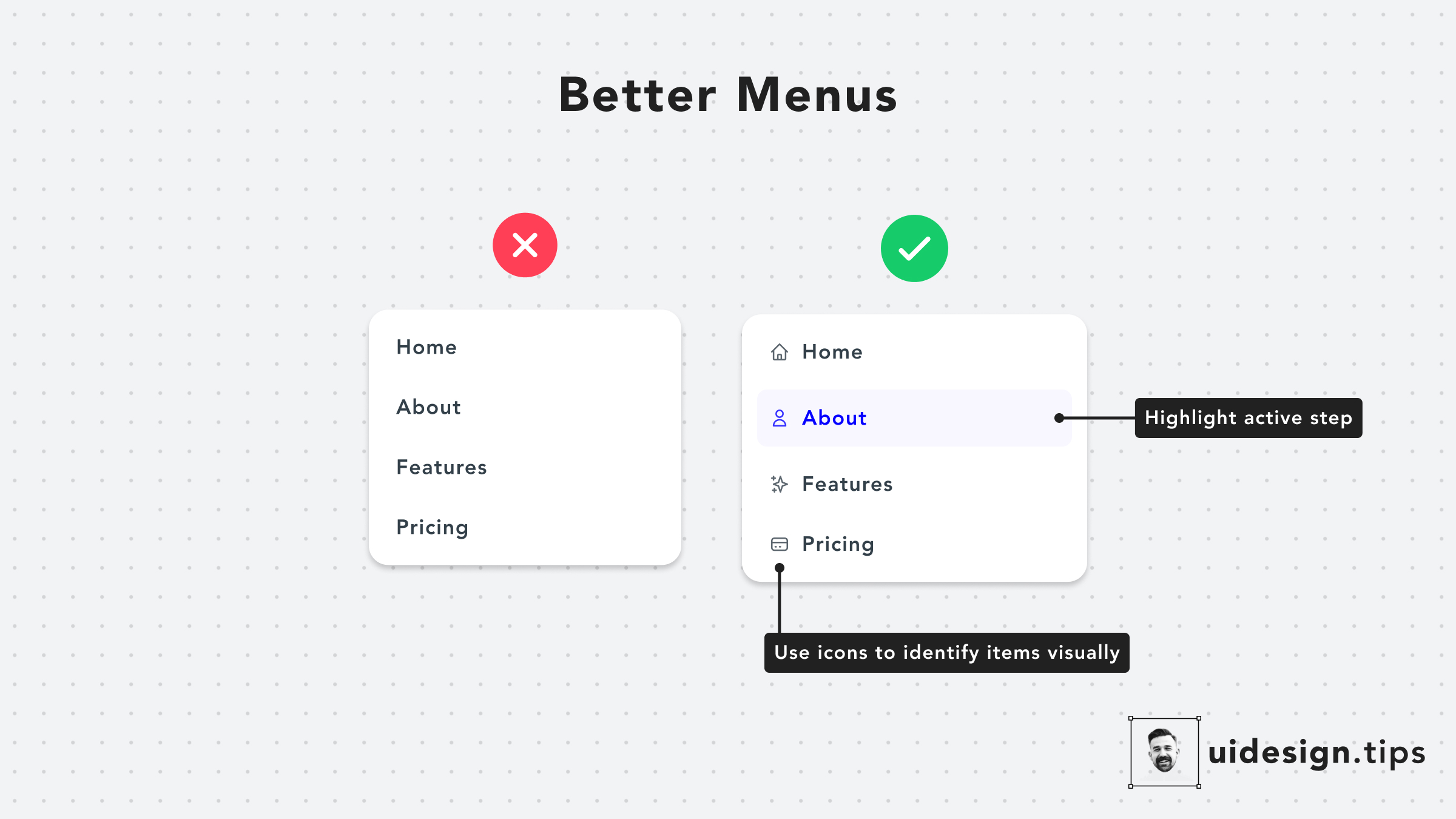
The tabs are a primary navigation element. They need to clearly show which one is active. Adding icons can also make them easier to identify at a glance.
Your Action:
- In your
script.js, make sure that when a tab is clicked, you add anactiveclass to it and remove it from the others. - In your
style.css, create a style for the active tab.
.tab-button {
  /* ... your existing styles ... */
  color: var(--text-color-subtle);
  border-bottom: 2px solid transparent; /* Placeholder for the active state */
  transition: all 0.2s ease-in-out;
}

.tab-button:hover {
  color: var(--primary-color);
}

.tab-button.active {
  color: var(--primary-color);
  font-weight: 600; /* Make the text slightly bolder */
  border-bottom-color: var(--primary-color); /* The indicator line */
}
This creates a clean, modern tab system where the active tab is clearly marked.
Test your understanding!
You have two buttons in your app: a primary "Analyze Text" button and a secondary "Copy to Clipboard" button. Based on the principles of visual hierarchy, which CSS snippet below would be a better way to style them?
Snippet A:
.primary-button {
  background-color: #007bff;
  color: white;
}
.secondary-button {
  background-color: #6c757d;
  color: white;
}
Snippet B:
.primary-button {
  background-color: #007bff;
  color: white;
}
.secondary-button {
  background-color: transparent;
  color: #007bff;
  border: 1px solid #007bff;
}
Show answer
Snippet B is the better choice. The primary button uses a solid, attention-grabbing background color, clearly marking it as the main action. The secondary button uses an "outline" style, which is visually less prominent. It's still clearly a button, but it doesn't compete for attention with the primary action. This creates a clear visual hierarchy.
Conclusion
Excellent progress! Today you've moved from being just a developer to thinking like a designer. By applying a few simple but powerful principles, you can transform a basic, functional application into one that looks polished and professional.
Key Takeaways:
- Give it space: Use generous padding and margin to let your layout breathe.
- Be consistent: Use the same styles for similar elements (buttons, corner radiuses, etc.).
- Use a limited color palette: Define your colors with CSS variables and saturate your grays.
- Create depth: Use layered, subtle shadows to make elements feel tangible.
- Guide the user: Use color, weight, and indicators (like an underline on an active tab) to create a clear visual hierarchy.
This was the final lesson in our module on building the user interface. You now have a feature-rich and well-styled frontend.
In our next lesson, we will begin the "Testing and Finalizing" module. We'll start by performing manual end-to-end testing to ensure every feature you've built works perfectly together, catching any bugs before we prepare the application for deployment.