Hello! In our last lesson, we dug into the z-axis of CSS with z-index and stacking contexts, and also learned how to manage overflowing content. With these skills, you've now covered all the fundamental properties for controlling individual elements in CSS.
This lesson marks a milestone: we'll shift from styling individual elements to composing them into a complete UI component. You will apply everything you've learned in this module to achieve today's goal: building a simple, clean, and professional page header with a logo and navigation links.
To arrange the logo and navigation links horizontally, we'll introduce our first modern CSS layout tool: Flexbox. We will only cover the absolute essentials today to get our header working. This will serve as a practical primer for the next module, where we will dive deep into everything Flexbox has to offer.
By the end of this lesson, you'll have built your first reusable component and have a foundational understanding of how to use Flexbox for simple one-dimensional layouts.
The Anatomy of a Header
First, let's establish the structure. A typical header contains a logo (which is also a link to the homepage) and a set of navigation links.
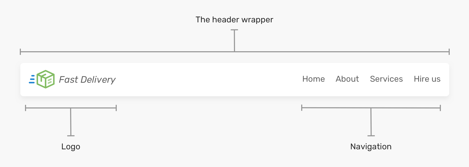
For our HTML, we'll use semantic elements we've already discussed. The entire component will be wrapped in a <header> tag. Inside, we'll have a link for the logo and a <nav> element containing an unordered list (<ul>) of navigation links.
Let's watch a short segment that demonstrates creating this exact HTML structure.
Navbar CSS Tutorial: 3 Ways to Create a Navigation Bar with Flexbox
This video from Skillthrive provides a clear, step-by-step walkthrough of creating the HTML markup for a typical header.
Watch from the beginning until this point. Pay attention to the use of <header>, <img> for the logo, <nav>, <ul>, <li>, and <a> for the links, plus a call-to-action <button>.
Your resulting HTML structure should look something like this:
<header>
    <img class="logo" src="logo.svg" alt="logo">
    <nav>
        <ul class="nav__links">
            <li><a href="#">Services</a></li>
            <li><a href="#">Projects</a></li>
            <li><a href="#">About</a></li>
        </ul>
    </nav>
    <a class="cta" href="#"><button>Contact</button></a>
</header>
Initial Styling and The Wrapper
Before we get to the layout, let's apply some basic styles we're already familiar with. This includes setting box-sizing: border-box, resetting default margins and padding, and defining some base styles for our fonts and links. This ensures a consistent starting point.
/* Basic Resets and Styles */
* {
    box-sizing: border-box;
    margin: 0;
    padding: 0;
}

li, a, button {
    font-family: 'Montserrat', sans-serif;
    font-weight: 500;
    font-size: 16px;
    color: #edf0f1;
    text-decoration: none;
}

header {
    background-color: #24252A;
    padding: 30px 10%; /* We'll adjust this */
}

/* Make list items display next to each other */
.nav__links li {
    display: inline-block;
    padding: 0px 20px;
}
You'll notice that without any specific layout rules, our header elements (logo, nav, button) stack vertically. Also, if the header spans the full width of a large screen, the logo and navigation will be pushed very far apart.
To solve this, a common best practice is to add a "wrapper" div inside the <header>. The outer <header> can handle the background and full width, while the inner wrapper contains the content and constrains its maximum width.
Building Website Headers with CSS Flexbox - Ahmad Shadeed
Ahmad Shadeed's article explains the rationale behind using a header wrapper and provides clear visuals.
Read the section titled The Header Wrapper. Note how the HTML is adjusted to include .site-header__wrapper and how the layout styles will be applied to this new element instead of the <header> itself.
Our updated HTML now looks like this:
<header class="site-header">
    <div class="site-header__wrapper">
        <img class="logo" src="logo.svg" alt="logo">
        <nav>
            ...
        </nav>
        <a class="cta" href="#"><button>Contact</button></a>
    </div>
</header>
Arranging Items with Flexbox
Now, let's arrange the items inside our wrapper. This is where we introduce Flexbox. By applying display: flex to the wrapper, we turn it into a flex container, and its direct children (the logo, the <nav>, and the CTA button) become flex items. By default, flex items will try to fit onto a single line.
.site-header__wrapper {
    display: flex;
}
This single line of code already gets our items into a row! But they are all bunched up on the left. To control the spacing between them, we use the justify-content property. A very common value is space-between, which pushes the first and last items to the edges and distributes the remaining space evenly among the other items.
To align the items vertically, we use align-items: center. This is useful to ensure the logo, text, and button are all perfectly centered along the horizontal axis.
Let's see this in action.
Navbar CSS Tutorial: 3 Ways to Create a Navigation Bar with Flexbox
This part of the Skillthrive video demonstrates the immediate power of these three core Flexbox properties.
Watch the segment from this point. The video applies these styles directly to the <header>, but based on what we just learned, we'll apply them to our .site-header__wrapper. Notice how display: flex, justify-content: space-between, and align-items: center instantly create a well-structured header layout.
Our CSS for the wrapper now looks like this:
.site-header__wrapper {
    display: flex;
    justify-content: space-between;
    align-items: center;
    padding: 30px 10%; /* Padding moved from header to wrapper */
}

.site-header {
    background-color: #24252A;
}
With just a few properties, we have a clean, robust header layout. This is the power of Flexbox, and it's why it has become the standard for one-dimensional layouts.
A More Flexible Layout: The auto Margin Trick
The justify-content: space-between approach works perfectly when you have items you want at the two extremes. But what if you want the logo on the left and everything else grouped together on the right?
This is where a classic Flexbox trick comes in handy: margin: auto. In a flex container, an auto margin will absorb all the extra space in the direction it's applied. If we set margin-right: auto on the logo, it will push everything else to the far right.
This is more flexible than space-between because it doesn't depend on the number of elements. You are explicitly telling one element (or group) to be on one side, and the rest to be on the other.
Navbar CSS Tutorial: 3 Ways to Create a Navigation Bar with Flexbox
The same video demonstrates this powerful technique by building a second header variation.
Watch the section from this demonstration. Notice how justify-content is changed to flex-end (to push everything to the right) and then margin-right: auto is applied to the logo to push it back to the left, creating the desired grouping.
The CSS for this alternative layout would be:
.site-header__wrapper {
    display: flex;
    align-items: center;
    padding: 30px 10%;
}

.logo {
    margin-right: auto; /* Pushes everything else to the right */
}

.nav__links {
    /* ... existing styles ... */
}

.cta {
    margin-left: 20px; /* Add some space between nav and button */
}
This margin: auto technique is a fundamental pattern for creating common UI layouts with Flexbox and is an excellent tool to have in your arsenal.
Conclusion
Congratulations on building your first complete component! We've integrated semantic HTML with the CSS box model, positioning, and a powerful taste of Flexbox to create a functional and professional page header.
Here are the key takeaways from this lesson:
- Component Structure: A header is typically composed of a
<header>element, often with an inner wrapperdivto control width, containing a logo and a<nav>element. - Flexbox Introduction:
display: flexon a parent element turns it into a flex container, arranging its children in a row. - Flexbox Alignment:
justify-contentcontrols horizontal spacing (e.g.,space-between,flex-end), andalign-itemscontrols vertical alignment (e.g.,center). - The
margin: autoTrick: A powerful technique in Flexbox to push elements to opposite ends of a container, providing more control thanjustify-contentin many scenarios.
This was just a glimpse of Flexbox's capabilities. In our next lesson, which kicks off Module 2, we will dive deep into the Flexbox model. You'll learn about its main and cross axes, explore all the alignment and justification options, and understand how to control the sizing and wrapping of flex items to build even more complex and responsive layouts.