Hello! In our last lesson, you implemented optimistic UI updates, a powerful technique to make your "My Reading List" application feel incredibly fast and responsive to user input. We've focused a lot on the app's functionality and internal state management. Now, it's time to turn our attention to its external appearance.
Today's lesson addresses a crucial aspect of modern web development: responsiveness. Your learning outcome is to ensure the entire application is fully responsive using Tailwind CSS. We will refactor your project so that it provides an optimal experience on any device, from a small mobile phone to a large desktop monitor. This is a key requirement for your final challenge project and a fundamental skill for any web developer.
1. Why Responsive Design is Non-Negotiable
Before we dive into the code, it's important to understand why this is so critical. A user might access your application from a phone while on the go, a tablet on their couch, or a desktop at work. A responsive design ensures a seamless and usable experience for all of them.
The Critical Need for Responsive Sites
The article 'Tailwind CSS: A Complete Guide to Responsive Web Design' provides a great overview of the principles and importance of this topic. It reinforces the 'why' behind what we're about to build.
Read the first two sections, 'The Critical Need for Responsive Sites' and 'Core Principles of Responsive Design'. This will set the stage by explaining the modern web landscape and the foundational ideas we'll be implementing.
As the article highlights, responsiveness isn't just about aesthetics; it impacts usability, user retention, and even search engine rankings.
2. The Mobile-First Approach and Tailwind's Breakpoints
Tailwind CSS is built around a mobile-first philosophy. This means we style for the smallest screen by default and then use special prefixes to add or change styles for larger screens. This is a more efficient and logical way to build responsive layouts.
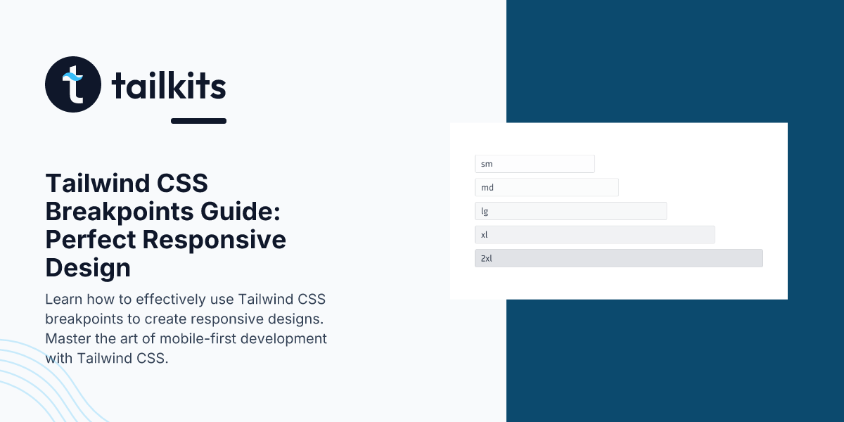
The mechanism for this is breakpoints. Breakpoints are predefined screen widths at which we can apply different utility classes.
Let's watch a short video that explains this core concept.
The BEST Way to Create Responsive Design with Tailwind CSS (2025)
The video 'The BEST Way to Create Responsive Design with Tailwind CSS' clearly explains the mobile-first system and how breakpoints work as minimum-width triggers.
Watch from 00:59 to 06:35. Pay close attention to the syntax (md:grid-cols-2) and the idea that unprefixed classes apply to all sizes (mobile-first), while prefixed classes apply from that breakpoint and up.
To summarize:
- Unprefixed classes (e.g.,
p-4,flex-col) are the mobile styles. They apply everywhere. - Prefixed classes (e.g.,
md:p-8,lg:flex-row) override the default styles starting at a specific minimum width.sm:applies at 640px and up.md:applies at 768px and up.lg:applies at 1024px and up.xl:applies at 1280px and up.2xl:applies at 1536px and up.
3. Your Task: Making the "My Reading List" App Responsive
Now, let's apply these concepts to your project. We'll work through the application view by view.
How to Test
Before you start, open your browser's developer tools (usually F12 or Ctrl+Shift+I) and activate the device toolbar. This lets you simulate different screen sizes and see your changes in real-time.
Example of the device toolbar in Chrome DevTools. You can select different device presets or drag the edges to resize the viewport.
Part 1: The App Shell and Navigation (App.vue)
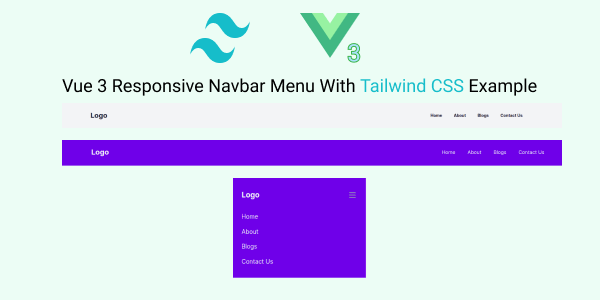
Our first goal is to make the main navigation responsive. On large screens, it should be a horizontal bar. On small screens, the links should collapse into a "hamburger" menu.
Step 1: Update the Navigation Structure
In App.vue, we need to add a button to toggle the mobile menu and the menu itself, which will be hidden on larger screens.
Replace the <nav> section in your App.vue template with the following structure.
<!-- src/App.vue -->
<template>
  <div class="min-h-screen bg-gray-100">
    <header class="bg-white shadow-md">
      <nav class="container mx-auto px-4 py-4 flex justify-between items-center">
        <RouterLink :to="{ name: 'dashboard' }" class="text-2xl font-bold text-blue-600">
          My Reading List
        </RouterLink>

        <!-- Desktop Menu (visible on medium screens and up) -->
        <div class="hidden md:flex items-center space-x-6">
          <RouterLink :to="{ name: 'dashboard' }" class="text-gray-600 hover:text-blue-600">Dashboard</RouterLink>
          <RouterLink :to="{ name: 'search' }" class="text-gray-600 hover:text-blue-600">Search</RouterLink>
        </div>

        <!-- Mobile Menu Button (visible on screens smaller than medium) -->
        <div class="md:hidden">
          <button @click="isMobileMenuOpen = !isMobileMenuOpen" class="text-gray-600 hover:text-blue-600 focus:outline-none">
            <svg class="h-6 w-6" fill="none" viewBox="0 0 24 24" stroke="currentColor">
              <path stroke-linecap="round" stroke-linejoin="round" stroke-width="2" d="M4 6h16M4 12h16m4 6h16" />
            </svg>
          </button>
        </div>
      </nav>

      <!-- Mobile Menu (conditionally displayed) -->
      <div v-if="isMobileMenuOpen" class="md:hidden bg-white border-t">
        <RouterLink :to="{ name: 'dashboard' }" @click="isMobileMenuOpen = false" class="block py-2 px-4 text-sm text-gray-700 hover:bg-gray-100">Dashboard</RouterLink>
        <RouterLink :to="{ name: 'search' }" @click="isMobileMenuOpen = false" class="block py-2 px-4 text-sm text-gray-700 hover:bg-gray-100">Search</RouterLink>
      </div>
    </header>

    <main class="container mx-auto p-4">
      <RouterView />
    </main>
  </div>
</template>
Step 2: Add the Logic
In the <script setup> section of App.vue, define the isMobileMenuOpen state.
// src/App.vue
<script setup>
import { RouterLink, RouterView } from 'vue-router'
import { ref } from 'vue'

const isMobileMenuOpen = ref(false)
</script>
How it works:
md:hiddenhides an element on medium screens and up.hidden md:flexhides an element by default (on mobile) and displays it as a flex container on medium screens and up.- The
isMobileMenuOpenref toggles the visibility of the mobile menudivusingv-if. - We added
@click="isMobileMenuOpen = false"to the mobile links to automatically close the menu after navigation.
This pattern of conditionally showing and hiding elements is fundamental to responsive design with Tailwind.
Part 2: The Search and Dashboard Pages
Both your SearchView.vue and DashboardView.vue display a list of books. Currently, they likely stack in a single column regardless of screen size. Let's change that to a responsive grid.
This is a perfect application of changing grid-cols at different breakpoints. The following video demonstrates exactly how to adapt layouts from single-column to multi-column.
How to Create Responsive Websites (TailwindCSS)
The video 'How to Create Responsive Websites (TailwindCSS)' has an excellent section on making Flexbox and Grid layouts responsive. The principles shown here are exactly what you need for your book lists.
Watch from 04:25 to 09:11. Focus on how the grid-cols-* utility is combined with breakpoint prefixes (lg:, md:) to change the number of columns as the screen size changes.
Step 3: Update SearchView.vue
Find the div that wraps your v-for for the search results. It is likely a div with grid and grid-cols-1 classes. Update it to be responsive.
- From this (example):
<div class="mt-8 grid grid-cols-1 gap-4"> - To this:
<div class="mt-8 grid grid-cols-1 sm:grid-cols-2 lg:grid-cols-3 xl:grid-cols-4 gap-6">
This will create:
- 1 column on extra-small screens (the default).
- 2 columns on small screens (
sm) and up. - 3 columns on large screens (
lg) and up. - 4 columns on extra-large screens (
xl) and up.
Step 4: Update DashboardView.vue
Do the same for your reading list. Find the container div for your v-for loop and apply similar responsive grid classes. You might want a different number of columns here, for example:
- To this:
<div class="mt-4 grid grid-cols-1 md:grid-cols-2 lg:grid-cols-3 gap-6">
Feel free to experiment with different column counts and breakpoints (sm, md, lg, etc.) to achieve a layout you like.
4. Advanced Responsive Techniques (For Your Awareness)
While breakpoint prefixes for layout and visibility cover 90% of responsive design needs, Tailwind offers more advanced features that are good to know about.
Understanding Breakpoints | Responsive Design With Tailwind Css
The 'Understanding Breakpoints' article from TechieLearn provides a great cheat sheet for various responsive techniques and explains how to customize breakpoints.
Briefly review the sections 'Customizing Tailwind's Breakpoints' and 'Advanced Techniques and Considerations'. You don't need to implement these now, but it's valuable to know that you can add your own breakpoints or style based on device orientation.
These advanced features, like creating custom breakpoints ('xs': '480px') in your tailwind.config.js or using orientation-portrait:, give you complete control when you need to deviate from the defaults for a specific design.
Conclusion
Excellent work! You have now transformed your application from a fixed-width layout into a fully responsive experience that adapts gracefully to any screen size. This not only improves user experience but is a critical skill for building professional-grade web applications.
Key Takeaways:
- Mobile-First is Key: Design for small screens by default and use breakpoints to enhance for larger ones.
- Breakpoint Prefixes: Use prefixes like
sm:,md:, andlg:to apply utilities conditionally at different minimum widths. - Common Responsive Patterns:
- Navigation: Use
hiddenandmd:blockto switch between a hamburger menu and a full navbar. - Grids: Change the number of columns with classes like
grid-cols-1 md:grid-cols-2 lg:grid-cols-3. - Spacing & Typography: Adjust padding, margin, and font sizes with prefixes (e.g.,
p-4 md:p-8,text-xl lg:text-3xl).
- Navigation: Use
Next Lesson:
You are nearing the completion of your final project! The application is functional, feels fast, and now looks great everywhere. In the next lesson, we will focus on the final polish. The learning outcome is to "Maintain consistent code organization and follow best practices for Vue, Tailwind, and Git." We'll review your project structure, discuss coding conventions, and ensure your repository is clean and professional.