Hello! In our last lesson, you successfully integrated Tailwind CSS into your "VueMart" project. You saw how a few utility classes could instantly change the appearance of your application. Now, it's time to unlock the full power of this framework.
This lesson dives into the core of Tailwind: the utility-first workflow. We'll move beyond simple examples and learn how to combine different utility classes to build sophisticated and custom component designs directly within your Vue templates. This is where you'll start to feel the speed and efficiency that makes Tailwind so popular.
By the end of this 60-minute lesson, you will be able to apply a wide range of Tailwind utility classes to style layout, spacing, typography, colors, and interactive states within your Vue single-file components.
Part 1: The "Why" of Utility-First
Before we start writing code, it's crucial to understand the philosophy that drives Tailwind. You've seen the term "utility-first," but what does it mean in practice?
Traditionally, we write CSS by creating semantic class names (like .product-card or .page-title) and then defining their styles in a separate CSS file. A utility-first approach flips this. Instead of creating new class names, you use a large set of pre-existing, single-purpose classes (like flex, p-4, font-bold) directly in your HTML.
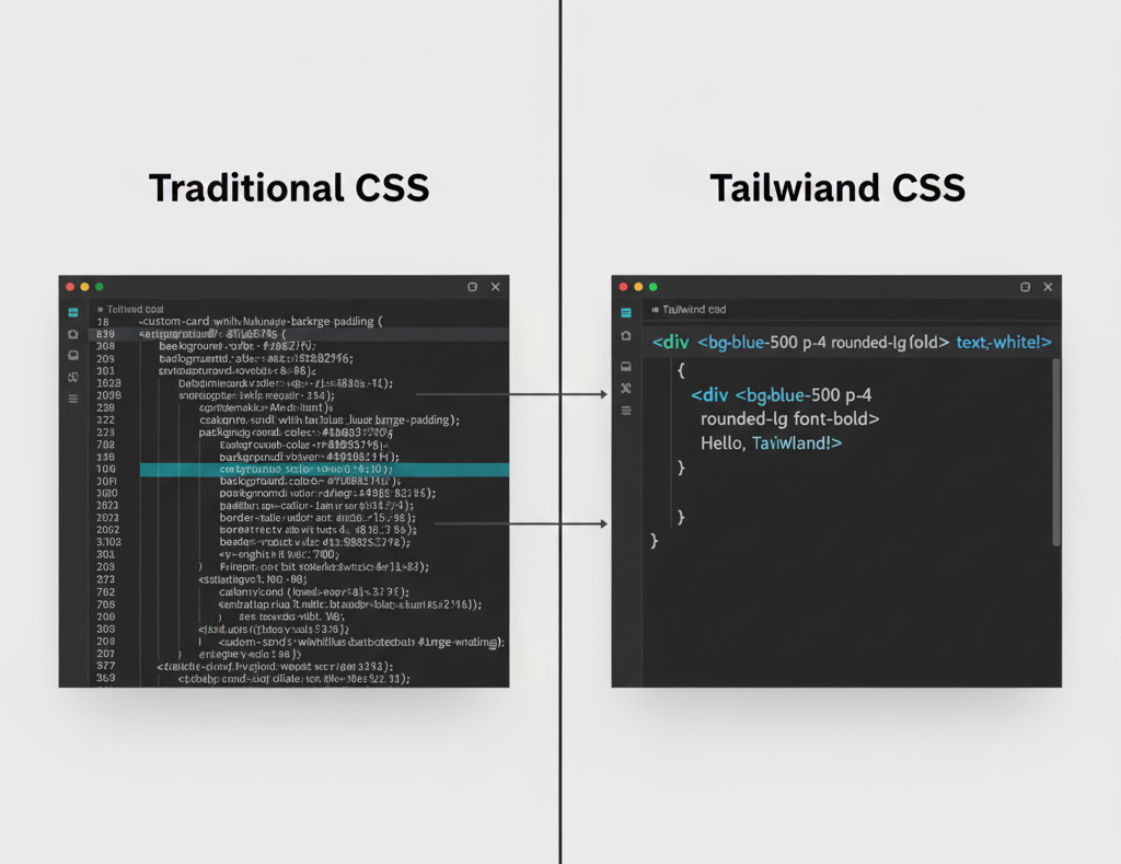
To get a solid grasp of this concept, let's explore two excellent articles that explain the benefits.
Utility-First CSS with Tailwind
This Vue Mastery article, 'Utility-First CSS with Tailwind', does a great job explaining the core idea. It contrasts the traditional approach with the utility-first method and highlights the key benefit: maintainability.
Read the first section, 'What is Utility-first CSS?'. Focus on the comparison between the classic CSS/HTML example and its refactored version using utility classes.
Building Vue 3 components with Tailwind CSS
The Snyk article we used in the last lesson also has a superb explanation. It reinforces the concept and shows how utility classes map to specific CSS properties.
Read the section titled 'Utility classes explained'. It provides another clear example and breaks down which utility class corresponds to which CSS rule, like p-8 for padding or text-xl for font size.
The key takeaway is that by using utilities, you avoid context-switching between your HTML and CSS files, and you no longer need to invent class names. The styles are co-located with their element, making components truly portable and easier to reason about.
Part 2: The "How" - Core Utility Categories
Now for the fun part: applying these classes. The best way to learn Tailwind is to see it in action. The following video from Fireship is a fast-paced but brilliant demonstration of how to build a UI from scratch using utilities. While it uses React for its examples, the Tailwind classes and the workflow are identical to what you'll do in Vue.
Ultimate Tailwind CSS Tutorial // Build a Discord-inspired Animated Navbar
Watch these selected clips from Fireship's 'Ultimate Tailwind CSS Tutorial' to see how different categories of utility classes are used to build a complex UI.
Focus on the following segments: Layout, Sizing & Spacing (04:21 - 06:25): See how flex, fixed, h-screen, w-16, margin (m-), and padding (p-) are used. Pay close attention to the explanation of the spacing scale. Colors & Effects (06:14 - 06:53): Observe the use of bg-color for backgrounds, text-color for text, and shadow-lg for box shadows. State Variants & Transitions (09:28 - 10:39): This is a key part. See how the hover: prefix is used to change styles on mouseover and how transition-all creates smooth animations.
Let's summarize the core concepts from the video and readings:
- Layout & Sizing: Use
flexandgridfor layouts. Control width and height with classes likew-full,h-screen, orw-1/2. - Spacing:
m-formarginandp-forpadding. These are followed by a direction (t,b,l,r,x,y) and a number from Tailwind's spacing scale (e.g.,pt-4is padding-top,mx-autois for horizontal centering). A value of4in the scale typically corresponds to1remor16px. - Colors: Apply colors to text (
text-blue-500), backgrounds (bg-gray-100), and borders (border-green-300). The number (100to900) indicates the shade, from lightest to darkest. - Typography: Control font size (
text-lg,text-2xl), weight (font-light,font-bold), and other properties likeitalicorunderline. - Borders & Shadows: Add borders with
border,border-2, and a color. Apply drop shadows withshadow,shadow-md, orshadow-lg. - State Variants: Prefix any utility with a state like
hover:,focus:, oractive:to apply it conditionally. For example,bg-blue-500 hover:bg-blue-700changes the background color on hover.
Finding the Right Class
You're not expected to memorize all these classes. The most important skill is learning how to find the class you need. The official Tailwind CSS documentation is your best friend. Simply search for the CSS property you want (e.g., "flex-direction", "font-weight"), and the docs will show you the corresponding utility class.
Part 3: Practical Application - Styling VueMart
Let's apply this knowledge to your VueMart project. Open it in VS Code and make sure your development server (npm run dev) is running.
Task 1: Styling the Product List (HomeView.vue)
Let's transform the simple list of products on your home page into a visually appealing grid of cards.
- Open
src/views/HomeView.vue. - Find the
<ul>element. We'll replace it with adivthat acts as a grid container. - We'll style the
RouterLinkfor each product to look like a card.
Replace your existing <template> content with this, then we'll break down the new classes:
<template>
  <div class="p-8">
    <h1 class="text-3xl font-bold text-gray-800 mb-8">Our Products</h1>

    <div v-if="loading">Loading products...</div>
    <div v-else-if="error" class="text-red-500">{{ error }}</div>

    <!-- Product Grid -->
    <div v-else-if="products" class="grid grid-cols-1 md:grid-cols-2 lg:grid-cols-3 gap-8">

      <!-- Product Card -->
      <RouterLink
        v-for="product in products"
        :key="product.id"
        :to="'/product/' + product.id"
        class="border border-gray-200 rounded-lg p-6 bg-white shadow-sm hover:shadow-lg hover:-translate-y-1 transition-all duration-300"
      >
        <h2 class="text-xl font-semibold text-gray-900 truncate">{{ product.title }}</h2>
        <p class="text-2xl font-bold text-green-600 mt-2">${{ product.price }}</p>
      </RouterLink>

    </div>
  </div>
</template>
Your product list should now look like a grid of cards. Let's analyze the classes on the RouterLink card:
border border-gray-200 rounded-lg p-6 bg-white shadow-sm: This sets up the basic card appearance: a light gray border, rounded corners, padding, a white background, and a small shadow.hover:shadow-lg hover:-translate-y-1: This handles the hover effect. The shadow becomes larger, and we slightly lift the card up (-translate-y-1).transition-all duration-300: This makes the hover effect animate smoothly over 300 milliseconds.
Notice the classes md:grid-cols-2 and lg:grid-cols-3 on the grid container. These are responsive variants.
grid-cols-1: On small screens (mobile-first), we have 1 column.md:grid-cols-2: On medium screens and up (≥768px), it becomes a 2-column grid.lg:grid-cols-3: On large screens and up (≥1024px), it becomes a 3-column grid.
Responsive design in Tailwind is this simple: you prefix a utility with the breakpoint you want it to apply at. This is a powerful concept you'll use constantly.
Task 2: Styling the Product Detail Page (ProductDetailView.vue)
Now, let's style the product detail page to have a clean, two-column layout.
- Open
src/views/ProductDetailView.vue. - Challenge: Using what you've learned and the code from the
HomeViewas a guide, try to style this page yourself. Aim for a layout where the image is on the left and the product details are on the right. - After you've given it a try, compare your work to the example below.
Here's a complete, styled version of ProductDetailView.vue:
<template>
  <div class="p-8">
    <div v-if="loading">Loading product...</div>
    <div v-else-if="error" class="text-red-500">{{ error }}</div>

    <div v-else-if="product" class="grid grid-cols-1 md:grid-cols-2 gap-8 max-w-6xl mx-auto">

      <!-- Product Image -->
      <div>
        <img :src="product.image" :alt="product.title" class="w-full h-auto object-contain rounded-lg border border-gray-200 p-4" />
      </div>

      <!-- Product Details -->
      <div class="flex flex-col">
        <h1 class="text-4xl font-extrabold text-gray-900 mb-2">{{ product.title }}</h1>
        <p class="text-sm font-medium text-gray-500 bg-gray-100 px-2 py-1 rounded-full self-start mb-4">{{ product.category }}</p>

        <p class="text-gray-700 text-base leading-relaxed mb-6">{{ product.description }}</p>

        <div class="mt-auto">
          <p class="text-5xl font-black text-green-600 mb-4">${{ product.price }}</p>
          <button class="w-full bg-blue-600 text-white font-bold py-3 px-6 rounded-lg hover:bg-blue-700 transition-colors">
            Add to Cart
          </button>
        </div>
      </div>

    </div>
  </div>
</template>
Breakdown of key techniques:
grid grid-cols-1 md:grid-cols-2 gap-8: A responsive grid for the main layout.max-w-6xl mx-auto: This constrains the maximum width of the content and centers it horizontally.flex flex-col: In the details section, this creates a flex container that stacks its children vertically.mt-auto: This powerful utility, used within the flex container, pushes the price and button to the bottom, ensuring they align nicely regardless of the description's length.
Conclusion
Congratulations! You've moved from installing Tailwind to actively using it to build and style real Vue components. You've seen how composing small, single-purpose utility classes allows you to create custom designs quickly and efficiently, all without leaving your .vue files.
Key Takeaways:
- Utility-first is about composition: You build complex styles by combining simple utility classes directly in your HTML.
- Core categories cover most needs: With classes for layout, spacing, color, and typography, you can style almost any element.
- Variants are powerful: State variants like
hover:and responsive variants likemd:allow you to create dynamic and adaptive interfaces with ease. - The docs are your guide: When in doubt, search the Tailwind documentation for the CSS property you need.
You may have noticed that the class attribute can get quite long with many utilities. Is there a way to manage this?
Next Lesson: We will explore the @apply directive. You'll learn how to extract long lists of utilities into reusable component classes, and more importantly, we'll discuss the trade-offs of this approach and when it's considered a good practice.