Hello again! It's great to see you.
In our last lesson, you did a fantastic job adding interactive states like hover: and focus: to your project. This is a vital skill for creating a responsive and engaging user experience. You learned how to provide visual feedback for user actions, making your site more intuitive.
Today, we're going to take a major step toward making your project's design truly professional and maintainable. We'll move beyond using Tailwind's default styles and learn how to create a custom theme that matches a specific design specification. This lesson directly addresses your goal of understanding industry best practices by focusing on how to create a consistent and unique visual identity for a project using the tailwind.config.js file.
This lesson is all about customizing your design tokens—your project's unique set of colors, fonts, and spacing—to ensure every component you build is perfectly on-brand.
1. The tailwind.config.js File: Your Design System's Core
At the heart of every Tailwind project is the tailwind.config.js file. Think of this not just as a configuration file, but as the single source of truth for your entire design system.
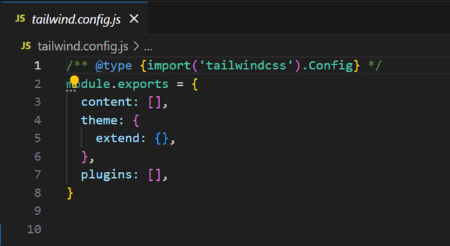
To begin, let's establish a clear understanding of the role this file plays.
A Guide to Tailwind CSS Themes
This article, 'A Guide to Tailwind CSS Themes' from Magic UI, provides a great overview of why the config file is so central to building with Tailwind.
Please read the first three sections: Start at the top and read to the end of 'Your Design System's Core: The Config File'. This sets the stage. Continue with 'Defining Your Core Design Tokens'. It introduces the key properties we'll be customizing. Finish with 'From Configuration to Class'. This section connects the concepts by showing how Tailwind generates utility classes from your config.
As you just read, by defining your colors, fonts, and spacing in this one central file, you create a consistent visual language that ensures your entire application has a cohesive look and feel.
2. Extending vs. Overriding: The Critical Decision
When you first open tailwind.config.js, you'll see a theme.extend object. This is where you can add new styles to Tailwind's existing defaults. However, for creating a strict design system, this can be problematic. If your team can still use all of Tailwind's default colors, how do you enforce your brand's specific color palette?
This is where the distinction between extending and overriding becomes crucial.
- Extending: Adding your customizations inside
theme.extendkeeps all of Tailwind's defaults and adds yours on top. - Overriding: Adding your customizations directly inside
themeremoves Tailwind's defaults for that category and replaces them entirely with your own.
This video makes a powerful case for overriding certain properties to enforce design consistency—a key principle in professional development.
This video, 'How the PROS Use Tailwind' by Frontend FYI, explains the professional rationale for overriding parts of the default theme rather than just extending it.
Watch from 00:44 to 09:42. The key takeaways are: The problem (00:44 - 04:30): Understand why leaving the default extend can lead to design inconsistencies when other developers (or your future self) use colors and sizes that aren't part of your official design. The solution (04:30 - 08:51): See how moving colors, spacing, fontSize, etc., out of extend and into the root of the theme object forces you to use only your defined styles. The recap (08:51 - 09:42): The presenter reinforces why extending would have allowed the default colors to still be available.
To solidify this concept, let's refer back to the guide from Magic UI, which offers a great rule of thumb.
A Guide to Tailwind CSS Themes
This section of the guide explicitly breaks down the difference between extending and overriding and when to use each approach.
Please read the section titled 'Extending vs. Overriding The Default Theme'. It provides a clear, concise summary of the concept we're discussing.
In summary: For things that define your brand identity, like colors, overriding is often the best way to enforce consistency. For other things, like adding a new font, extending is usually sufficient.
3. Practical Customization: Colors and Fonts
Let's apply this knowledge. We'll customize your theme to match a hypothetical design specification.
Design Specification:
- Colors:
- Primary: A deep blue (
#0A2540) - Accent: A vibrant teal (
#00D4B3) - Neutral: A palette of grays for backgrounds and text.
- Primary: A deep blue (
- Fonts:
- Headings: 'Poppins' (a sans-serif font)
- Body: 'Source Sans 3' (a sans-serif font)
Customizing Colors
We will override the default color palette. The official Tailwind documentation provides clear examples of how to do this.
Customizing Colors - Tailwind CSS
The official documentation on 'Customizing Colors' is your best reference for syntax and options.
Please review these sections: 'Using custom colors': This shows the syntax for overriding the colors object. 'Color object syntax': This demonstrates how to group shades of a color (e.g., gray-100, gray-200). 'Naming your colors': Skim this to understand the trade-offs between abstract names (primary) and literal names (blue). For our exercise, we'll use abstract names.
Based on the documentation, here is how you would implement our color specification in tailwind.config.js. Notice how colors is directly inside theme, not theme.extend.
// tailwind.config.js
module.exports = {
  content: [
    "./src/**/*.{html,js}", // Adjust this to your project structure
  ],
  theme: {
    colors: {
      'transparent': 'transparent', // Good practice to keep these
      'current': 'currentColor',
      'white': '#ffffff',
      'primary': '#0A2540',
      'accent': '#00D4B3',
      'neutral': {
        100: '#f5f5f5',
        300: '#d4d4d4',
        500: '#737373',
        700: '#404040',
        900: '#171717',
      },
    },
    extend: {
      // We will add fonts here in the next step
    },
  },
  plugins: [],
}
With this change, classes like bg-primary, text-accent, and border-neutral-300 are now available, while default classes like bg-red-500 or text-blue-600 will no longer work, enforcing your design system.
Customizing Fonts
For fonts, we'll extend the theme. We don't need to remove the default sans, serif, and mono stacks; we just want to add our new ones.
Step 1: Import the fonts in your CSS
First, you need to make the font files available. The easiest way is to import them from a service like Google Fonts at the top of your main CSS file (e.g., src/input.css).
/* src/input.css */
@import url('https://fonts.googleapis.com/css2?family=Poppins:wght@700&family=Source+Sans+3:wght@400;600&display=swap');

@tailwind base;
@tailwind components;
@tailwind utilities;
Step 2: Add the fonts to your config
Now, register these fonts in tailwind.config.js. We place fontFamily inside theme.extend because we are adding new options.
// tailwind.config.js
const defaultTheme = require('tailwindcss/defaultTheme');

module.exports = {
  // ... content and theme.colors from before ...
  theme: {
    colors: {
      // ... your custom colors ...
    },
    extend: {
      fontFamily: {
        'heading': ['Poppins', ...defaultTheme.fontFamily.sans],
        'body': ['"Source Sans 3"', ...defaultTheme.fontFamily.sans],
      },
    },
  },
  plugins: [],
}
Note: We include ...defaultTheme.fontFamily.sans as a fallback. This is a best practice that ensures the browser will use a standard sans-serif font if your custom font fails to load.
You can now use font-heading for titles and font-body for paragraphs.
4. Hands-On Practice: Theming Your Profile Site
It's time to apply this to your personal profile project. Your task is to implement the design specification we just outlined.
- Open your project in VS Code.
- Modify
src/input.css: Add the@importrule for the 'Poppins' and 'Source Sans 3' fonts from Google Fonts. - Modify
tailwind.config.js:- Replace the entire default
theme.extend.colors(if any) with the newtheme.colorsobject, effectively overriding the color palette with ourprimary,accent, andneutralcolors. - Add the
fontFamilyobject insidetheme.extendto extend the theme with the newfont-headingandfont-bodyfamilies.
- Replace the entire default
- Restart your build process. Since you've changed the config file, you need to stop and restart the Tailwind CLI command (e.g.,
npm run dev) for the changes to take effect. - Update your HTML files:
- Go through your
index.html,about.html, andcontact.htmlfiles. - Replace old color classes (e.g.,
bg-gray-800,text-blue-500) with your new theme colors (e.g.,bg-primary,text-accent). - Apply your new font classes. For example, add
font-headingto<h1>and<h2>tags, andfont-bodyto<p>tags and other text elements.
- Go through your
- Verify your changes: Check your site in the browser. The new colors and fonts should be applied. Try to use a default color class like
bg-red-500and confirm that it no longer has any effect.
This exercise solidifies the entire process, from configuration to implementation, giving you a powerful workflow for any future project.
Conclusion
Fantastic work today! You've moved from being a consumer of Tailwind's design system to a creator of your own. This is a significant step in your journey and directly addresses your goal of learning professional, scalable development practices.
Key Takeaways:
- The
tailwind.config.jsfile is the central command for your project's design system. - Overriding the theme (placing keys directly in
theme) is a powerful way to enforce design consistency, especially for colors. - Extending the theme (placing keys in
theme.extend) is ideal for adding new options, like custom fonts, without removing the defaults. - Custom theme values are used just like any other utility class (
bg-primary,font-heading), making your HTML declarative and easy to read.
In our next lesson, we will cover the final step in the Tailwind workflow: optimizing for production by purging unused styles. You've created a powerful development setup; now you'll learn how to ensure the final CSS file that you ship to users is as small and fast as possible.