Hello! Welcome to the next lesson in our journey of building complex websites with "vibe coding."
In our last lesson, we mastered a crucial performance optimization technique: using Hugo Pipes to bundle and minify CSS and JavaScript. You learned the difference between the static and assets directories and how to create a production-ready asset pipeline. As an SEO professional, you know that every millisecond counts, and so far, we've only optimized our text-based assets.
Today, we'll tackle the biggest contributor to page weight and slow load times: images. Our learning outcome is to use Hugo's image processing functions within a template to generate responsive image formats (srcset). This will enable browsers to automatically download the most appropriately sized image for the user's device, drastically improving your site's Core Web Vitals and overall user experience.
Why Responsive Images Matter
You're already familiar with the importance of optimizing images for the web. Sending a massive, high-resolution desktop image to a user on a mobile phone with a slow connection is a recipe for a high bounce rate. The modern solution to this is "responsive images."
The browser uses two key HTML attributes on the <img> tag to handle this:
srcset: A list of available image files and their actual widths (e.g.,small.jpg 480w,medium.jpg 800w,large.jpg 1200w).sizes: A set of instructions that tells the browser how wide the image will be displayed on the screen at different viewport widths (e.g., "on screens smaller than 600px, this image takes up 100% of the screen width; on larger screens, it only takes up 50%").
The browser then uses this information to intelligently download the best possible image from the srcset, saving bandwidth and speeding up rendering.

This image illustrates the core idea: one image source is adapted to display optimally on different screen sizes, from a large monitor to a small phone.
Manually creating all these image versions and writing the complex srcset and sizes attributes for every image would be a nightmare. This is where Hugo's power comes in.
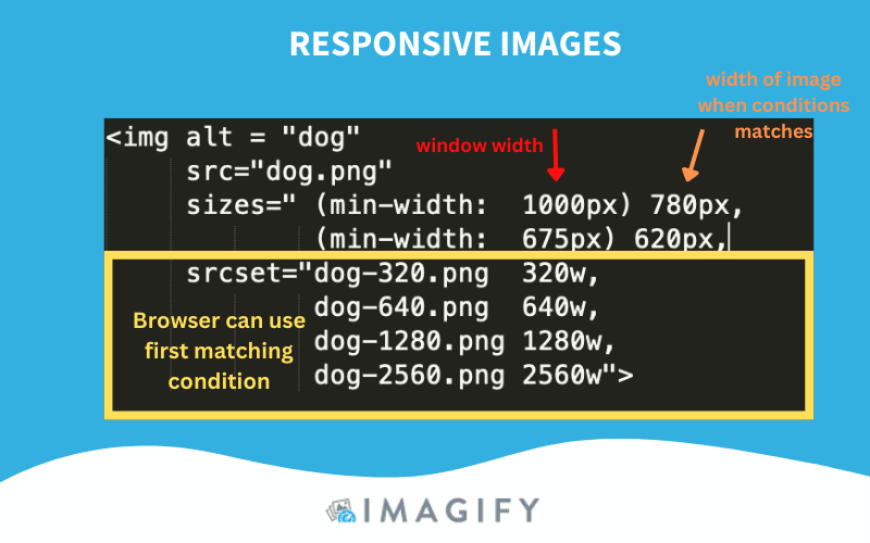
This is the kind of HTML we want Hugo to generate for us automatically. Notice how srcset lists the image files and their widths, while sizes provides context to the browser about the layout.
Enabling Hugo's Image Processing
Just like with CSS and JS optimization, Hugo can only process files that it treats as resources. As you learned in the last lesson, this means the files can't live in the static directory. They must be placed where Hugo's asset pipeline can access them.
There are two primary ways to do this:
- Global Resources: Place your images inside the
assetsdirectory (e.g.,assets/images/). - Page Resources: Place images in the same folder as the Markdown file that uses them. This is known as a "Page Bundle."
For this lesson, we'll focus on the Global Resources approach, as it's a common and straightforward pattern.
Better Responsive Images with Hugo
To enable Hugo's processing power, your images need to be treated as 'resources'. This article by Chris Wiegman clearly explains this first and most important step.
Please read the section that starts with 'First, if you’re loading your images from the static folder...'. This short paragraph reinforces why the assets folder is necessary for Hugo Pipes to work its magic.
The Best Practice: A Markdown Render Hook
So, how do we tell Hugo to process our images? The most elegant solution is a Markdown Render Hook. This is a custom template that overrides Hugo's default way of converting Markdown syntax into HTML.
By creating a file at layouts/_default/_markup/render-image.html, we can intercept every standard Markdown image (``) and replace the default <img ...> tag with our own advanced <picture> element containing the srcset attributes. This is incredibly powerful because it means your content team (or you) can continue writing simple, standard Markdown without needing to know any complex HTML.
Responsive and optimized images with Hugo | BryceWray.com
A fantastic, in-depth guide on this topic is 'Responsive and optimized images with Hugo' by Bryce Wray. It covers multiple approaches, but we'll focus on the concept of the 'render hook'.
Read the introduction, the 'What was I thinking?' section, and 'The code and the comments' section. Focus on understanding the purpose of the render-image.html file. The article presents a very advanced version with image placeholders for a 'blur-up' effect; we'll be starting with a more streamlined version that focuses purely on generating the responsive srcset.
Let's Build It: A Practical Walkthrough
Inspired by the resources, let's create our own render-image.html file. This version is simplified to focus on the core learning outcome: generating a srcset for both WebP and the original image format.
1. Create the Render Hook File
Create a new file in your project at this exact path: layouts/_default/_markup/render-image.html.
2. Add the Code
Paste the following code into the new file.
{{/* Get image source and alt text from Markdown */}}
{{- $src := .Destination -}}
{{- $alt := .Text -}}

{{/* Find the image as a resource. It can be a global resource (in /assets) or a page resource */}}
{{- $image := "" -}}
{{- if .Page.Resources.GetMatch $src -}}
  {{- $image = .Page.Resources.GetMatch $src -}}
{{- else -}}
  {{- $image = resources.Get $src -}}
{{- end -}}

{{- if $image -}}
  {{/* Define the widths for our responsive images */}}
  {{- $respSizes := slice "480" "768" "1024" "1200" -}}
  {{/* Tell the browser how wide the image will be at different breakpoints */}}
  {{- $dataSizes := "(max-width: 768px) 100vw, 700px" -}}
  {{/* Generate a default image for the fallback <img> src */}}
  {{- $defaultImage := $image.Resize "768x" -}}

  <picture>
    {{/* Generate WebP sources, which are more modern and efficient */}}
    <source type="image/webp" srcset="
      {{- range $i, $size := $respSizes -}}
        {{- if ge $image.Width $size -}}
          {{- if $i }}, {{ end -}}
          {{- ($image.Resize (print $size "x webp")).RelPermalink }} {{ $size }}w
        {{- end -}}
      {{- end -}}" sizes="{{ $dataSizes }}" />

    {{/* Generate sources in the original format (e.g., JPEG, PNG) for older browsers */}}
    <source type="{{ $image.MediaType }}" srcset="
      {{- range $i, $size := $respSizes -}}
        {{- if ge $image.Width $size -}}
          {{- if $i }}, {{ end -}}
          {{- ($image.Resize (print $size "x")).RelPermalink }} {{ $size }}w
        {{- end -}}
      {{- end -}}" sizes="{{ $dataSizes }}" />

    {{/* The fallback <img> tag is essential */}}
    <img src="{{ $defaultImage.RelPermalink }}"
         width="{{ $defaultImage.Width }}"
         height="{{ $defaultImage.Height }}"
         alt="{{ $alt }}"
         loading="lazy" />
  </picture>
{{- else -}}
  {{/* If the image isn't found, output the original tag so Hugo throws a visible error */}}
  <img src="{{ $src }}" alt="{{ $alt }}">
{{- end -}}
Code Breakdown:
- Lines 2-10: We get the image
srcandalttext from the Markdown. Then, we try to find the image file as either a page resource or a global resource in theassetsfolder. - Lines 13-17: We define our desired image widths in a
slice(an array) and set up thesizesattribute. We also create a medium-sized default image. - Lines 19-35: This is the core logic. We use a
<picture>element to provide multiple formats.- The first
<source>tag loops through our$respSizes, uses$image.Resizeto create a WebP version at each size, and builds thesrcsetstring. - The second
<source>tag does the same for the original image format (like JPG or PNG).
- The first
- Line 38: The
<img>tag is a crucial fallback for very old browsers and also displays the default image.loading="lazy"is a free performance boost.
3. Use It in Your Content
Now for the easy part.
- Make sure you have an image file in your
assets/images/directory (e.g.,assets/images/hero.jpg). - In any Markdown file, add the image using the standard syntax. The path should be relative to the
assetsdirectory. - Run
hugo server, open your site, and use your browser's developer tools to inspect the image. You will see the full<picture>element generated by your render hook, not a simple<img>tag!
Test your understanding!
Your site design has been updated, and you now need a much larger image size for high-resolution desktop displays.
How would you modify the render-image.html template to add a new 1600px-wide version to the srcset?
Show answer
You would simply add 1600 to the $respSizes slice. The range loop will automatically handle the rest.
The modified line would look like this:
{{- $respSizes := slice "480" "768" "1024" "1200" "1600" -}}
When you rebuild the site, Hugo will now generate an additional 1600px-wide version for both WebP and the original format and include it in the srcset.
The "Vibe Coding" Workflow: Prompting an AI
Now that you understand the components, you can "vibe code" this feature by prompting an AI. A weak prompt might be "make my images responsive." A strong prompt uses the terminology you just learned:
"Generate a Hugo Markdown Render Hook for images, to be saved as
layouts/_default/_markup/render-image.html.The template must:
- Use Hugo's built-in image processing (
.Resize).- Handle both global resources (from
/assets) and page resources.- Output a
<picture>element with two<source>tags.- The first
<source>should be for thewebpformat. The second should be for the original imageMediaType.- Both
<source>tags must have asrcsetattribute containing multiple image widths (e.g., 480w, 768w, 1024w) and asizesattribute.- Include a fallback
<img>tag withloading="lazy"and correctwidth,height, andaltattributes."
This detailed prompt gives the AI the precise technical specifications needed to generate high-quality, correct code that you can then adapt.
Conclusion
You have now automated one of the most impactful web performance optimizations. By leveraging a Markdown Render Hook and Hugo's image processing, you've created a scalable system where any image added to your site will be automatically converted into a responsive, multi-format asset.
Key Takeaways:
- Responsive images use
srcsetandsizesto let the browser choose the most efficient image to download. - Hugo automates
srcsetgeneration using its image processing functions like.Resize. - Images must be Hugo resources (in
assetsor a page bundle) to be processed. - A Markdown Render Hook (
render-image.html) is the most effective way to apply image processing site-wide without changing your content workflow. - Knowing the right technical terms is key to writing effective AI prompts for complex features.
Preview of the next lesson:
We've made our content (CSS, JS, images) responsive and performant. Next, we'll turn our attention to the site's primary navigation. In the next lesson, you will adapt an AI-generated header to include a responsive mobile hamburger menu, ensuring your site is fully usable and looks great on all devices.