In our previous lesson, we established the "big picture" of our AI-assisted design workflow, clarifying the roles of Figma, Claude Code, and the essential MCP integration that allows them to work together. You learned that for our project, we need a write-capable connection so our AI assistant can generate designs directly on the Figma canvas.
Now, we shift from the "how" to the "what." Before we can ask an AI to build anything, we need a clear plan. This lesson is dedicated to creating that plan. We will storyboard the core three-screen journey for our note-taking app and define exactly what "done" means for each screen. This blueprint will be the precise instruction set you'll provide to Claude in a later lesson.
What is a UX Storyboard?
A UX storyboard is a simple but powerful tool for planning. Think of it as a comic strip that visualizes the sequence of actions a user takes to achieve a goal within your app. It helps you think through the user's journey step-by-step, ensuring the flow is logical before any design work begins.
At its core, a storyboard consists of three elements: a scenario (what the user is trying to do), a sequence of visuals (the screens), and captions (what's happening on each screen).
To get a quick overview of this concept, let's watch a short video from the Nielsen Norman Group, a leader in user experience research.
This video, "How to Create a UX Storyboard," will introduce you to the fundamental components and the process of creating one.
Watch the entire video. It's very short and provides a perfect summary. Pay close attention to the three main components mentioned at the beginning and the six steps for creating a storyboard.
As the video explains, a storyboard doesn't need to be a work of art. The goal is clarity, not artistic polish. It's about communicating a sequence of events.
Defining Our Story: The Note-Taking Flow
Every story needs a character and a plot. In UX design, this translates to a persona (the user) and a scenario (their goal and the steps they take). This is the foundation of our plan.
User flow tutorial | How I use them in design projects
The video "User flow tutorial" explains this framework clearly. We'll watch the beginning to understand how to define our user and their goal.
Please watch from the start until the introduction to task flows. The key part is the explanation of the three components: who the user is, what their goal is, and what steps they take.
Drawing from this, let's define the story for our note-taking app:
- Persona (The "Who"): We'll imagine a user named Alex. Alex is a busy professional who needs a simple, no-fuss way to capture thoughts and ideas on the go.
- Scenario (The "What Goal"): Alex wants to open the app, create a new note, and see it saved in their list.
- Task Flow (The "What Steps"): This is the core sequence we'll design.
- Alex opens the app and sees the main list of existing notes.
- Alex initiates creating a new note.
- Alex types the content of the note and saves it.
- Alex is returned to the main list and sees the new note has been added.
This simple task flow directly gives us the three key "frames" or screens we need to storyboard.
Creating the Storyboard Panels
Now, let's translate our task flow into a three-panel storyboard. Each panel will represent a distinct state of the app interface. We'll describe the visual, the user's action, and the outcome.
Here are two examples of what a finished storyboard can look like. Notice how they combine a simple screen sketch with a description of the user's action and the system's response.
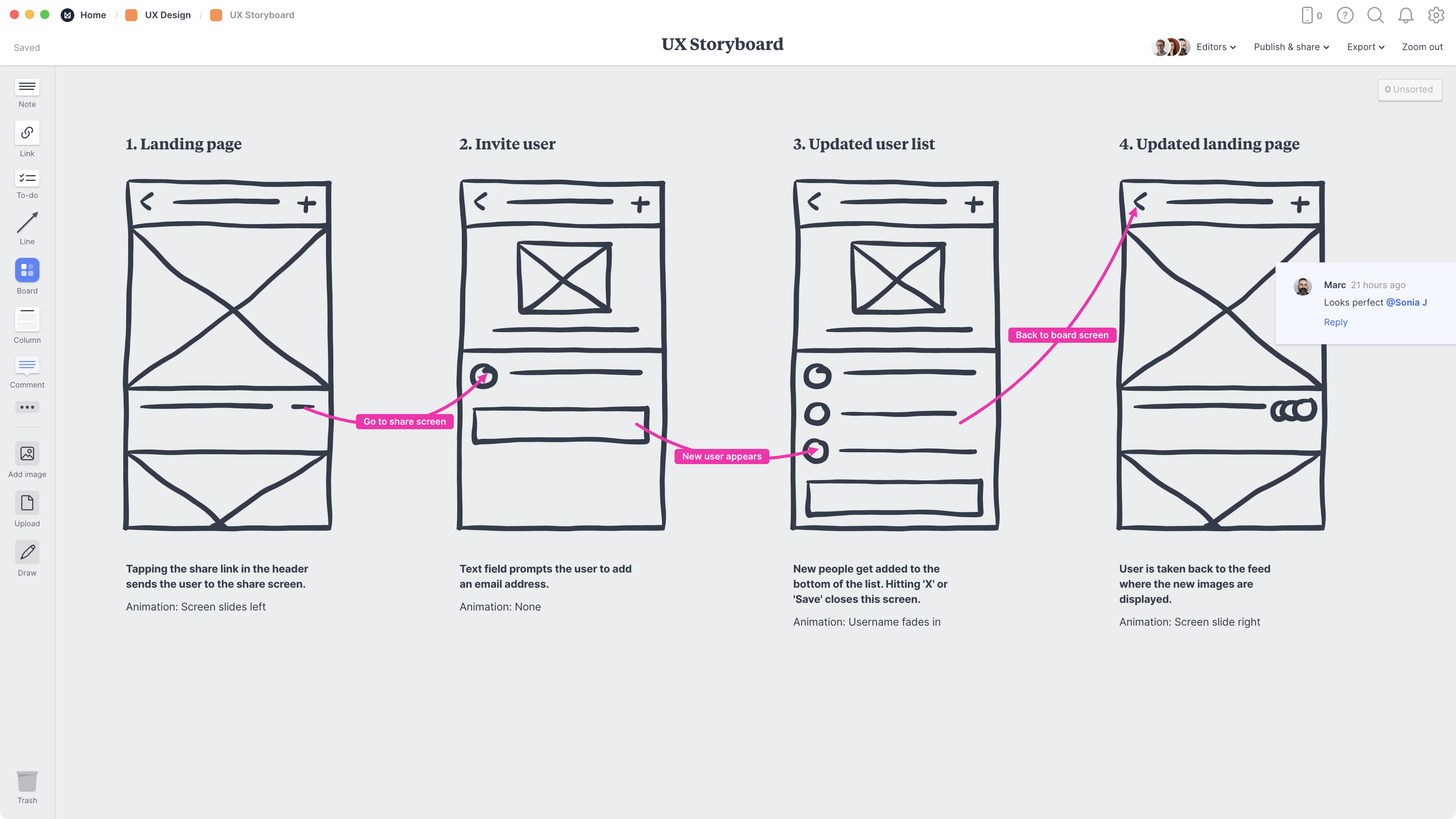

For our note-taking app, our storyboard will look like this:
Panel 1: Initial Notes List
- Visual: A screen showing a list of pre-existing notes. Each item in the list displays a short preview of the note's content. At the top or bottom of the screen, there is a clear button or icon to create a "New Note."
- User Action: Alex taps the "New Note" button.
Panel 2: Note Editor
- Visual: A clean screen with a large text input area, ready for typing. There is a "Save" (or "Done") button and a "Cancel" (or "Back") button.
- User Action: Alex types "Brainstorm marketing ideas for Q3." Then, Alex taps the "Save" button.
Panel 3: Updated Notes List
- Visual: The same screen as Panel 1, but now a new note titled "Brainstorm marketing ideas for Q3" appears at the top of the list.
- User Action: Alex sees the confirmation that the new note is saved and visible. The flow is complete.
This three-panel structure provides a complete narrative of the core function we want to build. It's the visual script we'll give to our AI assistant.
Defining "Done": Simple Acceptance Criteria
Our storyboard tells us what happens, but it doesn't define the specific conditions for success. For that, we use Acceptance Criteria (AC). ACs are a simple checklist of requirements that must be met for a feature to be considered complete. They remove ambiguity and ensure everyone (including the AI) has the same definition of "done."
Let's read a quick introduction to this concept.
19 Acceptance Criteria Examples for Product
This article from ProdPad clearly explains what acceptance criteria are and why they are important. It also provides several formats for writing them.
Please read the first three sections: the introduction, which defines ACs and their relationship to user stories. Then, focus on the section on formats, paying special attention to the Checklist-Style example. This is the simple format we'll use.
As the article states, ACs turn a vague goal into a testable outcome. Now, let's apply the checklist format to our three storyboard panels. These criteria will help Claude understand the non-negotiable elements of each screen.
AC for Panel 1: Initial Notes List
- The screen displays a list of notes.
- A button or icon to create a new note is always visible.
- If the list is empty, a message like "No notes yet. Create one!" is shown.
AC for Panel 2: Note Editor
- A text field is available for the user to type in.
- A "Save" or "Done" button exists to confirm the new note.
- A "Cancel" or "Back" button exists to discard the new note and return to the list.
AC for Panel 3: Updated Notes List
- After saving, the user is automatically taken back to the notes list screen.
- The newly created note appears as the first item in the list.
It's also important to know what not to do. Good ACs focus on function and outcome, not specific design implementation.
19 Acceptance Criteria Examples for Product
Let's review the same article for common mistakes to avoid.
Please read the section What does bad acceptance criteria look like?. Pay close attention to "Bad Acceptance Criteria Example 2: Gold-plated detail." We want to avoid telling the AI exactly how the button should look; we tell it that a button must exist to perform an action.
By defining the user, the visual flow, and the success criteria, we have created a comprehensive and unambiguous plan.
Conclusion
In this lesson, you've taken the first critical step in the design process: planning. You've learned how to translate an idea for an app into a structured plan that both humans and AI can understand.
Key takeaways from today are:
- A UX storyboard visually maps out a user's journey through an app, frame by frame.
- A complete plan defines the persona (who), scenario (goal), and task flow (steps).
- Acceptance Criteria (AC) are simple, testable checklists that define when a screen or feature is successfully implemented.
- Your final plan, combining the storyboard and ACs, will serve as the direct input for prompting Claude to generate your app's design.
You now have a solid blueprint for your note-taking app. In our next lesson, we'll get our hands dirty in Figma for the first time. Before we ask the AI to build for us, it's important to know how to navigate the environment and inspect what it creates. We'll start by exploring the Figma canvas and its key panels.