Welcome to the second module of our course. In our previous lesson, we established the "Proper Proof" contact sheet as a powerful first-pass diagnostic tool, allowing you to quickly survey an entire roll of film. This gives you a high-level view of which frames are potential candidates for printing.
Now, we'll take those promising negatives from the contact sheet and move to the light table for a more detailed, individual analysis. This lesson directly addresses your goal of learning to distinguish between "thin" and "thick" negatives. We'll build a systematic framework for evaluating a negative's density, which is the first and most critical step in predicting how it will behave in the enlarger and planning your printing strategy.
What is Negative Density?
Before we can evaluate density, let's be precise about what it is. In photographic terms, density refers to the opacity or "darkness" of a given area on the negative. It's a direct result of the amount of metallic silver that has been formed in the emulsion. More light hitting the film during exposure leads to more silver halides being activated, which in turn develop into a greater mass of opaque, metallic silver.
Think of it as a measure of light absorption. A completely clear area of the film has a density of 0, letting all light pass through. A very dark, opaque area has a high density, blocking most of the light.
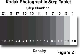
This concept is crucial because the enlarger's light must pass through the negative to reach the paper. The density of the negative directly controls the amount of light that forms the final print.
The Three Categories: Thin, Normal, and Dense
On the light table, we can group negatives into three broad categories based on their overall density:
- Thin Negatives: These look pale and overly transparent. They lack sufficient silver density, usually because they were underexposed. There is very little information in the shadow areas, which will appear as almost clear film. When printed, these negatives yield dark, muddy prints that lack detail in the darkest parts of the scene.
- Dense Negatives: These look dark and opaque. They have an excess of silver density, usually because they were overexposed. It's difficult to see through the highlight areas, which can be almost completely black. While shadow detail is usually present, printing these negatives requires very long exposure times, which can exaggerate grain and make it difficult to retain delicate highlight detail.
- Normal Negatives: This is the "just right" category. The negative has a good range of tones, from detailed, transparent shadows to dense-but-not-opaque highlights. You can see texture and separation throughout the image. These negatives are the easiest to print, typically working well with a standard contrast grade and reasonable exposure times.
This video provides an excellent visual demonstration of these concepts.
Photographer Sandra Coan provides a very clear explanation of film density, using test exposures to show what thin and dense negatives look like and the practical implications of each.
First, watch the main explanation from this segment. Observe the visual difference between the "thin" (underexposed) and "dense" (overexposed) negatives and how it affects shadow detail. Then, watch the following segment from this discussion on overexposure. This part is important because it illustrates that while some overexposure is beneficial (it ensures shadow detail), excessive density creates its own set of problems, like difficulty in scanning/printing and unwanted color shifts.
A Systematic Framework for Diagnosis
Simply categorizing a negative as "thin" or "dense" is only half the battle. To truly improve your photography, you need to diagnose the cause: was it an issue with exposure in the camera, or development in the tank? The classic darkroom mantra is:
Exposure determines the shadow detail; development determines the highlight detail.
This gives us a powerful analytical tool. Let's build a systematic process for reading a negative, based on decades of practical experience from master printers.
Evaluating negatives. - Andrew Sanderson - Substack
This article by Andrew Sanderson provides an exceptional, non-scientific guide to diagnosing negatives. It forms the core of our analytical framework.
Please read the section that begins with the diagnostic guide. This is a crucial part of the lesson. Focus on understanding the distinct characteristics he outlines for: Underexposure: Note the "empty shadows" and normal-density edge numbers. Overexposure: Look for "full shadows" and dense mid-tones, but again with normal-density edge numbers. Underdevelopment: This affects the whole film, resulting in pale density everywhere, including the edge numbers. Overdevelopment: This also affects the whole film, creating heavy density across all tones, including dark, bold edge numbers.
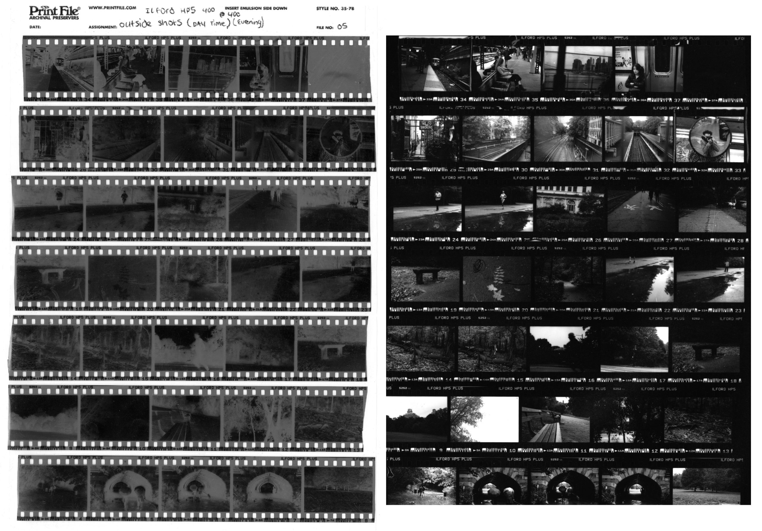
As you can see, the edge markings (frame numbers, film type) are your control variable. Their density is determined solely by the development process, not by your in-camera exposure. By comparing the image density to the edge marking density, you can isolate the problem.
Diagnosing the Combinations
Things get more interesting when you have combinations of incorrect exposure and development. The resource below provides a clear, systematic visual guide to all nine possibilities. Given your background in engineering, this matrix-like approach should be particularly intuitive.
How to read a negative | The Online Darkroom - Blogger.com
This article from The Online Darkroom offers a brilliant visual summary of how exposure and development errors combine.
First, read the introductory text from the start of the article. It introduces the basic method of checking shadows and then highlights. It also mentions the classic "newsprint test" for judging highlight density—a useful rule of thumb. Next, carefully study the nine example images. For each one, read the diagnosis (e.g., "Correctly exposed, underdeveloped") and the description of its characteristics (Overall density, Contrast, Shadow detail, Highlights). This grid is an invaluable reference for learning to identify specific problems.
By working through these examples, you can build a mental library of what different processing errors look like on the film itself.
The Practical Challenges of Density
A negative that is too dense presents a very real physical problem in the darkroom: not enough light can get through it.
DARKROOM PHOTOGRAPHY - DENSE FILM NEGATIVES
This video from Shoot Film Like a Boss demonstrates the practical challenge of printing a very dense negative.
Watch the first two sections, from the introduction of the dense negative and from the demonstration on the enlarger. Notice how the presenter uses text behind the negative to show just how opaque the dense areas are. He then explains that when this negative is on the enlarger, the thin areas will print very quickly while the dense areas will require extremely long times, creating a high-contrast print that is difficult to manage.
This is why achieving a "normal" negative is so desirable. It gives you, the printer, the most control and flexibility. A normal negative can be printed on a normal contrast grade, and you can then decide to add or subtract contrast for creative effect, rather than being forced into a specific grade just to get a usable image.
Conclusion
You now have a robust framework for moving beyond a simple contact sheet and performing a detailed analysis of your individual negatives. By examining a negative on a light table, you can now diagnose not only its overall density but also the likely cause of any issues.
Key Takeaways:
- Negative density is the physical opacity of the silver on the film, which controls how much light passes through to the printing paper.
- Negatives can be broadly classified as thin (lacking density, often from underexposure), dense (excess density, often from overexposure), or normal.
- You can diagnose the cause of density issues by systematically evaluating two key areas:
- Shadow Detail: Governed primarily by exposure. Empty shadows mean underexposure.
- Highlight Density & Edge Markings: Governed primarily by development. Weak highlights and pale edge markings mean underdevelopment; overly dense highlights and dark edge markings mean overdevelopment.
- An ideal "normal" negative has enough density in the shadows to hold detail and has highlights that are detailed but not so dense that they become difficult to print.
In our next lesson, we will refine this analysis. Building on your ability to identify overall density, we will learn how to assess a negative's specific contrast range by more closely examining the relationship between its shadow and highlight densities. This will be the final step in evaluating a negative before you place it in the enlarger.