In our last two lessons, we've built a powerful chemical toolkit. First, we learned how mordants create a lasting bond between dye and fibre, and then we explored how pH modifiers and iron can be used to shift and transform your colours. You now have the practical means to create a surprisingly vast palette from just a few plants.
This lesson addresses a different but equally crucial question: once you've created these beautiful colours, how do you talk about them? Your background in visual communication and design has given you a sophisticated eye for colour, but for teaching, documenting, and systematic experimentation, a shared, precise vocabulary is essential. We will formalise the three fundamental dimensions of colour: hue, saturation, and value. By the end of this lesson, you will be able to apply these concepts to accurately describe, compare, and analyse the results of your natural dyeing.
The Three Dimensions of Colour
Any colour can be precisely described by measuring it along three distinct axes. Albert H. Munsell, an artist and art teacher, developed a highly influential system based on this idea, comparing the description of a colour to describing a box by its length, breadth, and thickness. The Munsell system names these three dimensions Hue, Value, and Chroma. Another common model, HSV, uses Hue, Saturation, and Value. While the technical definitions vary slightly between systems, the core concepts are the same.
Let's begin by defining these three terms. We'll start with a straightforward article from Symfonie Yarns and then deepen our understanding with a more technical piece from the Munsell Color System.
Understanding Yarn Colors: Hue, Saturation, Value - Hand-Dyed Yarns
This article provides a clear, craft-focused introduction to the three key terms.
Please read the sections defining the three main concepts: Hue: Read from the beginning down to the end of the section about the color wheel, focusing on the definition of hue as the colour itself. Saturation: Read the section titled "Saturation", noting that it measures the purity or intensity of a colour. Value: Read the section starting with "Value is a term", which explains this dimension as the lightness or darkness of a colour.
To solidify these definitions with the precision that your design background merits, let's explore the more formal Munsell system's definitions. This system uses the term Chroma instead of Saturation. For our purposes, we can consider them largely interchangeable, with Chroma being the more technically specific term for colour strength or intensity.
This excerpt from A.E.O. Munsell's manual provides the classic, systematic definitions. It will reinforce the concepts with a more scientific rigour.
Focus on the definitions of the three dimensions: Hue: Read the section "Hue". Notice it's described as the common name of the colour, the first thing the eye detects. Value: Read the section "Value". Pay attention to the concept of a graduated scale from pure black to pure white. Chroma: Read the section "Chroma". This is a key concept. It distinguishes a strong, pure colour from a weak, greyish one, even if their hue and value are identical.
This short video provides an excellent visual recap of these three concepts, which might help you synthesise the information from the readings.
Understanding Color: Hue, Saturation & Value- Windy Shih
This video by artist Windy Shih gives a concise overview of Hue, Saturation, and Value.
Watch from the beginning to the end. The presenter clearly defines Hue as the colour family, Saturation as the intensity, and Value as the lightness or darkness.
Visualising the Colour Space
Thinking of colour in three dimensions can be made much easier with a visual model. The HSV (Hue, Saturation, Value) model is often represented as a cylinder, which is a very intuitive way to map these properties.

Using this model, every possible colour has a unique address in a three-dimensional space. This systematic approach is invaluable for a designer and educator.
Let's look at a beautiful, practical example from the world of natural dyes.
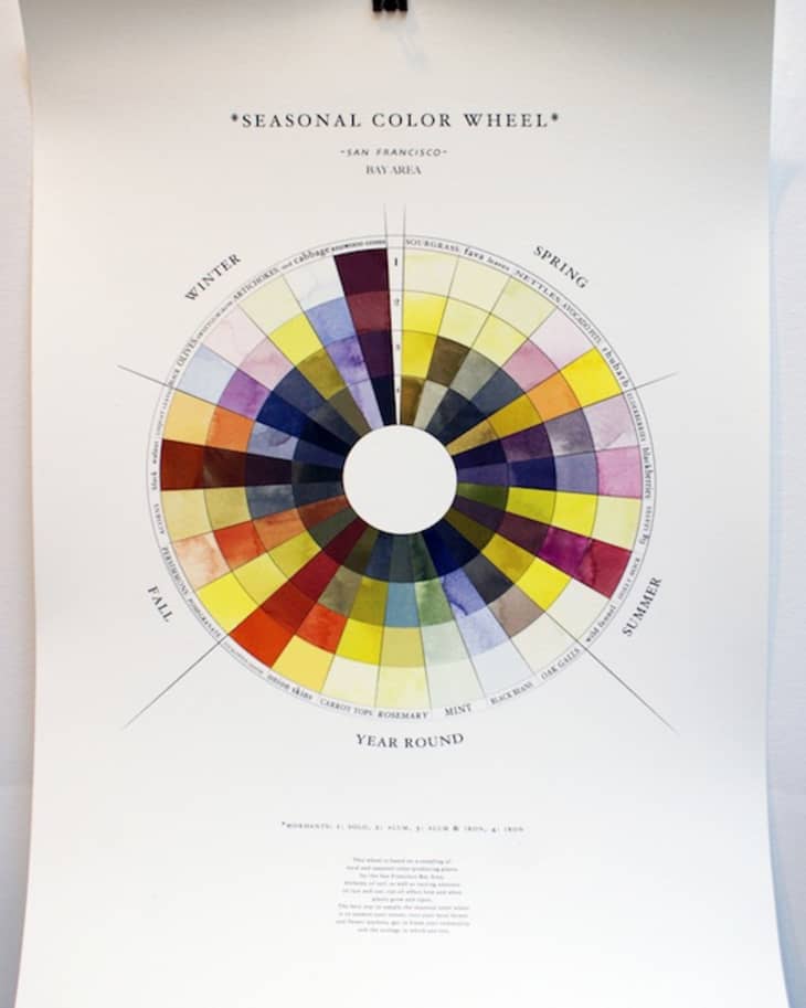
Take a moment to analyse this wheel using our new vocabulary.
- The hues change as you move around the circle: yellows and greens in Spring, vibrant magentas in Summer, earthy oranges and reds in Fall, and deeper purples and browns in Winter.
- The value changes as you move from the outer ring to the inner ring. The outermost colours are generally the lightest (highest value), while the colours become progressively darker (lower value) towards the centre.
- Saturation also varies. The bright, clear yellows of Spring have high saturation, while the muted, earthy colours of Fall and Winter often have lower saturation.
Applying the Vocabulary to Dyeing Results
Now, let's bridge the gap between theory and your dyeing practice. How can you use this vocabulary to describe the results you get from different dyes, mordants, and modifiers?
The best way to learn this is to listen to an experienced dyer describe their results and then translate their intuitive language into the formal terms of Hue, Saturation, and Value. The following video tests different mordanting methods on cotton and provides a perfect opportunity to practice this.
Testing 6 Mordant Methods on Cotton
This video from the "Chromatic Nature" channel is a detailed comparison of mordant effectiveness. The creator's commentary is rich with descriptive language that we can now analyse systematically.
As you watch these segments, pay close attention to how the dyer describes the colours. I will guide you through translating her observations. Madder Root: Watch the analysis of the madder results from this section. Osage Orange: Next, watch the section on osage orange from these yellow dyes. Avocado Skins: Observe the results from avocado from this segment. Logwood: Finally, see the dramatic logwood results from this final test.
Let's break down what you just saw, applying our new framework.
-
Madder Root: The dyer describes the control sample (no mordant) as "pretty saturated actually but it's kind of brown." In our terms, this is a red-orange hue with relatively low saturation and medium-low value. She calls the aluminum acetate sample the "most vibrant color... a bright orange red," indicating a similar hue but much higher saturation and a higher value. The aluminum lactate is a "more lipsticky color... even more of like a it might even be richer." This suggests a subtle shift in hue towards blue-red, with very high saturation and a slightly lower value than the aluminum acetate sample.
-
Osage Orange: She calls the control "very dull," which is a perfect description of low saturation. The mordanted samples are "more vibrant," meaning they have higher saturation. When she notes that after sun exposure "none of them look bright yellow," she is observing a loss of both saturation (they become duller) and value (they become darker/muddier).
-
Avocado: Here, hue is the main story. She's looking for a pink or red-purple hue. The control is a good starting point. The alum and sodium acetate sample is "very brown," a significant shift in hue to orange-brown with low saturation. After sun exposure, she notes that several samples "didn't really stay pink," describing a loss of the desired hue.
-
Logwood: This shows the most dramatic shifts. The control sample is a brown hue with low saturation. The successful mordants, however, produce a "delish blue color" — a complete change in hue to blue/purple with high saturation.
By using Hue, Saturation, and Value, you can move from subjective descriptions like "nice" or "funny colour" to objective, repeatable observations. This is the language you will use to build your colour sample books, to explain choices to your workshop participants, and to document your own creative process.
Conclusion
In this lesson, we have established a precise and professional vocabulary for describing colour. This framework is not just academic; it is a practical tool for any serious designer or dyer.
Here are your key takeaways:
- Three Dimensions: All colours can be described by their Hue (the colour's name, e.g., red), Value (its lightness or darkness), and Saturation/Chroma (its intensity or purity).
- Systematic Description: Using this vocabulary allows you to move beyond subjective impressions to make objective, communicable statements about your dye results.
- Analysis of Variables: This framework is essential for analysing the effects of different variables in your dyeing process—how a specific mordant affects saturation, how an iron modifier lowers value, or how a pH shift changes a hue entirely.
You are now equipped not only to create a wide range of colours but also to describe them with clarity and precision. In our next lesson, we will combine these skills. You will learn to predict colour shifts resulting from different mordant-dye-fibre combinations, turning your knowledge into a powerful creative and pedagogical tool.