Hello! Welcome to the tenth module of our course, "Visual Polish: Color Correction and Grading." In our previous module, we delved deep into the world of sound, culminating in a lesson on the strategic use of silence. Now, we shift our focus from the ears to the eyes. The principles, however, are surprisingly similar: just as sound design shapes the emotional texture of a film, color is a fundamental tool for creating mood, directing attention, and telling a compelling visual story.
Today's lesson is the first crucial step in that process. Our learning outcome is to perform primary color correction to adjust exposure, contrast, and saturation. This is the technical foundation upon which all creative color decisions are built. It’s the process of taking the raw footage from your camera and making it look clean, balanced, and accurate before you start adding any specific stylistic "look."
Think of it as cleaning and priming a canvas before you begin to paint. By mastering these fundamentals, you'll ensure your short films and YouTube videos have a professional and consistent visual quality.
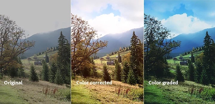
Let's look at what this process achieves:
1. What is Primary Color Correction?
First, let's establish our key terms. The world of color can be confusing, with "correction" and "grading" often used interchangeably. For our purposes, the distinction is vital.
- Color Correction is a technical process. Its goal is to fix problems and create a neutral, accurate, and consistent image. This involves balancing exposure, contrast, white balance, and saturation.
- Color Grading is a creative process. This comes after correction and is where you apply a specific mood or style—making a scene feel warm and nostalgic, cold and sterile, or gritty and dramatic.
Today, we are focused entirely on primary color correction. The term "primary" means the adjustments we make will affect the entire image globally.
To understand these core concepts, let's start with a foundational article.
Color Correction Basics for Short Films
The article 'Color Correction Basics for Short Films' from Indie Shorts Mag provides clear definitions of the key concepts we'll be discussing today.
Please read the introduction (up to 'Key Takeaways') to understand the difference between correction and grading. Then, scroll down to the section titled 'Applying Primary and Secondary Corrections' and read the first two paragraphs, which define primary corrections and introduce terms like lift, gamma, and gain (or shadows, midtones, and highlights).
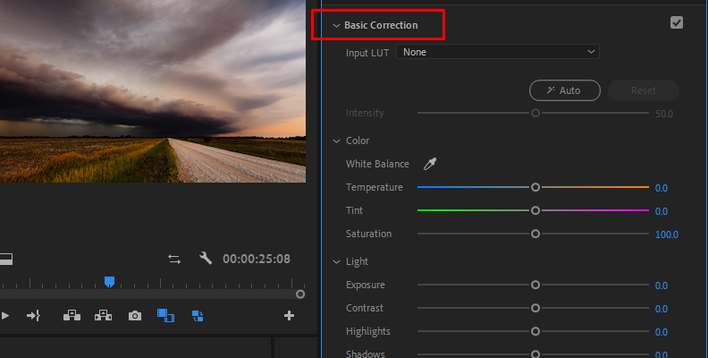
As the article explains, primary correction revolves around three pillars:
- Exposure: The overall brightness or darkness of the image.
- Contrast: The difference between the darkest parts (shadows) and brightest parts (highlights) of the image.
- Saturation: The intensity or "purity" of the colors in the image.
These are controlled using tools that look something like this in most editing software:
2. The Tools of the Trade: Using Scopes
How do you know if your exposure or contrast is correct? You could trust your eyes, but monitors vary, and our eyes can play tricks on us, especially during long editing sessions. To make objective and precise adjustments, professionals rely on video scopes. These are specialized graphs that measure the properties of your image.
For our purposes, we'll focus on two essential scopes:
- Luma Waveform: This scope displays the brightness (luminance) of your image from left to right. The vertical axis represents brightness, from pure black at the bottom (0) to pure white at the top (100). It helps you see if you are "crushing your blacks" (losing detail in the shadows) or "clipping your highlights" (losing detail in the bright areas).
- Vectorscope: This is a circular graph that displays the color information (hue and saturation) of your image. The distance from the center represents saturation (more saturated colors are further out), and the angle represents the hue (red, green, blue, etc.).
This next reading will explain what these scopes are and why they're so important.
Color Correction Basics for Short Films
Let's return to the 'Color Correction Basics' article to get a clear explanation of how video scopes work.
Read the section titled 'Using Scopes for Accurate Adjustments.' Focus on understanding the roles of the Luma Waveform and the Vectorscope.
3. A Practical Workflow for Primary Correction
Now that we understand the goals (adjusting exposure, contrast, saturation) and the tools (scopes), let's see how they work together in a professional workflow. This video demonstrates the process in Adobe Premiere Pro. Even though you have experience with CapCut and Shotcut, watching this will attune your eye to the process and the results you should be aiming for.
How to Color Correct (for beginners) - Master the Basics
In this video, 'How to Color Correct (for beginners) - Master the Basics,' professional filmmaker Alex Matraxia walks through the fundamental steps of primary correction.
Please watch from 10:01 to 20:45. The video is divided into three key parts for our lesson: The Core Principles (10:01 - 11:09): Pay attention to the three foundational elements he introduces. Contrast & Saturation (12:02 - 19:07): Observe how he uses the Luma Waveform to adjust contrast and the Vectorscope to guide saturation. Exposure (19:07 - 20:45): See how he makes a final adjustment to the overall brightness of the image.
To summarize the workflow demonstrated in the video:
- Set the Contrast: Start by adjusting the contrast to spread the signal across the Luma Waveform. You want your image to have rich blacks and clean whites without losing detail at either end.
- Set the Saturation: Next, increase saturation to bring life to the colors. Use the Vectorscope as a guide to ensure you aren't pushing the colors too far, which can look artificial.
- Set the Exposure: Finally, adjust the overall exposure to place the brightness of the shot where you want it. This is often the last step to dial in the final look after contrast has been set.
4. A Powerful Tool: Understanding Curves
In the video above, the adjustments were made with basic sliders. Another incredibly powerful tool for controlling exposure and contrast is Curves. You may have seen this tool in CapCut or Shotcut. A common technique is creating an "S-curve" to add contrast.
This next video shows you how to do exactly that in CapCut, a tool you're already familiar with.
FAST, EASY & FREE! Cinematic Color Grading in CapCut | Video Editing Tutorial
The video 'FAST, EASY & FREE! Cinematic Color Grading in CapCut' demonstrates how to quickly add contrast and saturation to flat footage using curves.
Watch the first part of the video, from 00:31 to 03:12. Focus on how an 'S-shaped Luma curve' is used to expand the waveform and add contrast to the image.
The S-curve is a classic technique, but why does it work? To truly master this tool, it helps to understand the logic behind it. This article breaks it down beautifully.
A Beginner's Guide to Curves for Color Correction
This guide from Frame.io, 'A Beginner's Guide to Curves for Color Correction,' demystifies the curves tool and explains exactly how it works.
Please read the following sections: 'Ups and downs': This explains the basic layout of the curves graph. 'Brighten' and 'Darken': These show how a simple curve adjusts exposure. 'Add contrast': This explains the theory behind the S-curve you just saw in the video.
Test your understanding!
Look at the Luma Waveform for a very "flat" or low-contrast image. The signal would be bunched up in the middle of the graph.
If you apply a standard S-curve, what happens to the waveform? What does this do to the image's shadows and highlights?
Show answer
Applying an S-curve will stretch the waveform vertically. The lower part of the "S" pulls the dark parts of the image down towards black, and the upper part of the "S" pushes the bright parts of theimage up towards white.
This makes the shadows darker and the highlights brighter, which increases the overall contrast of the image.
Conclusion
You've now taken your first and most important step into the world of color. By understanding how to perform primary color correction, you have the power to transform flat, inconsistent footage into a clean and professional-looking base for your creative vision.
Key Takeaways:
- Primary correction is the technical foundation that comes before creative color grading. It involves adjusting exposure, contrast, and saturation.
- Use video scopes like the Luma Waveform and Vectorscope to make objective, data-driven decisions about your image.
- A solid workflow is to first set contrast, then adjust saturation, and finally dial in the overall exposure.
- Tools like basic sliders and curves (especially the S-curve) are your primary means of controlling an image's brightness and contrast.
Next Lesson Preview:
Now that we can control the luminance (brightness) and saturation (color intensity) of our image, the next step is to ensure the hues (the colors themselves) are accurate. In the next lesson, we will build directly on today's foundation and learn how to correct color casts and white balance issues in your footage.