Hello! Welcome to the sixth module of our course, Logo and Brand Identity Design. In the previous module, we honed your vector illustration skills by creating a consistent set of icons. You learned that principles like simplicity, scalability, and consistency are vital for creating a cohesive visual system.
This lesson builds directly on that foundation. A logo is one of the most critical applications of vector graphics, and the principles you've already practiced are central to its success.
Today, we will focus on the theory behind great logos. Our goal is to identify the characteristics of effective logos and learn to distinguish between the different logo types. By the end of this lesson, you'll have the foundational knowledge needed to analyze logos critically and make strategic decisions in your own design work.
What Makes a Logo Effective?
Before we look at different types of logos, we need to understand what makes any logo good. A logo isn't just a pretty picture; it's a strategic tool. Its primary job is to be memorable and to represent the brand appropriately.
To start, let's hear from a master of the craft. Sagi Haviv is a partner at Chermayeff & Geismar & Haviv, the firm behind some of the world's most iconic logos, including Chase Bank, National Geographic, and NBC.
The 3 Rules of Good Logo Design
In this short video from The Futur Academy, Sagi Haviv boils down the essence of good logo design into three simple, powerful rules. This is a fantastic high-level summary from a leading expert.
Watch the segment from 00:38 to 01:52. Pay close attention to his definitions of 'appropriate,' 'distinctive and memorable,' and 'simple.'
As Sagi Haviv explained, an effective logo must be:
- Appropriate: It should match the feeling and personality of the brand. A logo for a bank should feel stable and trustworthy, while a logo for a toy company should feel fun and playful. It doesn't need to literally show what the company does.
- Distinctive & Memorable: It must be unique enough to stand out from the competition and stick in people's minds.
- Simple: It must be reducible to its most essential elements so it works everywhere—from a giant billboard to a tiny favicon on a browser tab.
These three rules are a great starting point. We can expand on them with a few more key principles that all great logos share.
9 Types Of Logos For Brand Design & Strategy (44 Top Examples)
The video '9 Types Of Logos For Brand Design & Strategy' by Brand Master Academy has an excellent section that breaks down the principles of memorable logos in more detail. This will expand on Sagi Haviv's rules.
Watch the section from 13:50 to 17:14. Notice how principles like 'timeless' and 'scalable' relate directly to the idea of simplicity and long-term brand strategy.
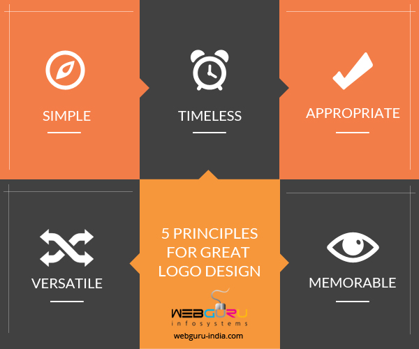
To summarize and reinforce these ideas, here are the core characteristics of a great logo:
- Simple: Easy to recognize at a glance. Think of the Nike swoosh.
- Memorable: Easy to recall. The hidden arrow in the FedEx logo is a classic example.
- Timeless: It avoids trends and remains effective for years or even decades. The Coca-Cola script is over 100 years old.
- Versatile/Scalable: It works well in different sizes, colors, and contexts. This is why vector graphics are essential for logo design.
- Appropriate: It resonates with the intended audience and industry.
- Relevant: It aligns with the brand's message and values.
The Different Types of Logos
Now that you know what makes a logo effective, let's explore the common categories they fall into. Choosing the right type of logo is a strategic decision that depends on the brand's name, industry, and goals.
This infographic provides a great visual overview of the main logo types we will be exploring.

To understand these types in detail, including their specific strengths and weaknesses, we'll consult a practical guide. Since your goal is to become a professional designer, understanding the strategic pros and cons of each type is crucial.
7 Types of Logos and When to Use Them
The article 'The 7 types of logos (and how to use them)' from Vistaprint offers a fantastic breakdown of each logo type. It not only defines them but also gives practical advice on when to use them, their pros and cons, and design tips.
Read through the sections covering the 7 types of logos: 'Monogram logos', 'Wordmarks', 'Pictorial marks', 'Abstract logo marks', 'Mascot logos', 'The combination mark', and 'The emblem logo'. For each type, focus on the 'When to use' and 'Pros and cons' subsections.
To see even more examples in action and explore a few additional categories, let's return to the Brand Master Academy video.
9 Types Of Logos For Brand Design & Strategy (44 Top Examples)
This video covers the most common logo types with excellent visual examples. It categorizes them slightly differently and includes types like 'Dynamic Marks' and 'Letterforms,' giving you a broader perspective.
Watch the segments from 01:36 to 13:50. This covers all nine logo types discussed in the video. As you watch, try to match the categories here with the ones from the Vistaprint article (e.g., 'Brand Marks' are 'Pictorial Marks').
Test your understanding!
Based on what you've learned, analyze the logos for these three well-known companies. What type of logo does each one use, and why do you think that type is (or isn't) effective for the brand?
- NASA (National Aeronautics and Space Administration)
- Amazon
- Starbucks
Show answer
-
NASA: This is a monogram logo (or lettermark). The full name is long and complex, so using the acronym makes it far more memorable and easier to apply. The red "worm" logotype and the circular "meatball" logo are both instantly recognizable and work well in different contexts.
-
Amazon: This is a wordmark with a clever twist. The main part of the logo is the company name, but it includes a pictorial element—the arrow pointing from 'a' to 'z'. This subtly communicates that they sell everything "from A to Z" and also creates a smile, suggesting customer satisfaction. This makes it a highly effective and meaningful wordmark. Some might also classify it as a combination mark, though the graphic element is integrated into the word itself.
-
Starbucks: This is a classic emblem logo. The company name and the siren illustration are contained within a circular seal. This style evokes a sense of tradition, quality, and heritage, which aligns perfectly with the brand's image as a purveyor of premium coffee. While complex, they often use a simplified version of just the siren for smaller applications.
Conclusion
Great work! You've just built the entire conceptual framework for understanding logos. This theoretical knowledge is what separates a designer who simply makes things look nice from one who makes strategic, effective design decisions.
Key Takeaways:
- Effective logos are simple, memorable, timeless, versatile, and appropriate for the brand and its audience.
- There are several types of logos, including wordmarks, monograms, pictorial marks, abstract marks, mascots, combination marks, and emblems.
- The choice of logo type is a strategic decision that should be based on the company's name, goals, and target market.
In our next lesson, you'll start applying this knowledge. We will move from theory to practice as you learn to sketch multiple logo concepts based on a fictional brand brief. It's time to get your ideas on paper