Hello! Welcome back to our graphic design journey.
In our last lesson, you did an excellent job designing a two-sided wedding invitation. You learned how to organize information across two surfaces and got your first taste of Figma's powerful Auto Layout feature to create structured, adaptable content.
Today, we're taking those skills and applying them to a common and valuable project for any graphic designer: creating a presentation template. Your learning goal is to design a branded title slide and a content slide for a presentation template. This is a core task in brand identity and marketing design, as it empowers a client or a team to create consistent, professional presentations on their own.
We will build on your knowledge of consistency and Auto Layout to create two fundamental slide layouts that are both beautiful and, most importantly, flexible and easy for others to use.
1. The Anatomy of a Presentation Template
A good presentation template isn't just a single slide design; it's a system of reusable layouts and styles. For this lesson, we'll focus on the two most essential slide types:
- The Title Slide: This is the first impression. Its purpose is to be visually striking, establish the brand identity, and clearly state the presentation's topic. It usually has a large title, a logo, and perhaps a subtitle or presenter's name.
- The Content Slide: This is the workhorse of the presentation. It needs to be clean, highly readable, and versatile enough to handle various types of content—from bullet points and paragraphs to images and charts.
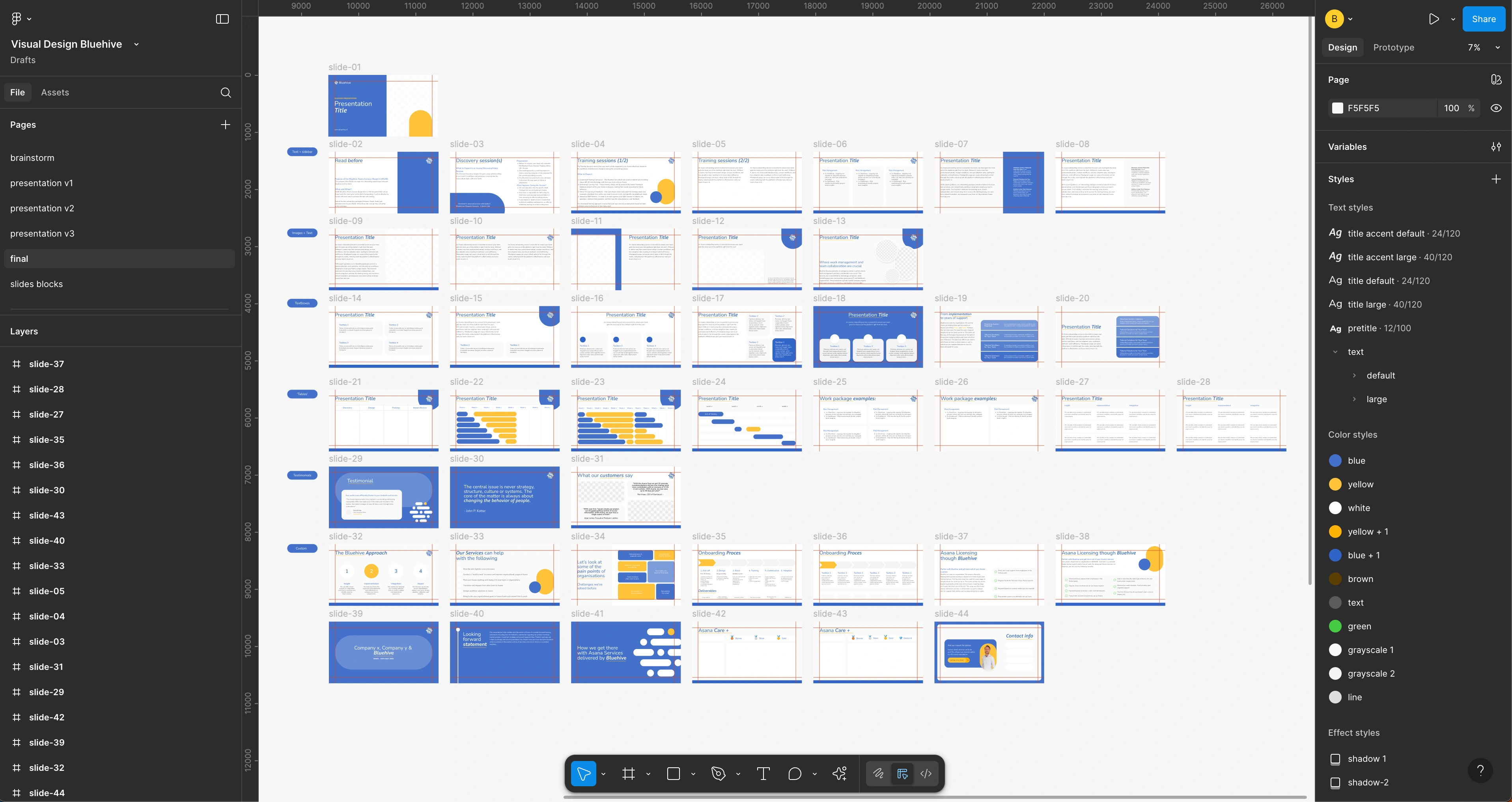
Take a look at the example below. Notice how the title slide (top left) is bold and simple, while the content slides offer different structured layouts for text and images, all while maintaining the same color scheme and typography.

To create a robust template like this, we need to first establish a strong foundation of styles and a structural grid.
2. Building the Foundation: Styles and Grids
Before designing the slides themselves, a professional designer first defines the core building blocks: typography, color, and layout structure. This ensures every slide you create will be perfectly consistent.
Fortunately, Figma has a dedicated environment for creating presentations that helps manage these elements. While the core tools are the same, it's optimized for slide-based workflows.
To see how to set up the foundation for a professional template, we'll watch a few key sections from a fantastic workshop by the Figma team.
Design your custom slides templates
In this video, 'Design your custom slides templates', a designer from Figma walks through creating a robust template system. We'll focus on the three pillars he mentions: typography, color, and grids.
Please watch these three segments: Template Typography (14:18 - 17:00): Focus on how he uses pre-defined text styles to ensure consistency and how making a change to the style updates it everywhere. Template Colors (22:05 - 25:30): Pay attention to how 'Template colors' are a curated set of brand colors that can be easily applied and even 'shuffled' to create new variations. Grids (27:47 - 33:00): This is a masterclass in creating a flexible modular grid. Follow along as he sets up a 12-column grid. You don't need to memorize the exact numbers; just understand the principle of using columns and rows to create a structured canvas.
Key takeaways from the video:
- Text and Color Styles: Your template should rely on a limited, pre-defined set of styles for headings, body text, and brand colors. This is the key to brand consistency.
- Modular Grid: A grid with both columns and rows gives you a powerful framework for aligning content. The 12-column grid is popular because it's divisible by 2, 3, 4, and 6, offering great flexibility.
3. Designing the Title Slide
With our foundation of styles and a grid in place, we can start with the title slide. Remember, the goal is impact and brand presence.
- Create a Frame: Use the Frame tool (F) and select the
Presentation (16:9)template, which creates a1920x1080pxframe. This is the standard for most modern screens. - Apply Your Grid: Select the frame, go to the "Layout grid" section in the design panel, and apply the modular grid you learned to create from the video.
- Add Key Elements:
- Place the company logo, usually in a corner or centered.
- Add the Presentation Title using your "Title" text style. Make it the most dominant element on the page.
- Add a Subtitle or "Presenter Name" using a smaller text style.
- Balance the Composition: Use the grid to align your elements. Leave plenty of whitespace to give your design room to breathe and to create a clean, professional look.
A great tip from the Figma blog post "8 Tips for Designers Building Branded Templates" is to lock the aspect ratio for your logo. This prevents it from being stretched or distorted if someone resizes it.
4. Designing a Flexible Content Slide
Now for the workhorse: the content slide. This slide needs to be clean, organized, and adaptable. This is where your skills with Auto Layout become essential.
The typical content slide has two main parts:
- A Slide Title at the top.
- A Content Area below for text and images.
We'll build this structure to be flexible.
Design your custom slides templates
Let's return to the Figma video to see how to build usable, flexible content areas. We'll look at how to handle text and create placeholders for images.
Watch these two clips: Making a Usable Slide (42:13 - 47:00): This section is a fantastic review and extension of Auto Layout. Pay close attention to how text properties (like Auto height) and Auto Layout work together to make content areas that grow automatically as a user types. Making Image Placeholders (51:48 - 54:00): Learn how to create shapes that act as dedicated image placeholders, making it incredibly easy for someone to drag and drop their own images into your template.
By using Auto Layout for text blocks and creating dedicated image placeholders, you create a template that isn't just a static design, but a tool that adapts to the user's content.
5. Your Turn: Design a Presentation Template
It's time to create your own branded presentation template. We'll use a simple, fictional brand brief.
The Brief:
- Brand: "Momentum" (a tech startup)
- Logo: You can create a simple placeholder. Just type "Momentum" and use a bold, clean sans-serif font like Inter or Poppins.
- Colors:
- Primary Blue:
#0D47A1 - Accent Green:
#00C853 - Neutral Gray:
#424242 - Background White:
#FFFFFF
- Primary Blue:
- Typography:
- Headings: Poppins, Bold
- Body: Inter, Regular
Step-by-Step Instructions:
-
Set Up Your File:
- Create a new Figma file.
- Use the Frame tool (F) to create two
Presentation (16:9)frames. Name them "Title Slide" and "Content Slide".
-
Build Your Foundation:
- In the right sidebar, create your Color Styles using the hex codes from the brief.
- Create your Text Styles:
Slide/Title(e.g., Poppins Bold, 80px)Slide/Heading(e.g., Poppins Bold, 48px)Slide/Body(e.g., Inter Regular, 24px)
- Set up a 12-column modular grid on both frames, as demonstrated in the video.
-
Design the Title Slide:
- On the "Title Slide" frame, add the "Momentum" logo.
- Add a text box for "Presentation Title" and apply your
Slide/Titlestyle. - Add a smaller text box for "Presenter Name | Date" and apply the
Slide/Bodystyle, perhaps in the Neutral Gray color. - Align these elements using your grid to create a strong, balanced layout.
-
Design the Content Slide:
- On the "Content Slide" frame, add a text box at the top for the slide's heading and apply the
Slide/Headingstyle. - Below the heading, create a main content area. This is a great place for Auto Layout!
- Create a text block for bullet points or a paragraph. Set its text property to Auto Height. Apply the
Slide/Bodystyle. - Create a rectangle next to it to serve as an Image Placeholder. Following the video's instruction, change its
FillfromSolidtoImage.
- Create a text block for bullet points or a paragraph. Set its text property to Auto Height. Apply the
- Select both the text block and the image placeholder and apply Auto Layout (
Shift + A). Set the direction to horizontal and adjust the spacing between them. This creates a flexible two-column layout.
- On the "Content Slide" frame, add a text box at the top for the slide's heading and apply the
Test your understanding!
A user of your template says that when they type a lot of text into the content slide, it overflows and looks messy. What feature did you likely forget to apply to the text box to make it grow downwards as more text is added?
Show answer
You likely forgot to set the text box's vertical resizing property to Auto Height. This allows the text box to expand vertically to fit its content, and if it's inside an Auto Layout frame, it will push other elements down instead of overlapping them.
Conclusion
Fantastic work! You have now designed the core of a reusable, branded presentation template. This is a huge step toward creating professional, high-value design systems. You've combined your knowledge of design principles, branding, and advanced Figma features like Styles and Auto Layout to create something that is not only visually appealing but also highly functional.
Key Takeaways:
- A professional template is built on a solid foundation of Color Styles, Text Styles, and a Layout Grid.
- The Title Slide is for visual impact and branding, while the Content Slide must be designed for flexibility and readability.
- Using Auto Layout and Image Placeholders transforms a static design into a dynamic and user-friendly tool.
- Thinking from the user's perspective is key to creating a successful template.
In our next lesson, we will move on to another essential piece of marketing collateral: designing one panel of a tri-fold brochure. This will bring us back into the world of print design and challenge us to think about how content flows across physical folds. Keep up the great work