Hello! Welcome back to the course.
In our last lesson, you mastered the crucial technical skill of setting up a print-ready document in Figma with the correct bleed, trim, and safe zones. This foundational knowledge is the bedrock of professional print design.
Today, we will build directly on that foundation. Your goal is to design one panel of a tri-fold brochure, considering folds and content flow. While we are only designing a single panel, you'll see that to do it effectively, we first need to understand the brochure as a whole. We'll explore how a tri-fold works, how a reader interacts with it, and how to plan your content to create a clear and persuasive story across its different sections.
1. Understanding the Anatomy of a Tri-Fold Brochure
Before we can design a panel, we need to understand its context. A tri-fold brochure isn't just a flat sheet; it's an interactive object. The way it folds and unfolds guides the reader's journey through your information.
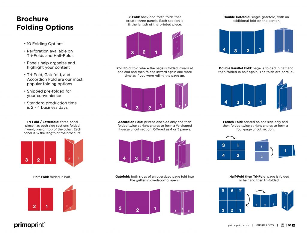
To start, let's get a clear definition of a tri-fold brochure and how it fits among other print options.
How to Make a Brochure: 12 Templates + Best Practices
This article from Figma's resource library, 'How to Make a Brochure', gives a great introduction to different brochure types. We'll focus on the tri-fold.
Please read the section titled 'Tri-fold brochures'. Pay close attention to how it describes the folding method (C-fold or letter fold) and its common uses. This will help you understand its physical structure.
As the article describes, a tri-fold brochure is a single sheet of paper folded into three sections, creating six distinct panels (three on the outside, three on the inside). This format is popular because it's compact and provides a logical sequence for presenting information.
2. Planning Content Flow: A Panel-by-Panel Guide
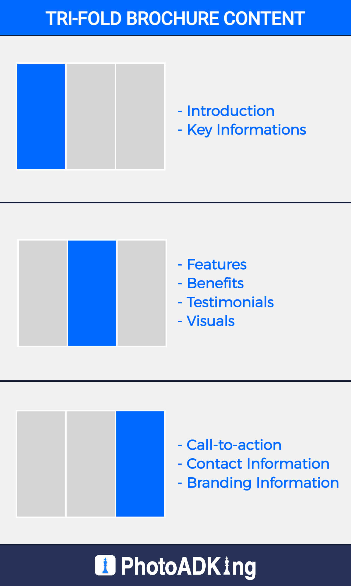
The key to a successful tri-fold is understanding what content belongs on which panel. Placing information randomly will confuse the reader. There is a standard, logical flow that designers follow.
This next resource provides an excellent, detailed breakdown of each panel's purpose.
A Guide to Trifold Brochure Layouts
The article 'A Guide to Trifold Brochure Layouts' from PrintPlace is a fantastic resource that explains the function of each panel in detail. It numbers the panels to show you the order in which a reader typically sees them.
Please read the section 'Layout Design: How a Trifold Brochure Works'. Study the diagram and the descriptions for Panels 1 through 6. This will be our guide for planning the content.
Let's summarize the key functions of each panel based on that reading:
-
Outside Spread (Panels 5, 6, 1): This is what you see when the brochure is folded.
- Panel 1 (Front Cover): The hook. It must grab attention with a strong headline, compelling image, and logo. Its only job is to make someone want to open it.
- Panel 6 (Back Cover): The contact details. This panel typically contains the address, phone number, website, social media handles, and a map. It's the last thing the user sees.
- Panel 5 (Inside Flap): This is the panel that's folded in. It's a great spot for secondary information like testimonials, a list of FAQs, or a special offer/coupon. It acts as a teaser for the main content inside.
-
Inside Spread (Panels 2, 3, 4): This is the "main event," revealed when the brochure is fully opened.
- Panels 2, 3, and 4: These three panels work together as one large canvas. This is where you put your core message, detailed service descriptions, key features, and compelling visuals. You have the most space here to tell your story.
Test your understanding!
Imagine you are designing a brochure for a new coffee shop. Where would you most likely place the full menu with prices?
Show answer
The full menu would best be placed on the inside spread (Panels 2, 3, and 4). This is where the reader expects to find detailed information after their interest has been captured by the front cover.
3. Practical Exercise: Designing the Inside Flap Panel
Now it's time to apply this knowledge in Figma. We are going to design Panel 5 (the Inside Flap). This is an excellent panel to start with because it's self-contained but must still feel connected to the overall design.
The Scenario: You're designing a tri-fold brochure for a fictional "Campus Coding Club". The goal of the brochure is to attract new members.
Your Task: Design Panel 5. Based on our guide, this panel is perfect for building credibility and offering an incentive. Your panel must include:
- A short, powerful testimonial from a club member.
- A call-to-action (CTA) with a QR code that links to the club's sign-up page.
- The club's logo (you can create a simple placeholder).
Step-by-Step Guide in Figma
-
Set Up Your Document:
- Open Figma and create a new file.
- Let's use a standard US Letter landscape document. As you learned in the last lesson, the trim size is 11" x 8.5".
- Including a 0.125" bleed, your total frame dimensions should be 3375 x 2625 px (
11.25" x 8.75"at 300 DPI). Create a frame with these dimensions. - Using guides, mark your trim lines at 37.5 px from each edge.
- Mark your safe zone another 37.5 px inside the trim lines.
-
Create the Panel Guides:
- Your total width inside the trim lines is
11 inches * 300 DPI = 3300 px. - We need to divide this into three panels. For simplicity, we'll make them equal:
3300 px / 3 = 1100 pxper panel. - From your left trim guide (at 37.5 px), add the width of the first panel to place your first fold guide:
37.5 + 1100 = 1137.5 px. - Add the width of the second panel to place your second fold guide:
1137.5 + 1100 = 2237.5 px. - You now have your three panels marked out.
- (Note: In professional printing, the inside flap panel is often made about 1-2mm narrower to allow it to fold in neatly without buckling. For this exercise, equal panels are perfectly fine.)
- Your total width inside the trim lines is
-
Identify and Design Panel 5:
- Looking at the layout diagram from the PrintPlace resource, the outside spread consists of panels 5, 6, and 1 from left to right on your artboard. Therefore, your design area is the far-left panel on your Figma frame.
- Now, design the content within this panel.
- Testimonial: "This club took my coding skills from zero to hero. The community is amazing!" - Alex, 3rd Year CS.
- CTA: "Join a thriving community of coders. Scan to sign up!"
- QR Code: Use a placeholder square for now, or use a Figma plugin like "QR Code Generator" to create a real one.
- Logo: Create a simple logo using basic shapes, perhaps
<C>.
- Apply the design principles you've learned. Use hierarchy to make the testimonial stand out. Use alignment to keep your elements organized. Use proximity to group the CTA with the QR code.
- Ensure all your critical text and the QR code stay within the safe zone guides for that panel. Background colors or graphics, however, should extend all the way to the bleed edge.
Conclusion
Great job! You have successfully moved from setting up a print document to strategically placing content within it. You've learned that designing for print, especially for a folded item like a brochure, is as much about information architecture as it is about visual aesthetics.
Key Takeaways:
- A tri-fold brochure has six panels, and each has a specific role in guiding the reader.
- The standard flow is: Front Cover (hook) -> Inside Flap (teaser) -> Inner Spread (details) -> Back Cover (contact).
- Planning your content flow before you start designing is essential for creating a clear and effective marketing tool.
- When designing in Figma, you must manually create guides for both the print safety margins and the panel folds.
In our next and final lesson for this module, you will learn how to take a finished design like this and export it as a press-quality PDF suitable for printing. This will complete the journey from digital design to a print-ready file.