Welcome back! In our last session, you successfully populated your database with your first set of tools and established your Category Option Set. You now have the raw data ready to go. The next challenge is to bring that data to life on your homepage.
Today's lesson focuses on one of Bubble's most fundamental and powerful elements: the Repeating Group. You'll learn how to use it to create a dynamic grid of your tool categories. This is a crucial step towards building the scalable platform you've envisioned. Instead of manually adding and linking each category on your homepage, you'll build a system that automatically displays them, updating itself whenever you add a new category to your database.
This concept might feel familiar from your experience with WordPress and Dynamic Content for Elementor, where you would use a widget to display a list of posts or terms from a taxonomy. The Repeating Group is Bubble's core equivalent for that task.
Understanding the Repeating Group
Before we start building, let's establish what a Repeating Group is. In essence, it's a container element designed to display a list of things. You design the layout for a single item (one "cell"), and Bubble repeats that design for every item in the data list you provide.
This official Bubble documentation provides a solid introduction to the concept of Repeating Groups.
Start by reading the introductory paragraphs to understand the core purpose of this element. Then, review the section titled "List design" to see how a Repeating Group is configured with a Type of content and Data Source, and how elements inside it reference the Current Cell's data.
Building Your Category Display
Now, let's apply this concept. Your goal is to create a section on your homepage that displays all the tool categories you created in your Option Set. We'll build this step-by-step.
1. Adding and Configuring the Repeating Group
First, you'll add the Repeating Group element to your page and tell it what kind of data to display.
- Go to the Design tab and open your
indexpage. - From the
Containerssection of the element palette on the left, drag a Repeating Group onto your page. - The property editor for the Repeating Group will open. This is where the magic happens.
The two most important fields are Type of content and Data source.
- Type of content: This tells the Repeating Group what kind of data it will be displaying. Since you want to show your list of categories, you'll select the
CategoryOption Set you created earlier. - Data source: This tells the Repeating Group which specific items to display. Here, you'll tell it to fetch all available options from your
CategoryOption Set. The expression for this is typicallyGet an option->All Categories.
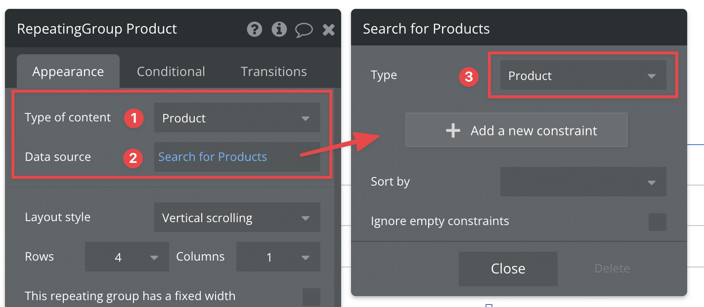
The following video provides an excellent walkthrough of this entire process. It uses an Option Set of company logos, which is a perfect parallel to your Category Option Set.
Repeating group logos: Getting started with Bubble (Lesson 1.8)
This official Bubble tutorial walks through creating a repeating group based on an Option Set. Follow along to build your category display.
First, watch how a group is added to the page to contain the repeating group, and how the RG element itself is added and configured. Focus on the steps from adding the group and the RG. Next, pay close attention to how the Type of content and Data source are configured to link to the Option Set from this segment. Replicate this in your app, choosing Category as your content type. Finally, see how an element (in this case, an image) is placed inside the first cell and its data is dynamically set to the "Current cell's" data. Watch from this point.
2. Designing the Cell
Following the video's example, your next step is to design what each category's "card" will look like. For now, let's keep it simple.
- Drag a Text element into the very first cell of your Repeating Group. You'll notice you can only place elements in this first cell.
- In the property editor for the text element, instead of typing static text, click
Insert dynamic data. - The expression you want is
Current cell's Category's Display. This tells Bubble to show the display name for the category corresponding to that specific cell. - Use the
AppearanceandLayouttabs to style the text as you see fit (e.g., center it, change the font size).
3. Choosing a Layout
Repeating Groups can be arranged in several ways. For a category display, a grid is often the most effective and visually appealing layout.

In the Repeating Group's property editor, under the Appearance tab, you can control the layout.
- Layout style: You can choose
Vertical scrolling,Horizontal scrolling, orExt. vertical scrolling(which shows all items and extends the page). For a grid, you'll typically use one of the scrolling options. - Rows and Columns: Set these to create your desired grid structure (e.g., 2 rows, 3 columns).
Bubble Repeating Group Configuration Guide
This article from DevMatrix provides a concise summary of the different layout options available for Repeating Groups.
Read the section titled What are the layout options for Bubble repeating groups? to understand the differences between vertical, horizontal, and grid layouts.
At this point, if you preview your page, you should see a grid displaying the names of the categories you entered into your database. Congratulations, you've just built your first dynamic element!
Leveling Up: Creating Category "Cards"
Displaying just the text is functional, but given your design background, you'll likely want something more visually engaging. A common pattern is to create a "card" for each item. The best way to do this is to place a Group element inside the Repeating Group's first cell to act as a container for all the elements of your card (text, an icon, etc.).
This technique gives you much more control over styling, such as adding a background color, borders, and shadows to each card.
The following video from Buildcamp is a masterclass in this technique. It builds a beautiful, responsive card layout. While some concepts might be new, observing the process will be highly valuable.
Cards (Flexbox) | Bubble tutorial
This tutorial demonstrates how to build a sophisticated, responsive card layout inside a Repeating Group.
Watch how a Group element is placed inside the first cell of the repeating group to serve as the card container. Pay attention to how it's styled with a background and rounded corners. This is covered in the segment from adding the group. Next, see how text elements are placed inside this new group and are still able to pull data from the parent cell. This is demonstrated from adding text. You don't need to replicate this complex design exactly, but absorb the core principle: Group within a Repeating Group Cell = Card.
Conclusion
In this lesson, you've unlocked one of Bubble's most critical features. You've moved from static data in a database to a dynamic, scalable frontend display.
Here are the key takeaways:
- A Repeating Group is used to display a dynamic list of items from a data source.
- You must configure its Type of content (what it is) and Data source (which items to show).
- You only need to design the first cell, and Bubble will replicate that design for every item in the list.
- Elements inside a cell can access the item's data using the
Current cell's [Thing]expression. - For more complex designs, placing a Group inside a cell is the standard way to create a "card" layout.
You now have a grid of categories on your homepage. However, clicking on them doesn't do anything yet. In our next lesson, we will focus on navigation, making each category card a clickable link that takes the user to a page displaying all the tools within that specific category.