Recommended resources
The freely available resources this lesson will direct you to.
Hello! Welcome back to your front-end development course.
In our last lesson, we explored the CSS box model, establishing that every HTML element is a box with content, padding, border, and margin. You learned how to control the size and spacing of these boxes and how to use box-sizing: border-box for more predictable layouts—a concept that mirrors how you work with frames and spacing in your design projects.
Today, we'll build directly on that knowledge. Now that you understand the box itself, we'll focus on how these boxes behave and interact with each other on the page. This is controlled by the CSS display property. As a designer, you intuitively know that some elements should stack vertically (like paragraphs), while others should sit next to each other within a line of text (like an icon or a bolded word). The display property is how we define this behavior in code.
Our learning outcome for this lesson is to use display properties to control element behavior including block, inline, and inline-block. By the end of this lesson, you'll be able to control the fundamental layout flow of your elements.
1. The Default Flow: Block vs. Inline
In the normal flow of a document, HTML elements generally have one of two default display behaviors: block or inline. Understanding the difference is the first step to mastering CSS layout.
Block-level Elements
Think of block elements as components that demand their own space. They are the main structural elements of a page.
- They start on a new line.
- They stack vertically, one on top of the other.
- By default, they take up the full width available to them.
- They respect all box model properties:
width,height,margin, andpaddingon all four sides.
Common examples include <p>, <h1> through <h6>, <ul>, <li>, and <div>.
To see this in action, let's watch a segment from a tutorial by web developer Kevin Powell.
Block, Inline, and Inline-Block explained | CSS Tutorial
This first part of the video clearly demonstrates the characteristics of block-level elements.
Watch the section on 'Understanding Block-Level Elements' (00:33 - 02:41). Notice how the paragraphs stack vertically and take up the full width, even when there's enough room to sit side-by-side.
Inline-level Elements
Inline elements are the opposite; they are designed to sit within the flow of content, like a word you've made bold or a link inside a sentence.
- They do not start on a new line.
- They sit horizontally, next to other inline elements.
- They only take up as much width as their content needs.
- Crucially, they have limitations with the box model:
widthandheightproperties have no effect.margin-topandmargin-bottomare also ignored. Whilepadding-topandpadding-bottomare visually applied, they don't push other elements away and can cause content to overlap.
Common examples include <a>, <span>, <strong>, and <em>.
This next segment from the same video explains these limitations perfectly.
Block, Inline, and Inline-Block explained | CSS Tutorial
This part of the video explains inline elements and, most importantly, demonstrates how they interact differently with box model properties like height and margin.
Watch 'Understanding Inline Elements' (02:41 - 06:43). Pay close attention to the part where height and margin-top are applied to a link and have no effect on the layout. This is a key difference from block elements.
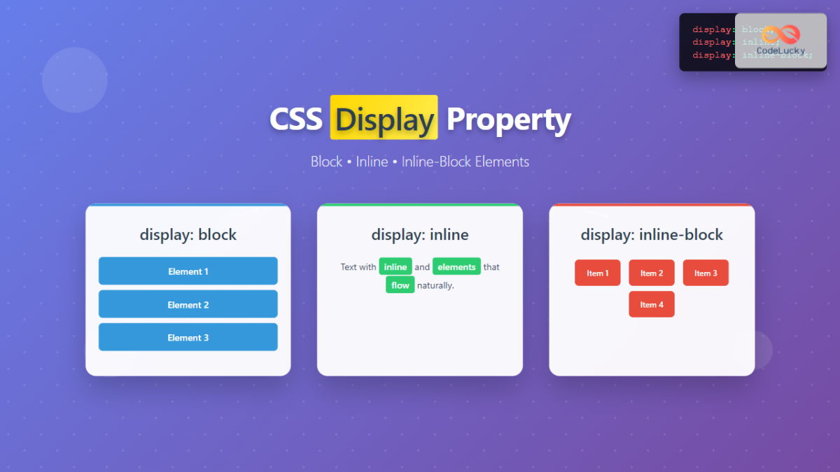
The image below provides a great visual summary of these two behaviors.

2. The Hybrid Solution: inline-block
So, block gives you full box model control but forces a new line. inline lets elements sit side-by-side but removes control over their dimensions and vertical spacing. What if you need both?
Imagine creating a row of buttons. In a design tool like Figma, you'd place them next to each other and give each one a specific width, height, and padding. To achieve this in CSS, we need display: inline-block.
inline-block elements are the best of both worlds:
- They flow horizontally and don't force a new line, just like
inlineelements. - They respect all box model properties (
width,height,margin,padding), just likeblockelements.
This makes inline-block perfect for things like navigation links, buttons, or small cards that need to be arranged in a row while maintaining their specific dimensions.
The next part of Kevin Powell's video provides a perfect, practical example of why inline-block is so necessary.
Block, Inline, and Inline-Block explained | CSS Tutorial
This segment demonstrates a classic use case for inline-block: styling a link to look like a button. It clearly shows the problem with using display: inline and how inline-block solves it.
Watch 'Introducing Inline-Block Elements' (06:43 - 12:58). Focus on how the padding on the button overlaps other content when it's an inline element, and how switching to inline-block fixes the layout issue entirely.
3. Generic Containers: <div> and <span>
So far, we've talked about elements that have semantic meaning, like <p> for paragraphs or <a> for links. These elements come with a default display property.
However, much of front-end development involves grouping elements for layout and styling purposes. For this, we have two non-semantic, generic container elements:
<div>(division): The default isdisplay: block. It is the most common element for creating sections, containers, or wrappers on a page. Think of it as a generic block-level box.<span>: The default isdisplay: inline. It is used to group or style a small piece of inline content, such as a few words within a paragraph, without breaking the flow of text.
Using <div> and <span> gives you "hooks" that you can target with CSS classes or IDs to apply styles and structure your page, without implying any specific meaning about the content inside.
Let's read a quick article that summarizes these concepts and reinforces the role of div and span.
The Odin Project provides a concise article that recaps what we've learned and clearly explains the purpose of <div> and <span> elements.
Please read the sections 'Block vs inline', 'The middle ground inline-block', and 'Divs and spans'. Focus on understanding why div and span are described as generic boxes for styling and grouping.
4. Knowledge Check
Let's take a moment to check your understanding. Try to answer these questions for yourself.
- What are the two main differences between
blockandinlineelements regarding layout? - You have an
<a>tag that you want to style as a button with 50px ofheightand 20px ofpadding. Whichdisplayproperty should you use and why? - What is the default
displayproperty of a<div>element? - What is the default
displayproperty of a<span>element?
Click to see the answers
- Block elements start on a new line and take up the full available width, while inline elements sit next to each other and only take up as much width as their content needs.
- You should use
display: inline-block. An<a>tag isinlineby default and would ignore theheightproperty.inline-blockallows it to respectheightandpaddingwhile still allowing it to sit next to other elements if needed. - The default display property of a
<div>isblock. - The default display property of a
<span>isinline.
Conclusion
Great job! You've now learned how to control the fundamental layout behavior of elements using the display property. This is a critical skill that bridges the gap between styling an element's internal space (the box model) and arranging it on the page.
Key Takeaways:
display: block: Elements stack vertically, take up full width, and respect all box model properties. Ideal for main page sections and content blocks.display: inline: Elements flow horizontally within text and ignorewidth,height, and vertical margins. Ideal for styling content inside a block element.display: inline-block: A hybrid that allows elements to flow horizontally while respecting all box model properties. Perfect for elements like buttons or navigation items in a row.<div>(block) and<span>(inline) are essential, non-semantic elements used as containers for CSS styling and layout.
In our next lesson, we'll address a common question that arises as you write more CSS: "Why isn't my style being applied?" We will dive into CSS specificity and cascade rules, which are the rules the browser follows to decide which style declaration "wins" when multiple styles target the same element.